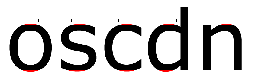
In another thread, William Berkson wrote:
For example, generally, overshoots are said to work in the 2-3% range. But it is also argued that they should be different for bold characters and pointed characters. And Matthew Carter has said that he generally thinks that the S needs slightly less overshoot to look balanced.
An overshoot question for type designers: within a given font
Do you stick to two heights in your designs (one for flat and one for curved/pointed);
Or do you use three (flat, curve, and pointed);
Or do you break it down further?