
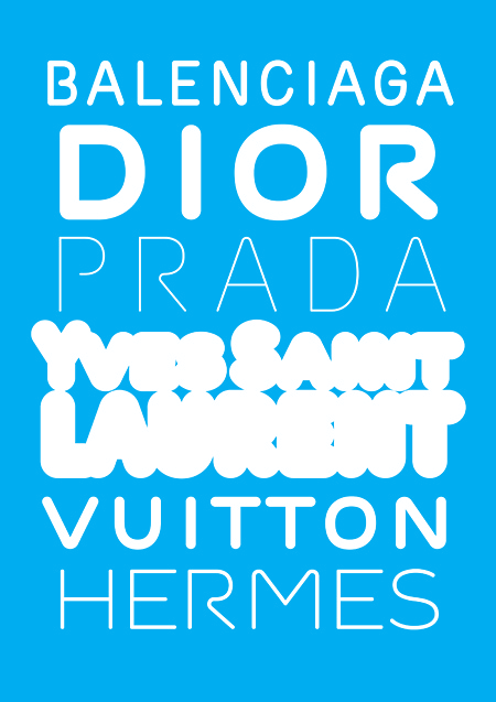
hello. this is Monoxil Outliner, one of three font from my diploma project (along with Klimax and Kakao). its design is based on the original Monoxil, which i made last year. i used that font only twice or so because it somehow didn't fit into anything :), but it worked quite nice with various outlines applied to it.
so i decided to design a new font, especialy for use with outlines.
1. i changed the proportions a bit (the white spaces in B, E, F, P, R and S are the same size, so they close at the same time when you increase the thickness of the outline)
2. the ends of strokes are rounded
3. all sharp connections have a very small rounded curve in the corner, so there don't appear any ugly triangles sticking out ot the shape when the letter has a thick outline. (because it is not possible to choose the type of the connections of the outline for text in indesign)
thank you for your comments. ondrej
| Attachment | Size |
|---|---|
| monoxil-outliner.pdf | 625.39 KB |
