Typophile

Klimax Update with Italic

urtd

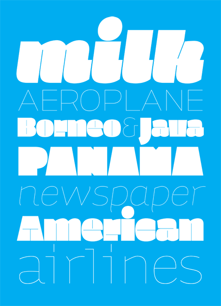
hello. this is klimax. it is part of my diploma project with two other display fonts (Monoxil Outliner & Kakao).
the idea was to draw two opposite climaxes - the heaviest and the lightest, but both sharing the identical metrics and kerning.
i would really appreciate some feedback and critique.

thank you. ondrej

This is really sweet, and very unique.

However, I think the counter strokes on the Ultra weights are a bit too thin. Take "National", in the upper left corner, for example. The counter strokes practically dissolve away.

I like the look and I think thickening the counter strokes a little wouldn't have too negative effect on the over all look.

After looking at the PDF, something about the capital C, G, Q and O seem off, like they're compressed. I also don't like the length of the counter strokes on the capital E, 4, 5, they're too long. Actually, some of your counter stroke lengths seem inconsistent, and long. Such as on the U, V and W.

Hope I'm not being too nit-picky.

One more suggestion, and then I'm done, how bout adding a rounded end to the counter strokes instead of a straight one? It'll soften the forms slightly; as if a laser cut into them.

Nice work. I know it's part of its character, but I think your 'a' bowl could stand to be a tad larger.

I actually kind of enjoy the "ultra-black" looking like they have no counter, but I do agree that the counters are waaay to thin if you are to keep them there. I think that even tripling the counters in size wouldn't be too much. I enjoy the ultra-light weight, the R reminds me of gotham, and the eyeglass g is great. I agree with stephen about the bowl of the a

While I like the black version alot, I agree about the counters. I think the concept and idea are great, but what about making another black, next to this one, with a bit more 'normal' counters? The light version is excellent, though.

You probably need optical sizes.

hello.

asvetic: i'll check the C, Q, G, O and U, V, W letters. i tried make the white strokes of E shorter, but it looked too much out of concept. the only exception is S where long strokes look super bad. the first version had rounded counter strokes and i can't recall why i decided to make them straight actually... maybe i wanted them only to show the inner construction, not to play part of real counters. that's why they are so thin too.

stephen: yeah, i know the bowl of the a is smaller than usual, but i have this feeling that anything larger would be too ordinary in this case. people always complain about this in my fonts by the way... maybe i have do something with it :)

the others: the optical sizes seems to be a good idea. i will definitelly keep this version for big point sizes and design something more conform for smaller ones. the plus style with classic counters and the minus version with thicker strokes and maybe a bit of contrast too. however, this will have to wait because i still have two other fonts to draw... ah... this hard student's life...

thank you all.

> i know the bowl of the a is smaller than usual, but i have this feeling that anything larger would be too ordinary

It's a fine line a type designer walks between personality and usability. That 'a' can get more usable without losing its personality.

ok, i'll trust you and i am gonna fix the 'a' bowl. what do you think about the counters in the 'plus' style stephen?

Very niiice. (I especially love the heaviest weight.) Quite different. So heavy, so blocky, but still cute as hell. ;)

Dav

I think the heavier weight is cut too deeply by the counter space as well. It doesn't seem quite right. My eyes want to see the thin line breaking the e, c, u, t to be MUCH shorter. Maybe that cut into the lc a should closely resemble what you've done to the S. I don't even think the p, h and r need them at all.

This is beautiful. I think it's perfect; you don't need to change a thing. Good work.

-matt

andrew: this was not meant to be a serious thing. i'd call it a display font for extra big sizes with a weird concept... i actually don't know how to explain the the lenght of the counters, but i think the rules i followed while designing them are clear. one explanation could be 'super heavy weight with super big contrast' which is best visible in the 'o'. this system, of course, is not possible to use with all letters, but the aesthetic effect which this system produces is quite interesting, i think.
later i will design the 'normal' version with counters as long and as regular as they should be :)

love the direction.

keep us posted.

----------
Paul Ducco
Creative Design

The Ultra Black weight is lovely especially the lower case "g".

You're definitely on to something.

Love the heavy and the light weights! I would like to be the proud owner of (files enabling me to use) these fonts when they are finished... ;-)

Ronald Kyrmse
ronald.info.ms

Ditto on the optical weights. I also don't think you'd lose anything by broadening the counters in general (on the ultra-black). The beauty in such a fat weight all comes from the tension between how badly the strokes just want to crush the counters, and how hard the counters have to work to resist.

I love the lowercase g, especially. The spine looks like a muffin top!

I LOVE THE ULTRA BLACK!!!

The light/regular weight feels like Auto from Underware.

Mikey :-)

Very cool!

ITALICS COMING IN FEW DAYS!

Now I know what means Ultra Ultra Ultra Light and Ultra Ultra Ultra Black. Impressive.

cool!

it's very cool. i love the super heavy. it's really unique. great!

Ultra black is very very unique in did. The most amazing thing about it is that it's still readable. Definitely not as much as regular weights but definitely much more than other ultras.

Kudos!

That's quite a body of work, and a very fitting name for a diploma project. I <3 the Plus Italic lowercase k.

thanks. i am pretty proud of the lowercase k too... unfortunatelly, i had to break the rule of same width of minus and plus style. i had to add some kern pairs with k in the minus version, because the fat style is filled on the right side, while the minus style k is just regularly open... but i think it doesn't spoil the concept that much.

Absolutely great!
I like both the heavy and the light, plus the italics. I would still like a more regular version of the heavy, but nevertheless; great work. :)

okay... I’m in love!

Ondrej, you're planning to offer us all a free pre-release copy of Klimax right? ~wink~

should i? :/

Well, you could create a little buzz for it.

Perhaps just giving it away isn't exactly what you were thinking (though I'm not opposing if you want too), but what if you made it a cool give-away prize in a type oriented game or drawing.

Kinda like I Love Typography's crossword/drawing for a complete set of Haptic.
http://ilovetypography.com/crossword-1/

Maybe Punchcut/Typophile could host a little contest/drawing right here and give away a few sets of Klimax.

Of course, it's just a suggestion.

well... acutally i am thinking about offering it to some typefoundry or someone. i haven't done that before, but i feel that klimax can be the one to start with. but first i think i'll wait for peter bilak, who's gonna write me an opponency, i'll see how's that going to be like and then i'll decide. i guess...

again, cool

Great stuff.

pretty

Great work! I really can't decide which I like more, the Heavy or the Light, I love them both :) The Heavy reminds me of Fat Ed by Underware (it's a compliment), love the Small Caps, the g, a, s, diacritics, italics. And the Light is not less awesome. Like I said, love them both.

Something about klimax reminds me of Gloriola, or maybe the other way around since I came across it for the first time last week. It's not quite as extreme on the heavy side, but the lighter weight characters seemed to have a lot in common.

oooh it;s beautiful!

are you planning on releasing it? I;d love to use it!

I find that the thickest set of writing, for example 'milk' is difficult to read.

Otherwise, the other two I adore.

I just saw this - it's delish!!
Where is it now?

hhp

soon to be released!

Cool. I think it really fits with Typotheque. :)

A-MAZING! Congrats! That is really so cool your gonna published with Typotheque.

Mikey :-)

Captured from web.archive.org on 14 Jul 2014. view this capture