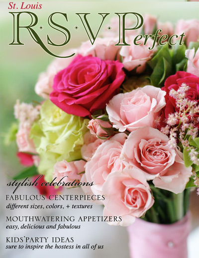
I am totally and completely stuck! I’m launching a magazine (RSVPerfect) in a few months and am trying to create a logo for it. It is a party planning and event design magazine. I’m including a mock-up below. I wanted to create an elegant look that reflected class, however, I wanted it to stand out in the midst of the many magazines that are already on the news shelves. Any font ideas?
Two questions... what do you think of the logo? I know that “St. Louis” looks too small and poorly placed. And what do you think of the name RSVPerfect? Do you think that the general public will understand it or is it too abstract?
Any feedback would be GREATLY appreciated.