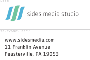
I’m working on literature for a brand that uses Neo sans in the logo. Neo doesn’t do too well at small pt sizes. Its horizontal stress and other quirks carry through too strong on the common characters (s, c, F in particular). The qualities are looking outdated already. Keeping in mind that I can’t change Neo in the logo, are there any suggestions for a good workhorse sans to be alongside it? I’m looking for a more neutral, slightly squarish
non-geometric sans with similar x-to-cap height ratio.