Typophile

Type families

vyse

Do you agree that a good designer really only needs five or six families of types to explore - for me it is Eric Gill's Sans in its mnay forms - plus his father-in-law Edward Johnston's charismatic and ground-breaking Sans for the London Underground (still very much in use and full of beans and new applications today) not to mention Joanna who, as well as being a fine fnt somewhat akin to his Perpetua, was also incidentally Johnston's daughter, hence the font name.

Top that list of three font families off with Bembo or Goudy etc or whatever you like working with and you have enough type variations and weights etc to keep you busy for a year or three ringing the changes and possibilities.

By the way, this is my first post - just stumbled on this lovely site while idly Googling for a beautiful alphabet series of lithos by The Beggarstaff Brothers (which I did not find, any help anyone can give will be very gratefully received). I have owned an original for the letter "Y is for Yokel" for fifteen years and want to find out the rest.

But back to my question: Do you find that, except for specific briefs of course, you come back to certain type families - rather like a musician having a favourite instrument which you get better at playing the more varied ways you use it?
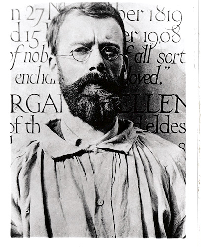
PS The pic is Eric Gill with some of his early incised letterforms.

I think it is natural to go back to what you know best. I try to explore and I think it is important to do so. But sometimes the project doesn't need a rocket scientist mentality, it just needs a good typeface.

Hello MT. I agree 100% with the you about exploring. It's oxygen for a typo or designer. Otherwise we'd never feel the drive to create sommthing new and totally original.

But sometimes it can be just as rewarding (and more challenging) to explore a small back yard for nuggets as to explore a massive wilderness.

I spent the first ten years deliberately seeking something new with fonts hardly anyone had used - I fewltI owed it to myself to find something recognisable new for every project - then I saw a 30x20 sheet of stuff a design student had done with Bembo and it blew my socks off - totally fresh, immaculate new ways with line spacing and kerning, wild indents etc.

I've been playing around with Gill lately - chopping back ascenders and descenders - pairing Gill headlines with bold heavily leaded u/lc Perpetua for the body copy, squashing, stretching, metal spacing etc - add colour and suddenly fonts I thought I'd exhausted in my first moths out of college jumped up another level or two.

It was like havin learnt all the rules I could now decide which rules to break. But the important thing was probably to know which rules to break.

It just seems that now, with untold thousands of fonts available, young designers tend to switch font for each job almost as a point of honor - and never really get to extend the infinite possibilities that a font with a really big range of weights and styles can offer.

I don't say there is a right way to approach choice of fonts or a wrong way.

Just interested to think that if all the fonts in the world except five or six suddenly disappeared off our screens tomorrow which ones you'd keep. And whether that'd slow you down as a designer or simply add to the challenge.

There are certainly typefaces I like and those that I don’t like, but apart from that I’m the exact opposite. For every project I do I take my time (long time, lots of considering and trying out) to find the appropriate typeface and combinations - and for me that’s most of the fun in my work. I’d get bored using the same type over and over.

It is similar to music for me (but as a listener not a musician). There are definitely reliable fonts that I know I like and can work with and have used over and over in different contexts for many years. And yet - I love getting new fonts and am thrilled when the right project comes along for them.

Same thing with music, there are artists and albums I always come back to and at the same time I'm always looking to get turned on by something new.

And by the same token I will sometimes burn out on a font (or an album) and shelve it for awhile so that I can come back to it with a fresh eye (or ear).

I am not so bound to doctrine to either feel the need for a limited number of typefaces to comfort myself with or the constant need for something new and different. I let the context of the communication problem speak to me and allow a typeface decision to follow uninhibited by artificial boundaries.

ChrisL

That was nice Chris, good text for a type specimen...?

I worked as an advertising agency art director in the 1980s. An agency would have many clients, and each had its own typeface. The most fun work I did was for the Ad Club of Toronto, which organized monthly lunchtime speaking events. One year my boss was the chair, and every month I'd be called upon to design a flyer to be mailed to members, advertising the upcoming event. This was an imposition, as I wasn't remunerated, so I rewarded myself by indulging in using a different set of typefaces each time (ah yes, the old pro bono accommodation). One month Folio Extended heads with Fairfield text, next month ITC Fat Face Black with ITC Caslon No.224 Medium, and so on. I did settle down a bit in the 90s, and recall Myriad Bold Condensed in a lot of sidebars in financial newsletters. I went to town with Adobe Garamond when it was released, as it introduced the opportunity to apply "real" typography to desktop publishing--small caps, old style figures, swash characters, extra ligatures, titling, &c. For one newsletter I managed to use almost every font in the set, except the one of bold superiors.

Now that I design type full time, I continue to follow the "so many flavours, try them all" approach, although critics such as Bald Condensed have discerned favorite themes.

"That was nice Chris, good text for a type specimen...?"

:-) I hadn't thought of it that way--I just burped out the above text after reading the thread--but you may have something there ;-)

ChrisL

i'm not nearly as prolific or knowledgable in print design as most folks here, but when i begin considering fonts for a given assignment i start by setting the words, headline, or sample in a variety of extreme variations, just to see how they feel.

even if i'm sure a title or word demands a script, for example, i'll set it in several scripts, a chunky sans, lowercase serifs, circus type, whatever. i want to see it take on unexpected qualities, even if i drag it back to an understated and perhaps more predictable solution.

usually my initial instincts are confirmed but there are surprises. i'm essentially self-taught, so i may be wasting time in my round-about methods, but i feel confident about the results and i enjoy the process.

i'm usually designing for film or video titles where the criteria are rather different than for print, but i always print out many test groups and examine the words on paper in a variety of fonts, as that retinal experience yields a unique kind of information about the choices.

As a letterpress lover who works with lead type, I prescribe to the limitation philosophy, in part because I have (or had) no choice. But, because I really enjoy setting type by hand, and because I don't like to find reasons to bitch, I decided to embrace that limitation, and in doing so have become an advocate of having a "house typeface," or a library of "house fonts." (In my case it's the Century family and News Gothic by MF Benton...I feel lucky to have this stuff in metal because I believe it's classic American type.)

Now that I've entered the digital age and have an unlimited number of options (well, limited I suppose by the pocketbook, but digital fonts are a lot cheaper and lighter and smaller than lead type), I've made a conscious choice to stick to my house fonts when possible, which are dictated by my metal type collection.

HOWEVER...I operate as a private press, primarily, and I like the signature that my chosen house fonts give to my work. When it comes to freelance work for clients, I look first to my house fonts, but allow myself to explore other options whenever necessary.

This means that limiting oneself to a specific set of house fonts is, in a way, branding your designs, which may or may not be something a person wants to do. I think there are clients who might appreciate it; potential clients may choose you as a designer because they like your "brand." On the other hand, there are clients who will have no interest in working within your own personal-taste-driven typeface choices.

There are type families that are very versatile, and of course they will get used a lot. Trade Gothic is still kicking because it's so unassuming and utilitarian. But that's not the same thing as being afraid to try new things, or lazy about making decisions. There are new, versatile workhorse families introduced every year. So there isn't really any reason for design to be as stale as it sometimes is (in the US anyway). When someone's portfolio clearly reveals what one font CD they own, or when a designer makes very different campaigns or products all look the same, something is wrong. It's like eating the exact same bland lunch every day.

It's one thing to explore and truly understand the range of a typeface. That helps you know when not to use it as well as what it can do. Every typeface has a different range of applications. It's another thing to get in a rut with a few comfortable, safe, and reliable families, ignoring everything else.

I think the method described by Ch is ideal. By trying various unexpected things before committing to a certain typeface, you can learn new things about a few different ones, and experiment with voice.

My standard approach is two type families for one client nonprofit agency: the main, a serif workhorse with plenty of weights and both lining and oldstyle figures, easily switchable (but never on the same job). Then, for highlights and sidebars, a well-matched sans. But after a few years, as PattyFab says, you get tired of those faces, but the client is happy and doesn't want to re-invent the wheel, so you're stuck. I used Bitstream Arrus as soon as it was released and got tired of it within three years--no fault of Arrus. But there's too much happening in type today to limit yourself to a handful of families, as Vignelli did years ago.

So there isn’t really any reason for design to be as stale as it sometimes is (in the US anyway).

I have to take issue with that - I work on a lot of co-editions (books translated from a foreign language into English) on which I do only the typesetting. I get the Quark files from the foreign publisher. I find that European book design tend to be far more conservative and old-fashioned looking than what you see in the U.S. And we're talking art books here, not medical textbooks.

I’m afraid I have to agree with Patty. I should know. I’m German. Actually I think that in the U.S. especially cover design for books is much more understood as packaging that sells and there’s a lot more effort put into that. I can’t think of a Chip Kidd here. Being conservative about book design in Europe probably comes from traditionally judging a book by its content rather than the packaging. Old school. It’s like if a book is good from the ouside it has to be bad inside.

Note: Book covers are almost a completely separate issue from other kinds of design, including the guts of the same books. I agree this is a strong area; it's actually a very vital category of design. But I think that moves away from the original question. Can you get by with very few families? It's certainly possible, but that policy probably works better with versatile families that can handle display as well as text, a few different styles, and a certain number of typefaces that have a neutral quality.

Hoefler & Frere-Jones show examples on their website combining various families of theirs. It's wonderful and informative because they demonstrate some of the versatility of the various designs and they also show how rich and varied layouts can be when type is combined well. You could stick to one foundry's work, if it is well-rounded.

joanna was eric gill's daughter.
gill and edward johnston weren't related,
except professionally.

check your facts before showing off.

Note: Book covers are almost a completely separate issue from other kinds of design, including the guts of the same books.

Not in art book design which is primarily what I do, and what I was referring to.

It's true that American book design is more marketing savvy (if that's the right word. Marketing driven? Marketing aware?) than European. For example it is not uncommon for European art book jackets to have blank back covers, blank flaps, and no frontispiece. The same is often true of the interiors. Our french co-publisher often considered our designs too showy, unseemly for the European market.

What was the name of Gill's famous dog?
Is there a typeface named after a dog?
Would you name a dog after a typeface?

"Here, Comic Sans!, Good Boy!, now Fetch!"

ChrisL

Captured from web.archive.org on 19 Nov 2014. view this capture