I really like the simplicity of the design and the font choice which seems pretty inspired to me. But the overall effect I get is sort of "toy store". Probably via the colors which feel like paint instead of "food". Also it feels a bit "accessible/easy" rather than "elite/high end". If this was for sale in gas stations you would probably be bang-on; but it isn't. It's snobby foodie SF bay - no? ( my peeps! ) And so I think a softer more subtle color palette would be way more upscale. What about letting one of the puddles run in three rivulets? what about just one wipe of cream behind the letters in an arc? Maybe photographed from behind glass. I think less space between the a & m would be good. Or looser spacing overall to match the a & m. Can this be done in one spot color instead of CMYK? Or two? I guess you are not down with the very fancy decorated thing that's still seems to be all the rage... ;-) I will be interested to hear what the other folk think.
Hi all,
This is a straightforward design, but I'm having trouble because my eyes are very unfresh on this project. The logo's theoretically final, but I can tweak the kerning if you have suggestions on that. I'm feeling waffle-y about the border - what I'd really like is an embossed border, but we are on a low budget.
I suppose I should tell you: Scream is a two-person company who'll be selling in SF Bay Area farmer's markets, and then hopefully expanding to a brick-and-mortar store and/or restaurant sales.
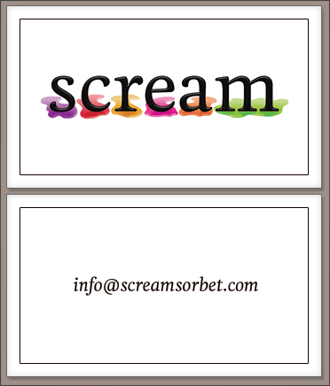
This image suffered a bit in the conversion from CMYK to RGB, but it's about right. Again, letter spacing & the border are the things I'm stuck on, although I welcome any thoughts at all.
Thanks!
Beth


