
I thought I’d make a new thread for this to separate it a bit.
My brief was to create an identity for a homemade cookie company with emphasis on the homemade and traditional elements of the brand.
I’ve taken the logo in a different direction from my original ideas.
This logo was my original idea that I wanted to use.
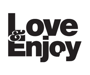
This is the different direction that I took it. This logo would be applied by rubber stamp to all the stationary and packaging.
Because this is quite a small-time company this is commercially viable. I hand drew the lettering and then traced them. Advice on the type would be really appreciated as I have never really done it before.

Thanks for the feedback in advance.
