
I've been working for this company for a year and a half. I hate their logo. I'm really looking for a good reason to prove to my boss that the logo is ugly and that changing it won't hurt the branding of the company. My boss is the wife of the company founder. She and I both have fine arts educations, not design. She drew the logo and is very possessive of it. I think the fish is ugly and the free font "Addcityboy," is not only ugly, but impractical as it becomes unreadable at a not-so-small size. Here is a progression of the logo since I have been working here:
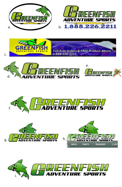
a. The official logo when I arrived
b. The alternate logo when I arrived. Used mainly in print.
c. The logo appearing on the homepage when I arrived.
d. My first attempt at shaving some of the crap off the logo
e. The fish would fit nicely with the slant of the letters if only it was flipped over and rotated a bit. That is not allowed. Precious fish must remain unadulterated.
f. I was able to shave off a little more excess.
g. we hired this outside marketing/ecommerce software making company to build us a new website and help us with branding. They made the letters dimensional and then dropped them on to of the flat fish in order to save space which, imo, looks totally awkward. This is how the logo looks now at the to of our website.
h. This is how it will look when the brand new fancy site is launched (if it is launched, the company we hired has been kind of a disappointment). They wanted to update the look by making it more web 2.0, thus the shadows and gradients. How can they say it is more web 2.0 when they've removed the lighter yellowish green- arguably the most web 2.0 color on the web?
i. My suggestion for web 2.0 -izing the logo.
Actually, I'd really rather scrap the whole thing. By the way, any guesses at what the company does? In addition to the logo, I think the company name is somewhat inappropriate and misleading, but I'm not going to get into that.
Please tell me if I'm crazy and the logo looks fine, or if I'm right and rethinking the branding strategy might be a good idea.
Thanks


