Typophile

>>> Type ID Pop Quiz V2.3.2 - Intermediate Level

This thread ran to 5 pages of replies and only one was recovered, so replies are missing.

Bald Condensed

This is how it works:

  • A complete glyph is published in the Type ID Pop Quiz.
  • Try to identify the typeface. To win, you need to name both the typeface and the weight.
  • Show off your knowledge by casually mentioning additional trivia, like who designed it, when and by whom was it (first) published, and other cool stuff to impress your fellow Typophiles with.
  • The winner produces a new challenge -- a complete glyph, black on white background, presented in a 288 x 288 pixel square, including a R204G000B00 1 pixel border.
  • The person who posts a challenge can't win the next game.

In case of any disputes, I will act as judge, jury and avenging angel of wrath.

If you think this is a little too difficult, maybe try the Entry Level Type ID Pop Quiz first. Too easy? Go to the Expert Level Type ID Pop Quiz.

Good luck everyone, and have fun. ;^)

With respectful thanks to the originator of this utterly useless but highly entertaining waste of time, the often imitated but never duplicated Cheshire Dave.

Continued from here.

Karl Gerstner's Gerstner Original ?

No, it’s not Gerstner Original.
Hint: The original was released in 1996 with Mac OS 8…

Yes Akira, it’s Truth Regular from David Berlow. Your turn

Thank you.

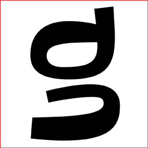
Here is the next one:

I think it’s easy. ;^)

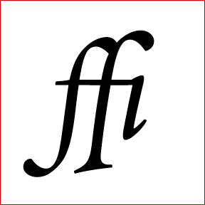
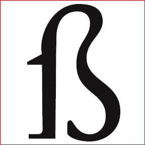
Jonathan Hoefler’s Requiem (Text) Italic, isn’t it?
Its ‘fffl’ is depicted in The Elements of Typographic Style … ;°)

Yes, Florian, it’s Requiem Text Italic.

Your turn now.

Okay, here’s mine:


Have fun!

A first hint?
This typeface is exactly 1 year old.

It’s a commissioned free font.
Its creator is a typophile member, though not a very loquacious one.

Mmh, oh dear, seems to be a little bit too hard.

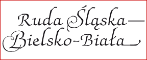
Yes, Marcelo, that’s the one! Silesiana, a typeface for the Silesia region by Artur Frankowski. Congrats!
I’m glad you knew it … next hint would have been: It’s the font with the most inscrutable EULA – at least to me, as it is only available in Polish. ;°)
Your turn.
F

Thanks Florian! I found it only because your geographic hint (with a little bit of help of my friend Google) :)

Here is the next one:

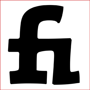
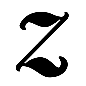
Conrad Extra Bold by Akira Kobayashi

9 days for Florian and 9 minutes for me! I’m going to hide under the pillow now ;^D

You’re totally correct Akira, my friend. Your turn.

Thank you, Marcelo.

I was just lucky because Conrad is one of my favourite fonts. :D

Here is the next one:

Conrad is one of my favorite fonts too! :)

I’m glad to hear that, Marcelo, my friend. ;^)

Hint:

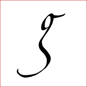
This font is based on a famous left-handed calligrapher’s writing.

The calligrapher’s husband is a well-known letter-carver.

I can’t win but I want to know!... the calligrapher herself produced the font? or was someone else who did it inspired by her writing?

OK, Marcelo,

What it comes down to is:

The designer is a left-handed calligrapher.
Her husband is a letter-carver.

And here is another hint:

The person who digitized her writing is a well-known type designer.
He is well-known also for you and me. ;^)

Thanks Akira! I found it... ;^D

Congrats!

You know him well, don’t you? :D

Yes I do! ;^) and the font is... let me find the word... gorgeous, yes, that’s it, and with the alternates and swashes, wow!

Yeah, it’s gorgeous. It’s an excellent font.

I’m waiting someone else to find the font! ;^)

Anyone?

It is Hamada Roman by Gaynor Goffe.

Yes!

Congrats, Pieter. You’re correct.

It’s Hamada designed by Gaynor Goffe. Akira Kobayashi digitized her writing.

According to Akira Kobayashi, Hamada was named after two people.

One is a Japanese famous ceramist, Shoji Hamada (濱田庄司) whom Gaynor and her husband like. Two is a man whose name is also Hamada. He is the boyfriend of their daughter.

And another reason is that Hamada sounds musical and it fits the typeface.

Pieter, your turn now. ;^)

Thanks Akira.

Good Luck!

Hint: One of the designer’s best friends is called Charlie.

Nobody?
Hint: Charlie is a Italian Greyhound

PMN Caecilia ?

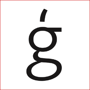
It is Seravek from Process Type Foundry. Good hint!

Seravek Roman to be precise.

Hello Miss Tiffany. You are right it is Seravek Roman from Eric Olson (Process Type Foundry).
It’s your turn now.

Pieter

Here's a hot samba of a text face for you to guess.

Just chiming in to say that's a beautiful glyph...yet I have no idea to what face it belongs.

Hint: This foundry is fairly new and the designer sounds Italian.

Is this too difficult? Need another hint? I just recommended this font to someone based upon the merits of the italic.

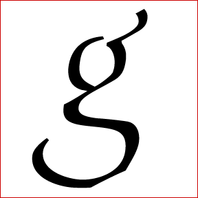
...how about Adrianne Text Bold Italic?

Exactamundo! You're turn, Glen!


I hope the formatting is OK... I'm a newbie :)

Hint: The foundry is located in the Czech Republic.

Jannon... medium? by Storm

Hooray! Your turn

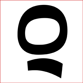
This should be an easy one!

Happy New Year! :D

hmmm... not so easy eh? I thought it was because is very distinctive and is from a well-know senior designer released by a major foundry.
Maybe another glyph?

Eggwhite

Cyrus Highsmith & Font Bureau.

Captured from web.archive.org on 10 Oct 2013. view this capture