
Does bad design make you a loser? Opinions?


Does bad design make you a loser? Opinions?
well, i think that it certainly affects the “team spirit”. Imagine this by considering the shape combinations, whether they are aggressive or neutral, the coloring, agressive or neutral? And to sum up, yes i believe it does.

Red Sox —- proves you don’t have to know how to spell in order to hit a baseball. Wonder if those are Curt Schilling’s sox? I had a Grade 4 teacher who blew a gasket every time she saw “Toronto Maple Leafs” —- should be Leaves, she’d scream. Proves that in hockey at least you do have to know how to spell in order to win.
The Rockies logo looks like something on a bottle of mineral water.
Curt Schilling is horrid. A friend of mine interviewed the Sox for a radio show and said he’s as unpleasant in person as he comes off. It’s kinda like having Dick Cheney on your team.

http://www.underconsideration.com/brandnew/archives/it_is_high_it_is_far_it_is_cau.php
Also, a few days ago Hank Steinbrenner said, “As bad as they want it, they’ll never be the Yankees with their brand.” These really are brands, in the most generic, traditional sense of the term, for whatever fans make of things.
Or Conrad Black.

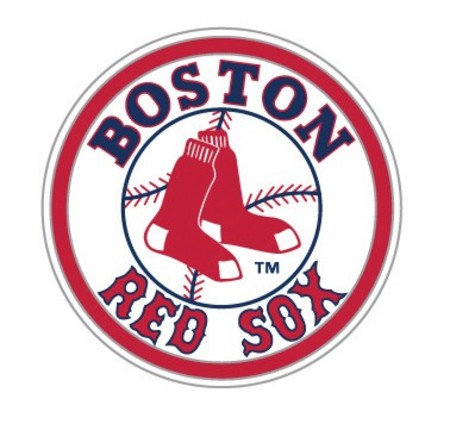
Is it just me or does the word BOSTON need some spacing help?
This topic was inspired by a conversation I overheard in an elevator yesterday. Two women were looking quizzically at the Rockies logo, trying to figure out what GR stood for. One suggested the team was from Grand Rapids, Colorado (is that a place?) while the other wondered if the full name was “Grand Rockies.”
I was wholly amused. Sure, I really want to fix the wonky bowls of the Red Sox B, but, in my opinion, it’s not nearly as lazy as either of the Rockies logos.
Wow, YES, the BOSTON needs kerning, and RED looks like it’s bouncing along inside a stage coach wheel.
Given the expansive sports branding empire, how do these logos end up so glaringly imperfect?

Is it just me or does the word BOSTON need some spacing help?
It’s possible that the spacing has been this way for a long time. Red Sox fans may value traditional iconography far above legibility or other similar considerations.
Under the circumstances, I don’t think it’s really possible to “fix” anything.
Apparently Boston didn’t need to fix anything! Congrats on the win, and I’ll raise a glass of Sam Adams to another year of insufferablility from their fans (esp the two that work for me).

Is that really the Rockies logo, the first one? It looks to me like two letters with an overly thick outline, destroying the integrity of the font. Don’t they know you don’t just stroke a character ... you follow that up by pasting an unstroked version on top that maintains the font design.
Victory for the frumpy Tuscan!


1970 logo WE ARE THE CHAMPIONS!!

The Rockies marks look like clipart chosen by a team exec’s admin who had an art class in college.
Captured from web.archive.org on 31 Oct 2007. view this capture