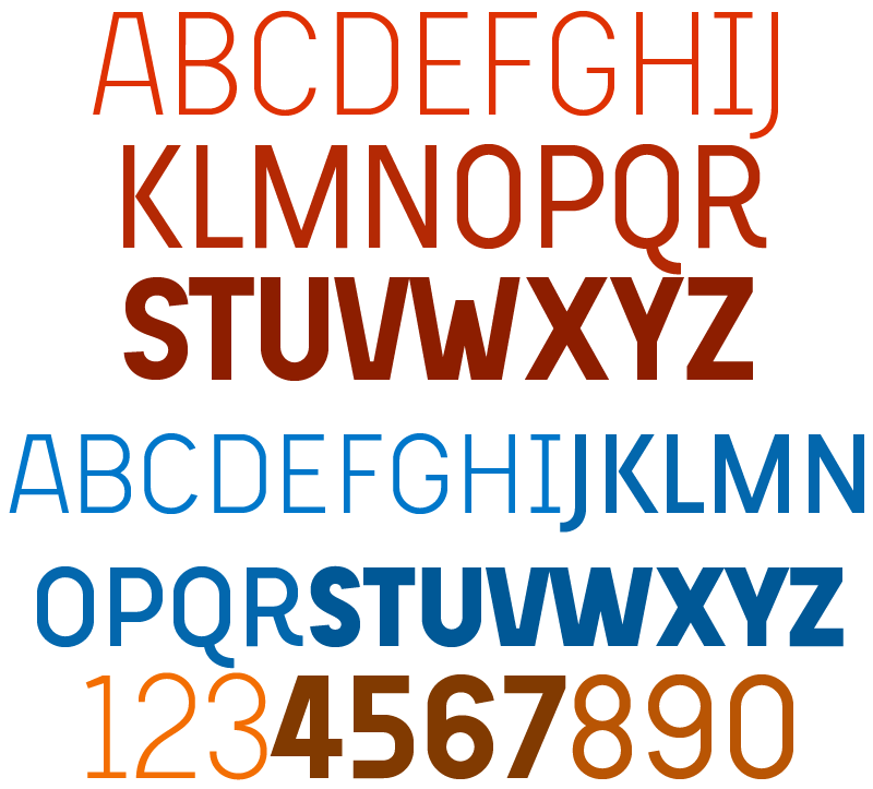
I was wondering if anyone has a clue to what this typeface could be.
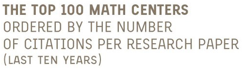
It's from a infographic I saw on a designer's flickr-photostream, here.
I was wondering if anyone has a clue to what this typeface could be.
It's from a infographic I saw on a designer's flickr-photostream, here.

That's beautiful. Someone please let us know! Look at that A and R.
Exactly! Those characters made me wonder what it is, that R is excellent.
I will post a question to the flickr-page as well, I don't know why I didn't do that before.

Having recently been in the market for an R like this, I can say with confidence that this isn't...
FF Milo
FF Sanuk
Vista Sans Alt
Priori
Tarzana Wide
Aspect
PTF Parisine Plus
PTF Costa
...but I'd love to know what it is, too.

LOL Marc I checked out that old thread too.
Well, after I got the obvious idea to ask the guy himself on flickr, he replied that he designed it himself. I don't know if he designed it from cratch, or if he edited a couple of characters though. It could very well be some kind of DIN-like face, with a couple of custom glyphs.

Jelmar: Juan Pablo de Gregorio is on Typophile too. That typeface is a custom work he did for the University of Santiago in Chile, drawn from scratch, not modified from other outlines as far as I know. I alerted him of this thread, he’ll probably chime in later on.
I'm not sure the cap M works (I'd be curious how a Gotham/Din-like treatment would look), but otherwise I like this a lot. I love how the stylish treatment of a couple of key characters can give a face a fresh look, even one that's in familiar territory.
Antonio: I didn't know that he was on here as well!
I hope I didn't offend Juan Pablo with thinking it might be edited, I didn't want to. :)
I absolutely love the infographic and typework. I think it's looking very impressive. The face just has this DIN-like character, only with this very cool 'R', and a couple of other key elements that give this a very new look. This is information-design which also looks good.
To bad this is not up for licensing. I really like it. I'm with Marcox on the M though. Would be interesting to see it with a different twist.

I'm crying of happines. I am the typographer who design this font...
It's true... "M" can have some problems, but this is not a final version. I designed this font at the time I was designing the infography. And I think this is not the final version. I remember I fixed the "M" when I change the numbers from oldstyle to caps.
Many books are working with "ugly" typefaces, but too cools and with a fresh look. And I wanted to design an special font, because a great designer in Chile give me the great oportunity to work with him...
I thinked that nobody will like to my font. I designed 3 weights in about 2 weeks... I will have to end it, and talk with some foundry that want to sell it. (I have about 150 characters by weight)
Thank you
Don't forget to read "letritas"
Well, obviously there's people who like your font.
And I would read "letritas", if I understood Spanish. :)
You can read http://www.typies.blogspot.com/ which is also made by Juan Pablo but in English;-)
Ah yes, I thought I saw that blogheader before when I opened the "letritas" blog. I have read the "typies" version.
He he he
Soon you can get this typeface for extreme and cool headers...
And I will comment the monography in letritas as soon as I can get the print.
Thanckx
Yihaaa. Looking forward to it! Think you can have it done by friday? Lol kidding (I just possibly have the perfect job for it). Maybe next time;o)
thank you,
and Antonio... the font is not for university od santiago. Is for university of chile...
Sound similar but both are differents universities

Hi Juan Pablo. I just realised you where talking about the headline font on the blog and not the infographic. My mistake. I'm a good beta tester for any font though so if you need testers just let me know.

degregorio I really like your typies blog. found the stuff about vector drawing really good. you should definitely release that infographic typeface its lush.
Thank you cuttin.
I really appreciate it. I am working in this font. I hope you like it.
Great work, Juan. :)
Thank you!

It's a nice design indeed, but I think it still needs some work on optical corrections and such.

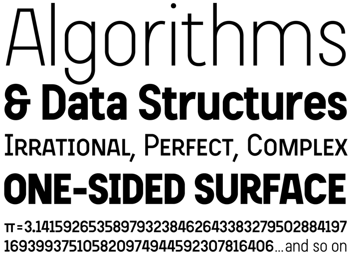
Juan Pablo's typeface has been released by Veer as Beauchef.
Beauchef is a grotesque sans serif in the DIN tradition. Designed originally to support the typographic needs of an advanced mathematical thesis paper, Beauchef knows how to let the information take the spotlight, but still retains enough attitude to convey energy and zeitgeist. Beauchef is readable and clear, with a crisp accuracy you and balanced geometry based on tabular numerals. Humble, yet expressive. Simple, yet avant-garde.
Beauchef has a personality perfectly suited for authoritative short paragraphs, headlines, chapter headings, and declarations of principles, rich computer graphics and the like. But it can also speak clearly in long text passages.
The font family features small caps, fractions, superior, inferior and lining numerals, plus full Western European language support.

Wonderful!!!!
Congrats, Juan Pablo.
Thank you very much.
Here is a specimen that you can to see.
http://jpdegregorio.googlepages.com/beauchefespecimen.pdf
And you can read a little more about this project at http://letritas.blogspot.com/
Thank you
Captured from web.archive.org on 24 Mar 2015. view this capture