Typophile

In search of an 'R' with an interesting right leg

Marc Oxborrow

Hi all,

I’m looking for sans serif faces that have a “curled foot” (for lack of a more precise description) on the right leg. Examples include Priori and Tarzana Wide from Emigre.
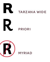
Not interested in legs that have an convex, or outward curve, like many other sans (e.g., Myriad) and slabs.

Thanks in advance for your suggestions!

I think it’s Aspect by Jeremy Tankard that has this kind of leg.

FF Sanuk has a little curve more or less like that.

Both are great suggestions, gents. Thanks, and keep ’em coming...

And what, pray tell, are you going to do with that curled leg once you find it?

I shudder to think.

I’m designing a logo that includes an ’RY’ combination. Looking at the curled leg as device to activate/engage/fill/gently invade the white space in the shade of the Y’s outstretched arms.

Thanks, Stewf.

Why not just draw it, or have someone draw it for you??

That’s certainly an option, James. But I want to see how other designers have handled that sort of curve.

For those scoring at home:

Parisine Plus

Costa PTF from Porchez Typofonderie

That’s a jaunty one, Tiffany! Thanks.

Fedra Sans has that outward facing leg too. I’m probably too late now.

Captured from web.archive.org on 23 Oct 2008. view this capture