
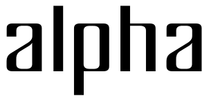
This was my very first font (I know I said Satinwood was my first, but this was kind of easy compared to that). I actually made it a few years ago. I've tried to balance the regularity and simplicity of the font with something --- well, I don't think it could be called humanism --- perhaps life, spirit or just warmth.
Have I succeeded? Any suggestions?

| Attachment | Size |
|---|---|
| sample.pdf | 6.79 KB |
| scarange.png | 2.39 KB |
| sample.pdf 14 Sept 2007 (with new curves) | 8.13 KB |
| sample.pdf 9 Oct 2007 (new _t_, hinted) | 12.53 KB |


