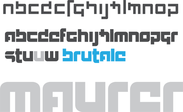
This is my first attempt at anything resembling a typeface / font. This is a result of a few (5-6) hours work over the weekend in an attempt to kill some down time.
This is still in the very early stages, and I am annoyed by all the details I am seeing that I failed to address before posting this image.However, I thought this would be a good time to get some feedback and advice on what to avoid going forward from this point, as well as what you feel works well in the current image.
The featured Super Duty typeface was my inspiration to really start playing around with a bold and heavy display face. My concept is a symmetrical and powerful type, built around a single squared form. Ideally, each of these letters would use only those few simple shapes, and all would contain the same amount of area... optically at least.
Enough of that. Here is what you see below:
First Line: My initial hashing out of the concept
Second + partial third line: I revisited this a day later, and decided that I wanted a lot more weight and emphasis, thus the much heavier treatment. Also, I set the name of the type in cyan: BRUTALE
Fourth Line: My last name (maurer) set and scaled up just to see how it went...
That is about it, let me know what you think.