Typophile

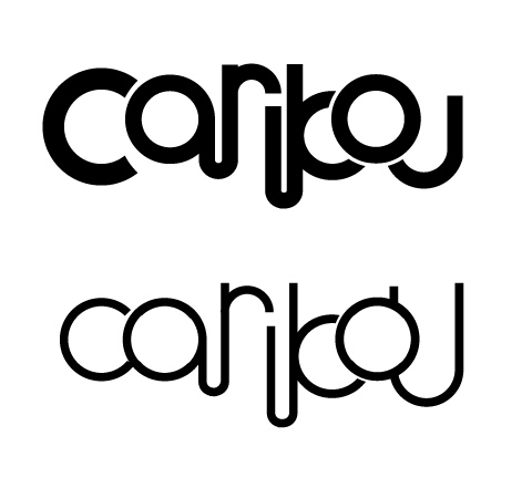
Experimental logo idea...why does it suck? --Updated with new try

toog

Hi everyone!

So I’m making a poster for a band called “Caribou” and started experimenting with some type treatments. What do you think? Like it? Hate it? Is it readable?

Something seems not right to me but I can’t put my finger on why I’m dissatisfied.

Put of copy of it on the wall and look at it from 10 feet away. Then you’ll see why it doesn’t fly. Too busy and lack of pleasing shape for retention.

It’s not very legible. I read the first two letters fine, but then after that it’s a challenge. Is there a reason why the o overlaps the b and the u?

cyanide is right. I think you’re trying too hard to make a continuous line. try to stick to one baseline and see what happens.

With something like this, as you connect more lines, just like when blackletter joined stems (is it mun, num, mnu, mum, mmu, umn, etc), it can be hard to recognise letters are they should be.

On first glance I couldn’t immediately process the letters, and after thinking about it for a while (without reading your post) I figured it was either carikou, or carijoou (I’m sure those mean something in some language —wait, nevermind, actually there is a musical artist Len Carikou, though according to Google, Yahoo!, and MSN, I’m the first person on the internet to type in carijoou, wahoo)

Anyways, some alternate interpretations would be caruoou, carykou, couribou, courikou, etc. If you have to go for the connected letters look, make sure it’s unambiguous as to which letter it is. If you have to go for the long connected descenders, maybe try a slight break (like you have between the top of the c and the bulb of the a) so that we know to see two descenders, and not a connected u. I agree with some of the others who’ve already posted, the o on top of the b and u is really distracting, and hampers reading (it makes the b look like k).

«El futuro es una línea tan fina que apenas nos damos cuenta de pintarla nosotros mismos». (La Luz Oscura, por Javier Guerrero)

my $.02 for free: incorporate a dot into the tail of the r, have the b and o just touch each other, with bou on the same baseline, u not touching o, and maybe make the right side of the u taller.

Beside the concept of readability – my perception tells me that you should work on the mono linear “bone-effects”…

Thanks everyone!

Very good critiques. I’m going to disconnect the b-o-u and see if that helps.

Kristian, what are “bone-effects”?

the spacing isn’t consistent. The first half is airy, the second half is smashed together.

I can’t remember the source of the quotation at the moment (discomforting), but basically it’s all about where the straight lines connect to the circular curves.

Improved? I followed Typical’s advice (which I quite liked—thanks!)

better, but it might read as canbou. Maybe try a version further separating the r and i.

Thanks everyone for the ideas/opinions! As I stated earlier, this is really just a flight of fancy—probably not to be used on the final poster. But I’ll keep playing with it and if I do use it I’ll post the results here!

this might be a really cheesy idea, but...

I noticed the i and the loop between it and the b is a bit face-like. Perhaps you can arc the ’car’ and ’bou’ upwards and get a caribou head/antlers thing going.

Again, maybe really cheesy. ;0)

have you considering starting the u with a curve over the o? As it is now, those two characters look kind of tacked on.

The thread that refuses to die!

Aluminum-get this:

I did that for a self-promo piece a few weeks ago—inspired by Epcot Center, 60s/70s educational textbooks and so on. Great (or damaged?) minds think alike!

And speaking of Pattyfab—that is exactly what I was doing when I read your post! GROUP HUG!

Sorry its art for arts sake and not communication. Review the goals of the mark and start over.

ouch.

I agree that’s harsh. Graydon, if you don’t like it that’s fine. But I think you may be the one missing the mark (so to speak). This isn’t a corporate wordmark but a band logo and it has to look cool on a t-shirt, a sticker, a drumset. It should be readable, yes, but there’s no reason it can’t be artistic as well. I’m not sure your branding doublespeak applies here, especially since you haven’t given any constructive criticism at all.

Theres some good stuff in there. And I think you might be right on the mark, depending on the band’s sound/image overall.

Possible ideas:
playing with using a radius on the r more similar to the other letters

now that te o and u fit the rest of the word, get freaky with them. try bending each end of the u. Maybe around the o, maybe into it move the o up to the b’s ascender area. See if any of that looks good, or spawns other more interesting ideas.

Ignore the haters. The logotype only needs to be art letters at first, and eventually become pleasantly readable (after digestion) The first image wasn’t pleasant, but you are closer now. If someone really needs the letters to be data containers, they can flip it and read the band name in Arial on the spine of the box.

Hard to explain what can easily be shown. Here I made the r a consistent shape and position with the o and a, and I think this alleviates a lot of the problems with that letter. I also played with the u a bit, but ignore it. I think it fails.

what about this one?

out of the lasr two, i like the bolder variation.
in the 2nd one, something doesn’t seem right with the “b” “o” “u”. i like the tiny serif on the “r” too.

Captured from web.archive.org on 28 Sep 2008. view this capture