
Hello all,
first post here after reading quite a few :)
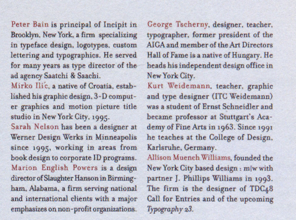
Anyone can help me identify this body text font ?
It’s from the TDC#48 Call for entries.
uppercase W and J are quite distinctive...
| Attachment | Size |
|---|---|
| TDC-48Font.jpg | 179.87 KB |
Hello all,
first post here after reading quite a few :)
Anyone can help me identify this body text font ?
It’s from the TDC#48 Call for entries.
uppercase W and J are quite distinctive...
| Attachment | Size |
|---|---|
| TDC-48Font.jpg | 179.87 KB |

I think it’s a Bodoni, based on the W, G and C. It might be one of the three ITC Bodoni’s (Six, Twelve or Seventy-two).
- Mike Yanega

It’s Zuzana’s Bodoni — Filosofia.
That means Emigre Filosofia is also a possibility. the image is too blurry to see the details well.
- Mike Yanega
Hmmm, the “3” is not raised in Filosofia. :^/

Just confirming what you all suspected. It is in fact Filosofia. The “3” is raised in the version I’ve worked with.
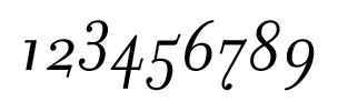

So there’s more than one version of Filosofia out there?
BTW, if they raised the “3” they should’ve raised the “5” as well.
hhp
Wow, amazingly quick and precise answers...
Thank you all !
Shall I mark this as found, or is there still a discussion about it being Filosofia ?
(Looks pretty spot on to me...)
So there’s more than one version...
I didn’t realize that was the case until this thread brought it to my attention. The version I’ve used is copyright 1996. It seems that Emigre (and Zuzana) have updated the font, including the OSF. I notice that the spacing is better in the new version, too.
Good morning?! Could you somehow verify for sure that it has in fact been re-spaced? Because that would cast extra suspicion on why they never re-spaced Mrs Eaves (which has much worse spacing than anything) even though it had a formal OT re-release.
And what could be the reason for having a raised “3” at first, and then lowering it?
hhp
Hrant, the version currently offered at myfonts.com is 4.0801. They indicate that the regular weight (Windows PostScript) contains 2777 kerning pairs. The version I licensed for a project a few years back contains 194 kern pairs! And that is consistent with a thorough analysis that Kent Lew provided in this thread: http://typophile.com/node/459#comment-2948.
Clearly, there have been updates.
It strikes me as a little odd that the earlier release had the raised “3.” I can only speculate that it was recognized as a mistake and therefore corrected in a subsequent version.
Interesting - thanks.
I wonder if they did the spacing fix in-house or
they out-sourced it. In any case, I hope that one
day somebody will fix the spacing of Mrs Eaves too.
I’ve actually heard a rumor that James Montalbano
once did exactly that for some client (undoubtedly with
premission from Emigre). But you know how rumors go.
> Clearly, there have been updates.
It would have been nice to alert users about it,
and maybe even provide the upgrades for free.
hhp
I agree on all counts. I find the 194 pairs totally inadequate, and Mrs. Eaves is a nightmare to work with in most settings.

FWIW Emigre upgraded my PS version for free, I’d assume they’d do the same for any other customer.
Maybe. Don’t forget though how much money you’ve spent with them... But more importantly: did they offer the upgrade themselves, or did you have to ask for it? And if it was the latter, how did you find out there was an upgrade?
hhp
Honestly, I don’t remember. I think I might have called about something else. I don’t think I asked and I do remember being happy about it.
Just to be clear they only upgraded my PS versions, not the OT.

the Filosofia looks like a Fournier in small size
Well, Fournier (the person) did take his inspiration from the Didones!
hhp
Captured from web.archive.org on 12 Jun 2008. view this capture
