Hello again,
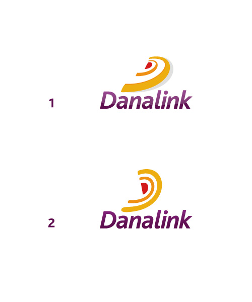
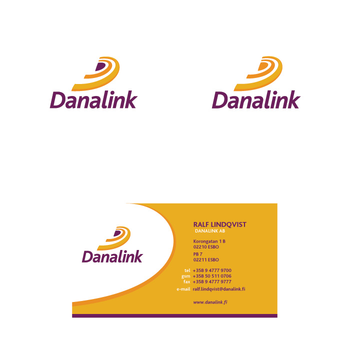
I’m making a logo for a company that imports and sells hearing aids, they sell other hearing equipment also but their main focus are hearing aids. The name Danalink comes from Denmark (Dana) from where they import their porducts and “link” as a ink between Denmark and Finalnd, where the company is based. Target group is elderly people from 60 years old and upwards.
They wanted a simple and humanist logo.
The sketches I’ve made so far are mainly my thoughts around a symbol. haven’t thought much about the color or type yet, although DIN looks pretty nice.
I’m kinda stuck on the shape of a hearing aid and soundwaves at the moment. Any more ideas or suggestions would be greatly appreciated.
That’s their old logo http://danalink.tulilla.fi/palkit/bsi/Danalink_logo_harmaalla.gif a friend pointed out that it kinda looks like a smiling penis :)
Peter
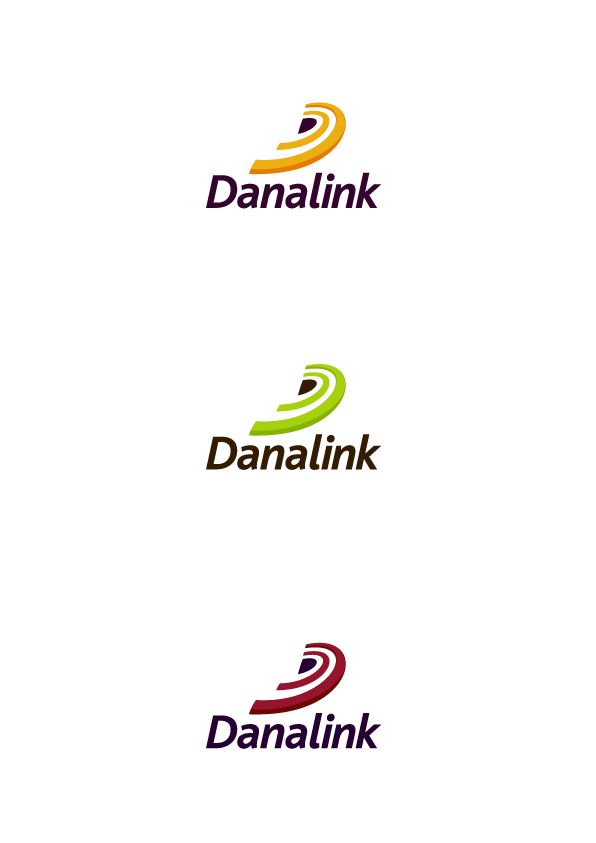
EDIT: made another version
| Attachment | Size |
|---|---|
| danalink_logo_comp.jpg | 113.96 KB |
| danalink_logo_ex6.jpg | 34.53 KB |