Typophile

Handwritten Logo Critique

vbschan

hello there,

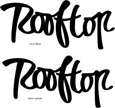
i'd love some feedback on a logo for a little collective i'm involved with. i've played with the curves and i'm not yet happy with it. some fresh eyes and opinion would be appreciated.

thanks!

vin

AttachmentSize
Rooftop_Logo_Trials.gif27.35 KB

Initial reaction is they look good, points I would look at are the vertical stroke of the R I feel it should flare to the left rather than right and possibly work in a closed loop where the counter and leg meet; work on the second o – it is slightly cramped; slightly close up the fto combination; try a thinner connecting stroke on op or maybe a more exuberant stroke – it is rather straight compared with some of the others; and possibly make the counter of the p a little wider.

Tim

I think it's really nice. I agree with Tim to spend some time on the second o. In addition I think the space between t and o is much to wide.

Best,
Juergen

my take:
i like the R in version 3 better than versions 1 or 2. i don't think its flare is a problem - rather it feels in keeping with the movement of the rest of the type. again, second 'o' needs tweaking, as others said.

thanks so much for your comments. i'll have another fiddle and repost.

I vote number two but i would move the "top" slightly the to the left and fix the P at the end as it's starting to look a little too much like an R to me. Really just my taste I suppose. Other than that I think it looks really great.

sorry about the delay in reposting.
here are the latest adjustments taking in to account people's comments.
thanks so much for the critique.

i love this place.

Captured from web.archive.org on 2 Apr 2015. view this capture