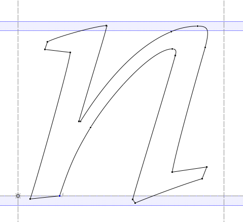
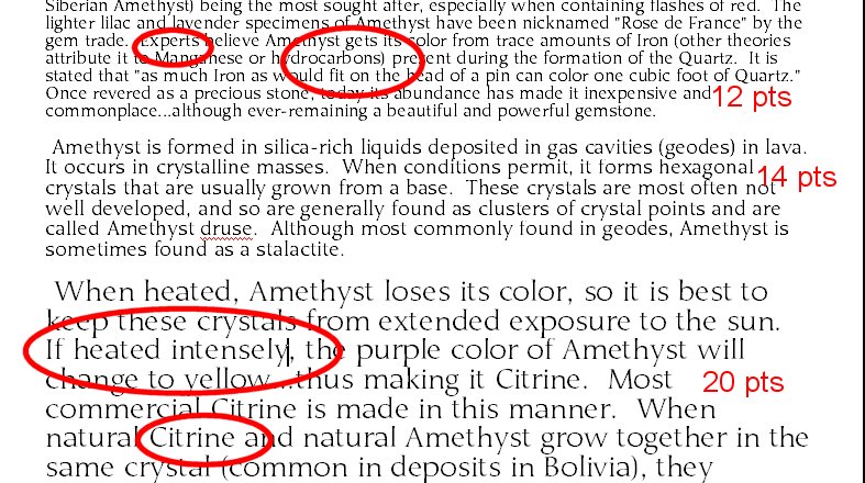
In some fonts I have noticed a problem I can not correct. I have drawn all the characters in the lower case properly, but when generated into a font some of the characters display in a rather distorted way, dependant on character size displaying.
It usually happens to the lower r, n, h. sometimes the a or the s.
Larger displayed sized the problem goes away, but it also seemt to happen in documents.
Even though my explanation is confusing, does anyone have an idea what is wrong.
I have attached an image someone has supplied me with to illustrate the problem
| Attachment | Size |
|---|---|
| umerica.jpg | 148.49 KB |