Thank you!
Dave Lancer
| Attachment | Size |
|---|---|
| 22.jpg | 56.36 KB |
Thank you!
Dave Lancer
| Attachment | Size |
|---|---|
| 22.jpg | 56.36 KB |
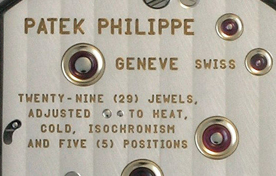
These marks were not made from a digital font. It was probably an engraving machine or stencil. You can get a similar feeling with DIN 17, Bryant, or Gravur Condensed.

check out Gravur at lineto
Thank you. These fonts are similar BUT Not the same...
The I,W,and J are Not the Same.
I appreciate any farther help!!!
Thank you!
Dave

As Stephen wrote this is not a digital font, almost certainly a router with a slave guide.
Another variation
http://www.myfonts.com/fonts/madtype/variable/
Tim
Thank you Tim!
BUT this one is Very Far from the Font engraved )-:
I will appreciate any farther help!!!
Thank you all!
Dave.

How many characters do you need? If you only need the basic set it couldn’t be that difficult to create, especially since you know exactly what you want.
I need All the characters, a Specialy the I,W,M,G,R,E,F,J...
PLEASE HELP ME FIND THIS FONT !!!
Thank you!!!
Dave.
It isn’t a ‘font’, it’s created for the constraints of an engraver.
Tim
Wow. I thought my first post was pretty clear. Some letters are not made from fonts. You need make these forms yourself, or hire a letterer to do them.

Dave, you have to realise that this kind of lettering is output device-specific: it is a set of characters that is produced specifically for a certain type of engraving machine. This means it has no equivalent in what we know as digital fonts. This alphabet only exists for engraving machines to make these watches, not as a digital font. We can’t find this font because it simply DOES NOT EXIST.
Other examples are alphabets available for the stamping machines that produce automobile license plates, for sowing and embroidery machines, for stone engraving et al. It just is a different world. In some rare cases you’ll find alphabets that have digital font counterparts, but more often than not they will be unique to that reproduction system.

Well, it’s not exactly the same either, but the “I” is similar in Typ1451 also at Lineto..
Yes! Typ1451 is the closer until now!
ARE WE SURE THE LETTERS ARE ROUNDED ?
Thank you and much appreciated!
Dave
The letters are rounded as part of their working with a routing tool, essentially a drill bit that is designed to cut sideways, incising means that without manual finishing it is impossible to get a square corner.
There are some sample fonts here, although pretty rough.
http://www.able-engravers.com/engraving_fonts.htm
Tim

And please remember, the same metal engraving apparatus with different hands, does produce different looking type - everytime!!!
Shakes anyone?
BTW - you aren’t planning to sell rip-off Patek watches in front of Saks Fifth Avenue for $25 a pop - are you?
He he he (-: No Im not, Dont worry (-:
Thanks allot to every one!!!!!!!!!!!!
Dave
Hi DeveLancer,
try this:::::::
http://moorstation.org/typoasis/designers/klein06/text01/berlin_sc.htm
HTH
- a b s i n t h e -
Thanks. But only the I and M are similar.
Cheers,
Dave

BTW - you aren’t planning to sell rip-off Patek watches in front of Saks Fifth Avenue for $25 a pop - are you?
Have to admit I was thinking the same thing.
Captured from web.archive.org on 24 Sep 2008. view this capture