My handwriting sucks. What can I do about it?
My handwriting sucks. What can I do about it?

Are you a doctor and one of your patients died
because the pharmacy misread your prescription?
hhp

Practice. Practice. Practice.
Taking a calligraphy class maybe? Having / improving calligraphy skills should sure improve your regular handwriting as well. :)
Dav

Good pen – not necessarily expensive just comfortable to hold and well balanced, bic biros are good for me, a gel version even better.
Don't hold it too near the tip, and don't lean too far forward, I find that when I am doing calligraphy I tend to move more from the elbow and keep the wrist steady but not tense.
Tim
Identify a handwriting or even a font you wish to emulate - and then practice drawing its forms.

The rhythm method is good (e.g. Pual d Hunt's), I'd like to suggest to check out :
http://www.amazon.com/Art-Calligraphy-David-Harris/dp/1564588491
Hand-drawn faux type, now that's semi-worthwhile.
BTW, Briem's "it takes two weeks" is way off. Unless you're a street urchin or something it takes an instant to achieve legible handwriting: all you have to do is slow down. Unless Briem is confusing pretty with legible, which wouldn't be very surprising at all...
hhp

Take classes in formal calligraphy.
Firstly, basic exercises tighten up your form and give it a pleasing consistency.
Secondly, the joining rules turn writing into an intriguing game, because when it comes to writing an unusual word, or one that requires "notwithstanding" sub-rules, writing then becomes a process where the writer is trying to implement the rules correctly, and this engagement can impart an expressive personality to the writing. Or else it turns into a very "proper" style -- but either way it's an improvement.
I didn't mention the book by Francesco Ascoli & Giovanni de Faccio, I suppose you are looking for an English text, beside practicing, of course, but, if you'd like to check out the title is "Scrivere Meglio"——scroll down at http://www.aiap.it/asso/libri1.htm
I took a class in formal calligraphy. The last thing I did in class was this:
http://www.flickr.com/photos/48413419@N00/222343485 _
But my actual handwriting didn't change one bit.
hhp
Max, here are some examples of what I mean by the
"faux type" that I recommended learning [instead]:

This is from "How to render roman letter forms", T Thompson, 1946.
And here's something from Berolina, a local pastry shop:

More:
Something in sand, and a sample from the deservedly
famous children's book, "Don't let the pigeon drive the bus".


hhp

Are you sure yourhandwriting really sucks? In which way? Can you show us a sample? Please?
I always think my handwriting sucks but some people love it for some weird reason.
I think maybe the problem is your hand. If you make only limited exercise with your hand (like repetitive movements typical of people that use computer all day) it tends to get rigid. If your hand is more flexible and relaxed it might improve the way you hold your pen and it may reflect on your handwriting. Try to play the piano or something.
Trust me: I'm a doctor.
Lorenza makes a good point with her second question, somehow the aesthetic aspect of an handwriting expresses the relation between what its author innerly is and how he/she presents him/her self to others, how he/she would like to be treated and considered by them.
The graphic and plastic expression (a gesture is a sign that leaves traces in the memory and the actual sign is the visible trace of the gesture and it keeps the energy) is linked——rather than to an aesthetic sensibility——to a motional-sense form of the knowledge, towards the goal of giving a tangible consistence to the development of the inner side of man.
When the inner wealth, most of all, the creative wealth, goes together with an adeguate way of expression, there comes the harmony between the ideas and their happening.
> some people love it for some weird reason.
Lorenza, could we possibly see your handwriting? Maybe from a presciption? :-)
No, I'm serious.
hhp
Well, if your handwriting is an expression of your personality, maybe you need a shrink :-)
Trust her: she's a doctor.
I make type. Of course I need a shrink.
hhp
Yeah right. I know you hrant: you'll probably use it against me!
Well, it depends. But if so, only as a means, only with good intentions. It's quite unlikely that you know me. For one thing, you don't have to like me for me to be fair to you. And I know things about you that you don't know I do. You might not even know them yourself.
hhp
Known unknowns?
Watch out Rummy, here comes Hrant.
Like I know why you and Nick are in cahoots.
--
Tell you what though, Lore:
1) I promise not to say anything about your handwriting. I'm honestly just curious to see why some people "love it". Share the love.
2) http://typophile.com/node/16005
If you still decline, maybe we'll all be learning something (in fact one of those things) about you, handwriting sample or no.
hhp
Nick, our cover is blown. What shall I do now?? Damn! That wasn't on our plans!
Google, youtube and now hrant.
Serious hrant: interacting with you sounds like mad fun but I think I'll pass. You'll have to prove your love, baby. Words are not enough.
The Proof, always the Empirical Proof with these people.
hhp

curses. cursive.
i was at the hardware store yesterday. bought some plumbing items.
when i wrote a check for the purchase (analog as hell, i know), the checker looked at it and said, "where'd you learn to write an "e" like that?" she turned and showed it to two other checkers in the adjoining lanes.
it was ridiculous.
Let's see that "e" man! (I love you, I promise.)
hhp
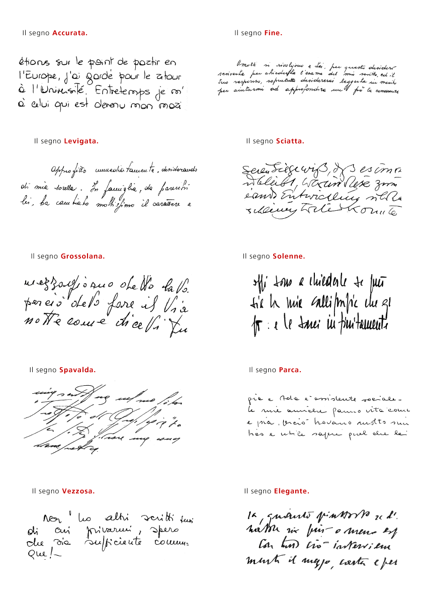
To whom it may concern, here you can see ten among the frames you can apply to handwriting (sorry adjectives are in Italian) :
http://www.as8.it/type/grafologia_estetica.gif

Taking a calligraphy course is probably the best thing you can ever do -- it certainly improved my handwriting no end and gave me a real appreciation for most folks who design fonts.
(Well, OK, except for people who design exceptionally dull fonts for big newspaper clients that don't proof their magazine inserts, and/or who feel they are morally superior to anyone else. That certainly doesn't describe anyone here....)
Linda
http://typophile.com/node/21090
Got some good books from that thread. Haven't had much time for it yet though.
Did anyone else start humming the theme from the “Odd Couple” during the middle of this thread?
Two mis-matched type designers are forced to share an apartment and find their lives disrupted by the arrival of a Brazilian doctor with hilarious consequences:)
Tim
lol! I must say there has been an improvement. It used to be disastrous consequences!

Alessandro, would you translate the titles from the link you posted?

Or Dr. Bartollo starts singing, "La Vendetta" to drive Figaro out of town :-)
ChrisL
accurata: accurate
fine: fine, classy, subtle or elegant
levigata: smooth,glossy, faced (as in stone)
sciatta: sloppy
grossolana: coarse, rough
solenne: solemn
spavalda: (i love this word): daredevil, bold
parca:frugal
vezzosa:graceful (also affected)
elegante: elegant (oh really?)
Hope Alessandro agrees with that.
I have taken several years worth of caligraphy courses but that does not change my "real" handwriting. It just gives me some other styles to use on those very rare occasions when my handwriting needs to be read by someone other than me. My handwriting is not for multiperson communication :-)
ChrisL
What Hrant calls "faux type", we used to call type indication in the years before computers came to design. When you did a layout for a client to approve (before a job was sent out for typesetting), you drew the letters matching the typeface. We got good at it too. Eight hours a day for 20 years will do that! :-)
Digitize them! They're all the rage now.
hhp
faux type doesn't look very practical for daily scribble notes though.
Thank you Lorenza, sorry I had no time to translate, same now :
Il segno Elegante si ha quando la scrittura presenta numerose disugualianze metodiche, ma senza grande varietà di Calibro, procede con spigliatezza. Ne derivano bellezza, proprietà, armonia, ma in modo molto naturale e spontaneo.
Elegante è un segno caratterizzante l’intelletto principalmente, poi la volonta. Comportamento dignitoso e fermezza signorile nel difendere i suoi punti di vista. Il segno indica l’attitudine all’arte di prospettiva; senso estetico naturale, stile, gusto del bello, senso delle proporzioni.
OOOH so many replies! Thanks!
My handwriting is so bad that my dad really believed me when I told him that I just found out, at age 26, that I really am lefthanded.

make a typeface out of your sucking handwritting and name it 'sucker'.;)
Since it would be your handwriting, you could call it "Thumbsucker" :-P
ChrisL
I happened to pick up "Drawing on the Right side of the Brain" off the shelf the other night and noticed that there is a section in the back about improving your handwriting.
I think I might actually read that part of the book. Bought the book years ago as part of a course but never used it.
Let us know how it is!
Yes do. And a summary of what's there too please.
Captured from web.archive.org on 5 Aug 2014. view this capture