Hi,
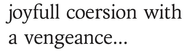
Following the responses on my earlier "Primus" post (see "Primus: Please critique this font under construction"), I made some major edits on this typeface.
One of the main edits was around using a more curvy flairing of the lower stems (following crossgrove and dezcom's feedback).
Also I updated all all the 'bowled' letters of the lower case (b, d, p, q, e, c) as well as all the upper case.
The input I got was very helpfull and I would appreciate any further pointers!

(PDF test text from WikiPedia: Punchcutting)
| Attachment | Size |
|---|---|
| Primus v2.pdf | 27.23 KB |
| Primus v2a.pdf | 27.31 KB |
| Primus v2b.pdf | 27.44 KB |