Hi guys,
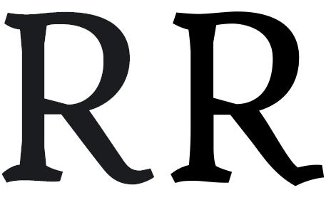
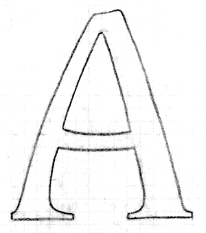
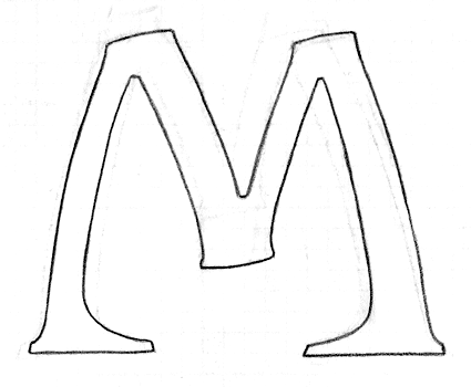
This is a font that I have been working on on and off in the last year and I will call it "Reethi Rah". I named it after the One&Only Resort island Reethi Rah, where my wife and I spent our honeymoon. This place is sheer paradise and I started sketching on this font from the first day.
I think this has big potential and I want to go all the way with this font. It's the first serif font I've made and I did it very intuitive. The font should be optically and emotionally balanced. You'll find the details where I fiddled with forms and proportions.
I'd like your expert opinion on this first draft. I think this font will polarise some of you people out there. The serifs are kinda extreme and will not be everyones darling. In small these serifs work very well and give the font a pleasant warmth and softness to it. In large the serifs come out in full strength and show their freaky nature. It's a love or hate thing...
I optimized the proportions for setting long reading texts in (art)books, articles, etc. The font has no correct spacing and kerning yet. I will do this when I leave the beta stage.
What do you think about it? What do you like and what not? But most important is that you give me some expert feedback on the proportions, legibility and charisma of the font.
Thanx in advance,
®ené
| Attachment | Size |
|---|---|
| RV©ReethiRah1.pdf | 217.37 KB |
| RV©ReethiRah2.pdf | 148.11 KB |
| RV©ReethiRah3.pdf | 147.71 KB |