
I’m turning to the experts ... I am looking for a beautiful capital “S” ... something that would look good as a logo for a person with initials SS
Your help will be greatly appreciated.
I’m turning to the experts ... I am looking for a beautiful capital “S” ... something that would look good as a logo for a person with initials SS
Your help will be greatly appreciated.

By all means, avoid leaning towards this design

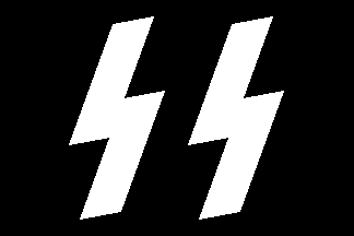
What sort of S do you look for, old/new, serif/sans-serif?
Maybe you can play with the idea of the Eszet (German double ss’s)
ßßßßßßßßßßßßßßßßßßßßßßßßßßßßßßßßßßßßßßßßßßßß
oookay ... I get your drift I think :) Sophisticated, elegant ... not too pretentious :) How’s that?

The recently-noticed (by me) “S” in Kennerley/Horley is quite special I think:
http://www.myfonts.com/fonts/linotype/horley-old-style/mt/win-t1/115303/...
But if your logo will have two of them, you need to
make them different, somehow. Or ligate/fuse them.
BTW, check out the one here:
http://typophile.com/node/20111
hhp

Letterforms are a lot like women (or men, if you choose). Some can be
’perfect’ with little to no personality, and others can be
beaming with personality but a little odd looking.
Which one’s beautiful to you? Please be more specific.
Something really scripty? Doyald Young’s Young Baroque as a basis?
I think I like personality, I’m odd enough ;)

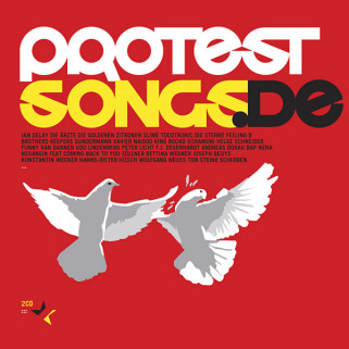
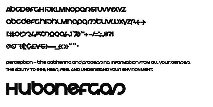
Here is something bold, and unconventional that could work for you. I think it is good for initials because its simplicity and proportions. Both lower and upper case are beautiful.
Logasmen
by Martin Aleith
http://www.die-gestalten.de

You might also consider rotating one of the Ss through 180 degrees, and finding a typeface that suits.

I’ve been thinking about the S recently, actually, and I think the definition of elegant is bound up in the delicate relationship between the top and bottom bowls, with the top being slighty, to greatly smaller than the bottom. Many modern fonts, in the pursuit of regulation, serve a tiny difference between top and bottom, and thus approach the geometric associated with a nazified doubling of the letter.
I also mused on the possible relationship between the smaller top, and the very small top of S’s l.c. script version, but then, I realized that was impossible, isn’t it?
Some script fonts do it the other way around, top larger than bottom, and I incorporated that in Fontesque. However, I’ve seen typographers correct this “mistake”!
Weiss Initials look like the top is bigger than the bottom, but only because we’re so used to a more contrasting size relationship.

Some script fonts do it the other way around, top larger than bottom
if you look in any of the old speedball books, you’ll see this in almost ever alphabet.
> elegant ... the top being slighty, to greatly smaller than the bottom.
I agree, coupled with a sufficiently narrow width* (the two things being also related structurally, like in the “B”). But if the top is too small I think the glyph starts becoming less elegant (maybe because it becomes a caricature of an “S”, and nobody wants to do the Waltz with a clown).
* Narrowness/tallness being the prime attribute of “elegance” in my mind.
> that was impossible, isn’t it?
I guess you mean the very small loopy top of the script “s”. Maybe it can be possible if you loosened the topological requirements of what an “s” is, and put a strategic gap somewhere in the stroke of the loop? I’d have to flesh that out...
> Weiss Initials look like the top is bigger than the bottom
But in the Weiss lc the top actually is larger, so I’d think the Titling probably has the same spirit (if not geometry) intentionally.
—
BTW, I think we’ve been missing the (typographically) obvious solution to your logo: find a font with a really nice section mark! Any suggestions on that guys?
hhp
Also: when we see an “S” that has a mathematically equal top and bottom as having a heavier top, more than what we’re used to it’s an optical illusion resulting from our visual “hardware”.
hhp

What about this one?
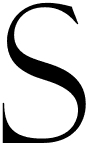
This is based on Felice Feliciano’s alphabet, published as
Felix Titling. The original drawings from 1463 had a fantastic coloured 3D-effect, similar to an open face. Unfortunately this was dropped by Monotype, which makes it look a bit heavy-handed now.
“when we see an “S” that has a mathematically equal top and bottom as having a heavier top, more than what we’re used to it’s an optical illusion resulting from our visual “hardware”
I agree. Apparently not everyone does, or knows, who knows?
http://www.microsoft.com/resources/design/ClearType.html
Most of these are more mathematically inclined it seems. Perhaps just a coincidence.
Cheers!
I’m not an expert (and probably shouldn’t be responding) but did want to point out “Sloop” from the Font Bureau:
http://www.fontbureau.com/fonts/Sloop
As “S’s” go, it’s my current favourite.
I spent a couple of weeks working on an italic, and for several days afterwards, all romans looked backslanted.

On the top of the ’S’ being smaller. Stanley Hess, in ’On the Modification of Letter Forms’ says that as a general rule, any vertically divided letter tends to have the top half narrowed.
Thus the top half of the B and S are generally smaller, the top arm of the E shorter, the top arm of the a shorter, etc. I think the rule is more general. In furniture, the classic ’highboy’ or ’chest on chest’ of drawers has the top half narrowed. Otherwise the top looks ’overweighted’. Similarly often with buildings (not Bauhaus though).
I suspect this optical effect is because the narrowed top in a physical object makes it more stabile. The roman letters, resting on a base line, we view to some extent as objects having weight. Perhaps with scripts, the ’marks on paper’ aspect is more prominent and the illusion of an object with weight holds less. This might explain the reversal...
On the shape of the s curves, there is something complicated going on, which I don’t understand, but we respond to the swan’s neck etc as being ’right’ and graceful.
> http://www.microsoft.com/resources/design/ClearType.html
Assuming I get your complaint:
But bitmap fonts (and outline fonts “dependent” on bitmap rendering - yes, even CT has such restrictions, especially considering the unavailability of subpixel positioning in the Y direction as well as the -current- disabling of 2D anti-aliasing) can wisely give in to slight optical imbalance in favor of avoiding heavily dispropotioned forms in the case of an even number of pixels to work with (picture an “S” with 3 pixels for the top and 5 for the bottom).
hhp

...obvious solution to your logo: find a font with a really nice section mark! Any suggestions on that guys?
Both for classic-looking Ss (that have a larger bottom bowl) and their possible arrangements, I would recommend the Dover facsimile publications on Monograms. Link will not be the first or the last among us to be asked to make a logo out of repeated letterforms.
“I suspect this optical effect is because the narrowed top in a physical object makes it more stabile”
That may be true because the effect begins historically before the advent of lowercase. But, if you excercise the issue visually, you can produce all caps with less difference between top and bottom that look better in that specific use, and normal caps with a difference tuned to the l.c., i.e. a bigger difference than normal for a small x-ht, and a smaller difference for a big x-ht., and see that the best caps for all uses are somewhere in between those two versions. So, in effect, if you decide to compromise the S and s for low resolution, you are, in effect either incompetent, or led by someone of similar abilities, but you are in no way actually helping the user, much.

A pair of Johnston’s funky meathook esses can be cool. The don’t shout “Nazi”.
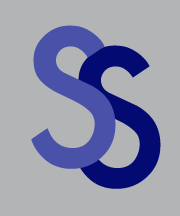

The § idea is certainly an elegant solution. Perhaps it’s far too easy, though.

Take any sans serif S, do it as an outline, clip off the straight segments, and you now have two S’s that fit together like puzzle pieces. This would probably work with some serif S’s, too.
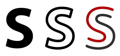
Reminds me of Senna’s logo.
hhp
Captured from web.archive.org on 11 Apr 2008. view this capture

