Typophile

Logo: small freelance dtp/web design business

JonnySchneider

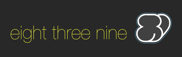
This is a logo I am putting together for my own website.
I dont have much experience yet, this is my first real go at a logo - It's a lot harder than I ever thought it would be.

'Eight Three Nine' is the name I have been trading under for the last year. Mostly low level desktop publishing and some basic web design services.

Any feedback would be great.

The website that it will eventually belong to is also being redesigned.
This thread has discussion and screenshots related to that.

Cheers - JonnySchneider
AttachmentSize
logo_001.gif5.67 KB
logo_002.jpg15.99 KB
logo_03.gif5.11 KB
logo_04.gif2.82 KB

kinda confused on the mark. is it an eight created by two threes.

remove the blue outline from the logo..and post some other options..not sarisfied with this..Im able to read because u said it in the headline.

mad_grab - the mark is actually supposed to read 839. 8 and 3 are joined together, with the 9 behind. It's obviously not succeeded as a legible mark since you guys havent recognised it right away.

Perhaps i'd be better off with an ambiguous mark?

I'll do some more work and post some revisions. I've got limited time to get this done though and so far its taking a very long time.

Here's a variation using an ambiguous mark, still has similar shape.

Doesnt feel very inspired to me, I like the way the words stack, but not sure about how it feels next to the mark.
version 2:

Another variation. Tried to make the mark legibly read 839. This is pretty sketchy. Not sure if the idea is worth developing.
version 3:

Here's another direction. I think the idea is okay, but it looks a bit conservative for it's purpose. The mark can be read as "ETN" It might be a bit subtle?
version 4:

Out of all of them, I prefer the mark in version 3 the best. I think version 4 is too subtle because even after explanation, I don't get it. Version 2 looks too much like a shamrock (esp. since it's green), which I guess could work if you wanted to emphasize your Irish / Bostonian roots.

I say stick with version 3, refine it a bit more, and do something different with the type.

- Lex

Thanks Lex.

Agreed, the type in version 3 needs a lot of work. It was the one I probably spent the least amount of time on. I might do some custom lettering to give it some distinction. Maybe a simple geometric with some shaved finials?

-Jonny

Version three is working best for me too, perhaps you could investigate using a triangular upper counter for the 3 (hope that makes some sense).
Tim

thats a really good idea. that way the top and bottom of the mark will be flat and three will definitely read as three, instead of maybe being an eight.

This idea was originally inspired by the cool shapes of triline type for Mexico Olypics in '68. I saw it in a book recently bought and like the way it looks.

Thanks for the idea Tim. I'll work on it...

You're welcome.
Some very good links on this thread to Mexico (and other) Olympics stuff, for me it's a toss-up between Munich and Mexico for the gold.

Edit: oops didn't paste the url
http://www.typophile.com/node/15401

Tim

Captured from web.archive.org on 7 Nov 2013. view this capture