Typophile

redesign: freelance design website

JonnySchneider

Heya,

I'm between projects which is a perfect time to have a look at redesigning my own website.

So, I think the original design http://www.design839.com/old_website/ is uninspired, bland, and a little bit dot.com-ish. It was put together in a few hours about a year ago. I'm embarassed by it, and typically dont refer people to it.

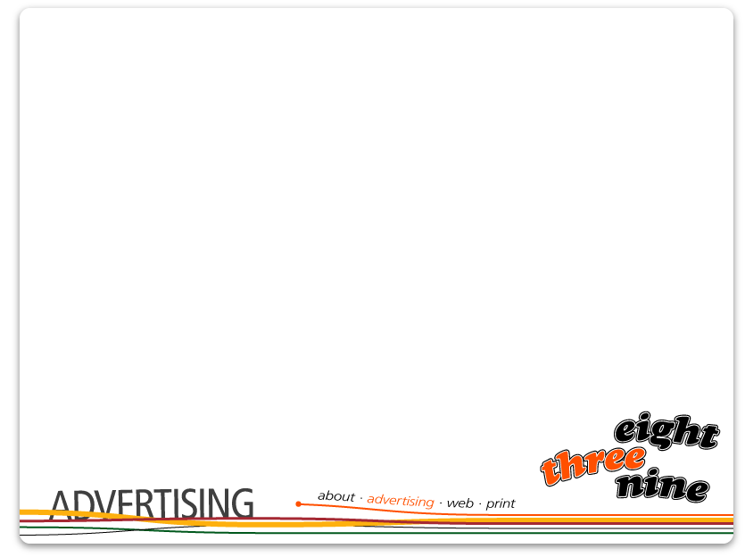
Here's a start on a redesign. I'd like it to be fairly informal, unpretentious and maybe even a little bit fun.

Any constructive criticism very welcome.

Cheers - Jonny

Live site:
31st Aug 2006

AttachmentSize
screenshot.gif16.58 KB
screenshot_002.gif13.28 KB
screenshot_003.gif43.72 KB
screenshot_004.gif38.9 KB
screenshot_006.jpg122.6 KB

Eh....I prefer your first one. Although done very quick, its got a lot of potential. I would work that one completely through.

For example, take the clean grid you have there and work in some animated interaction. Change the pastel colors to something that pops. The new one is funky because theres no sense of strong grid. The colors, I feel, are uncontrolled.

i agree with the above post. the first rendition looks more sophisticated and seems to match your company statement in a much better way. it's not without flaw and it definitely needs refinement, but there is structure and a sense of an underlying grid taking place.

the second option feels wimpy and lost. the elements have nearly no relation to each and the overlapping lines and angled text is annoying to look at. too much is happening at the bottom. i'd say just stick with the first approach, work it out a little more, work in some new colors, perhaps from the second variation and play with your grid strucutre. i also feel the design 839 logo at the bottom right of that version is too large and oddly placed in the brown box

w|m

wow, thanks for your comments. I'm really surprised though, as i really do think the new version could be on its way to being a much better design. Maybe I'm just bored with the old one, which i'm sure is normal when looking at your own designs for any amount of time.

I agree with comments, there's too much going on in at the bottom of the new version. Logo should probably be a bit smaller, navigation needs have more of a relationship.

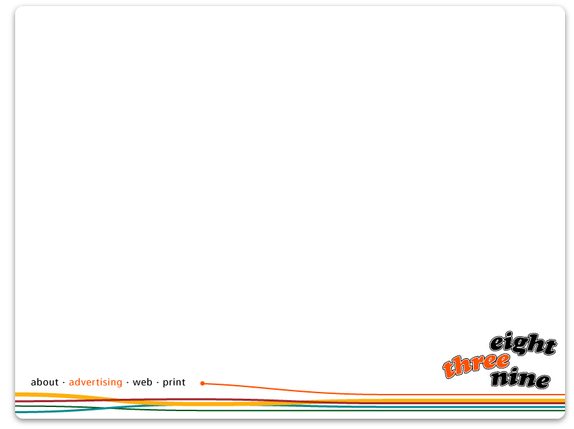
Maybe something like screenshot_002.gif (attached)

Any comments on the beginnings of the new logo? This is one of the main reasons I want to redesign - I think the geometric logo isnt really working, and its also a little bit hard to say - 'Design, eight three nine'.

The 'sense of grid' in the first design is also strengthened by the 2 column content layout. Maybe this influencing your comments here?

1st one indeed... Definitely!
Less is more!
The colours are nice as well.

thoughts on site: the left bottomhand is getting better. it doesnt look AS disjoined from the rightside any longer but i'm still not a fan of the weaving colors in the way you have made them do this. perhaps it's just that they are underneath the text and it catches your eye in a bad way? i still like the first design better. and yes, this is because of your column layout. the first site just has a feeling that someone who had an idea of what they are doing designed it. i dont think there's anything majorly wrong with it, i think you should use that as your skeleton and upgrade your logo.

thoughts on logo redesign: i'm not a fan of this redesign. yet. maybe if you reduced the space between the words, killed the arc-ing effect you have on it and started without a line around the edges you'll be able to see the obvious problems. i'd suggest starting bare bones with the logo, in it's own file, away from the web application and playing with joinging some of the parts of the letters? i'd also maybe try a big 8 to the left and a three nine speeled out to the right? the position of the spelled out three to the left is confusing. see if you can pack them in together?

but please post again with an update. it's always exciting to see the process. you just had it down on that first website attempt. nice job

w|m

Jonny,
I'll echo the 1st one and suggest you work more on the curves an placement of your "eight, three, nine" so that they feel more comfortable together.

ChrisL

Thanks guys.

well, it seems that the original design at www.design839.com is overwhelmingly more popular than the attempted redesign so far. I'm getting a little bit confused at which design specifically people are talking about though.

WM, your comments make sense, cheers, thanks for the thoughtful input.

ill sans and dezcom: when you say '1st one' do you mean the original (www.design839.com) or the first redesign (screenshot.gif)?

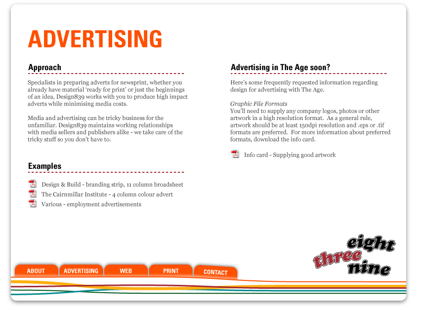
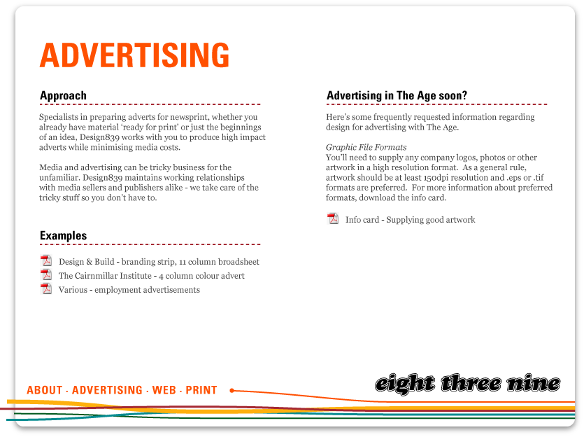
Since your comments, i've done some more variations on the redesign. Lets call these screenshot_003 and screenshot_004 respectively.

I think screenshot_004 is a stronger design, and it still has the solid content grid, which i never had intention of getting rid of, because I think it does work well. My only concern is that the navigation isnt obvious enough. Hidden away in the bottom left corner, attached to the footer, this could easily be mistaken for a tagline, and might read "About advertising web print contact", which is just odd if you say it out loud.

Screenshot_003 tries to deal with this issue by introducing the ubiquitous navigation tabs. But i dont like it. It looks cheap.

What to do?

Well, i think I might take everyones advice and simply upgrade the existing design. To start i think i'll give it new fresher colours, and new logo, and some subtle curves. That should go a long way towards livening it up.

Thoughts?

Screenshot.gif

ChrisL

i'll be honest, i usually hate tabs, but in this case i think they look pretty decent. they anchor the bottom of the page for you and i think i like the layout without that line with a dot at the end of it. i think you are on the right track..

w|m

Not loving the tabs--at all. You're using cheap tricks here with the bevels, gradients, drop shadows. I think you need to think about this website long and hard. Remember that its not just a page with page and tabs, its a fun interaction for the user. Make it stand out conceptually. I don't care how amazing you are with photoshop and HTML, if you dont have a concept, its gonna show immediately. Sorry if Im harsh but you're heading the wrong direction.

woah, easy fella! I sounds like you've checked out the screenshots without actually reading my comments on it (although thats not an accusation!)

-
Screenshot_003 tries to deal with this issue by introducing the ubiquitous navigation tabs. But i dont like it. It looks cheap.

What to do?

Well, i think I might take everyones advice and simply upgrade the existing design. To start i think i’ll give it new fresher colours, and new logo, and some subtle curves. That should go a long way towards livening it up.

Thoughts?
-

I'm not trying to show off any Photoshop skills at all (to be honest, they're infantile at best anyway).

Also, I disgree with you about needing a concept. A concept can easily be mistaken for a gimmick. A web page doesnt have to be cool, or have something special, it needs to be functional. I think its much more about giving people access to information and having them feel good about the experience.

I'm not trying to discredit a well thought out and nicely executed concept. There's always a place for that. But I dont think its the holy grail.

I'll be back with more updates at some stage. I've appreciated everyones comments so far, and value all of your opinions, but lets keep it objective and possibly constructive if we can - much appreciated.

it sounds like a bigger discussion regarding concepts and ideas...

i agree with prakash in that concepts are important, fundamental and key for sound design. the skeleton upon which aesthetic skin is molded

anyway...

i dont think there is a right/wrong direction...i had originally stated i thought it was the right direction but really this is up for interpretation. obviously.

i do not like photoshop tricks either, but if you think your viewer would, then by all means, perform glossy button tab magic.

i think as long as your structure is there, the design and layout will fill out nicely. i just think there is a difference these days with a design aesthetic and a true design layout/concept. dont let the attempt at creating perfect glass-like tabs or buttons be confused for true design. eye candy is just that. it's only a way to hook someone in like a flashing neon sign. it doesnt mean it's well laid out.

ok..just really needed to get some of that out

w|m

After a few weeks of letting things bounce around my head, here is a reworked design. I've tried to take in all the comments about grid, colours and gimmicks.

http://www.design839.com/comps/eightthreenine/new_compostion.jpg

Here i've rearranged the grid to something a bit more flexible, I've tried to drop the gimmicks and i've kept a similar theme with colour scheme, just altered it slightly and tried to give it some more punch.

It still needs filling out and probably some refinement, but as a foundation, what do you think?

Should I start a new thread for this?

Sorry, I noticed a typo in this reply when I had just hit the post comment button. I tried to cancel it, corrected it & posted the good one only to find out the other reply was already posted...
Oops!
Is there any way ro delete your own posts?

Seems like you're back on track, but to be entirely honest, I still like the first one best ;-)

Tabs are overused for a reason...they work. They are a recognizable, usable interface widget. So nothing wrong with the tabs.

I, too, like your first (current) site better. Of course, I'm a sucker for simple web sites. Perhaps swap out the heavy black bar and replace it with some of the colors you are pushing in your new design. The current logo isn't much, so play with that too.

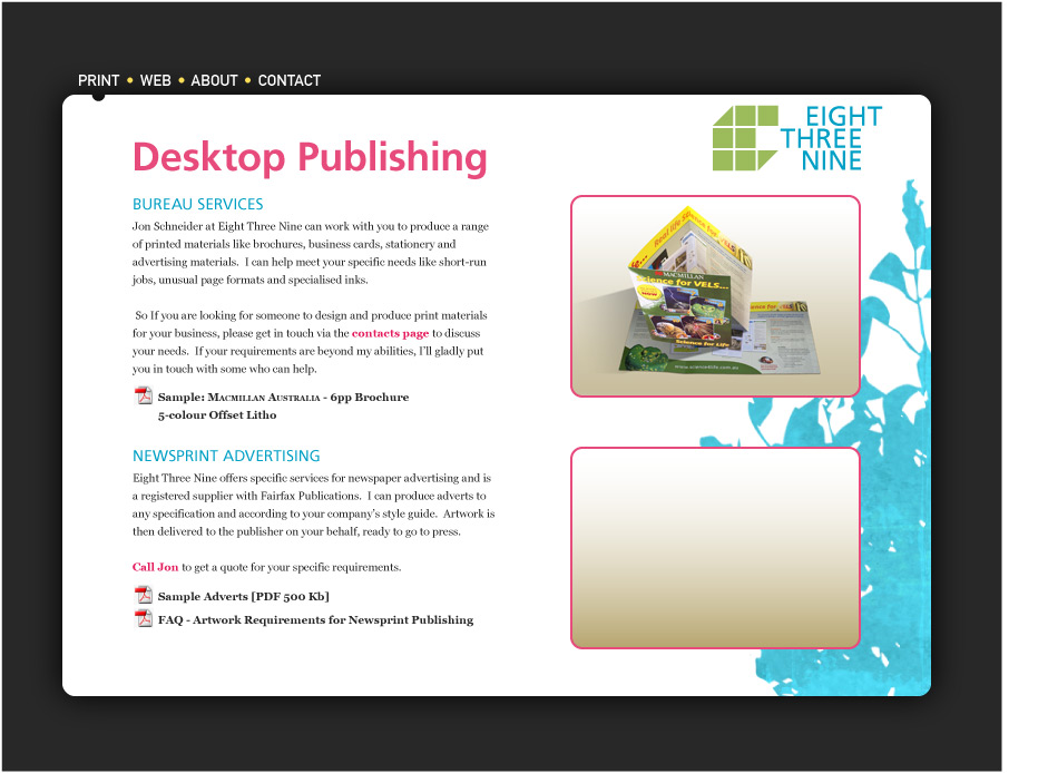
Here's the latest.

composition 06 - 28th. Aug.

The mark is still a work in progress, there's a separate thread for that.

Cheers - Jonny

Live site is now up.
http://www.design839.com

Captured from web.archive.org on 19 Oct 2013. view this capture