
this page contains a short artist statement to be included in the back of a photography monograph.
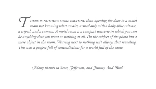
i am curious about a couple of things:
- is the placement and size of the drop-cap acceptable?
- does the phrase that is set in small caps, false-ilalics work? i am using adobe garamond and i skewed it 13 degrees. it didn’t look quite right to me with small caps roman preceding the rest of the italic text. do you think this is ok or should i set it in italics like the rest of the text?
- the text block is 4.2 inches. do you think that is too wide?
the page dimensions are 10x10 inches and the type is 11/14
any advice and recommendations are greatly appreciated
thanks,
gregg
