Typophile

a gay typeface?

lore

I am currently working on the design of a photography book on gay parades.
All photos are black and white and all photos are portraits of gay men (from the drag to the handsome boy and the big guy with piercing and moustache...).
The cover should be mainly black and white and I am currently experimenting with different typefaces.
It should not be to "sombre", too dramatic or to circensian, also not too grotesque...
I'm trying to find the perfect typeface, one that evokes celebration but it's sober at the same time...and one which reflects the context (gay, diversity, celebration...)but not in an obvious way...
Any suggestion? Please?
Thanks!!

Well, there are a number of typefaces designed by gay type designers. Would one of those work? You'll have to do your homework here, though. I don't want to go to deep into the personal lives of any typophiles.

I was working on some materials for a pride organization a while ago and ran into a similar dearth of options. While some faces might be historically appropriate (based on designer, philosophy, or geographics) they didn't communicate what was needed. The creative director eventually settled on something futuristic because it fit our mission statement of "looking forward," though it wasn't to my personal liking, so I won't recommend it here.

Have you considered the option of having something custom-lettered? It sounds like you have a clear enough idea of what you're looking for to give some good direction and, with a photography book, you're probably just using lettering for headings and titling, right?

First of all, don't try to be too literal - that's guaranteed to backfire.

I don't know about gay, but there is a typeface that looks androgynous, and has been used to great effect in a book about a transvestite artist ("John Kelly", typeset by Pentagram-NY) - that font is FF Avance by Bloemsma, and it's not difficult to see why it works so well for that.

hhp

I rencently had a WeHo client tell me Storm's Tenebra was Gay. Maybe he wasn't being literal. My typographic gaydar could be on the blink.

I don't think it is necessary or relevant. I would think that the photography will guide you and you shouldn't be too consumed with the sexual orientation of the people in the photos or the type designers.

I agree with Tiffany, but you might be interested that Christian Schwartz says of his early typeface Hairspray that it's "the gayest thing I've ever seen."

It doesn't exist. All typefaces are straight.

based on the portion of your "brief" that is actually descriptive, i think Hercules would work well, but my inital reaction was actually Farao.

> my inital reaction was actually Farao.

I own Fareo (one of several given to me by F.S. for pointing out some spacing problems in a font I bought) And I can see why you might think that. It certainly is cute.
: )

I think Farao esp. Bold would be appropriate for its masculine with feminine twist, quite an option.

--- pinky kinky winky ---

I couldn’t resist this topic, its so dear to my heart. What is a gay typeface? What would Judy Garland like? What is the Carneigie Hall, March 18 1958 of typefaces? Well I say I like Futura extra light really really big printed in a fifth colour or maybe I could use one of those lovely butch Grotesques by the Font Bureau or Hoefler & Frere-Jones. But then again I am rather taken by Mr Dardens new creations, just need a place to use them.

Now, now...that was quite an interesting little brainstorming. Thanx everyone. I am trying to avoid being literal here, I'm not looking for a typeface that looks "gay"...( whatever that means)but I thought it would be cool to "honour the content" as Bringhurst says (or was it someone else?)and use a typeface designed by a gay person or that has some kind of androgynous feel (or at least avoid a major gaffe by using some catholic, puritan typeface (I guess there are loads around). It's more what Mich431 wrote: something that is historically, philosophically appropriate.
I'll have a look at the suggestion you guys gave me and see if that works. Thanx a lot and keep posting.

Has the Cristopher Lowell Decorating Show made it over there? You could see what font he uses. You don't get much gayer than that without an operation.

Btw, this topic reminds me of a joke:

"Is that chair saved?"

"No, but we're praying for it!"

fontplayer: hmmmm...no I don't know the show but I know one thing: gay don't need operations, that would be a transexual, which is a different thing. They also don't need necessarily to be cute.

> fontplayer: hmmmm…no I don’t know the show but I know one thing: gay don’t need operations, that would be a transexual

I thought that was just a progression, or acute case of the...uh...condition. This is great. You learn all kinds of things here.

You seriously thought that being gay is just a station stop on
the way to being a transit passenger?! Sure, the two are related,
but come on man. For one thing, the motivation to be a gay man
would be a lot less if they were all sans.

I have to wonder: how old are you, and when will
your parents allow you to step foot outside The OC?

hhp

"All typefaces are straight."

No, some are Italic :-)

ChrisL

> I have to wonder: how old are you, and when will your parents allow you to step foot outside The OC?

Much older than you, I'm sure. But being from OC has limited my exposure to some things you young tykes from the big city take for granted.

A gay typeface... hmm?

ITC American Typewriter could match, probably - vibrant, artificial but with a certain warmness. I'm waiting for the next suggestions.

Just my 2cents, Thom

Dennis, I think I was a bit too harsh, sorry.

hhp

> Dennis, I think I was a bit too harsh, sorry.

Having participated in an unmoderated Christian Usenet group once upon a time, Almost everything else seems tame by comparison.
No apology needed.

A gay typeface? I don`t know what it means at all.
Meet Mixa. it's a font on hybridation process between palatino and Symbol medium. If u are interested i'm working on.

what about that m

>what about that m

It's not straight enough :)

my two cents:

I agree with dan_reynolds. I think that choosing a face that "looks" gay might be the worst thing you could do. I am a believer in connecting the text or content with the look of the type, but, I do believe that the gay community has far too many stereotypical labels as it is. You might accidentally irritate one that you were unaware of. In choosing a typeface that was designed by a gay designer, you could debut this somewhere cleverly, by citing the designer, and relating a little about his life as a "gay" typographer. I suppose that many people would not find this, or they would not care, but I think this subtler approach at connecting content with type is far better then choosing something that "looks" gay.

Maybe what is confusing some people is the title of the forum. No: I am NOT looking for a font that "looks gay" but for a typeface that can contribute to the spirit of the project, which is to emphasise DIVERSITY and "OTHERNESS" (That's for you fontplayer!). I appreciate the input, William Berkson, but fonts like "hairspray" for example, is not what I had in mind, I'm afraid. That would be a huge stereotype.
What I could do is to play with 2 different fonts, like using a classic one and then insert something completely different to subvert it a little, like insert something hand-made to give it a human touch...dunno...would that give the idea?

Mixa??? Sounds good, I like the M but can we see more? Cheers.

Having done a bit of work with gay publications, I'll say that it matters not. What is more important is the relevence to the project. BUT...

If you were to force me to answer (c'mon, make me!)... I'd say for gender ambiguity/shifting/borrowing, I've always liked Bodoni (or anything closely related) because of the contrast in line, the Masculine/Feminine, the sort of posed-ness of it.

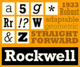
If you're addressing both lesbians and gays, I really like Rockwell because it is playful and hits both crowds well.
Kings and Queens

It may work really well for a parade book, too.

I’ve always liked Bodoni (or anything closely related) because of the contrast in line, the Masculine/Feminine, the sort of posed-ness of it.

yes, exactly. that's why i suggested Farao--delicate yet strong.

Rockwell? Really? I Thought it was one of these typefaces reminiscent of American Highschool/collegea bit like Princeton? Or am I totally out of my mind? Isn't it why they used it for the Kings and Queens' book in the first place...?

(thanx for the link)...dunno...a bit too geometric, maybe. In fact, farao does have this american-highschool-feel too, there's a version of farao that really looks like princeton. Coincidence?

(I like it though...)But Bodoni, you can't go wrong with it, can you?

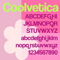
I am getting quite attached to this Coolvetica by Ray Larabie...for some reason, it's kind of simple but it's got a little twist, which is probably why I liked it.

Any opinion about that one? (forget about the pinky flowery thing...it's not because of this that I think it might fit...)
Thanx!

i think coolvetica is very cliche and personally would be turned off by it. i'd rather have something more subtly sexy than something campy... unless you're shooting for campy.

Anyone know what a red asterisk means mext to a subject? I had one on this topic.

Point taken Paul...
I have no idea why that asterisk on the topic, I just know that I am deliriously happy with the input received from all of you. This book is going to be big...(for my standards!)so it's important to get the opinion from people from different (cultural) backgrounds on this subject. Cheers!

I thought the red asterisk means a thread that hasn't been visited at all yet.

hhp

This one was almost used up when I saw it.

I mean visited by a given user.

hhp

Well, if we could figure out who the slacker is, the problem would be solved.
: )

Perhaps this is rather obvious, but Porchez' Anisette might do the job.
You can play around with its combination of butch and femme alternates, tuning to the text, to strike the right balance.

I feel like I am selling secrets, but if the gays are trying to tell us it is a normal thing to be gay, then wouldn't a normal font be the perfect thing to inculcate the masses? This would simplify things, as most fonts haven't come out of the closet.
: )

Except there are no normal fonts.
Which is great because neither are there normal people.

hhp

Personally, I think deciding on the selection of a typeface based on the sexual oriantation of the type designer, graphic designer or audience is, at best, foolish. :)

Pick a type that works with the photos in the book. The photos are the subject matter. I remember the James Bladwin Richard Avedon book of the 60s as a success full approach to the interplay of few wordswith very powerful images. The type should not attempt to compete with the images. Perhaps just something simple that is not too noisy.

ChrisL

For some reason I'm seeing something Hairline, like Helvetica Ultra Light, kind of large. I like the Stymie custom font in the NY Times Q magazine which is on fashion and design, which seems to be a revival of L&C Stymie Hairline (not unfortunately available to us mortals).

It's not only the font but how you use it, obviously.

No, I don't think it's a good idea looking for a font designed by a gay person either, although you'll never know...it could be a way to pay an hommage... But it's about CELEBRATION OF DIVERSITY really. I like the idea of simplicity and avoid competing with the images but since we are talking about a BOOK COVER I thought I might as well try something unusual just to keep up with the spirit.
Hey Dennis, you are really having difficulties coming to terms with the concept of gay, uh? :)
and yes: gay means homosexual, which can be man AND woman...

Anisette is cool....

the ultra light ones...gorgeous.

I like the idea of thin, elegant and sophisticated.

Perhaps "new", "forward thinking", or simply "open", as opposed to "old" and "closed" or "traditional." Maybe that's the key. Don't ask what it should be... ask what it shouldn't be.

I like the idea too, of ultra thin Helvetica, or something along those lines. A cover? Lately I've been a huge fan of Bernhard Fashion - in an all caps setting though. Take something from Avant Garde ligatures too maybe? Voila.

Of course, this is all sooooo subjective... Especially here, with "The Nerds." (I mean that in the best way.)

-b

> Hey Dennis, you are really having difficulties coming to terms with the concept of gay, uh? :)

To me it's like someone saying the sky is (a fabulous) lime-green. Maybe if enough people insist it is lime-green, some people will be swayed, but I am pretty sure I wouldn't be one of them.

If that was the only strange thing they tried to foist upon me, then as long as we don't talk about the sky, I could have a nice conversation. (because I have found that the lime-green sky people can be very nice, otherwise)

I dunno Dennis, you do seem to have gay issues - I seem to recall a thread about Brokeback Mountain recently in which you compared it to font piracy... methinks thou doth protest too much.

OK, enough lurking for me... The typeface, in the case of a book cover, can COMPLETELY dictate the meaning of the words. There was a great ad in cmyk magazine a few years ago from a student for a type foundry, the gist was that if you set the words "will you marry me?" in a horror typeface it changed the meaning quite signifigantly.
I choose not to lob an opinion on the "gay" issue, or the "beer" issue, although I find it ironic they are coexisting. I am Junged out right now with joseph campbell's "hero of a thousand faces" and I get less sympathetic with each read.
At some point, someone mentioned American typewriter, and I am inclined *ahem to agree.


IMHO the photography has to speak, so let the flavor of the images dictate to you how they want to be represented. Don't hot-button the gay thing.
Good design is beautiful and interesting
Great design is invisible and speaks for itself

Disagree. The meaning does not change. Changing the style it is displayed in can alter, or affect ones perception in regard to the meaning, but the actual, or literal meaning does not alter. "I eat dog biscuits" displayed in a script may give impression of frivolity of doing so, and a jaggy typeface may give impression of shock, or disgust, but the actual statement "I eat dog biscuits" does not alter one iota. The typeface alters the mood the way the statement is recieved, but not the meaning.

Graham, I think you're underestimating the inherent ambiguity in any natural language. Not always, but often enough the content can have multiple interpretations, depending on context and even the reader - and this is what can give Design a central role in communication; especially because written language doesn't benefit from the gestural and tonal richness of spoken language (all we have is measly italics).

hhp

Yes... You are correct. Written language is fairly rigid when put beside the spoken word. Inflections on the spoken word can purposely alter the perception of a statements meaning, with the intention of actually say one thing while meaning another. I suppose I am being a bit pedantic(?) about it, but I put that down to my acerbic nature. It isn't too good to focus upon one narrow section and block out the surrounding information. As, after reviewing the previous messages on this thread, I seem to have done.

Unfortunately we dont have the emotive variety available to us in the typefaces that we can produce vocally. Maybe we can come up with some emotion accents to add in the new opentype format :) Sounds like a challenge to me.

To get back to the book, I feel a typeface that looks festive and partylike, while retaining a clear visual readability would probably suit.

i agree with lunyboy - this american typwriter is interesting becuase it has diversity. on the one hand it's a typewriter face with it's "formality", on the other hand letters like C and R have these little things which make the more "feminine" (i don't know how to call these little things but there is something ornamental in them). this face no too formal, it has round edges and that's another quality. it would look even more interesting if it has lighter wheights.

Just for a moment, look at the problem from a different angle.
What does a straight typeface look like?
Something that would be used for important heterosexual occasions?

That's actually harder, because "deviations" (as long as they're not
too obscure) are easier to find associations for than the "mainstream".

hhp

where are the pink pilcrows when you need them?

Oh dear..I can't turn my back, can I? I was away for a couple of days and look at the mess!!!

ok...I went through the threads including the digressions about morality and beer.
Now...I wasn't going to bother replying but Dennis..(sigh)why do you think there's something funny abou the topic, do you giggle everytime one says the word GAY? Yes, I did call it A GAY TYPEFACE? because I wanted to draw some attention to the forum but I think it was pretty obvious that I wasn't looking for a "spiteful, frivoulous and sophisticated" font...I mean nobody can seriously think it is possible to give fonts human attributes, right?
However I do agree that you can somehow subvert the meaning of a text with the use (or misuse) of a specific font style. You can't probably change the meaning but you can affect the reading experience. Nothing new about it.
Party celebration, festive is all useful not because of the cliche of gays dancing at the sound of Abba but because it is about GAY PARADES. But I am so not convinced about typewriters...I really don't get it.

Dennis..(sigh)why do you think there’s something funny abou the topic,...?

Like a typeface can be gay. I've used a few fonts that were trying to poke parts of themselves where they don't belong in another letter, but that was a quality problem.

That why it reminded me about the joke: "Is that chair saved?" ...

But one problem is I failed to note the obvious; that there might be a lot of gays in graphic design. I madew a few off-hand comments, and then I had to dig a deeper hole, so to speak, trying to explain something.

I was trying to examine my thoughts on the matter this morning, and realized, that aside from any moral issues involved, my gut feeling is that male gayness is disgusting to me (if I start trying to imagine). Not much I can do about that. But a female being attracted to a female is not. Women are soft and cuddly. Who wouldn't want to get with that? - This is mainly to clarify how I personally feel, not to instigate a bunch of people to gang up on me.

On the other hand, if I keep on going this thread could pass the Typophile Beta Bug Report in number of responses.

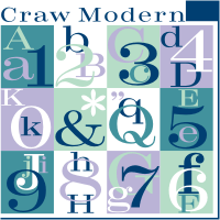
But back to the matter of fonts, I saw these heavy Bodoni variations in another thread which I couldn't find (I looked up the links in browser history), but I think they looked great for a festive titling. I even had two of them. See what you think:

http://www.myfonts.com/fonts/bagraphics/sahara-bodoni/sahara-bodoni/

http://www.myfonts.com/fonts/urw/craw-modern/

http://www.myfonts.com/fonts/urw/didoni/urw-d-normal/

Well, thanks for being honest*. In fact in some ways (although not
the disgust part - my benchmark for that is totally different, and
almost entirely outside the physical realm) I feel quite the same way.

* Although this should ideally extend to speaking your mind whether the
group/person in question is present or not (although I admit that can be hard).

And really, nobody should feel guilty for his emotions. But we are all responsible for our actions, so for example not giving somebody a job (at least one that isn't inherently heterosexual) because some aspect of his own emotions disgusts you is not good. Human society cannot be harmonious under such draconian standards.

hhp

But we are all responsible for our actions, so for example not giving somebody a job ...because some aspect of his own emotions disgusts you is not good

Agreed, and I am capable of forgetting about that aspect of a person in order to hang and work, although I haven't been challenged with anyone "over the top".

And in the same way I might look for a Jewish lawyer or doctor, if I wanted fashion advice, I wouldn't mind Clinton's (What Not to Wear) advice on something that works for me. Unfortunately none of his stores would have shirts to fit me.

Typophile Beta Bug Report? I don't even know what that is...I am soooo not interested in this kind of competition. It's about QUALITY not quantity and how useful are your contribution going to be to me ( and everyone participating.


I like that one...looks pretty dynamic to me, kind of jolly too. Thanx.
Another hint : I've found that it could refer to the meatphor of "coming out", in short coming out to the streets, to the day light instead of hiding because there are people out there who find you...er...disgusting and don't even seem to realise that is quite insulting to say it in public.
Get it?

I would be interested to see some of the work. Whatever makes me a fontfreak, makes me thrill to see the graphic above that demos the Craw font. I am very happy I have this one.

You mean the photos? it probably won't give you an idea because the great thing about it is the diversity of types, all sort of people, pretty, ugly, dressed up, totally normal...I do admire people that fight for their rights and go through a sometimes quite painful process until they actually come out.

> quite insulting to say it in public.

But much better than hiding it (which I'm
sure is the case with many people here).

Progress relies on open communication,
and open minds, but not covert feelings.

hhp

exactly...tolerance is a good think and I don't see what good can bring to say to someone : "I don't like gays" without eevn think that this may hurt someone. Sometimes to keep your prejudices for yourself is better.

> Sometimes to keep your prejudices for yourself is better.

Better for whom? Yourself. Otherwise, it's assuming the
the person in front of you is in fact the intolerant one.
Tolerance is much much more than fake civility. Just
observe the mess the Netherlands is in now - and it was
triggered by a completely irrelevant incident! It was all
a veneer, all this time. That to me is disgusting.

hhp

I don’t see what good can bring to say to someone : “I don’t like gays”

I'd like to clarify that I didn't say that. I do like some gays. Just like I like some of those WASPs. My real judgementalism comes from other traits like people who prey on the helpless, and men who beat up on women, etc.

Oddly, much of the worst untempered condemnation of gays is from Christians, who can't hang with people who they consider "sinners". Which is ludicrous, in that it ignores the glaring fact they are (continue to be) sinners too. And as if hatred & hypocrisy are represetative of God's love. (see white-washed tomb analogy)

Better for whom? Yourself.

Exactly! And everyone's failure to recognize my victimization is lowering my self-esteem! (to quote the wise sage Calvin)

All of this generalization is making me sick and dizzy.

Well, Life is a heady affair.

hhp

Lorenza, you mentioned Anisette earlier. You could also use Anisette Petite. Also on Typofonderie you could look at Parisine Plus PTF, Jean François has added all kinds of unexpected ligatures.

I recently used Suburban Bold for a jewellery fashion promotion aimed at gay men and women. You might find it too circensian (thank you for introducing me to that word btw) or working against the photography, my use was for type only. It strikes me that thin faces or didones might be too "fashion". Clarendon might be a more solid alternative.
Tim

ahhhhhh! I love the Parisine Plus, very gracious!
I think we are getting really close here...thanks for that. Tim: true that thin faces can be too fashion, I hadn't thought of that. Very useful stuff, thanx.
That suburban bold is interesting although some rightly say that I shouldn't use a font that compete too much with the images and maybe this one tends to get too close to an image (sorry I can't explain that too well)...look at the Y for example.

I went through a script phase and a clarendon phase (didn't like very much , just a question of personal taste)...

I think Veljovic would work quite well.

Captured from commoncrawl.org on 18 Apr 2015. original URL