Typophile

Wallau vs. Troy-- thoughts?

jlg4104

I came across an intriguing comparison by William Chappell/Robert Bringhurst in A Short History of the Printed Word. Chappell (who is clearly the one speaking in this section, since he refers to watching Koch at work) says, “It seems to me that the calligraphic forms of the Troy font fail to achieve the naturally organic characteristics of a rotunda, and instead only imitate models on which they were based” (244). Below are examples, Troy (Morris) above and Wallau (Koch) below.

What I see is this: the Troy looks like a simpler, wider, more “modern” face that’s hiding behind some calligraphic embellishment. And I do see that the Wallau seems to be something like “appropriate to itself” in its form, especially, for example, in the narrowness and the occasional extra flourishes that make it seem more “exotic.” But that’s from a very naïve eye.

Can some of you produce more concrete terms for distinguishing these two, in a way that explains the difference Chappell sees?

- J
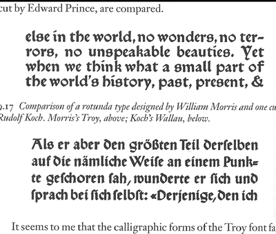
I wouldn’t classify either of these types as rotunda. Morris’ Troy type reminds me a lot of Schweynheim and Pannartz’s Roman type. Like the contemporary Ashendene Press Subiaco type, based on S&P’s first type, it is an attempt to capture something of the historical transition from blackletter to humanist type that took place in the first few years of printing in Italy. If you add to these two types the Doves Press roman, you have a kind of historical recreation, culminating in the Jensonian roman.

Morris’ Troy type reminds me a lot of Schweynheim and Pannartz’s Roman type

And when I looked for examples of that in Chappell’s book, damned if it’s not just as you say— loads of similarities. Chappell’s book has been really helpful for me, but maybe he’s forced this comparison.

I’m not a big one for classification, but there are some apparent structural differences in the 2. See d, e, a . I think Morris was hoping to open up the design and make it more readable to an English-speaking audience, one not used to reading blackletter. Hence the more latinised shapes of d, a, w, etc.

Morris’ Troy was an effort to revive the look-and-feel of early printing in the machine age. Morris was interested in all the aspects of book arts, but was English and not known as a letterer. Koch was a calligrapher, a German one, who was thoroughly familiar with the various historical blackletter styles. Koch’s various blackletter types derive directly from calligraphic styles, ones he practiced and read. The Troy type was a little like Morris’ Golden type; a mimic intended to convey an archaic feel in books produced by Morris’ workshop. In contrast, Koch not only practiced many blackletter hands, but cut a few types himself in addition to the ones Klingspor had cut from his designs.

Chappell (Warren, not William) says it himself, Troy “imitates models on which it was based”.

You might say Morris was attempting to reproduce the superficial characteristics of early printing in his work. There is an element of kitsch or parody to his types. Koch knew the structure and history of the hands he based his types on, and was successful at translating those styles directly into printing types intended for his contemporaries.

Captured from web.archive.org on 19 May 2008. view this capture