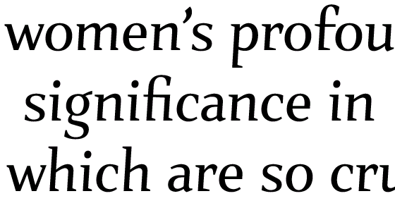
John Berry notes that Mark van Bronkhorst's old style Italic for his typeface Verdigris is exceptionally readable. Minion's italic is also quite successful in this respect, I think.
I would be interested in people's views on what makes for a readable italic. For example, old style italics tend to have a great variety of different slants to the letters. Does making them more uniform help readability, or not? Do wider letters help? Handling of Contrast? Smaller or bigger 'serifs'?
I understand that often there is a desire to have the italic 'dance' more than the roman, and accept some lesser readibility for the sake of emphasis or decorative force. Still, within these constraints, how do people view the problem?
Also discussions of italics seem to be very rare, compared to discussions of romans. Any good references?


 Arrighi's letterfoms