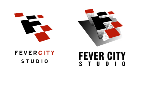
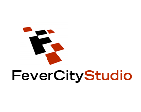
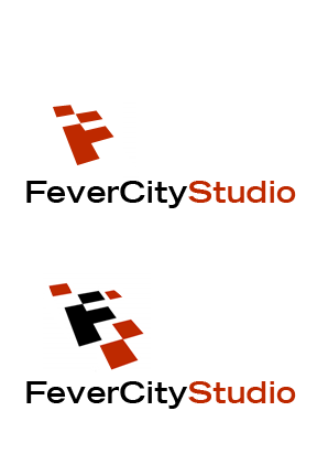
I guess you get what you pay for. Live & learn. In a fix, I went to a ’logo farm’ for my production company. I specialize in long-form network / documentary work and needed something quick for a project.
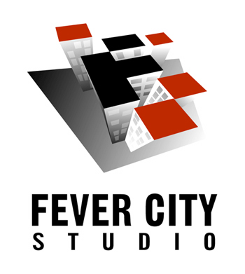
It took ’final approval’ to get the electronic files and now, hopefully, I can take the tweaking to another level. Now - there’s time to play before a printing order and I can’t help feeling that this could be ’more’. The font’s Gothic No. 13 and the icon’s a cityscape they came up with. Pantone 1805U for the reddish tint.
I do really like Trade Gothic (which is a bit skinnier than this Gothic) but might be too skinny when up against the looming city thingie. It definitely makes for odd text positioning. Any and all input appreciated. I can take it. Thanks in advance - Michael
| Attachment | Size |
|---|---|
| FCStest1.pdf | 744.7 KB |
| JustCityScape.pdf | 136.77 KB |