
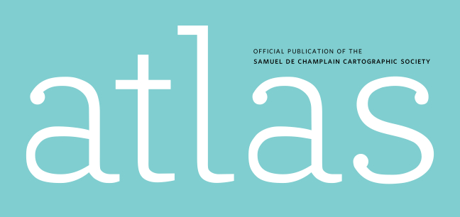
I created this typeface for the masthead of a cartographers’ magazine called “Atlas.” I wanted to make something elegant and soft, a contrast to the Myriad Condensed design the publication feutured before. I decided to use Whitney Book and Medium Small Caps as the secondary typeface.
So, tell me what you think
| Attachment | Size |
|---|---|
| Atlas.pdf | 184.77 KB |
| Atlas2.pdf | 22.93 KB |
| Atlas3.pdf | 21.7 KB |


