Hi guys,
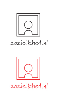
here is a logo I am working on. It is for a girl who is starting a website on where she is going to write about modern art exhibitions she has visited. 'zo zie ik het' is dutch and translated it means 'this is how I see it'.
The logo is portaying a person who is standing in front of a picture/painting and at the same time you can read it as an uppercase A. Her first name is Akkemei so this seems appropriate. Because she is writing about the art I thought that a handwriting typeface (marydale) is too.
Do you have any comments/critique?
Thanks in advance!
| Attachment | Size |
|---|---|
| zozieikhet.jpg | 20.2 KB |