Typophile

Tom Cannon Design

This thread ran to 2 pages of replies and only one was recovered, so replies are missing.

Tom Cannon

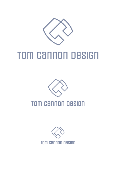
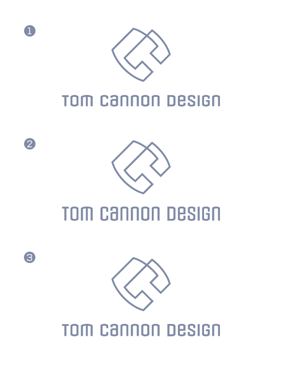
I have been working on my own logo between projects for years. It has been a source of frustration because I am a horrible client. Ideas for client’s logos come easy, but ideas for my own do not. The best I have come up with is an icon that has a “T” reversed out of a “C”. About two years ago I started a thread on typophile and felt at the time that I finished with a good logo that can be viewed on here: http://tomcannondesign.com/.

I am unhappy with it again. I don’t feel the same excitement about it that I do for other logos I finish. The icon is too simple and it needs 3d treatment to make it interesting. I don’t like 3d logos because they aren’t functional. I have always felt they were weak in design if they need 3d and mine fits in that category.

I have posted below my latest attempt to use the same T-C idea but tweaked the icon. I haven’t spent much time with the type yet. Suggestions of any kind would be welcome and appreciated!

AttachmentSize
logo_avenir_flat.pdf253.7 KB

I can’t see the picture?

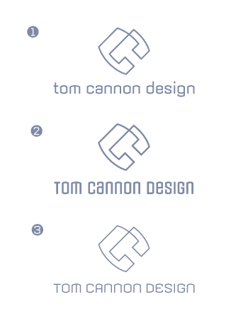
Tom the first two CTs make an x that jumps out at me and my fundamental problem is just that it reads CT not TC. Having said this it probably never be used out of context (without the name). Have you done some sketches of tc combinations, it might work. I also agree about the 3D effect, but I also feel that way about any effects with a logo (drop shadows etc.)

First impression, I think you caught something with the third one. I would try to work with a solid color instead of an ouline. The typeface is also good, but may be using caps for the first letter would be more efficient with the logo and set in two line: Tom Cannon on the first line and Design, (in smaller size) under the name.

Good work.

André

It’s nice, but everybody has initials. If you want clients to remember you, you would probably be better served by a design involving a cannon.

I really like it - especially the middle iteration. I like the linework that forces you to read it in two different ways, althought it might hinder you because I can see problems with it getting fiddly at a small size. That might just be me. In fact it probably is the more I think about this... it would be good to see it applied to something to see how it will stand up. It might just need a strong colour to complement the linework - try it and see what happens.

Also, please don’t do a ’cannon’ logotype.

Nice one

Si

>Also, please don’t do a ‘cannon’ logotype.

I agree with Simon.

A reason I don’t want to use a canon is the same reason I would never use the color red if my company name was Red. The focus of the logo is design with my name happening to be Cannon. If it were Cannon Antiques it might be a different story.

I have done many sketches of different combinations since college. I am set on using the idea of the T-C combo both in a 45 degree angle (unless someone else has another idea that is better).

Something else I didn’t say about the reason I like the line version of the logo. It captures the feel of what I do because in design most everything is built out of lines such as layout grids, typefaces, sketches, logos, etc.

I am uploading a new file using armada. Because the all uppercase version of armada is too harsh I made the letters lowercase, but I altered the “G”, “T”, “D” so that the stems don’t go above or below the rest of the letters.

Once I get the layout finished I will work with the colors. I appreciate any suggestions!

Much more interesting. Great improvement with the new typeface. It fit much better with the larger outline logo.

“LOL” Tom about the red color (first time I hear that) ; ^j

Tom,

Armada is a better match.

However, let me just play devil’s advocate. While the face matches the mark, does it match too much? I mean, does it start to feel more corporate than you want? Does it represent your attitude about design? Will the typeface become too trendy long before you tire of the mark?

I like Armada, don’t get me wrong. I wonder if an normal or extended version might be better? Or using some U/lc?

Tiffany,

I thought of purchasing Infinity from Thirstype (bold I think). I own Armada (from when I used the “C” icon that is bulkier a few years back) so that was an easy choice. I welcome any font suggestions that would enhance the icon. Do you think the icon is too corporate or the type with the icon?

Sometimes when things are too matchy-matchy they start to feel corporate. I’m not sure your’s is doing this, only seeing your entire identity would show this.

I like the mark. I like the typeface. I’m just not sure it isn’t a little too much of a good thing.

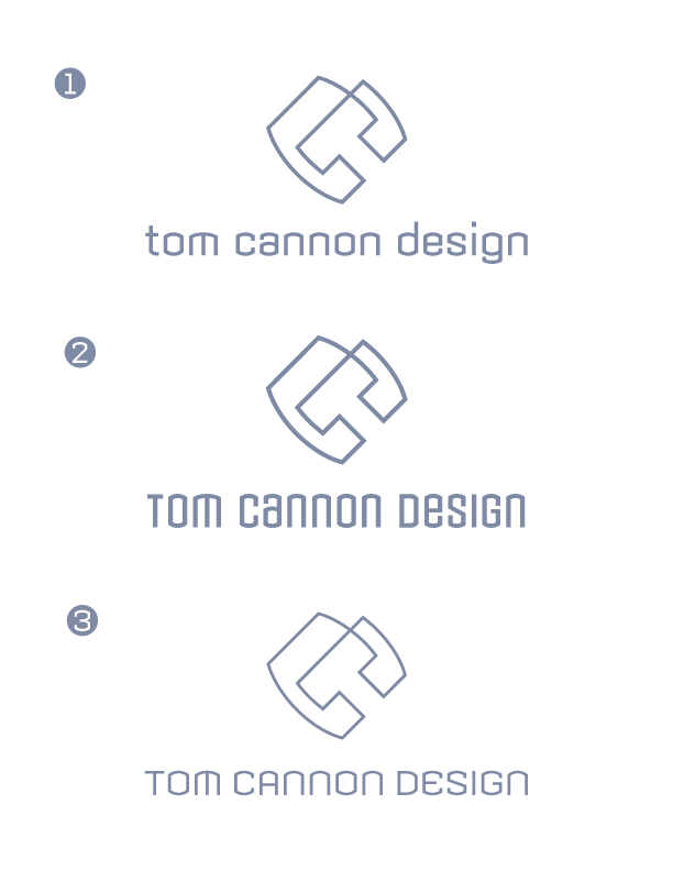
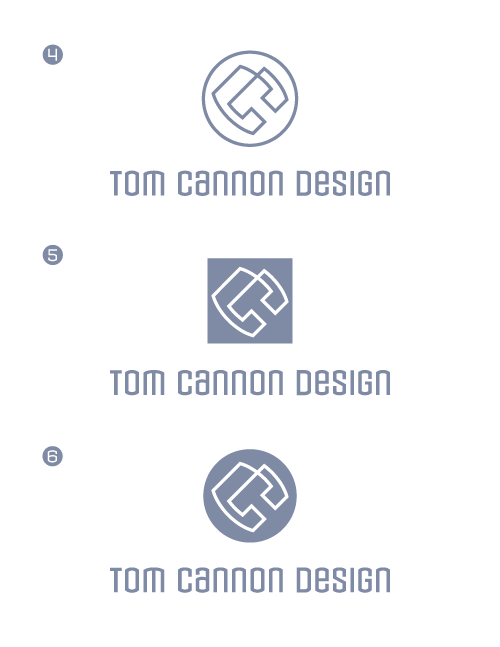
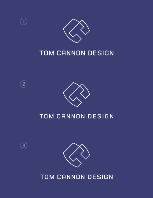
Here are more versions using armada regular. I could alter version 1 like I did version 2- change the upper case letters to lowercase.

To me the second one has a better impact. The slight condensed of the name, compare to the third one give a “friendly” look. I like that. However, the first one, with the name in lower case has not enough “personality” and the link with the C and the T in the logo is losted.

Sim,

If I changed the “t”, “d”, and “g” to uppercase letters (the way I did version 2) would that change your view?

I’ve to see. But what I also like in the number 2 is the proportion logo/height of type.

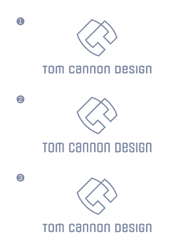
Here are variations in the letterheights. They are not stretched. Please let me know which looks best.

I reckon the best version is No.1 on the sheet without the logo ’containers’ on. I think the extra linework/block/circle don’t add anything (the circle linework actually makes it too complex). It’s kind of what I sometimes catch myself doing if I feel that the logo’s not strong enough - ’I’ll just put it in a box, that’ll make it stand out’. Your logo is strong enough to go without.

Type-wise, the lettering on the first one is the best, it’s the least condensed looking; the only slight niggle I have with it (and it is only slight) is that I’m not personally a fan of the ’m’ glyph. It bugs me, but it bugs me least when it’s less condensed (and looks a bit less spindly without those long legs).

It looks great.

Si

P.S. Put it to bed as soon as you can; set yourself a completion deadline and stick to it!

I’m my own worst critic, and never 100% happy with my stuff, I know what it’s like. As an outsider, I think it’s a strong, interesting logotype and you get the ’oh I get it!’ moment when you look at it.

Go with it!

Thanks Simon. I think I am done and I will begin working on the graphics that will accompany the logo on my website/stationary. You are right! I do stay too long on projects.

hmm. I actually liked the all lower-case. Why not U/lc mixed? Version 1 of the first versions with the variant condensed widths was nice. I guess I prefer a more rounded shape to work with the implied rounded shape of your mark. Looks good though Tom. The mark is really good. Organic and yet somehow geometric.

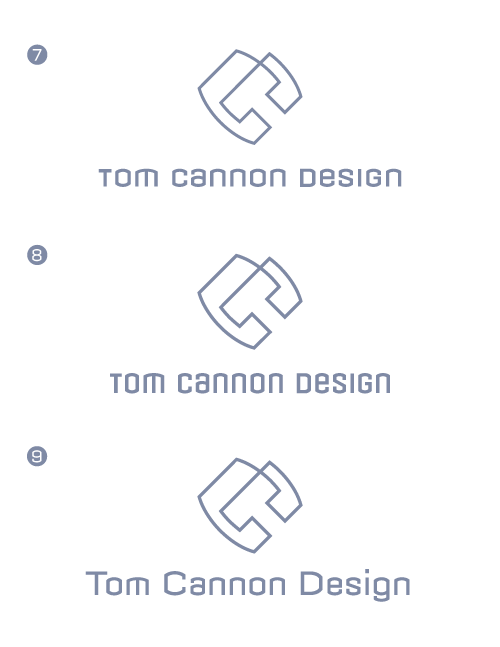
I have worked on the things suggested. I favor version 7 (which is the same as the first version 1 with changes to the t,d,g). I agree about the letters matching the squareness of the icon. I like version 8 also. Version 9 is the u/lc of version 7 and I am not fond of it.

Please look at the “t” and let me know if I can make it look better. Thanks for all of the suggestions. I am happy with how it is cleaning up.

Version 7 — this one works the best for me.

If anything is not quite right, it is the stem of the T, perhaps a little too thin.

Version 7 it is. I widened the “T”. Thanks for the help.

Good work Tom, you’ve done an efficient logo. I also like the reverse version you use as avatar.

André

The new mark with the overlapping is really great. Much improved over the original TC mark. I like the outline too.

Very nice! The concern about initials seem unnecessary. It catches the viewer’s eye and holds it firmly there.
DK~

>Very nice! The concern about initials seem unnecessary. It catches the viewer’s eye and holds it firmly there.

Dennis. Your’re right on!

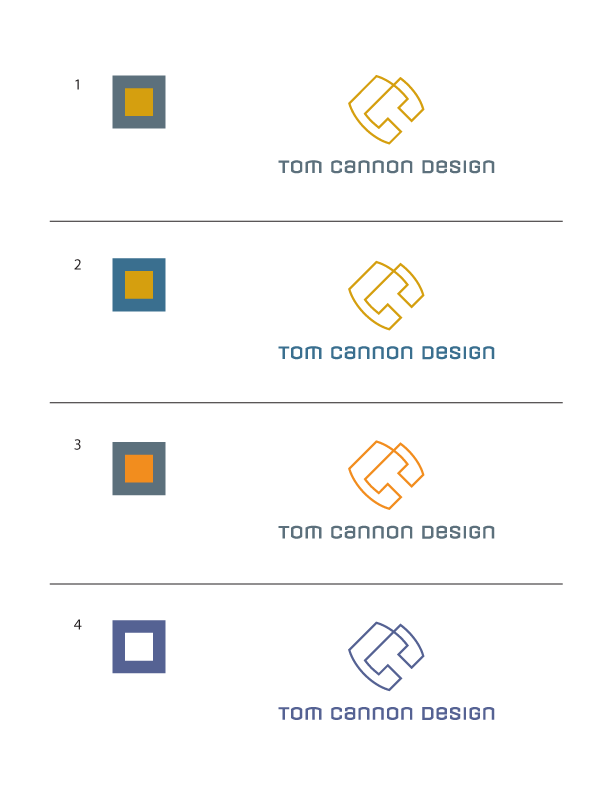
Here are color alternatives.

4. You’ve nailed it!

Still liking No.4!

I think it’s actually better & stronger for being single colour - your print job will be less expensive in a single colour also!

Also really like it reversed out of your background colour on your Typophile pic (still haven’t got around to doing one of my own yet).

That’s not to say you should reverse out the logo as your main logo. It just gives you options; if you need to reverse it out, or use it as a single colour (white or black for instance), it still holds up really well.

Job done - it’s finished...!

Although it’s hard to choose a color by screen, I prefer the one color option (4). The fifth option is also good.

After stepping back from this project for a day, I like the u/lc version of the logo (with modifications). I have got other feedback that the all caps is hard to read and not interesting enough. I will use the white logo on a blue background.

In any case, it’s a good work. Bravo! ; ^j

I have altered armada by changing the “N”, “M”, and the “E”. I have never been happy with this project because of those letters, but I haven’t been able to find a font that matches the icon. What Tiffany said has stayed with me about when things are too matchy they start to feel corporate. I think that the customized type solves the problem. I think the type feels unique but it doesn’t take the attention away from the icon, which the other did. It also looks good at smaller sizes.

I have also altered the icon by making the negative space “T” more proportional. Not both bars are the same thickness.

Here are two versions with the same type but different spacing. I think version 1 might be the best choice.

you’ve nailed it with number one. i really don’t think you should change anything else, it’s there!

a great improvement.

The new logo with the overlap (for lack of a better term) is really good. But Tiff has a point up towards the beginning about “too much of a good thing”. And I think the best way to reduce the corporate effect is to use lowercase instead of uppercase (or even mixed case). That would endow the whole with a useful friendliness. On the other hand it would be nice to not have a descender in there, so I might try making the “g” a UC form, or maybe even something new again.

Whatever way you go on that though please provide
a PDF so we can crit the spacing and such.

hhp

I don’t want it to be too corporate, that is why I modified the letters to not be as extreme as Armada. However, the u/l case isn’t solid enough. I am not set on anything, but it seems the all caps version is better looking. I have included both versions in this pdf and as a .gif.

http://us.f2.yahoofs.com/bc/40d4ceca_1582/bc/My+Documents/logo_flat.pdf?...

With time, I’m slowly seeing why all caps works better than a U/lc. The appearance of a solid base. Are you set on the logo being centered? I still think all lowercase would be more fun and less corporate, and Hrant’s suggestion of modifying the G so it doesn’t hang might be good also. However, all said all caps isn’t bad, perhaps it is the centering of the logo that makes it seem a bit to severe?

I should mention that I will most likely be using them apart. I want it to work being together, but I will probably have the icon on one side of the page and the type on another. I am still planning that out with thumbnails (which tends to take awhile when I am doing it for myself).

I don’t mind it being corporate some. However, all-caps, without altering armada, was too corporate (like Tiffany said awhile back). It was too close of a match to the icon and it looked industrial.

I included the pdf so that the spacing and the details can be critiqued. I am sure there are flaws. I am still very inexperienced in typography.

Thanks,
Tom

Yes, I think mixed-case is the worst (unless you manage to make the UC as short as the lc - maybe by making them a lot wider) but I was talking about all-lc.

So the PDF up top is current? I’ll check it out.

BTW, that link is getting truncated.

hhp

That PDF seems old - what am I missing?

hhp

Sorry for making you repeat yourself Tom. If they are going to be used in a more assymetric way it will be less corporate than two items centered and stacked. The mark itself is really great and will be the focal point anyway.

I can’t get your link to load.

Captured from web.archive.org on 6 Aug 2007. view this capture