Typophile

An amusing exercise

K Cerulean Pease0 votes

Hey all. I had this weird thought: If, in some bizarre alternate history, chatspeak abbreviations like "LOL" had become popular long before there were computers and character sets, they might have, over time, become new symbols, like "et" became "&" and "at" became "@". What might they look like?

These are too typographic. I think you need to imagine a sign that evolves from a handwritten contraction, and then apply a typographic rationalisation. Quickly, and without benefit of a stylus:

Interesting; I think the emphasis might fall on the other end:

I like that one.

Yes, that is nice. It reminds me of the contractions one finds in early printed books, which is a good sign.

Maybe something like this:

Just a rough sketch, but you get the idea. It's a bit abstract, like an ampersand, but you can find the three characters in it if you look for them.

(This makes me think of the imaginary alphabet that Alessio Leonardi showed in his presentation at TypeCon this year. That was brilliant.)

That looks lovely, Mark, but I wonder how well such a form would adapt to other contrast models? With a translation (broad-nib) model, you would get a lot more heavy strokes through the loops. As a form in this particular style, I think your 'rough sketch' is exemplary, but I'm left wondering what forms would be appropriate for e.g. a renaissance oldstyle type, a neo-grotesque sans serif, etc.

It's a funny exercise, because a good end result might not be identifiable in its evolved state. That's why I was throwing up some samples of early ideas, thinking they would be refined through collaboration.

Mark's work is very refined, and the balance is off in that the W anchors his character like the A anchors the @.

These would make funny t-shirts.

Part of my thinking is that it would be like the at sign, which for a long time had pretty much only one model based on the 19th century modern style. The at sign has that hairline loop in the early model which leads to varying solutions when type designers try to adapt it to other styles. In some cases, like adapting the Euro to older face, you get to rewrite history in a sense, and try to imagine how it would have been done had it existed. The ampersand is a good example of the range of solutions which are possible, not all of which are fully embraced by type users (e.g., the original and later Univers ampersand).

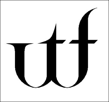
Just for fun, here's a Jenson-like variation:

>Jenson-like variation

Wow so elegant and authentic. If Jenson could come back I'm sure he would look at it and say wtf!?

For Barry Deck's "Eunuverse" typeface (1999), we designed a "www" ligature:www.png">

There are some other typefaces with a www lig, aren't there? I think some of Christian Schwartz's have it.

(I would guess that John won't like the way you've encoded it... :-)

What is the Unicode index for a www ligature?

This was waaaaaaay back in 1999, when we used to use those random glyph slots for ligatures and other fun stuff, instead of random mathematical symbols: ∑ ∏ ∂ ∆ ¬ Ω √ ∫ ◊

Thanks to pop culture, we habitually included the π - thanks to Darren Aronofsky's film - and the µ - thanks to the early breakbeat of µ-ziq - in our types. If some hot rapper comes up named "Ωman", I'm sure that we'll start to see the Omega everywhere.

In a general purpose font - read: created for graphic designers doing general design work, not specialists setting math textbooks, which require far more specialised glyphs than those listed above - it seemed perfectly reasonable to fill those slots with something fun and potentially useful. And the design of the "w" lent itself to this treatment.

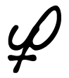
A couple of the Thirstype fonts from this same period featured the glyph then being used by Prince as his name.

> A couple of the Thirstype fonts from this same period featured the glyph then being used by Prince as his name.

Chester, you're waaay too clever for your own good. This is some great thinking, a perfect appropriation of pop culture in the context of type. Nice...

A bit of speculative alternate history with Futura Book:

Actually, I think the top loop would be a bit smaller than the bottom loop.

And since it's Futura, it would be "Was der Fuech?", right? (Maybe Karsten can tell us.)
A ligature for "imho" would probably be in miniscules or small caps...

I think it's not supposed to be a ligature so much as a kind of evolved, abstract shorthand symbol that has become a sign distinct from the letters from which it is derived. The at sign comes from English (I think) and the ampersand from Latin, so language would not necessarily be relevant for such a thing. It's all rather academic, anyway. If one tried to introduce the at symbol or the ampersand now I don't imagine that it would catch on.

Okay, Mark, I'm convinced. This form works really nicely across a range of styles. Someone needs to use this in some books or magazines, so we can justify a proposal to encode the wtf symbol in Unicode :)

Presentation to the Board of the Unicode Consortium:
Proposal for the addition of a glyph to the standard, a new glyph named "Whatthefuck".

The WTF glyph feels like a natural to be followed by uni203D.

I think at least one form with a level crossbar (like Jup's) would arise, and the sans faces would adopt these. Verdana:

Hahahaha! This site's engine just turned my "Whatthe-eff-you-see-kay" into "Whatthe----".

Mark,

Your WTF ligatures are really beautiful... only 30,000 more fonts to do and you're done. ;-)

I can't believe this didn't occur to me before: the origins of the exclamation point, question mark, and laughter mark.

Do you really think this exercice is really efficient?

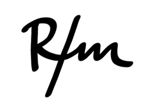
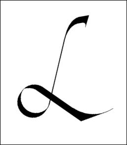
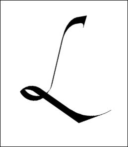
My interpretation of a possible "lol" ligature:

i think it should look like this more or less
from 2 reason 1.its not connecting anything , so it should be clear
2 it should have some continuty(?).................maybe

I really like your symbols, Mark, but they still look rather linguistic to me. I would think evolution would take them one step further, like so:

http://img.photobucket.com/albums/v231/jazzsammich/wtf.gif

--Jim

PS -- would somebody with the inline image option please repost this picture for me? Thanks!

Here's jazzsammich/Jim's image (above) for those who don't want to click off to see it:

nevermind

Guy--your LOL looks just like a delete mark (used in proofreading).

i could really use a ROFLMAO ligature. >^D

really?
and for that ill say LOL

ROFLMAO

not sure if this will come through…

pd

FWIW...

I showed jupiterboy's wtf to a non-graphic artist colleague. He glanced at the screen, and said "What the f--?" Obviously an excellent and highly recognizable representation. We both want t-shirts!

You have to consider the ease of writing these symbols; obviously if the symbol is harder to write than the acronym, then it wouldn't be widely used. Usually this means one continous motion going in one direction (left loop, left to right) and can't be too different than how language (Western) is written. For LOL, i would suspect two quick loops, punctuated with a dot to close. For WTF, 3 spikes, with a quick line and a dot; i was also thinking perhaps the dot would go away altogether after a while and just have a single bar at top of the "w".

> You have to consider the ease of writing these symbols

I think Mark Simonson's wft is just about as easy for most as the &. Frankly, many people are too lazy to even write the &, opting for an even less complicated mark like +.

Mark's "wtf" (and Jim's shortening, which seems like a likely evolution) is actually more satisfying to me than an ampersand to write, because the ampersand is drawn diagonally up from the bottom right, a weird place to start a character.

> because the ampersand is drawn diagonally up from the bottom right

Hm. Then... I must be writing my ampersands in reverse!

Hm. Then… I must be writing my ampersands in reverse!

It took me a minute to figure out if I did it in reverse too, but alas I write them diagonally up and to the left as he stated. Although, I could see myself doing it your way too... :D

James,

I've had a look for a FAQ which might save me asking this question - couldn't find one, though this may be due to an error in my search rather than the document's absence - and I don't know whether it's a massive etiquette breach to even ask this, but:

I really like one of your wtf ligatures. Please may I start to use it, giving you appropriate credit?

Thanks in advance,
Chris
(having checked to see whether it's possible to e-mail you this rather than posting it to the board)

Gee, nice to see that the ops can delete my posts in 5 minutes but that nasty garbage has been there for almost an hour.

---

jlt : http://www.hewnandhammered.com : rnrmf!

hmmm yeah, what's the deal with that. It's not that late..

There are 7 ops, right? I know it's the Wednesday before thanksgiving, but someone needs to delete this junk.

---

jlt : http://www.hewnandhammered.com : rnrmf!

This is some really great stuff. geesdude I think you've got two excellent ideas, especially for pen writing. I'm not sure how easily the looped L's would work with a sans-serif console-style font, but as some kind of TT character it could definitly work.

The WTF t-shirt is a great idea, someone get Cafepress on the phone.

This is a modification to simplify the submission of Mark Simonson. I noticed, that in it's shape, the W was inherent as the center of the symbol already and the weight in the beginning was unnecessary.

James,
I’ve had a look for a FAQ which might save me asking this question - couldn’t find one, though this may be due to an error in my search rather than the document’s absence - and I don’t know whether it’s a massive etiquette breach to even ask this, but:
I really like one of your wtf ligatures. Please may I start to use it, giving you appropriate credit?
Thanks in advance,
Chris
(having checked to see whether it’s possible to e-mail you this rather than posting it to the board)

”Start to use it” is rather open ended.The odd exercise like this is fun, but if we can keep the work here open and collaborative, without the worry of the work being used, I think we preserve the intent of the group. Drop me a note at jupiterboy@sbcglobal.net if you would like to discuss further.

Someone call the janitor.

sorry 'bout that, folks. i mopped it up as soon as i could. thanks, edward for calling this to my attention. as you were, gentlemen.

Ah finally, hopefully that doesn't become a regular occurance!

There are some beautiful symbols here. (I especially like Ikean's
2005-11-24 2am
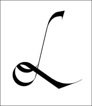
based on an idea of Mark Simonson's.) Here are another two possible evolutions of LOL starting from script, and one of them, my favorite, ends up looking remarkably like cerulean's 2005-11-19 WTF, though the other is more suggestive of a smile:

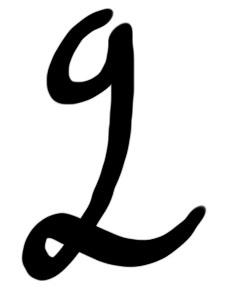
The focus seems to be on WTF and LOL. How about something like this for g2g?

- Lex

P.S. A master calligrapher I ain't.

RTFM?

It's sort of based on the prescription symbol.

- Lex

I think the point made earlier about if these were to be viable solutions they would have to ultimately be easy glyphs to produce by hand and not just integrated into new typefaces. The g2g is interesting but not really a viable solution when you could easily write g2g in the same time it takes you to create that glyph.

I guess I should have shown the evolution of the g2g glyph. I started with a much simpler hand-drawn version, then figured out what it might look like once it had been turned into type. I'll post it when I get home from work.

- Lex

Here's where that g2g originated:

- Lex

Here is a ligature for "LOL"

ChrisL

There's a slight mistake in this line of thought. symbols @ and & are created for single words. LOL, WTF, ROTFL, are all phrases and therefore are more akin to S.A.S.E. (self addressed stamped envelope) or P.S. (post script) and the likes...

Here is a ligature for “LOL”

Each glyph in the typeface is a 24 bit TIFF with transparencies...no noticable increase in size or performance. ;^)

"Each glyph in the typeface is a 24 bit TIFF with transparencies…no noticable increase in size or performance. ;^)"

Right, just an increase in volume :-)

ChrisL

some nice wtf's but all a little too complicated to be written down.

What does "wtf" mean?

ChrisL

What the f#&$ :o)

Thanks David. Earlier, I guess then I could have said" "wtf does wtf mean?"

ChrisL

Haha, true. No problem!

Hello guys, I am just discovering this great forum and already want to apologize for my bad english (sorry if I make mistakes).
I am french and have been practicing calligraphy for 5 years but using computers for only 2 years (!). I simply don't know WTF to do to make pictures appear in my message, I almost tried everything & hope you'll get them.

This WTF exercise is particularly interesting and funny.
Here is what I would propose:

- first, an exercise of simplifying the form into one single line, then drawing it faster and faster until it becomes something new...
Image hosted by Photobucket.com
http://i34.photobucket.com/albums/d133/Damidoux/Whatzeuf.jpg

The final sign looks like a D if rotated clockwise! Calligraphy on a computer is something strange because feelings are lost, but this first experience is pretty amusing.

- then, a kind of logo work done in happy orange to go with the meaning:
Image hosted by Photobucket.com
http://i34.photobucket.com/albums/d133/Damidoux/Whatzeuf2.jpg

Please tell me which you like the most (my favourite tend to be number 3)

Hope you'll enjoy & even if my culture in modern typography is poor, I truly appreciate letterworks.

Thanks for reading.

In regard to the "mess" that has since been cleaned up by Paul...

Did anyone else notice that this particular thread was BoingBoing'd last Wednesday?

http://www.boingboing.net/2005/11/23/typographers_ponder_.html

It was also mentioned on Coudal.com before that even, and I'm sure on many other blogs since. But that's probably how the comment spammers and trolls got in here.

I have modified proportions to make it look better:

http://i34.photobucket.com/albums/d133/Damidoux/Whetzeuf3.jpg

Do I have to consider myself as a troll? If so, don't worry this will be my last message.

> Do I have to consider myself as a troll? If so, don’t worry this will be my last message.

Heavens, NO! New type-enthusiasts are always welcome here.

Apparently there were several off-topic, nasty posts which have since been deleted by Typophile moderators. Being widely-linked in the blogosphere has benefits (bringing new, genuinely-interested people to the site) and pitfalls (bringing spam-bots and troublemakers).

Ok, sorry for misunderstanding...
Letters are the same for us but language isn't! Sometimes it's hard to get everithing in the wright way.

Best regards.

DMX

Daminox, to upload images, you need the Flash 8 player plug-in installed in your browser. Once you do this, an "Insert image" link will appear below the Comment box.

http://www.macromedia.com/go/getflashplayer

I sat down to a piece of paper and this was my first attempt at writing LOL with a Sharpie as a symbol:

And after a half-dozen scrawls, here's where I ended up for WTF:

It's written like a normal 'w' that loops up and then down, finishing by making the crossbar at the bottom. I like it -- I'm not sure why, but I think there's a certain vulgarity to the symbol that matches with the spirit of WTF.

> I like it — I’m not sure why, but I think there’s a certain vulgarity to the symbol

It reminds me of someone (upside-down) flipping the bird. Or a butt. Yep. It kinda looks like a butt. :)

Okay, last one...I promise. I know that I arrived on this thread way late.

Here's my take on RTFM:

Yes, just an exclamation-point opened like a book.

That's just too cheeky Gavin. :-)

ChrisL

Haha, I have to say that to have a whole hefty thread discussing how best to represent "What the F**k" is proof that typographers and type designers do have a sense of humour.

"...proof that typographers and type designers do have a sense of humour."

Nah, it just proves that we are not much different than sailors or truck drivers :-)

ChrisL

Of course the WTF sign has to be obscene, but in a hidden and sofisticated way!
Here is an interrogative form of the sign I proposed a few days ago.
Its vulgarity seems obvious (ask Dr Freud or your girlfriend if you don't understand why...) :


- Thanks for your help on macroflash, so good it is-

Last thing, a butt-like logo that has not forgotten its gothic origins :

I'm afraid this funny exercise is making myself an addict. I swear this is my last try (until tomorrow?).

Wow, my kinda thread!! Great stuff guys.
But did this really get over 54 thousand reads?!
I guess the spam comes with the territory. Or is it that
the beef comes with the territory... Or the actual cows.

> the imaginary alphabet that Alessio Leonardi showed in his presentation at TypeCon

Mark, where can I see this?

Ikean, I guess yours really IS the German one: "Vat der ****?!". ;-)

> they would have to ultimately be easy glyphs to produce by hand

Maybe. But that would place it outside the context of this site.

> @ and & are created for single words.

I've actually heard that "&" was originally called "and per se and" or something.

> Letters are the same for us but language isn’t!

I think letters aren't either! :-)

hhp

hi, how can i contact with owner of this blog? Give me e-mail please , i have a question.

Regards
Dr. Tomash Sanderson

Mike Duge
Peter Jackson
Mattew pall
Haryy Pellenie
Donovan Pallack
Rachell Trellow
Sara Derety
Washington Pox
Sui Vaniloni
Denzel Parker
Ivan Dox
Kat Persley
Jack linsey
Doroti Chex

Mark Simonsons first post is a rough sketch?

Excuse me while I die…

peace

But did this really get over 54 thousand reads?!

Yes, we were boing-boing'd.

Ho boy! Porn spam on university forums linked here! WTF?
(Now would be a good time to have that handy ligature.)

I've been thinking about it recently...


Different language, different letters - collaboration!

Those last two are eerily reminiscent of the old Hartford Whalers logo...

The t and the f look like bosom buddies :-)

ChrisL

Chris, is that the breast you could come up with? ;-)

Titilating though this is, we don't want to get boing-boing'd again.

Vahrumpah! Chiiish!

:-)

ChrisL

[spam removed by moderator]

[removed by moderator]

Removed by [myself]

I’ve had a look for a FAQ which might save me asking this question - couldn’t find one, though this may be due to an error in my search rather than the document’s absence - and I don’t Sohbet know whether it’s a massive etiquette breach to even ask this, but:

I really like one of your wtf ligatures. Please may I start to use muhabbet it, giving you appropriate credit?

Thanks in advance,
Chris
(having checked to see whether it’s possible to e-mail you this rather than posting it to the board)

Oh, that eternal question of how to get rich quickly; and the miraculous invention of spam as the solution...

I hear that the province of Asdsd in the country of Sdfsdf has declared war on San Serriffe. Does Ad3m know anything about it?

Hi all,

Let's dig it up for an announcement: Mammy L and Daddy L just gave birth to a baby o.

+

=

They call him Lolito, for he came to the world with a spontaneous smile.

...And, in case this has not been investigated yet:

or finally, for all those who want to say "Lots of Love":

Cheers,
D.

Hi,

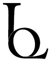
From the time stamps on the posts I fear this thread may no longer be active, but this thread was only brought to my attention just now (by the Webdesigner Depot news letter). I would still like to comment on this thread: both WTF and LOL are normally written in capitals, so my suggestion for their symbols would be

(in Myriad)

Captured from web.archive.org on 18 Jul 2018. view this capture