Hello folks,
I felt in love with "Antwerp" font made by Henrik Kubel for Playtype.
https://playtype.com/index.php?q=font/antwerp
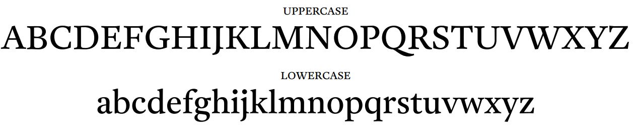
But i'm really annoyed by its "J". (see jpg)
I asked Playtype if there was a mistake.
I got this quick answer :
"The Antwerp lowercase ‘j‘ was designed this way.
It is not a mistake, in fact it helps the direction of reading and matches the ‘i’ better.
There will be a future version of the Antwerp font(s) without this detail.
I'd like to use that font for a book and find it more distracting then helping, as it is really unusual.
My question here is : do you know other fonts with such 'J' ?
Or is it a sort of trick to add a 'j' that didn't exist in the 1500s ?
I have to admit that knowing that form exists somewhere else at some point could help me using it.
I think also that if a modified version is scheduled, i'm not the only one to find the 'j' awkward. ;-)
Many thanks in advance for your comments.
Stef
| Attachment | Size |
|---|---|
| antwerp.JPG | 51.43 KB |