
I am trying to design a book for a customer. It's non-fiction, perhaps one or two images, otherwise it's text with maybe two levels of hierarchy. The body text alternates between quoting from an old religious text and explanatory comments. Sometimes these alternations stretch over a page or more, sometimes they're only a line or two.
For the body text, the latest proposal was to alternate between normal and italic of the same type and weight, a solution which I found comfortable to read. Setting the old religious text a little "poem style" (indented, italic, ragged right) and the explanatory comment as just reading text (no indent, normal, justified) I found quite pleasing.
However, the client insists on using a bold weight for the old religious text, mixed with normal weight for the commentary. I find it more and more difficult to argue why I would avoid a bold face. My latest comment to the client is this: Bold faces are frowned upon for reading. Anywhere I look, the sprinkling of bold faces into reading text is labeled as a "type crime" because it "blotches" the page and interrupts the reading comfort. Go into a bookstore, grab any of the books and you'll find that barely any one scatters bold faces into the flowing text. If you mix bold and normal text, and hold an open book at a smaller distance you'll see black blobs, the "blotches" scattered across the pages. This unbalances the text, brings it out of weight (that's why "bold" and "normal" and "light" are referred to as type weights).
In your opinion and experience, how would you handle this situation? Which arguments are there for and against mixing normal and bold face in reading text?


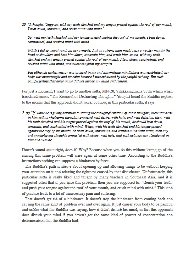

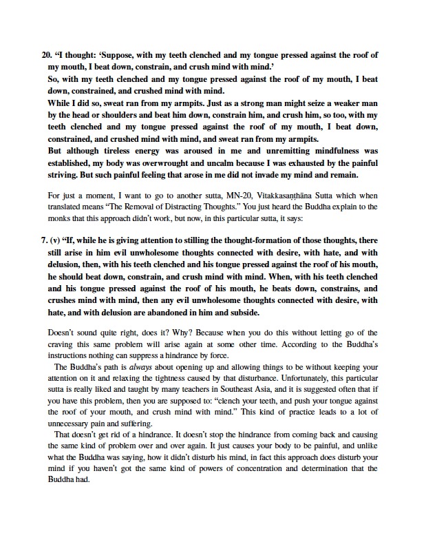

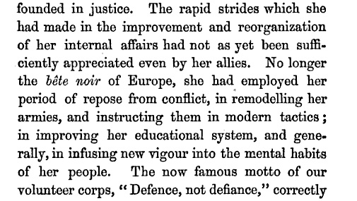
JamesM: Hm, that's exactly the direction it goes to. I'll dig around for some examples, if you have any would you mind posting them? (One example would be here.)