
Would it be a bad idea to set a 96 page book that's maybe 50% photos in Frutiger next?
10pt/14pt
Would it be a bad idea to set a 96 page book that's maybe 50% photos in Frutiger next?
10pt/14pt

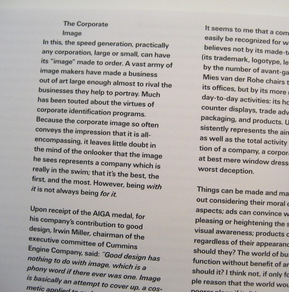

I'd think it would depend on the nature of the photographs. Also something to look out for is whether the weight of sans is too light for comfortable reading on shiny coated paper, which art books usually are printed on. Also you should note that Frutiger had problems with Frutiger Next. Neue Frutiger is the one he did, together with Akira Kobayashi, that has his approval.
Thanks for the photo Nick, I like the idea of using bold. Do you think its a good idea if their is not much white space on the page? The photos are actually not on the same page as the text, they are at the end of each chapter. The reason I mentioned the photos(B&W) was to point out that their is not much text, so using a sans serif shouldn't be a problem, even though I think, if given enough leading, sans serif is fine for long text even though most typographers(more experienced than me) keep telling me that serifs are better for long texts, I just don't see it.
William I will definitely rethink the Frutiger Next, maybe it's worth buying the Neue Frutiger or even using Univers.

William, you mentioned that Frutiger had problems with Next. Care to elaborate? I’m curious.

I would feel unloved as a reader of a long text in a sans.
Although I guess with such a high proportion of images
it's not possible to get immersed in the text anyway.
hhp
See pages 259-260 of Adrian Frutiger Typefaces: The Complete Works. He explains his unhappiness particularly with the cursive in Frutiger Next, which he didn't draw. He was against doing it, as he thought it was out of character with the roman. After that book was published, Frutiger was able to redo it 'his way' with the assistance of Akira Kobayashi, in Neue Frutiger. This not only changed the cursive to a sloped roman, but also changed the range of weights, and corrected compromises that were done earlier because of the system of fixed units in Linotype film.

>> Neue Prutiger
‘Prut’ is a nice Dutch word for ‘sh*t‘… Something Freudian going on here, William? : )
Bert, funny, but I doubt it's 'Freudian' as I don't know Dutch. Now corrected. I do think that the typeface Frutiger is one of the best and most influential of the past 50 years.
> I don't know Dutch.
Your subconscious does. ;-)
In my book, Frutiger was fine when it came out. Now it's dorky.
hhp
I love Frutiger. Used it a lot on Linotype, esp. for job ads and such, in de eighties and early nineties. The best thing about it was that is stood up to a bit of stretching etcetera, which helped a lot in copyfitting.
He explains his unhappiness particularly with the cursive in Frutiger Next, which he didn't draw. He was against doing it, as he thought it was out of character with the roman.
That’s interesting, because the true italics were the main reason I wanted to try using Next in a recent project, to set speech quotes. I don’t own a copy, however, and ended up using the vanilla flavour instead.
Rather than true, I’ve always considered the Frutiger Next italic to be a travesty.
Optima Nova likewise.
Frutiger evidently felt the same way as Nick. There is a heartbreaking paragraph in the book in which Frutiger is tormented by the thought that Frutiger Next might ultimately damage his reputation. That's why I'm happy that he was able to do Neue Frutiger.
To me Optima Nova is a different story. I think Zapf guided this, at least the regular width styles, and you can argue under what circumstances it might be better or worse than the original. But I agree with Nick when it comes to the condensed styles—a travesty.
> a heartbreaking paragraph
What cloying melodrama - get a spine, people. The usefulness
of a font goes beyond what the designer wants. A good example
is Treacy's Arrow typeface: he started with a slanted-Roman,
and when he eventually replaced it with a so-called "true"
Italic his clients clamored for the original dorky version,
and he duly obliged (nicely ending up with two Italics).
Optima Nova: I like it. The new "a" alone is nice
proof of a courageous desire for improvement.
hhp

>What cloying melodrama - get a spine, people. The usefulness of a font goes beyond what the designer wants.
Sure, but I think when the font uses your own name then you should be allowed to make the call on such improvements. Also in the case of Frutiger there are myriad other alternatives if you want a cursive italic. :-)
OK, I'll start working on "Hrant'sFontNumber23".
hhp
M. Frutiger was lucky/smart that his eponymous typeface is one of his best.
Carter Sans is no such thing, it is Carter Incised; the real Carter Sans is Verdana.
Frutiger writes "My masterpiece is Univers, but my favourite typeface—if I'm being honest—is the original Frutiger. It's probably the typeface that holds the middle ground of the type landscape. It's like a nail that been driven in, and on which you can hang everything. It corresponds, most likely to my internal image, comparable with what I feel in the works of my favorite artist, Constantin Brâncuşi. It is a typeface that really is beautiful, one that sings."
> the real Carter Sans is Verdana.
I don't see that.
hhp
Captured from web.archive.org on 6 Apr 2015. view this capture