Typophile

What's wrong with this? Chiseled C looks bad.

mads

Dear Typophile

I'm trying to use my mark as in an illustration, where I'd like the A & C part seem as if it was chiseled.
If I may say so myself, I think my A is quite okay. But the C is driving me mad!

I'd like to convey the effect in only two colours, and all the c's presented seems a bit off to me. Number 4, of course, is the most sketchy one. Just wanted your take on it, before I go on.

best regards
Mads
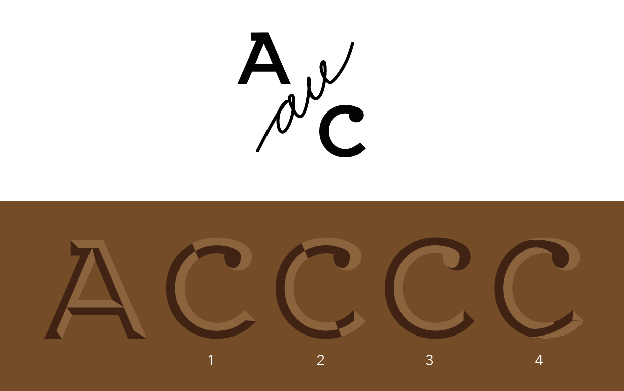
Sorry - this picture is better:

With the "A" I can understand how the light is hitting it, with the "C" I can't. You were maybe approaching that with #4, but the logic isn't consistent yet. I'd need to see the implied peak running through the spine of the letter for it to make sense.

Are they supposed to be inset (engraved) or outset (relief)? Judging from the shading on the A it appears outset (which is fine, as long as that's the effect you want).

With the C you seem to be having trouble visualizing which direction the light is shining from. Going by the A it seems to be shining from straight above (12 o'clock), so in that respect #1 is actually closest to the right track. But you need to rethink the transition of shading from one side of the curve to the other. Try starting with an angled transition as follows:

  • On the outside curve, a transition in the \ direction, from dark to light, with the inner end starting at about 7 o'clock.
  • On the inside curve a parallel transition from light to dark, with the inner end starting at about 11 o'clock.
  • The outside ends of these two angled transition should both hit the edge of the letter at 9 o'clock.
  • During this transition, the centre spine will be unmarked (invisible).

That'll give you the basic idea. Then you'll obviously want to tweak the angle of the transition so that it appears to reflect the curve of the letter (rather than being a straight line).

Light, shmight.

hhp

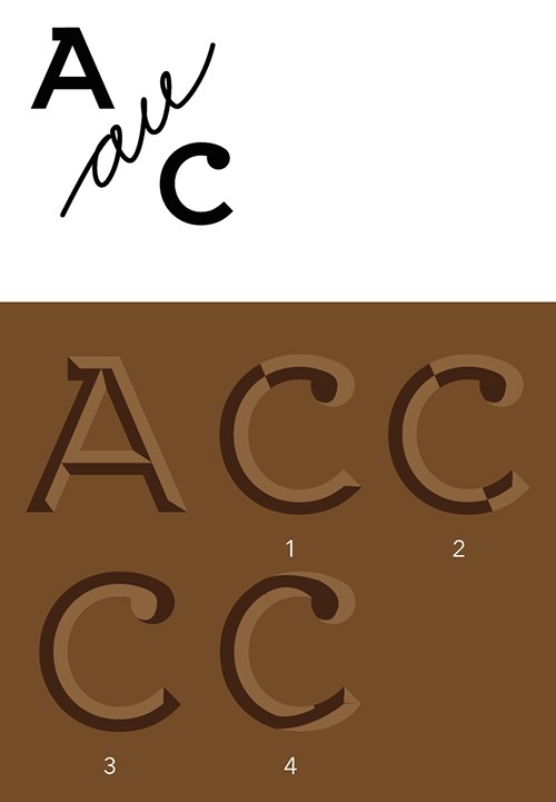
Your first one is close to how I would do it. I would also add a shadow in the ball terminal, like this:

I would also tend to do the shadow transitions on curves at 45 degrees. For this kind of effect, it tends to look better if the light is coming at a 45 degree angle, rather than straight vertically or horizontally. Those can work too, but you get less satisfying modeling of forms.

No matter how you flip it, I suspect the ball terminal will give you problems. Why not change it to a vertical serif?

Here are some references that may or may not help:

http://www.myfonts.com/fonts/castletype/shango-chiseled/
http://typophile.com/node/84573

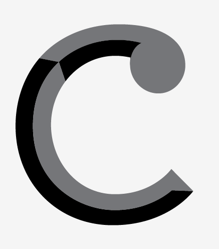
Here is what I would do:

Thank you all for contributing - and in such a thorough manner. I admire quite a few of you, so I'm flattered you would take time to look at this. I also like that you all have a different take on it - makes me think that the task isn't easy :)

@altsan - you're right: it actually does look outset. And I was in fact trying to do inset. Sadly, my lack of time and limited abilities will probably make me settle with this.

@Mark Simonson & @Frode Bo Helland:
I like both of your versions, and have drawn inspiration from both of them. Thanks a lot!

@Luma Vine: Thanks for the references - very helpful.

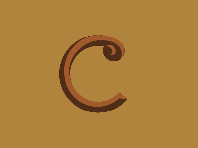
This is what I ended up with:

best regards
Mads

The two top-right curves are malformed - too flat.
Otherwise it looks great (to me).

hhp

Captured from web.archive.org on 20 Jul 2014. view this capture