Typophile

Number ligatures or address inspiration?

Luma Vine

I am working on a custom house number, and I am having trouble finding some interesting examples. Are there any neat examples of number ligatures? Or really anything that uses numbers in an interesting way beyond just interesting individual numbers combined. To be more specific, nothing too ornate, a kind of 1910s craftsman/foursquare/arts & crafts style. I was thinking of something that could be made as a single piece of material instead of mounting each number individually. Just looking for inspiration and ideas at this point.

Arts and crafts font figures look nice reversed on a dark plaque.
eg. P22 Dard Hunter, ITC Rennie Macintosh.
Paul Shaw's Kolo is more Art Nouveau.

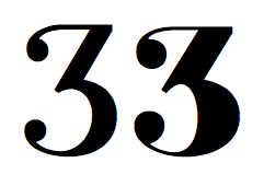
Old thread about numeral ligatures:
http://www.typophile.com/node/40401

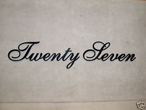
Despite my functionalist tendencies, I have always had a soft spot for house numbers that are spelled out in words.

Thanks! I don't think the spelled out script is right for this project, unfortunately. It needs to be a good bit less ornate to work with the architecture. Although it is not classic mission or prairie style, so something strictly Arts & Crafts proper is not necessary either. It is not really a historic restoration so being true to the era is a loose parameter. I really love those ligated numerals! That is the kind of thing I was thinking, but I didn't have quite the right search terms. There really are not many examples of that. I was looking at P22 Dard Hunter & ITC Rennie Macintosh, which do offer a good starting point. I was hoping to bring more specific designed relationships between the adjacent numbers than a font could afford, and ligatures was how I was thinking about creating that feel. Thanks for the responses! Off to sketching...

If you are sketching, you might refer to some sources on monograms for ideas, eg:
http://www.amazon.com/Monograms-Alphabetic-Devices-Pictorial-Archives/dp...
(Not all are as elaborate as those shown on the cover!—and note "Customers Who Also Bought" section.)

What is the sequence of digits in the house number?

Thanks Nick! Good thought, I will have a look.

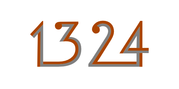
It's 1324. Some interesting relationships already.

Neutra Number was designed for building numbers. I read its white spaces as ligatures:


http://www.dwr.com/product/neutra-number-aluminum.do?gclid=COyD4pT91qoCF...

I hired John Downer to hand paint numbers for my house sign. The house has an Arts & Craft style exterior. The numerals on the sign are based on John's Iowan Oldstyle type, which fits nicely with the style of the house and gate, but we tested variations of weight and proportion to get the best legibility and impact when the sign is seen from the road.

John: Photos please? :)

If anyone is interested where the progress is on this project:

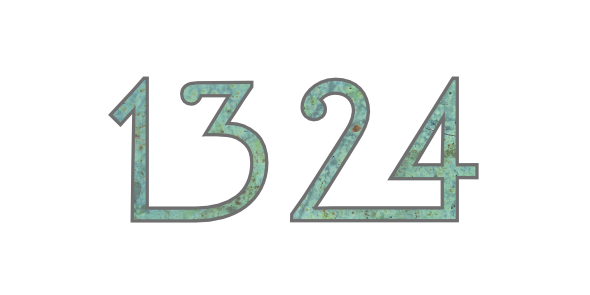
After some research and sketching, I arrived at the image below. Looking into copper with a tin edge, hence the texture on the image.

Nice!
But have you tested it for readability from a fast car? :-)

Thanks Nick! Your Bodoni Egyptian Pro was one inspiration, so thanks doubly! Now about that readability testing...

As a sidenote, I haven't found a face with a /3/ that has a flat top with a ball terminal - interesting.

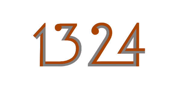
So here is how I am thinking of incorporating the two different metals:

As a sidenote, I haven't found a face with a /3/ that has a flat top with a ball terminal - interesting.

These do!

Nice!

Two different metals... A bi-metal number that can change shape as the temperature rises and falls! I love it!!!

:o)

(looks great)

I think the first number pair would read better if the top part of the 3 were larger and used more of the space.

Thanks for the comments! I made some changes based on your suggestions.

Not very relevant, but pretty. It’s from my friends farm.

Doing a search right now, but not having much luck. I worked with a client who bought Futura Serie which had a sweet set of osf but I appear to be finding dead and/or usless links. Strangely, many of them are throwing up a bunch or free stuff pop-ups. The 1 and 2 are particularly nice. Very close to Neutra Number but from a much larger family.

Regarding “single piece of material” any stencil type style would meet that criteria. Futura Stencil Black is pretty neat.

Check out where this project ended up: http://www.behance.net/gallery/1324/2070634

Thanks for all the comments I received. Hope you enjoy the final result!

Captured from web.archive.org on 20 Aug 2013. view this capture