Typophile

Questionnaire about the needs of Greek typography end-users

This thread ran to 9 pages of replies and only 7 were recovered, so replies are missing.

Tatiana Marza0 votes

BACKGROUND:
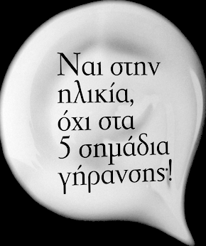
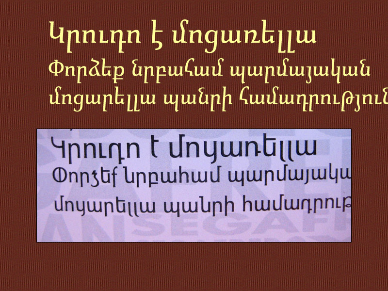
During the last few decades Greek typography has been strongly influenced by Latin elements. Often, there is substitution of Greek letters by Latin ones. A few designers try to preserve characteristic Greek typographic elements into their work, but overall Greek typography appears to trend towards Latin assimilation.

AIMS:
a) To define what constitutes Greek characteristics in a font,
b) To delineate the needs and problems faced by contemporary Greek typography end-users (graphic designers, book publishers of Greek texts, etc.)

EXPLORATORY QUESTIONS:
a) How do you define or how do you approach the issue of a Greek characteristic in a font?
b) What questions would you have for end-users of your fonts?
c) Why do you design Greek fonts?

P.S. The results of this study, including all information from font-designers and end-users, will be posted in this blog in the end of June.

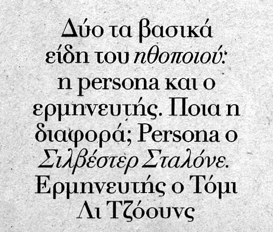
Could you provide some examples of what you mean by "substitution of Greek letters by Latin ones"?

This is my favorite topic (although not specifically about Greek, but Latinization in general) so I think you have chosen your thesis topic* very well. :-)

* http://typophile.com/node/99450

I intend to reply in detail soon, but in the meantime I would recommend reading my article "Latinization: Prevention and Cure" which has been published in two journals: Spatium #4 (2004) and Hyphen #5 (2005).

hhp

I am not a native speaker of Greek, so I cannot speak to the issue in a way useful to you. But I am curious about your findings.

My understanding of the situation is that Greek typography is weakly developed due to the long period of Turkish rule, when printing in the Greek language was suppressed.

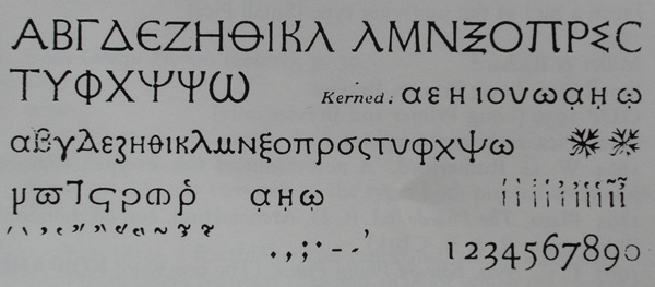
Thus, it came to be that most readily available Greek typefaces were designed in Latin alphabet nations for use in study of the New Testament or the classics - or for use in mathematical formulae. The latter application led to the infamous Porson typeface, long the standard for Greek, where the upper case was upright and very much like that of Latin, while the lower case was cursive... and italicized.

The upper and lower case of the Latin alphabet are based on a compounding of Roman capitals with the uncial script done at the behest of Charlemagne, but over hundreds of years, the two scripts achieved a unity and complementarity - for most categories of typeface, this process seems less far along in Greek.

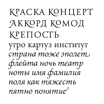
The Cyrillic alphabet, based on the Greek alphabet, of course, illustrates what a completely Latinized Greek script might look like. On the other hand, most of the typefaces designed to be based on authentic Greek sources are sans-serif - and the advantages of serifs for legibility are well-known.

So I suspect that typography in the Greek language faces many contradictions - and its difficulties, compared to the success of the Latin script, makes borrowing and assimilation a strong temptation.

Incidentally, I've seen the substitution of the Latin capital Y for the Greek Upsilon (Υ). The font used here does that! I suppose people could also use W for Omega, but I can't think of any other replacements (not counting digamma and qoph).

Hrant, I'm very glad to see your post here. Thank you for your contribution!

> To me calligraphy fails to promote -and in fact essentially opposes- functional or cultural progress in type design.<

I would be very interested in reading your point of view about this. Could you explain your statment, please?
If I understood correct, looking back to early Greek typography opresses the progress of Greek font design? (and I suppose you are speaking about the calligraphy of any other language)

The history of Greek typography reveals the big impact of byzantine scripts in the design of Greek fonts. While the latin typography evolved through a different path and always seemed modern. Based on which criteria could anyone desing a modern Greek font, but not using elements from calligraphic manuscripts?

I am not an expert at all, but it seems to me that some recent fonts have quite a contemporary look based on byzantine roots… What do you think?
See Maiola, Skolar, Colvert
http://rosettatype.com/index.php?action=carro/search_by_kw&kwId=3&kwName...
http://www.typographies.fr/uk/index.php?page=fontes&s=Colvert

Also, I see a preference in "calligraphic" Greek fonts which are more suitable for extended texts, because they have "fluidity", while the modern ones are static and "printed" rather than "written". Should we change our attitude towards letters? To accept that they are not written anymore, but designed on a computer?

< Could you provide some examples of what you mean by "substitution of Greek letters by Latin ones"?>

This is one of many examples:
Minion Pro retains the characteristics of each alphabet, while Tahoma obscures the difference (left - latin, right - greek)

I’m not quite sure about which end user you’re adressing, Tatiana. The reader? The typesetter?

It makes quite a difference wether you consider serifed faces or non-serifs. The more tricky and more interesting part is the serifes, of course.
– What about script faces, displays, blackletter?

Make sure you get hold of a copy of Viktor Scholderer’s Greek Printing Types, 1465-1927.
He himself tried out the third way of Hellenisation, as an possible alternative to Byzantinization and Romanisation. Worth consideration by all means.
My own Greek took me about five years to finish. I would describe it as modern-classical yet rather non-historic, not byzantine nor romanized.
My 2 cents.

Cheers to wonderful Saloniki :-)

I’m not quite sure about which end user you’re adressing, Tatiana. The reader? The typesetter?

You left out the book interior designer, or graphic designer, for small pieces. In the book world anyway, the interior designer is the person who selects all the typefaces used. Occasionally the author gets a voice. Occasionally too, the book designer will ask the typesetter for a recommendation, when they have selected a typeface for the text that does not have a companion Greek.

FWIW, in the past 33 years, I think I've set one book that used a sans for the Greek. From 1980 to the late 1990s, Porson Greek (Monotype) was far and away the preferred font for academic works (essentially in English, but with classical Greek passages). Thank God that has changed...

In any case, I imagine it is the www world to which you're really directing your question...

(a) I try to strike a balance between maintaining the conventional Greek letter forms, and respecting the thematic characteristics of the typeface.

(b) None. Type designers don’t do market research.
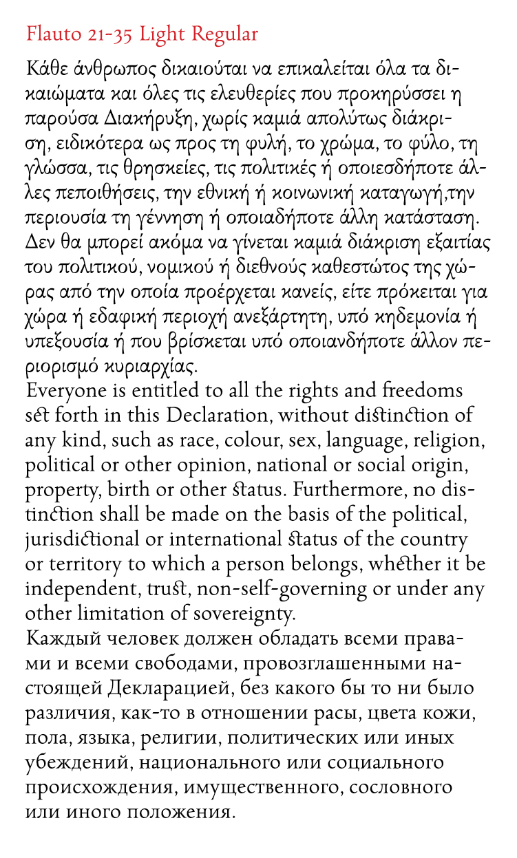
(c) Because Adobe has set a standard for OpenType fonts that includes both features and Pan-European language support, and because it interests me.
Hi -

years ago I had to get a strictly-in-house solution to the problem of mixed Roman/Greek/etc texts - that's why I cut my "MT Joanna Greek SIR" version – after studying above Viktor Scholderer’s Greek Printing Types, 1465-1927. This is a very first cut only and for strictly-in-house use only - I never thought about finishing - but here you can get my reformation of Greek type:
http://www.elbrecht.com/sir/SIRlandscape.pdf
http://www.elbrecht.com/sir/SIRportrait.pdf
Now the official Monotype Joanna Greek is out - but see for yourself…

HE

Due to the lack of time (less than 3 months), I will address my questionnaires only to graphic design studios, book publishers, Greek magazines, and I'll have to include the www world, because in one way or another they are all responsible for the chosen font people are reading daily.
A "usual reader", who is not accustomed to typography, cannot make the difference between a serif and a non serif font, he is more preoccupied with the legibility factor, so I cannot ask him technical and typographic questions.

< It makes quite a difference wether you consider serifed faces or non-serifs. The more tricky and more interesting part is the serifes, of course.
- What about script faces, diplays, blackletter?>

I would need some more specifications on this part, Andreas.
I'm just a graphic design student, not a typographer. I try to read as much as I can, but you are the experts :)
Please, correct me if I'm wrong, but I thought there are no blackletters in Greek type history…
Thank you!

> blackletters in Greek type …

Nick, may I ask why type designers don’t do market research? As graphic designers we were taught to think about our target group, because the final product will eventually reach them. Doesn't this apply to your sphere too?

Andreas, you've got great taste for sweets:)

I've been in Sachsen for a MotoGP show few years ago! I felt like a dwarf amongst German spectators, quite weird for a woman being there. Of course, I didn't remember anything from the show, so I had to watch it once more on TV :)

Now, on typography… I liked very much your font. And I'm sure, the polytonic form is a big advantage of it. There are still people who prefer polytonic fonts for literary text. Since last month I continuously discover new, great, Greek fonts… Maybe I was totally wrong about the latinization of Greek typography? May I ask what elements influenced your design?

Thank you for you time, Andreas.

"(b) None. Type designers don’t do market research."

I think that probably is true of most retail fonts, simply because the potential audience is so varied. In fact I'd guess we've all been through cases where you think that a font has a target market, but then it's picked up and used someplace completely different.

But that's not always true. I imagine that if you're designing a font for a specific product or brand, you'd do a lot of research into the market that that product plays in.

Andreas, I found some more examples of blackletters in Greek Typography. So, what about them? How could this letters be related to my research?

> great taste for sweets

actually, I have even more taste for other sweet things in life :-) like spicy type

But now, seriously. The decision to support the polytonic range of characters is not just meant to be an advantage, but is clearly aimed at a specific user group: scholars of the classics who just need this entire set. As far as I can tell, Andron Greek is used more outside Greece by editors and scholars than by Greek customers.
Latinization. This is one of the most fascinating topics in type, actually. (By the way, one can cross-flavour every script with whatsoever writing style, you can do a chinese-looking Latin or an Arabic-looking Cyrillic; a Chinese blackletter face has been done recently… so far the game of it.)
The greek minuscule got under Latin pressure over the last 15 years not only because there was some wishful mood of getting Greek ‘modernized’ – whatever this may imply. More than that we still see (and feel?) that the Latin and the Greek letters are basically identical. So the wish *to see either alphabet on the same level* seems natural. Not to forget that both capital alphabets co-exist as close kin without the medieval-age metamorphosis history of the minuscules, to the day.
So the Latin journey of Greek was inevitable. When I started to work on Andron Greek I thought “make it look like Latin” in order to get a harmonized overall appearance. (I never intended to stick to one of the historic models like Garamond or Didot Greek.) The result was perfect: you couldn’t even spot a few greek phrases interspearsed in a Latin text because the likeness was extreme. But then I learned – again: inevitably! – that my achievement was ‘too much of a good thing’, the Greekness got lost and that was just bad. So I reworked it, several times. And I went back the path from Greekness to Latinitas, step by step. I found an old review image of that process, versions A to D in time order:


As you see I came quite back home to Hellas with the latest version D. But I was still not convinced. Some details were now “too Greek” – no. Not too Greek but too cursive, too scripty. The more traditional reverse contrast pattern (lambda, chi) did not fit in. I now knew I wanted it not more Latin, but more smart. And I compiled another version (M) from the previous ones:

But still this was not the end. At least three more versions got tested.
After a year something very important happened: I was in Greece :-) (in Saloniki, actually). And I digged in the very life of Greek type: newspapers, shopfronts, the wonderful και, menus, even silly espresso cups.
When I was back I screwed up the font again and did those version which remained the valid one till today:

I know that the result does not convince everyone. But the font found its way into use and that tells me that the solution is a possible one.

postscriptum. Last year I enjoyed visiting Corfu. I learned that the island, although belonging to Greece and being populated by Greeks, is rather Italian by kind of its fauna and style of its architecture. I found this most remarkable.

The examples you’ve just posted are actually no blackletter, although the appearance is somewhat similar. But strip off the serifs and you get basically quite a normal capital style.

To provide some context for the comments that follow, here are samples of some Greek typefaces that I have created. Note that Gabriola is a display face, intended for larger sizes, and looks too light in the screenshot; note also that the heavy horizontals in the SBL Greek are due to rounding at this size and resolution. Click on the image for a zoomable and printable PDF version.

Hrant's intervention introduced 'calligraphy' into this discussion, but I would prefer to return to the framework of Tatiana's original query. I don't consider any of my Greek types 'calligraphic'. The one that might seem on first glance to most obviously display calligraphic characteristics -- the Gabriola display face -- is actually the one that I created with least reference to scribal models, even less, it might surprise to learn, than the Helvetica World Greek.

So, some comments on how I 'define or ... approach the issue of a Greek characteristic in a font':

I think Tatiana is correct to say that the history of Greek typography reveals the strong influence of the Byzantine scribal hands. It is not the only influence: one sees sometimes reference to archaic styles, especially in display typography, and the Complutensian and related pre-Aldine types saw revival in the 19th and 20th Centuries (ignoring for now the importation of styles from other scripts as in the blackletter and woodtype examples shown in this thread). Overall, though, the Byzantine style has been the dominant influence, but not simply in terms of its most obvious historical stylistic aspects: intensive ligation and contraction, cursiveness, varying contrast patterns, etc., which frequently blind people to its most lasting influence. It is within this style that the Greek lowercase letters came into existence and persist in being written up to and through the introduction of type and print publishing. So it is entirely ordinary that it should have become the dominant model, just as the relatively unligated, formal and more regularised humanist book hand should have become the dominant model for Latin type: typography pretty much everywhere picks up whatever is the main scribal book hand of the day and runs with it.

When I am designing type, I'm generally thinking mostly about structure and texture rather than style. So the questions I ask myself are not about what consitute 'Greek characteristics' but about the structure of Greek letters and how these create a particular texture on the page that I associate with 'Greekness'.

In 2003, I designed the Constantia family for Microsoft, which was the last time I tried to harmonise Greek and Latin designs through stroke contrast pattern. There were a few reasons for this, one of which was that the ClearType rendering environment for which the types were designed is much more forgiving of thin horizontals and thick verticals than vice versa. At the same time, there are some Latinised contrast patterns in the Greek lowercase that I really find totally unconvincing -- too far removed from the historical evolution of the letter shapes --, so in Constantia there is a mix of contrast patterns (compare pattern of ο with that of π and τ; note pattern of λ). As I say, it is the last time I tried this approach, and Constantia Greek is my least favourite of my Greek designs (at least, of the ones I can still bear to look at). After the experience, I was left convinced that the shapes of the Greek lowercase letters, evolved through the Byzantine scribal model and its 350+ year typographic expression, naturally carry the pattern resulting from a more steeply held writing implement, and that this contributes massively to the Greekness of the texture on the page.

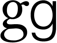
Around the same time as the Constantia project, I began work on the SBL Greek type for the Society of Biblical Literature, and used the opportunity to renew study of Robert Granjon's Greek types, which I had earlier used as a model for the uncompleted, heavily-ligatured Clio type shown at the first ICTVC conference in Thessaloniki. For SBL Greek, I ditched all but two of the ligatures (γγ and λλ, which have become a feature of most of my Greek types), but stuck very closely to scribal letter shapes and proportions, and the variable contrast pattern. One of the personal goals of the project was to get a better sense of how much of the texture of Byzantine manuscript and Renaissance print pages was the result of the ligation and contraction, and how much was the result of the lettershapes and contrast patterns. My conclusion -- also confirmed by my experience with lots of other writing systems -- is that texture is built up from layers of characteristics, beginning with relative proportions and letter frequencies, then stroke contrast patterns, and that these, before the influence of particular weights and styles, contribute to what I think of as the 'feel' of a particular script on the page. The observable qualities that constitute Greekness in both a heavily ligated page of Aldine, Grecs du Roi or Granjon types of the Renaissance and a mostly unligated Foulis Press edition of the 19th Century are the product of structure and contrast pattern.

As I wrote above, Gabriola is superficially 'calligraphic' in style -- which is to say that someone who doesn't know much about Greek calligraphy is likely to identify it as such --, but unlike the SBL Greek is not derived from a scribal model. The Gabriola Greek, because it doesn't include the same level of ornamentation options as the Latin and Cyrillic, includes a compensatory of ligatures to enliven things. But these are all what I think of as tying ligatures, i.e. in which the shapes of the underlying letters are not modified significantly, only linked to each other.

[This relates back to my study of the Granjon types, in which I classified Renaissance Greek ligatures into two kinds: connecting and morphographic. The three pages of this PDF show the same passage in the Clio type with, respectively, no ligatures, connecting ligatures, and both connecting and morphographic ligatures. In general, connecting ligatures present no problem for modern Greek readers, since the basic letter shapes are easily recognised; many of the morphographic ligatures from the Byzantine/Renaissance tradition present considerable problems, as a straw poll taken at the first ICTVC conference confirmed.]

As with the Latin and Cyrillic, the Gabriola Greek explores what happens to structure and texture when lettershapes traditionally associated with a translation stroke model are instead made with an expansion stroke model.

Gabriola is a display face, so shouldn't be taken as directly representing any ideas I have about Greek text types (even though we hinted it so that it bears up remarkably well at text sizes on screen (better than in print)). However, when I came to design the new Greek type for the academic publisher Brill, I made use of many of the same decisions that I had employed in Gabriola. My point of departure in this case, though, was the Didot Greek types of the 18th Century, which were informed by the dynamics of the contemporary split nib, and are the basis, via Monotype 90, for the famous απλά, i.e. simple or normal, style of Greek literary publishing. The Brill Greeks represent a regularisation and softening of the stroke contrast of the Didot types, maintaining the traditional Byzantine patterns but applying them to less cursive, more formal and upright structures. For comparison, here is a characteristic Didot Greek -- from Firmin Didot's 1828 edition of L'Iliade d'Homère -- shown above the Brill Greek regular and bold (obviously I've got very different ideas about wordspacing!):

It's been very gratifying to see the Brill Greek in frequent use in Brill publications, and to note among other things that it harmonises incredibly well with the Brill Latin, despite a completely different ductus and contrast pattern. This confirms again something that I discussed during my Beatrice Warde Memorial lecture Same Difference [some corruptions in that PDF resulting in missing characters] at St Brides a few years ago: cross-script harmony is firstly and most importantly a matter of weight and proportion, rather than of ductus and contrast pattern. It is possible to elegantly harmonise two different writing systems together on a page without forcing either into the dress of the other. It is possible for both to display their characteristics textures on the page and still harmonise. Indeed, to take the notion of harmony back to its musical origins, it is possible for the two voices to produce beautiful harmony without one trying to sound like the other.

Finally, a word on the earliest of my Greek designs shown here, the Helvetica World Greek that I designed for Linotype at the beginning of the millennium. See also this comparison of the design -- here under its earlier name Helvetica Linotype -- with Matthew Carter's original Helvetica Greek from the 1970s. Some people, especially at the time of the release of Helvetica World, interpreted my design in terms of ideas about correct and incorrect ways to design Greek types, especially sans serif types, which I suppose relates directly to Tatiana's questions. I was bemused to find that I had both champions and critics in Greece, and there were references to the 'Hudson way' as something to be emulated or disavowed. As time has passed, I've tried to get away from that interpretation, and one of the things that I find interesting about the project is that it shows how much designing an extension of an existing typeface for a new script is like a work of literary translation: more than one translation is possible, and each is likely to respond to different aspects of the original. The original Helvetica Greek reflects the contemporary associations of Helvetica with internationalism, standardisation and, it must be said, westernisation; the Helvetica World design reflects my interest in the relationship of the mid-20th Century Swiss/German grotesk to the structures of 18th Century romantic types (esp. Didot and Walbaum). So my Helvetica World Greek is thematically related to my most recent, Brill Greek, although one might not guess so from a simple comparison.

So that's a longish answer to Tatiana's question (a).

I'll give some thoughts to the other questions and try to respond in shorter manner.

Just a short comment:
In my own designs i try to transport the ›feel‹ of the Latin forms into the Greek script. The latter follows the traditional Greek writing not too close but still visible. So, my aim is to make it harmonize with Latin but still being its own script. The structure and movement of the Greek script is clearly different to the Latin lowercase alphabet. It would look wrong if you’d latinize it.
I followed a more latinized approach for a geometric sanserif i did in commission for a large corporation. But there (similar to John Hudson’s Helvetica World approach) the typeface was intended more for display use.

My Dear Typophiles, I am more than grateful for your contributions. You provide me precious information and I want to tell you a big THANK YOU!

P.S. the images of your designed Greek fonts and the process of their design are very useful. Also, the extended explanatory text doesn't bother me, vice versa.

Well -

with all these Brave New Greek fonts available now - I still stick to what Eric Gill wrote on Greek in his 19[30/]36 'An Essay on Typography':
http://www.elbrecht.com/sir/Gill'n'Greek.pdf

HE

What Gill knew about Greek would fit on the head of a pin. His comment that '...the leaders of typographic design in the fifteenth century never achieved for Greek what they did for Latin and modern languages' shows just how poor is his knowledge and superficial his analysis. In fact, the typographers of the 15th Century starting with Aldus achieved for Greek exactly what they achieved for Latin, i.e. the translation into type of the standard scribal book hand of the day. And although this cursive style became the dominant mode of typographic Greek, it wasn't the only mode and the non-cursive Greeks of the 15th Century all point to more fruitful directions in Greek type design -- as Scholderer demonstrated -- than Gill's embarrassing Perpetua Greek, whose only redeeming feature is that no one ever used it.

The thing that I find remarkable about Gill and Van Krimpen and others who set out to deliberately Latinise the Greek script -- whether they used that term or simply talk in terms of 'modernising' or 'formalising' --, is that they end up producing stiff, clumsy and lifeless forms that do not combine well, of a kind that they would never accept in their Latin type designs. It is as if they abandoned all their knowledge about what makes a typeface work, ignoring all that they knew from Latin script even as they try to 'Latinise' the Greek. So when Gill writes that 'Just as the capitals of the Perpetua Greek are of precisely the same family as the Perpetua Roman, so the Perpetua Greek lower-case is of the same family as the Perpetua Roman lower-case', my response is 'No. It isn't. The Perpetua Latin lowercase has life and elegance, and pleasing curves, and nice proportions that make the letters combine well into words. The Perpetua Greek has none of these characteristics.'

> More than that we still see (and feel?) that the Latin and the Greek letters are basically identical. So the wish *to see either alphabet on the same level* seems natural.

In his book,"The history of Greek script", Antonios Sigalas (Ιστορία της ελληνικής γραφής, Αντώνιος Σιγάλας - I'm afraid is available only in Greek), shows how the handwriting of Latin and Greek languages at one point (first centuries AD) were so mixed, that with difficulty anyone could distinguish them. But this was due to social evolutions of Roman Empire, where Greek and Roman children were exposed to similar educational system, so the handwriting (dimotiki) on wax tablets was resembling, he says.
Despite this, through time, when Greek minuscule appeared (around 9th century AD) the letters distinguished themselves from Latin ones (because the Capitals of two alphabets had similarities and differences). [When someone tries to write fast, different alterations appear in letter forms, not to mention the natural conversion of upper to lower case. Try for yourself to write 'Γ' and then a very quick gamma, which will evolve steadily to 'γ'].
Aldus Manutius may be criticisezed for "negative influence", but in one way his printings preserved the characteristics of Greek letters and thus influenced greek typography for quite a long period. The lack of political and economic stability in Greece for few centuries (Ottoman rulling, revolution of 1821, WW1, WW2, again revolution, Hounda) didn't give the opportunity to the Greek type to flourish, as Latin did. Maybe this is an explanation why latin fonts always seemed more modern than greek and eventually dictated the style of contemporary fonts.

And at this point I will have the (naive?!) courage to put in discussion a relation of the following theory to Latinization: that people tend to be more open to things that they are most used to, because they feel more "comfortable", safe.
How is this related to Latinization?
Lately, my friends are asking me what project I am doing and I tell them that I found (yes, I too wasn't aware of it) a fenomenon concerning typography - latinization of greek alphabet. And they are all surprised that something like this exists, because is not easily perceived by society.
Latinization was introduced day by day into Greek typography. The reader was getting used to the micro changes and could not see the image from another point of view, except of typographers, graphic designers etc. But you see, the released typefaces were read by all Greek speakers and not only. Unconsciously, they accepted what they were served for dinner.

Let's see, hoω εαsγ γου cαη rεαδ τhις τεχτ?

If a English speaker is exposed for centuries to this king of metamorphosis of letters (which would occur with minor changes step by step), some day he will get used to it.
As Matthew Carter underlines (From tablets to pixels, [1996]," Which came first, the Greeks or the Romans?" ), every epoch has its specific demands and people are exposed to different typographical approaches.

It would be irattional to ask from a Greek to read today the complicated word "para- παρά" (see the image, up center) and from an English - "que" and "pre", says Carter. Even if these were the most common ligatures of the past when people could easily read them!

For me, there are some key points here:
1) Today, latin alphabet can be read everywere, in almost every society. Population is accustomed to it and as result, the phenomenon of latinization is unconsciously accepted.
2) The written forms of an alphabet is a cultural heritage, is the identity of every nation and social group. Aknowledge and education can prevent the Latinization process.
3) Even if we all agree that Latinization is a logical process of letter evolution, can you imagine universal type in 100 years? It will be all the same, no difference between latin, arabic, greek, thai, armenian, etc. Quite boring… and at some point, the return to roots will be inevitabile, I suppose. (I'm waiting for Hrant's :) critique about this)

So, I'm asking Andreas, "the wish *to see either alphabet on the same level* seems natural", is a intuitional statement or a unconsciously perspective directed from specific groups?

P.S.
1) John, thank you for the comments about Gill! :)
2) Soon I will reply to other comments - specifically reffering to what I found about the "characteristics of Greek letters"
3) did you know that in ancient times the fathers were obliged to educate their sons, otherwise they weren't entitled to ask for support and care when they would become old?

Please, correct me if I’m wrong, but I thought there are no blackletters in Greek type history…

For your collection, Tatiana.

Maxim, I was carried away by the information of Klimi Mastoridi that there are no blackletters in Greek as there were in Latin script. I think he meant that Greeks never used blackletters to write, albeit for some logos, as the images posted here.

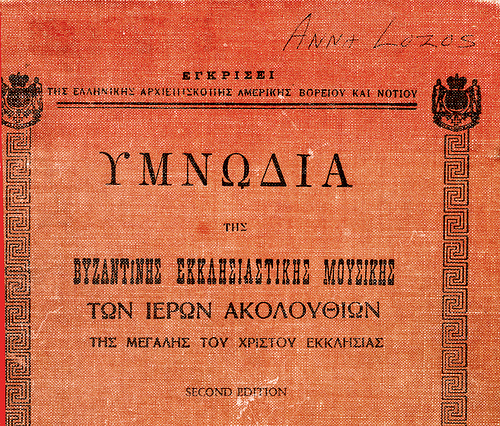
In any case, that Greek newspaper name came from a Greek-language newspaper published in New York City, surounded by Latin-alphabet users who thought that blackletter was the only style of printing suitable for a newspaper masthead - this was true until some time during the 1960s.

Early written Greek is almost indistinguishable from Phoenician, so one could argue that an authentic "modern" Greek ought to look like... Hebrew, with almost as much validity as to claim, on that ground, that it should look like Latin.

Although I have no love for Gill, or his Latinized Greek face, I do think that the comments quoted do have a bit of validity - Greek lowercase and Greek uppercase are not harmonized; Greek lowercase essentially only exists in a cursive form, and so doesn't match non-cursive uppercase.

The cure, though, is not to ape a Latin, Cyrillic, or even Armenian model. This will continue to prompt much experimentation by Greek type designers, and perhaps eventually the popular taste will favor some particular style. But this isn't a problem that can be "solved" overnight.

It can even be argued that this is not necessarily a problem, since it doesn't affect legibility or readability in a serious manner; the Greeks can read their own printed material just fine, even if it does not quite meet an aesthetic canon of foreigners. (Note, incidentally, that this may also suggest that the solution lies in making the capitals match the lowercase better, instead of the other way around - which Latin-script outsiders would favor, since they relate well to the capitals as they are.)

It would be irattional to ask from a Greek to read today the complicated word "para- παρά" (see the image, up center) and from an English - "que" and "pre", says Carter. Even if these were the most common ligatures of the past when people could easily read them!

The ꝓ (p with left-side hook) may be read as an abbreviation for pr, not always pre -- what came after the abbreviation would determine the reading --, but the point about the challenge for modern readers is the same. I think it is worth noting, though, that while the Greek παρα ligature is graphically more complex than the Latin abbreviations, it is decipherable because the underlying letter shapes and their order can be discerned in it (the Latin abbreviations cannot be deciphered from their shape, and one has to learn their meaning in order to read them). This is true of very many of the Greek ligatures, although some make use of neglected variant letter shapes, as in this γγ ligature

and a few obscure one or more of the underlying letter shapes almost completely, as in these επι and ος ligatures

[In my researches on Byzantine ligatures, I found that the letter ε was most frequently subject to shape change in ligation. There are some ligatures in which it is indistinguishable from ϲ (lunate sigma) and some in which it is reduced to a small curved stroke.]

As I tried to suggest in my long comment, I think the role of ligatures in terms of the characteristics of the Greek minuscule is easily overstated and can be a red herring -- as the free variant elaborations of the Arabic naskh style can be -- distracting attention from what contributes most to the characteristic texture of Greek on the page regardless of the presence, absence or number of ligatures employed. This, I maintain, is primarily the steep stroke contrast pattern and the letter structures that evolved from that model.

Since I mentioned Arabic, I'll point out that my review of Byzantine manuscripts led me to conclude that no rules existed for where and when particular ligatures or variant forms were used in Greek. So, unlike much of the letter shape modification and joining behaviour in Arabic, which is graphotactical (representing an aspect of a consistent script grammar), the Greek ligatures are free variants, whose use is a matter of personal preference or, sometimes, text fitting. With regard to the latter, it is interesting to note that Granjon's smaller sizes of Greek type include more ligatures than his larger fonts, and when one sees these small types used in marginalia and footnotes one can appreciate the space-saving value of many of these ligatures.
_____

Greek lowercase and Greek uppercase are not harmonized; Greek lowercase essentially only exists in a cursive form, and so doesn't match non-cursive uppercase.

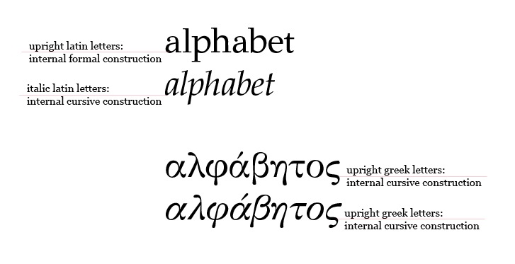
I'd like to be careful in the use of terminology here, just to be clear what we are talking about. The term cursive can mean running in the sense of connected letters, which is clearly not what we're limited to talking about when it comes to Greek (indeed, in this sense the Byzantine manuscript style is at most semi-cursive). But if we apply the term to the internal construction of individual letters, then yes, the dominant model of Greek minuscule is cursive, i.e. the pen is not lifted in the writing of most letters, but instead strokes are reversed or turned to form transitions, as is the case with the humanist italic letters.

The relationship of Greek uppercase and lowercase letters is indeed complicated by their separate histories, although I think it is wrong to say that they are inherently 'not harmonised'. Better to say that they are a challenge to harmonise or, even more simply, that they do not harmonise in the same ways that Latin upper- and lowercase harmonise. The same can be said of Latin italic upper- and lowercase -- for exactly the same reason: uppercase letters with interrupted construction and lowercase letters with cursive construction --, and yet that doesn't prevent these being accepted as paired alphabets.

Who was the first person to pair Greek upper- and lowercase letters as a true bicameral system? Tatiana, is this something that Antonios Sigalas discusses? My impression is that this was either a typographic innovation or, at least, contemporary with the introduction of printing. Byzantine manuscripts are mostly unicameral, employing only lowercase letters. Uppercase forms are found occasionally in them, but mostly as initials at the beginnings of sections or paragraphs, and not used systematically within the text.

Another thing to point out about cursive construction is that while in Latin script it is associated with the informal (quickly written) scribal hands that lead to the italic style of typography, it is only one of the characteristics of such hands, and isn't necessarily linked to informality. Slant and horizontal compression are other characteristics of informal hands, and while these are characteristic of the late Byzantine manuscript styles on which Aldus based his Greek types, there are plentiful examples of more formal Bzyantine manuscripts hands with broad and upright letters. The cursive letter construction is still the norm, i.e. pen lifts are minimised, and many letters are still joined in ligatures, but the overall impression on the page is much more formal and quite different from the Aldine style.

This article on the library at Vatopaidi has some nice examples. [Right click on the images to view them at larger size.]

I was carried away by the information of Klimi Mastoridi that there are no blackletters in Greek as there were in Latin script. I think he meant that Greeks never used blackletters to write, albeit for some logos, as the images posted here.

Are you sure there were no Greek blackletter-style typefaces in the 19th century? I thought that Greek typography of the 19th century was as influenced and inspired by the Romanticist movement as was its Russian sister. This is an example of a Cyrillic (Russian) blackletter, dated 1862:

And, sure enough, there were many attempts at applying the ‘Gothic’ style to Russian penmanship. This is a page from a copybook of 1902, by Semen Volchenok, showing a ‘Russian Gothic ABC’:

Another good example is this title page (or cover) of the first edition of Gogol’s Dead Souls (1842)—designed by Gogol himself: blackletter is used for the words Н. Гоголя.

Cyrillic blackletter was discussed on this list four years ago.

Maxim, I can't say for sure whether any Greek blackletter types were produced in the 19th Century, but because of the circumstances of the Greek war of independence the association with Romanticism was linked to the latter's neo-classical rather than gothic expressions. It's no surprise that the foreign Romantic most closely associated with Greece was the most classical of the English Romantic poets, Byron, and the Greek revolutionaries deliberately emphasised a connection with classical Greece to garner support from western artists and intellectuals raised on Sophocles, Aristotle and Homer.

The Cyrillic blackletters are wonderfully weird, though!

> Andreas, "the wish *to see either alphabet on the same level* seems natural", is a intuitional statement or a unconsciously perspective directed from specific groups?

I can’t say. But I guess, intuition does play a part in this.

Actually, this whole matter could well be a subject for field study. Which font designer decided when and how about it, favoring the one or the other way? Which magazin designer choose what and why for body copy of a Greek/English journal – ? What considerations led the CI designers of a bank make their decisions about fonts? And so on …

I wondered much about things like this:

My Dear Typophiles,
As I mentioned earlier, due to the lack of time, I have to send the questionnaires as soon as possible (during the next days) to the end-users of Greek fonts. If you have any information you would like to elicit from them, meaning answering to my initial question:
b) What questions would you have for end-users of your fonts?
please, post them soon, so I could include them into the questionnaire.

Thank you!

PS. because I have to finish the questionnaire part of my project,please, give me a little bit more time to answer to your questions posted lately

Tatiana, how are you defining 'end-users of Greek fonts'?

I presume from your location that you are thinking of end-users in terms of native Greek users. But one of the distinctive aspects of Greek script typography -- thanks to the classical heritage and early Christian heritage -- is that there is a very considerable user base that is outside of Greece and not made up of native readers.

@John Hudson:
But one of the distinctive aspects of Greek script typography -- thanks to the classical heritage and early Christian heritage -- is that there is a very considerable user base that is outside of Greece and not made up of native readers.

An edition of the classics in the original, for use of students, or even a book of mathematics, can be a thing of typographic beauty. I don't dispute this.

But native speakers of a language have certain special requirements - high, effortless readability; naturalness; and a valid aesthetic sensibility fitting with their cultural context - that non-native speakers do not. And, as I've noted, for historical reasons, the evolution of Greek typography has only been in the hands of native speakers for a relatively short time.

So investigations concentrating on locating possible unmet needs of native speakers of Greek are legitimate and important, and setting non-native use of Greek typefaces aside from consideration is not arbitrary, as you seem to be suggesting.

I didn't mean to suggest anything of the sort. I was just pointing out that the phrase 'end-users of Greek fonts' may be misleading or, at least, is very vague, because there are very different end-user groups. It should also be noted, of course, that there are different kinds of users within Greece, also with quite different needs (just as there is no uniform body of 'end users of Latin fonts'). People who only work with monotonic texts don't have the same needs as publishers working with polytonic text. Packaging designers don't have the same needs as editorial designers. So I think my question to Tatiana about how she is defining the end-users of Greek fonts for the purpose of her project as a valid one. Related to this question of who the users are, of course, is how she is planning to get her questionnaire to these users, and how she will correlate results. Nativeness in itself isn't a terribly interesting qualification -- and I'm not talking now just about Greek, but about any script --; what is much more interesting and important is knowing what sort of work a person is doing and what sorts of fonts that work involves. In order for information flowing from users to be useful, it is necessary to have some idea of who they are and, hence, the context of the comments. These days, of course, anyone who uses is a computer is an 'end-user of fonts', but I presume Tatiana won't be handing our her questionnaire on street corners. I presume she has some plan to garner responses from, say, graphic designers, maybe publishers, probably students and maybe their teachers, since they're often easiest to involve in such things. How broad will the response base be? How representative? What user groups are likely to be under-represented or perhaps not represented at all?

By the way, I recommend to you Konstantine Staikos' _Charta of Greek Printing_ which documents the important role of native Greek speakers in the evolution of Greek publishing and typography.

@John Hudson:
I didn't mean to suggest anything of the sort.

Nativeness in itself isn't a terribly interesting qualification -- and I'm not talking now just about Greek, but about any script --; what is much more interesting and important is knowing what sort of work a person is doing and what sorts of fonts that work involves.

You could be seen as contradicting yourself. But you're right that nativeness in itself has no meaning, and I'm also willing to accept that you had not intentionally been grinding a political ax.

It's just that it's obvious to me that the use of a typeface for reading text in a language with which one is fully conversant is an important use, and that different cultures have their own aesthetic sensibilities.

John, Andreas asked me from the beginning what I meant by end - user:

> Due to the lack of time (less than 3 months), I will address my questionnaires only to graphic design studios, book publishers, Greek magazines, and I'll have to include the www world, because in one way or another they are all responsible for the chosen font people are reading daily.

I will send the questionnaires via emails. It's the most quick way of communication. And of course, the results will be grouped by specialty, i.e. book designers, magazine designers, package designers, web designers and so on, information which will be provided by them. As you see, I have a lot of work to do.

To be sincere, I am so interested in this topic, that outside the boundaries of my university project, I would like to continue it and expand as possible. I do see a logic in questioning the non-native Greeks and also the 'ordinary' population of Greece (and yes, I will have to stand in the middle of streets to question them). But I intend to do this after June, because this involves different questionnaires and as you all understand, much more time, which I don't have now…

As for your recommendation of Konstantine Staikos' _Charta of Greek Printing, I am glad to hear that it exists in English too. It's one of first books I bought. Also, a very great book belongs to George D. Matthiopoulos - Anthology of Greek Typography.

Tatiana: why no ad agencies on your list?

Tatiana, I didn't note your earlier response to Andreas. Thanks for explaining your process in more detail. It seems a good approach.

Here are some questions that occur to me:

1. How would you estimate (percentage) the amount of monotonic and polytonic text you work with?

2. Whether you work with polytonic text personally or not, how important do you consider it for a Greek text type to include polytonic support?

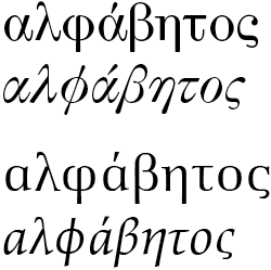
3. Greek italic types tend to be less differentiated from their upright styles than is the case with Latin fonts; sometimes slant is the only distinguishing characteristic. Do you find this sufficient, or do you wish for more differentiation, e.g. variant forms of some letters or different stroke patterns?

4. Apart from upright and italic styles, what other features do you most want to have in a Greek font family? Additional weights (which?), true smallcaps, true superior letters (uppercase? lowercase?), or something else? If you want it all, how would you rank these things in importance?

5. Some types evoke particular associations, e.g. 'classic' or 'modern', 'reserved' or 'friendly', etc.. These associations are subjective and seldom precise, but they are conventionally recognised. When you think about available Greek types, what associations do you wish were better represented? For example, do you wish there were more 'fun' Greek types, or perhaps more 'elegant' ones?
_____

Also, a very great book belongs to George D. Matthiopoulos - Anthology of Greek Typography.

This is indeed a very good resource. One of the most interesting things I noted when leafing through this book is just how late it became a standard for tone and breathing marks to be set to the left of uppercase letters.

NICK, thank you!
For some reason my brain overlooked this part of "shared pie". But, you know, in Greece is quite usual a graphic design studio to do all kind of work, from adv, web design, package, photography... I'll check about ad agencies, in order to include them as a separate group.

JOHN, great thoughts!
Can you give me some explanations on your questions, please? Forgive me my lack of knowledge, please.

question nr.3:
what does 'slant' mean in typography, esp. in a Greek font?

question nr.4:
>true smallcaps, true superior letters (uppercase? lowercase?)? <
I know about smallcaps, but not of true smallcaps and true superior letters. Any font which would have all this, so I could see them for myself?

I like your question nr. 5. I'm going to correlate it with a psychological question and will have some interesting results:)

Also, I included a question about serif and non serif fonts:
for the new designed Greek fonts, what percentage you would prefer to be serif and what percentage non serif?

Have you noticed that except of one font, the others designed and posted by all of you here are serif?
Do you have a inclination for serif? Or is a demand factor?

> One of the most interesting things I noted when leafing through this book is just how late it became a standard for tone and breathing marks to be set to the left of uppercase letters.<

You are right! There was a switch from right to left. Also, a middle version, see images (Anthology of Greek Typography) 258 - up, 259 (if it corresponds to English version). I didn't notice it. For some reason, the tone in uppercase letters bother me so much optically, so I excluded this information... Not wise at all! But, the middle version is quite great, by the way. How are you designing them now?

From an unreliable source, I found that these marks were inserted (again) during Roman Empire, as to say, for foreigners, in order to know how to pronounce Greek words. Because, for a Greek person they are almost useless (concerning the uppercase letters).

what does 'slant' mean in typography, esp. in a Greek font?

Oblique angle off the vertical. So italic letters generally slant (lean) to the right.

In Latin script, the upright (roman) lowercase letters follow a formal construction model, i.e. if you were to write them with a pen, you would often lift the pen and put it back down on the page while writing many of the individual letters, but the italic letters follow a cursive construction model in which the pen stays in contact with the page much more, reversing direction to create new strokes rather than being lifted. As discussed earlier in this thread, the Greek lowercase letters have a cursive internal construction, which means that this distinction doesn't naturally exist between upright and italic styles for most Greek types. So often the only distinction between upright and italic is the slant to the right.

I know about smallcaps, but not of true smallcaps and true superior letters. Any font which would have all this, so I could see them for myself?

'True smallcaps' is a term often used to refer to designed smallcap glyphs in a font, these days typically accessed via OpenType Layout features, as distinct from fake smallcaps that have been mechanically produced by software (by scaling down and/or distorting regular caps). The same thing applies to superior letters (and numerals): these can either be designed glyphs in the font or are faked by software. In Latin fonts, it is now quite common to have a full set of lowercase superior letter glyphs in addition to a full set of superior (and inferior) numerals. When I've made fonts for scholars such as the SBL Greek or the new Brill types, I've been asked to include full upper- and lowercase Greek superior letter sets, because these are fairly frequently used in the apparatus (textual footnotes) of critical editions. This is what they look like in the Brill roman font:

What I am wondering is whether users in Greece have a need for superior letters.

Do you have a inclination for serif? Or is a demand factor?

I make custom fonts according to briefs from a client, so it just happens that most of my clients for Greek type design have wanted serif text faces. I designed another sans serif Greek, a corporate type for Heidelberg Druckmaschinen produced by Linotype (the Latin art directed by Erik Spiekermann and based on News Gothic):

_____

With regard to accent position, in almost all types I position them to the left of the uppercase letters (excepting the dialytika of course), because for better or worse that is now the accepted standard and I think most Greek readers would think it strange to see them anywhere else. But recently I made a typeface for the Dumbarton Oaks Research Library and Collection, which is one of the world's most important holdings of Byzantine seals and coins. That font represents the wide variety of uncial forms that Greek letters took during the Byzantine Empire, so that scholars can transcribe the appearance of text on particular coins and seals. One of the things we determined when planning that project was that in the Byzantine uncial the accents were always written above the letters, not to the right or left. One sees this also in ikons and mosaics.

Here are some samples of that Greek (and Latin) typeface for seal and coin scholars. I suppose it too might be thought of as a kind of sans serif.

This may be an aside for the diacriticals, and the author (Nick Nicholas) may or may not be wrong in some detail (I have no expertise to judge), but lacking anything else, I've used it for years whenever someone gets huffy about the proper περισπωμένη (perispomeni). Happens once every couple years...

There is also some discussion about what was done by Greek scribes, and by later, esp. British type founders.

http://www.tlg.uci.edu/~opoudjis/unicode/gkdiacritics.html

Nick Nicholas' site has not be updated in a while (newer fonts are not listed), but that hardly matters since it is such a wealth of really solid information. I've made a lot of use of it over the years, and have also corresponded with him.

Regarding the perispomeni, in SBL Greek I used an asymmetrical tilde form, because that was representative of the renaissance types that were my primary inspiration. In the Brill Greek I used the inverted breve form, and would be inclined to do so in any new font. I now wish I had done so in the Gabriola type, although the swung tilde there works nicely with the subtle lean of the letters. The Athena Ruby font for sigillography and numismatics uses the inverted breve of course, since that is the form used in the Byzantine seals and coins.

MAXIM,
I couldn't find any blackletters in the Greek script. I suppose they were used only for logos.

for JOHN:
First,
thank you for the detailed explanations! :)
Second,
>Who was the first person to pair Greek upper- and lower case letters as a true bicameral system? Tatiana, is this something that Antonios Sigalas discusses?<

I was looking for days in my books, and it seems that Greek bicameral system was introduced after Gutenberg, and not by every publisher/punch cutter. Sigalas doesn't discuss about it and I could deduct this information only from images. Also, I noticed that for codexes, up till year 1645, there is no bicameral system, only occasionally uses of upper letters, as you mentioned. So, is a 'typographic' innovation.

Do you know if the same happened to Latin? Or the bicameral system was introduced already in hand written texts before Gutenberg?

I was reflecting about one of the characteristics of Greek letters, and I found some interesting images for Typophile's collection (as the images appear, 215 AD, 8th century AD, 1060 AD, 1079 AD, 1305 AD)

for image 221 (the last): the first words are "ά]γωνισώμεθα΄χαλεπόν γάρ ".
Note that the ni "ν" in the word ά]γωνισώμεθα and χαλεπόν resembles a lot to "μ". And there are more examples of this kind.

WHAT MAKES A GREEK LETTER LOOK GREEK:

- ascenders and descenders (which are more in number in Greek alphabet than in Latin). If you cut them as much as possible, the result will be latinization of font

- another way to emphasize the Greekness is the unequal sizes of letters (the image below), but then you are loosing the harmonization

- serif and semi serif is another Greek element. Even in designing a sans serif Greek font, as Helvetica World or Whitney, it can not be a 'clean' sans serif (latin VS greek in Whitney font):

But exception are the capitals, as in John's project for Dumbarton Oaks Research Library and Collection.
This is the reason why lowercase Latin and Greek are considered two different categories of letters, especially in a cross script font?

John, as I understood from your explanations about 'slant' factor, the Greek letters have a 'hidden system of implemented ligatures', and the design itself is based on this construction. Thus, the slant is the only distinction between upright and italic Greek letters.
- so we have another element: ligatures

Also:
- different x-height. But I couldn't find out if Greek's should be smaller than Latin's. Or is the designer who decides the proportions between them two?

For Latin, the bicameral system was introduced under Charlemagne, and so it existed in handwritten texts long before Gutenberg, who made considerable efforts to copy the handwritten texts of his day.

At first, the bicameral system consisted of tacking Roman capitals on to the uncial script, and it likely did involve occasional capitals for a little while at the start. But by the tenth century, the system was well established:

http://en.wikipedia.org/wiki/Carolingian_minuscule

Incidentally, I see that your examples of Greek manuscripts suggest a small x-height. In Latin typefaces, though, x-height is quite variable, depending on the design goals of the script. Thus, oldstyle faces like Caslon or Cloister Lightface illustrate the traditional ideal x-height, while Times Roman or Corona have much larger x-heights to maximize legibility.

Armenian has a traditional "Bolorgir" form with a considerably smaller x-height than the Latin alphabet. The Armenian lowercase letterforms are suited to a small x-height, because they exclude two-storey letter forms; thus, lowercase S lies flat on its back. Greek lowercase, on the other hand, has a similar variety of letter shapes as Latin lowercase, so its natural x-height could not be much smaller.

(If you feel I am being noncommittal on this issue, you are correct. In my opinion, whether the x-height of Greek lowercase should naturally be lower than that of the Latin alphabet is a question that can really only be answered by generations of native speakers of Greek as type designers, as typographers who choose type designs, and as readers. Anyone who wants can study old inscriptions and design a "Greek" typeface, but a self-conscious effort to incorporate Greekness into a type design runs the risk of failing badly. Yet, without conscious attempts, there will be nothing to choose from but Latinized models. The only resolution I see is careful study of both traditional and folk sources - and patience.)

Tatiana,
I can’t access your message (this forum is famous for such things).
Please use http://this contact form for sending a pm.
ευχαριστώ

The part referring to WHAT MAKES A GREEK LETTER LOOK GREEK is intended for an open discussion, of course! I wrote about my findings, but I will be more than obliged to all of you for any comments and corrections. As I said earlier, you are the experts, I'm just a student, gathering information.

By the way, except for John, does anyone else have questions for my font end-users?

And can anyone tell me, please, how EXACTLY to use the HTML code in order to get something emphasized, for example? Anything I've tried, doesn't work!

How much time is left to submit questions?

For Italics you put "<em>" to open and "</em>" to close; for Bold use "<strong>" and "</strong>"; and you can combine them (by nesting). I also use "<blockquote>" and "</blockquote>" for quoting people.

hhp

The Compose tips give you the html tags that are allowed on typophile, with examples.

Hrant, welcome back! :)
I have time till this Friday to include more questions and to work on them as to suit the statistical criteria.
Thanks! and for HTML tips too:)

John, as I understood from your explanations about 'slant' factor, the Greek letters have a 'hidden system of implemented ligatures', and the design itself is based on this construction.

No, what I was talking about is independent of ligation. To be clear: ligation involves visual connection between different letters. In Greek this is optional -- unlike e.g. Arabic, Syriac or Mongolian --, but was characteristic of the Byzantine book hand and hence of early typography. What I was talking about with regard to italics, is the internal construction of lowercase letters, not their connection to each other. [See also my comments earlier about the use of the term 'cursive', which can apply to either joining of letters or to internal construction.] To understand this, consider the two common forms of the Latin lowercase a: the roman a can only be written with the pen being lifted from the page at least once and repositioned, i.e. first the top and right stem are written, then the pen is lifted and repositioned to write the bowl (a calligrapher may in fact lift the pen twice, using two separate strokes to write the bowl, especially if working at larger size); the italic a can be written without lifting the pen from the page, i.e. starting in the top right, the bowl is written as a loop and then the pen reverses direction to form the stem. The roman a has a formal or interrupted construction; the italic a has a cursive construction. The Greek lowercase letters as inherited from their Byzantine origins mostly have a cursive construction; only a few letters -- λ π τ ψ -- require that the pen be lifted during writing (θ and φ have both interrupted and cursive forms).

Nick,
Thank you for posting the article of Yannis Haralambous.

Herbert,
I never got to thank you for the 'An Essay on Typography' of Eric Gill. Thank you!

__________

Dear Gentlemen,

Writing the thesis on Latinization of Greek typography I faced a pragmatic question: why is so harmful this phenomena?
From the available bibliography, I could deduce that

1) every writing system is a cultural heritage and the identity of every nation
2) Latinization may demote cultural authenticity of a non - latin script and
3) reduce functionality

I cannot find a strong argument against Latinization.
PLEASE HELP!

I presume almost everyone would agree on three mentioned points, although the third, about functionality it is not quite clear to me. If it implies readability, at least for Greek text, I still do not see an extended problem. Recently I saw a short passage in a journal, where among other latinized greek letters 'η' was actually a latin 'n', no descending part. I read the text easily and observed the substitution only because I am aware of it. But there was nothing tragic in the situation.

Even if Latin alphabet will assimilate completely the Greek one, there always will exist a 'community' - editors of classical Greek and ecclesiastical texts which will use fonts related to Byzantine scripts.

From the discussions of this thread, although with an imprecise way, I understood that it is possible to preserve the characteristics of Greek letters and to give them a more modern form. But, it seems to me that Greek typography is 'trapped' into Byzantine/Renaissance/Baroque periods. While Latin letters give a designer more room for changes towards progress, Greek typography is far away from that. Do you think is possible to preserve Greek characteristics and to design a font which would resemble to the clarity and geometry of Latin one?

Greek nation is a contradictory one. It is steadily with one leg into their past and with other travelling through the entire world. But the same could be said about Arab countries. It is wrong or right, I don't know. But it seems to me that this is one side of human evolution - to tend to something new, something different.

Do you think only type designers are concerned with the issue of Latinization, while Greek society is not interested at all?

@Tatiana Marza:
Do you think only type designers are concerned with the issue of Latinization, while Greek society is not interested at all?

I can't speak to this from knowledge, but on general principles I would expect that readers do notice any eccentricity in a typeface, whether it's in the direction of more faithfulness to Byzantine models than is usual or more extensive Latinization than usual. And that anything that impairs functionality is not appreciated.

But stylistic Latinization - as opposed to anything that takes liberties with actual letter forms - might well be accepted, at least within limits, warmly - because it makes it easier to have the diversity, the choices, of typefaces that the Latin alphabet has.

I feel that the Byzantine model is inadequate to the typographic needs of the Greek people, and that something that is indigenous to Greece and yet as versatile as the Latin script needs to develop. Latinization is a placeholder until that happens, but it's destructive because it will change what people find natural, leading to future developments being diluted. The alternative, though, is fundamentally unacceptable - people won't do without an effective capability to express themselves in type if one is available.

Tatiana, I do think it is worth noting that the period in which Latinisation seemed to be the only trend in Greek type design -- beginning in the 1970s and extending into the 1990s -- is behind us, and while examples of Latinisation continue to be found, there is a lot more variety of approach and many more designers interested in trying to find an authentically Greek character across a range of styles and typographic needs.

Here’s another pertinent essay.
The Greek Futura shown (Olympia, from Karpathakis in 1939) is particularly relevant to the issue of Latinization. There were variants on this theme which further muddied the distinction between Latinization, Modernism, Globalization, and Typeface-ism.

http://afroditi.uom.gr/uompress/pdf/greek_typography.pdf

Tatiana,
As John Hudson said, the problematic period of Latinization is behind us. Today's Greek type designers are free to make Greek typefaces become whatever they see fit. As with any Greek endeavor, there will be differences of opinion on what comes out of it ;-) We all just need to trust in the talent and skill of the young generation of type designers who work in the Hellenic script to proceed in a healthy exploration of their task. We need not restrict their efforts with dictates and decrees of what they MUST do to overcome what their forefathers have left them. What is needed is for us all to just let them design type in their own World and in their own way. They will do what they need to do quite naturally if we don't impede their progress.

Thank you, again, Nick!
This was one of first articles I read. I really don't see the Latinization as ' giving up on history', more as moving forward... That's the problem.

[Edited] Nick,
I read again the article "The loneliness of greek typography; myth or reality". It didn't add anything new to my question regarding the harmfulness of Latinizations, although Klimis Mastoridis displays quite well the reality of Greek typography
.

John, Nick and Chris, I totally agree with you and I was aware of the fact that Latinization is already behind us. But you see, I began the thesis with the hypothesis that this phenomena implies some consequences and as matter of fact I do not see serious problems. Which would be ok too.

Except of 3 points mentioned by me earlier, can you add some other 'side effects' of Latinization? Much more serious?

______
Chris, you are a source of wisdom! :)
Thank you for the posted image.

For me, the most obvious effect of Latinisation is not a cultural or ideological one, but a graphic one. When non-Latin scripts are subject to Latinisation, to processes of trying to make them 'more like Latin', whether structurally or in terms of borrowed shapes or details, the result is almost always an awkward stiffness, the loss of organic feel. As I suggested earlier with reference to Gill and Van Krimpen, when Latin designers bring this approach to non-Latin types they seems to demonstrate a loss of the very sensibility that makes them successful designers in the Latin script: they end up producing parodies of their Latin types as much as parodies of the writing system for which they are designing. When native designers bringing a Latinisation approach to their own scripts, I'm often left wondering whether they've ever really looked at the Latin script or tried to understand its subtleties. 'Latin' is often taken as a synonym for simplified, which leads to crude geometries and lack of sensitivity to relative proportions and how letters group together in words.

You wrote:

Writing the thesis on Latinization of Greek typography I faced a pragmatic question: why is so harmful this phenomena?
. . .
I cannot find a strong argument against Latinization.

I would agree. In a similar vein, I have a friend who is American, ethnically half Cherokee (Cherokee is one of the many American Indian tribes). She feels it very important to preserve the old tribal values, traditions, etc.

I am American, ethnically half Norwegian. I do not feel it important to preserve the old values, traditions, etc., be those 10th century Viking traditions or 19th century Norwegian/American traditions.

* * *

In the States, there is a relatively new argument about the value of 'diversity.' The claim of value usually comes up in the context of race, ethnicity, sexual orientation, etc., and the numbers of people included in/excluded from various groups. But the argument is always put in terms of the value of diversity per se. If that's the case, don't we want to include an ax murderer for maximum value?

The point is, there is usually an agenda in all such claims, charges & countercharges, which if not exactly hidden, is not bought forward, either. Usually because it is spurious.

The knowledge, the history is interesting and has uses. Specific claims to its value are less obvious. You are wise to question them.

BTW (I'm addressing to everyone),

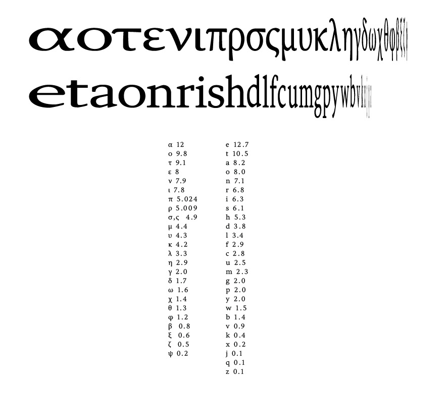
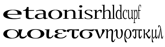
When you design a greek and separately a latin font, which letter you use for your greek x-height and which for your latin x-height? Should it be the letter which has more frequent linguistic occurrence?

In a cross-script font, is there a rule where the greek x-height should be smaller than the latin x-height? Or in every font, according to the final goal, the designer choses the proportions between greek and latin x-height?

Thank you!

_______
Charles,
Thank you for the encouragement :)

@John Hudson:
For me, the most obvious effect of Latinisation is not a cultural or ideological one, but a graphic one. When non-Latin scripts are subject to Latinisation, to processes of trying to make them 'more like Latin', whether structurally or in terms of borrowed shapes or details, the result is almost always an awkward stiffness, the loss of organic feel.

Yes! And inappropriate or artificial use of historical models can do the same thing.

Charles, a lot of arguments in favour of cultural diversity ultimately reduce to a kind of biological metaphor. We've got excellent reasons to believe that biodiversity is essential for the long-term survival prospects of life on earth, and we presume that cultural diversity might be similarly beneficial for humanity. Personally, I think such arguments are unnecessary, because there are perfectly good short-term reasons to favour cultural diversity over monoculture in terms of richness and variety of experience (which is not the same thing as cultural relativism; being able to say that e.g. circumcision is a form of cultural violence against the individual is important within this diversity) and respect for both particular and shared heritage as something to be celebrated rather than lamented.

That said, in terms of writing systems, and hence typography, a process like Latinisation seems simply perverse to me. Why does this conversation even take place, why is this a phenomenon? We're not debating Chinesification of Danish typography, or Hindification of Malaysian typography, or Cyrillification of Ethiopian typography, because these are all plainly ludicrous. Dressing up one writing system in another's clothes is ludicrous, and one doesn't need to make arguments from cultural diversity to say it is a pathetic idea. As a kind of novelty display typography, it has a long history, but would you as an English reader sit down with a book set in Chinese Takeaway? And yet we consider it normal, or at least something about which reasonable debate is possible, that Greek -- or Thai, or Hindi, or Russian -- readers should read Latinised versions of their writing systems? And that this constitutes 'progress', as if the Latin writing system were in some way inherently superior, and not simply the beneficiary of political, financial and industrial contingency?

Let me also clarify that while I think it unfortunate in terms of loss of richness and variety, I don't blame any society that decides to give up its indigenous writing system in order to adopt one that it thinks will be more materially beneficial. I think the traditional Javanese script is one of the structurally cleverest and most beautiful in the world, but adoption of a Latin orthography in the mid-20th Century clearly helped integrate Java within Indonesia and contributed to increased literacy in the socio-political context of that time. But actually adopting a new script is an entirely different matter than playing dress-up with your old script, of trying to make it look like something else. That's just sad and pathetic.

Now, does this mean limiting the range of expression of your writing system and typography to specific historical models? No, I don't think it does, and I think it is an entirely false association to equate the development of new styles with Latinisation just because Latin type designers have produced such a variety of stylistic innovations over the past couple of centuries. And, indeed, in what way does aping stylistic idioms of Latin typography constitute innovation in another script? If the only way you can stylistically innovate is to try to come up with a Greek -- or Thai, or Hindi, or Cyrillic -- version of Helvetica, then maybe you're writing system is culturally dead on the ground already.

I don’t think that’s the issue, John.
It doesn’t matter what the type looks like, people should tell their own stories in their own voices.

A few years ago, western multi-national corporations were producing experimental versions of foreign (to their creative directors and employed/hired type designers) scripts. These are now derided, and such corporations are now politically correct and conservative in respecting the quaintness of the until recently typographically-backward cultures to which they distribute their fonts, advised by expat gatekeepers.

Complicating the issue is the fact that classical Greek is OUR (Western Latin script users) story too, deeply embedded in our academic culture—and this too lends a conservative tone to the culture of Greek type design in the West.

I have nothing against a bit of conservatism, but it seems to me that Greek and Cyrillic type design in the West is overly safe and skewed in that direction.

That is why I look to type designers such as Panos Vassiliou and Alexandra Korolkova for inspiration, and hope that if my efforts at Greek and Cyrillic have a bit of a foreign accent for indigenous readers, it will be sexy, like Garbo or Schwarzenegger.

@John Hudson:
as if the Latin writing system were in some way inherently superior, and not simply the beneficiary of political, financial and industrial contingency?

While I agree this is true, I am not sure that it is always relevant. Cheaper hand-me-down typewriters or computers, an easier time learning economically significant foreign languages - those are as much valid reasons for choosing the Latin script, if making a choice is practical, as any intrinsic superiority.

Of course, there is no choice to be made in the case of Greek, because the people already have a writing system they know how to use, in which many books have been printed. But as a general principle, contingency is as good as inherent superiority for many purposes.

John (Q), note that the fragment of my post that you quoted referred specifically to Latinising indigenous scripts, not to adopting the Latin script. As I said, and think we agree, there are good reasons why someone might decide to abandon one script for another, just as there are good reasons why many people abandon their native language in favour of a dominant regional or trade language. But I don't see any good reason for trying to make your writing system look like someone else's.

@John Hudson:
But I don't see any good reason for trying to make your writing system look like someone else's.
It's true that there are few cases where that would produce obvious benefits.

Still, some writing systems have limited legibility; in Hebrew, some letters are difficult to distinguish, for example.

The fusion of a Roman monumental uppercase with a semi-cursive lowercase in Greek is, I think, a problem - even with the Porson italicization removed. One way to solve it would be to completely Latinize the lowercase, but fortunately that's prevented by the fact that for some of the letters in the alphabet, there's no obvious Roman-style lowercase shape. A typeface that you have to learn how to read has little chance of catching on. So Porson got improved, leading to Apla, and little further movement towards a more Latin-like lowercase for serif fonts has taken hold.

The other way is to go away from the Roman model. The common New Hellenic model goes that way.

Still, some writing systems have limited legibility; in Hebrew, some letters are difficult to distinguish, for example.

Yes, and within the varieties of Hebrew square letter and other styles there are things one can do to reduce these difficulties. The fact that in some of the Ashkenazic styles these things are not done and, if anything, the confusable letters are made more rather than less similar might suggest a number of interesting things about writing, type design and reading.

Mediaeval Arabic writers produced an entire genre of literature based around misreadings of un-disambiguated archigraphemes.

If disambiguation of hard to distinguish characters is the goal, I still don't see any obvious benefit comes from aping Latin letters that could not be attained in other ways. The methods used by cultures that adopted the Arabic script to capture sounds that do not exist in Arabic are a good example of the richness of sufficiently disambiguated forms that can typically be located within a scribal tradition, for instance the adoption of optional variant forms from an Arabic style as normative letters in a new orthography.

@Tatiana Marza: Be certain to properly cite Typophile in the references section of your paper. A failure to do so would constitute academic plagiarism. APA 6.0 format:

Dean, C. (2013, March 29). Re: Questionnaire about the needs of Greek typography end-users [Online forum comment]. Retrieved from http://typophile.com/node/101331

You will need to do this for every comment you reference.

Is this undergraduate or graduate research?

@Chris Dean
Is this undergraduate or graduate research?

I am an undergraduate student at AKTO Thessaloniki, Greece ( http://akto.gr/welcome-to-akto.aspx), Department of Graphic Design. This research is part of my BA in Graphic Design.

While reading your last comments, I could not ask myself what elements make a Greek alphabet (esp. lowercase letters) look Greek?
The same, of course, could be asked about the Latin alphabet.

| There are some lowercase letters in Latin, which never could be passed for Greek letters and vice versa.
| The greater number of ascenders and descenders in case of Greek letters
| The ductus

During the designing process of a cross font, what other features you are taking in consideration in order to give a Greek appearance to letters?

"what elements make a Greek alphabet (esp. lowercase letters) look Greek?"
Ductus is a loaded question. I do not feel that a particular ductus should be a requirement to look Greek overall. Ductus to me can only be addressed if we are looking for some subcategory of Greek that details the writing tool or technique or time period. I should be able to crudely scratch Greek in the dirt with a pointed stick and still have it be Greek.
In other words, if it looks like a duck, walks like a duck, and talks like a duck, it is a duck.

To quote my friend Nick Shinn, what makes it look Greek is the "Curly Bits".
That is an oversimplification but still of value. My mother detested reading what might be called sans serif Greek type (even though there really are no serifs in Greek). She may be referring to the entrance and exit strokes John Hudson referred to or to Nick's curly bits (She died several years ago at 90 so I can't ask.). Greeks of today have differing opinions but are quite accustomed to what we choose to call sans serif.
Arabic and other scripts also have "curly bits" but they do not look Greek. Greek is a phonetic system like Latin and follows the same rules of reading order (at least beyond the earliest form). This may give it a Latin-like grey value on a page from a distance but close up, what distinguishes it from Latin to me is the variety of stroke type. Latin ascenders are quite regular, a straight vertical bar is dominant. Greek has more variety and none of it as simple as a straight line. Descenders in Latin are much more regular and simple as well. The double-boweled g is the only odd-man out. Latin x-height is clearly defined. Greek is much more of a tendency than an exact point. I see Greek more like a form which extends both ways beyond a centerline than Latin, which is pretty much a railroad track.

Greek glyphs borrow less from each-other than Latin (which is much more modular). What I might find a better description is to say that while Latin "marches" [lock-step to the beat of the drum across the page in rigid 4:4 time], Greek "dances" [in complex time signatures to a lilting mix of interplay of instruments].

So then if it looks like a dance, sounds like a dance, and moves like a dance, it must be Greek. Opah!

A word about ductus:

This is a problematic term, because it has a couple of different uses when talking about writing and type. Some of my calligrapher friends are very particular that the word should only be used to refer to the order and direction (and sometimes speed) of strokes by which a letter is written, which is the traditional meaning and provides the etymological base for the word. I've come to the conclusion that they're right, despite having previously used it in the other sense, favoured recently by type designers, to refer to pen angle (and hence to stroke modulation pattern).

Chris, it seems that there is quite enough Greek blood running through your veins;) I am referring to your 'opha!' :)

John, what do you think about the "Greekness" of Greek lowercase letters?

...what do you think about the "Greekness" of Greek lowercase letters?

Isn't that what we were talking about for most of this thread? I don't think I've got much to add other than what I wrote earlier:

I judge Greekness in terms of texture on the page, rather than specific letter features or treatments, but obviously that texture is built up from those features. In other words, I find it much easier to critique Greekness as a quality when looking at a page of text, seeing how the letters work together, than in terms of looking at individual letter shapes.

As someone who works with a lot of different writing systems, I am sensitive to the fact that most scripts evolve normative letter constructions based on particular writing tools and practices, and that typography sits in relation to these letters (it can sit in critical relationship, or in rebellious relationship, but it can't ignore them). In the case of Greek lowercase letters, this means sitting in relationship to Byzantine scribal tools and practices, since that is where these letters came from. This means dealing with a predominantly cursive internal construction.

Does this mean 'Greekness' must involve only reproducing Byzantine forms, or even particular Byzantine cursive script as interpreted by the Aldine press? No. It should also be noted that the Byzantine scribal tradition was not stylistically uniform. The historically most fruitful innovations in Greek typeface design, it seems to me, have engaged with that tradition, looking for ways to reinterpret the normative letter constructions with new tools (Didot), or looking for different directions emerging from that tradition (Scholderer's New Hellenic).

After all I’m still and again wondering what *Greekness* actually may imply…
For instance, this particular devotion to single letters in their ancient shape, like they practise with the Theta on streets. I can’t help guessing the Greek have a special approach to things which others lack.

:-)
They didn't have a leg of Lambda to stand on ;-)

Tatiana, thank you for starting so interesting research, I'm looking forward to see the results of your study published. Unfortunately I found this thread too late to add any questions for the questionnaire, so I decided just to tell you about making greek script in my Flauto typefamily, maybe it could be of any help. It is a venetian antiqua with faces for different optical sizes and weights and now I have greek in light regular styles (I plan to make greek for bolds and italics too). When I finished first variant of my greek it looked rather latinized so it was hard to distinguish latin and greek in mixed texts. I didn't like it and I decided to make it more traditional so that it could be easily seen (even without reading) as greek (not latin or cyrillic). For the second variant of my greek I've chosen ἁπλά style, because it seems to be closer to venetian antiqua then other traditional greek styles. While making this variant I noticed that greek lowercase seem smaller and lighter then latin and cyrillic ones so I decided to make some compensations: I increased the height of greek lowercase and made them a little darker trying to balance the color and height of all scripts. Here is an example of my greek, latin and cyrillic scripts in a light regular style for the 21-35 pt:

Indeed, a nice balance of weight between the scripts.
But no “quaint” ligatures for Greek and Cyrillic?

Thank you, Nick. I plan to make “quaint” greek ligatures, especially in italic, and it would be natural for they were used a lot in such style. As for cyrillic ligatures I tried to make them in regular style but they seem a little annoying in text, and decided to leave only ту, ут, тут (which help to improve letter spacing) and several uppercase ligatures. In italic cyrillic ligatures look more natural, so I've already made some and will continue. Today ligatures are still rather rarely seen in cyrillic books in text setting, though some journals (for example «Большой город») use cyrillic typefaces with ligatures, but they are mainly sans serif. So cyrillic ligatures can be seen more often in headlines then in text. Here is an example of my cyrillic ligatures:

Given that Venetian Cyrillic is an historical anachronism derived from Latin script, it would be quite logical to also incorporate Latin-style quaints in the Roman, involving the /c, a connecting flourish, and a second letter with an ascender.

That might be ef, or perhaps ka or yu with ascender, Bulgarian-style.

Nick, thanks for idea, I think it's worth trying with quaints, especialy for Bulgarian-style cyrillic, which is more cursive in structure and has more letters with ascenders.

Юля, привет вам из Греции! :)

You are more than welcome for the Latinization research! It started out of nothing, as usually things do and had no idea that it would evolve into a captivating part for me, at least.

Yes, is too late for questions, but if you have any, I would be more than happy to include them into my thesis, as a discussion part.

I increased the height of greek lowercase and made them a little darker trying to balance the color and height of all scripts.

The x-height part of letters is preoccupying me intensively these days. I posted more than once this question on this thread, but never got any replies. Having no experience in designing typefaces, could you please, tell me, if the relation of greek x-height to other scripts x-height is always smaller, or it depends on the style of letters a designer choses to give to his font family?

Then, you said, that you made Greek font a little darker. By modifying modulation, stroke width? If you can share with us your secrets, it would be wonderful :)

Your font looks great, BTW! And it happens that I know all three languages, so maybe it's easier for me to extract information. Tell me please, how much you want the 3 scripts to look alike? I am asking because Greek seems to me to be dancing most of all under the music of "flute/flauto", then comes Russian, then Latin.
In Greek language, from all letters, the ''λ" seems a little bit stiff, not 'dancing' so much.
As for the cyrillic italic, the ligatures seem a little bit as ' just inserted there', not emerging from the natural way of writing letters. Seem to be added after you wrote the letters. Maybe you have time to try another kind of ligatures, more 'flaoutique' ? :)

Yulia, the color in your Greek and Latin are indeed nicely matching. I wonder however whether there's room for improving the harmony in apparent size, apparent leading and spacing.

The x-height part of letters is preoccupying me intensively these days.

Sounds like my life since the late 90s. :-)

I promise I will catch up (at least on that aspect) in the next 2-3 days. And now that I said that in public there's no escape, which is not a bug but a feature. :-)

I know all three languages

This is an enviable position for somebody who wants to design Big Three (Latin, Cyrillic, Greek) typefaces, and if I'm not mistaken, quite rare. It's even better than being left-handed in tennis. :-)

hhp

Hrant, you are exaggerating. It's all a matter of luck, in terms of where someone is born. I grew up in former Soviet Union, so I learned Romanian with a cyrillic alphabet, than Romanian with Latin alphabet, Russian was just my second mother language an then I came to Greece, so the languages became a natural advantage of my everyday life ...
Besides the languages I posses, the terrific would be to know Arabic or Hebrew. That would be a true enviable position.

Hrant, you are like Fantomas these period! :)
Yes, please, do come back. We need answers:)

.

I’VE GOT IT !!!!

Andreas, it just needs a bit of Feta ;-)

Somebody is hungry or is about new forms of Greek alphabet? :)

The secret of typophile Greekness at last: It’s just Paprika.

Amazing gamma! :) No, really!
I'm not sure I ever saw a similar one, referring to the upper part of it.
Will this be your new Cutprika font :), Andreas?

Tatiana: Yup, you got very lucky! :-)
I have nativity in three scripts too, but: Armenian is very hard to market; Arabic is somewhat hard to market and it's technically difficult.

terrific would be to know Arabic or Hebrew.

But it's too late. After about age 10 nativity is very hard to acquire. The good news is it's still possible to make good type in a script you don't really know, however it's limited to mimicking precedent - it's very hard to innovate in it.

Andreas, that's cool! The garnish is a great touch too.

hhp

> new Cutprika font … ?

Perhaps. :-)
Maybe I go and add Glagolitic.

Out of mushrooms.

Татьяна, спасибо!:) The question that interests me is about the using of polythonic small caps inside Greece today. I read John Hudson wrote: “Smallcaps have been used at times to emulate square uncial letters in the transcription of ancient manuscripts”. I've made them in my font, but still wonder If there's a need and does anybody uses it in contemporary editions in Greece.
Answering your question about x-height: my latin and cyrillic scripts have the same x-height, but greek lowercase I've made a little higher, I mean if you compare for example latin “o” and cyrillic “о” with greek “о” (omicron), the omicron will be mathematically higher then latin and cyrillic “o” in order to seem the same optically. I was adjusting the height of greek lowercase till it seemed to me equal to latin and cyrillic in text. And the similiar is about weight: for example if you compare again omicron with latin and cyrillic “o”, the omicron will be darker. I've increased the stroke weight till it seemed to me that greek evened in color with cyrillic and latin in text setting.
And also Yannis Haralambous wrote in his article “From Unicode to Typography, a Case Study: the Greek Script” (a very useful and interesting article that helped me a lot): “An intrinsic characteristic of the ἁπλά family is that the ratio of lowercase height to appercase height is smaller than the one of typical Latin typefaces. This makes harmonization between ἁπλά and Latin typefaces harder.” I've been doing greek in just ἁπλά-style and I can say for my case the compensation of height was needed, but I don't think that it works for all styles or fonts (and there are fonts that don't seem to belong to any particular traditional style), it should be checked by eye every time. However it seems to me the more “curly” or “cursive” (don't know how to formulate the term exactly) the style is, the more it needs to be compensated, but I'm not sure.
And answering your question about my three scripts, while making I tried to harmonise them so that they clearly seemed to belong to one typefamily, but at the same time to keep the tradition of each script and distinguish in mixed texts.
Andreas, what a tasty lettering:)

No doubt Tatiana can tell you what is needed in Greece, but I would like to submit this URL:

http://www.polytoniko.org/keyb.php?newlang=en

of a site which is apparently a voice crying in the wilderness. Essentially, if I correctly remember what I have read on this subject, after the regime of the generals collapsed in Greece, katharevousa, being so strongly identified with them - even if they did not use the best quality of it - collapsed, and dimotiki is used now for all purposes. And this took the polytonic script with it.

I am suspecting, though, that you don't really want to use small caps to simulate ancient inscriptions. Instead, there are special sans-serif typefaces for that purpose; in fact, I thought that one had already been discussed in this thread.

Юля,
Thank you for your interesting explanation on Greek x-height.
Concerning the usage of "polythonic small caps inside Greece today" I am not able to give you an answer now, because I will violate the integrity of my statistic analysis*. But, as I said, during mid June I will post the results of my questionnaire. Since you have the polythonic small caps, keep them. You never know!

[edited]
* I may tell you about some clues I have concerning your question, but if in time I receive more answers from the questioners, what I tell you now may be totally irrelevant in 2 months.

quadibloc, thank you for the link, I have seen this interesting site, which was organized by Yannis Haralambous. He's doing a fantastic job for spreading polytonic system and involving more people into it. When I started making greek nearly two years ago, first I didn't intend to make polytonic, but after reading Yannis Haralambous I found his arguments so convincing that I decided to make polytonic and alternative forms and some glyphs that didn't have unicode numbers, but were still needed and used in Greece.
Татьяна, I'll wait till the mid June of course, for the integrity of your analysis.

A bit "out of" topic for last comments, but I am trying to analyze the Greek letter (related to what I am writing in my thesis now).
Can anyone explain how exactly the letter frequency in a language can help to understand where the information is distributed (cartesian area) and how this affects the design?
from http://typophile.com/node/16454

I found the letter frequency for GR alphabet, but how can anyone use this information for designing greek type? Yes, descenders and ascenders hold the last positions and more round shapes took the first places.

α ο τ ε ν ι π ρ σ (ς?) μ υ κ λ η γ δ ω χ θ φ β ξ ζ ψ

α 12
ο 9.8
τ 9.1
ε 8
ν 7.9
ι 7.8
π 5.024
ρ 5.009
σ 4.9
μ 4.4
υ 4.3
κ 4.2
λ 3.3
η 2.9
γ 2.0
δ 1.7
ω 1.6
χ 1.4
θ 1.3
φ 1.2
β 0.8
ξ 0.6
ζ 0.5
ψ 0.2

@Yulia:
When I started making greek nearly two years ago, first I didn't intend to make polytonic, but after reading Yannis Haralambous I found his arguments so convincing that I decided to make polytonic and alternative forms and some glyphs that didn't have unicode numbers, but were still needed and used in Greece.

I am glad that you did. I should have noted one thing in my post to avoid the potential of it being misleading. While I believe that modern Greek is not typeset in the polytonic form any more, it is still very important and useful for a Greek font to have polytonic capability (even if extending it to new frontiers like small capitals is dubious) - because most modern Greeks are able to read Classical Greek without having it translated for them, and that is properly typeset with the polytonic accents.

Imagine an English-language font that couldn't be used to print Shakespeare! (But I'm not arguing to have eth and thorn added to every Latin font, nice though that would be. Chaucer, most English speakers do need a translation to read.)

EDIT: I think I may have become misleading in the other direction.

Native speakers of Russian do not need an acute accent indicating the stressed syllable in every word. Native speakers of Hebrew do not even need the vowel points! So native speakers of Greek may indeed have little trouble reading, say, Aristophanes without the use of the polytonic script apparatus.

But a typeface not available in polytonic fonts could not be used for a dictionary of Classical Greek, it couldn't be used for accurate quotations of texts printed in polytonic form, and for so many scholarly purposes, that I think it would be comparable to a Latin font developed by an English speaker that had no accented characters, and so couldn't be used to quote from French or Italian or Spanish - it would be usable only for the simplest purposes.

Tatiana,
Frequency of letters and combinations can help when kerning is done. As an example, if you find that two glyphs as neighbors require kerning but through frequency, you find that this combination so rarely might occur as to make the need of a kerning pair irrelevant.

As Chris suggests, sequence frequency is more useful than single letter frequency. Pair frequency is useful for kerning; frequency for longer sequences are useful for some writing systems, e.g. consonant conjunct sequences in Indian languages.

I find single letter frequency information most useful in getting a reasonable sense of the comparative fit of different typefaces. So, taking Tatiana's frequency information -- what is the source of this, by the way? -- one can create a frequency-weighted string of text like this:

ααααααααααααααααααααααααααααααααααααααααααααααααααααααααααααββββγγγγγγγγγγδδεεεεεεεεεεεεεεεεεεεεεεεεεεεεεεεεεεεεεεεεζζζηηηηηηηηηηηηηηηθθθθθθθιιιιιιιιιιιιιιιιιιιιιιιιιιιιιιιιιιιιιιικκκκκκκκκκκκκκκκκκκκκλλλλλλλλλλλλλλλλλμμμμμμμμμμμμμμμμμμμμμμννννννννννννννννννννννννννννννννννννννννξξξοοοοοοοοοοοοοοοοοοοοοοοοοοοοοοοοοοοοοοοοοοοοοοοοοπππππππππππππππππππππππππρρρρρρρρρρρρρρρρρρρρρρρρρσσσσσσσσσσσσσσσσσσσσσσσσστττττττττττττττττττττττττττττττττττττττττττττυυυυυυυυυυυυυυυυυυυυυυφφφφφφχχχχχχχψωω

This can then be used to compare how much space different fonts takes up, and provide a reasonably good guide to their comparative fit. Of course, individual documents might differ significantly from average frequencies, on account of recurring personal names or special terminology. And note that this Greek frequency data does not distinguish regular and final sigma.

Even better, visualize the differences via frequency.
For English-versus-Armenian: http://themicrofoundry.com/image/s_rome1-4.gif
That's basically what Armenian and English look like, in a single glance.
I've done this for English-versus-Greek too; let me dig it up.

hhp

How is that practically useful?

Aside from the usefulness of letter freqency in solving simple substitution cipher puzzles, it gives an idea of the 'feel' of a language. Why does Bodoni suit Italian, Caslon suit English, and Garamond suit French?

@John Hudosn,
Tatiana's frequency information -- what is the source of this, by the way?

http://utopia.duth.gr/~vkatos/documents/the_book/ch3.pdf, look at page 83
http://el.wikipedia.org/wiki/Ανάλυση_Συχνότητας_Γλώσσας, I found is dated from 2009
But they are in Greek...

And note that this Greek frequency data does not distinguish regular and final sigma.
Yes, this is quite a problem in being totally accurate about letter frequency.

@John Q,
What do you mean by the 'feel' of a language?

Hrant,
I tried to do same kind of interpretation for Greek and Latin alphabet. Although it seems that my information on Latin letter frequency differs from yours...

Given that letters have different shapes - b c d e o p q on the one hand, k w x z on the other, h m n u for still another - and some have ascenders and others don't, it is possible that different languages using the Latin alphabet could actually look different in the mass, if letter frequencies differ in such a way as to affect the extent to which certain features of the shapes of letters are encountered.

John (Hudson),
I was asked from my adviser to explain through images some terminology we discussed earlier on this thread. I would be grateful for a confirmation or any comments. Thank you!


Tatiana,
I would not say that your second example is "serif". To me, it is also exit and entrance strokes. There is no serif in Greek lower case.
Also, cursive is connected writing. What you show is italic.

cursive is connected writing

Do you mean letters connected to each other? "Cursive" says to me "few lifts of the pen" in letter construction but not necessarily connected letters.

I do not mean that each glyph must be connected to its neighbor. Cursive is writing in a stream. The example Tatiana shows above is just italic.

Chris is right about the first image: in both the low contrast 'sans serif' and the higher contrast design, these are entry and exit strokes. Traditionally, there are no serifs -- i.e. constructed stem terminals -- in the Greek lowercase, only entry and exit strokes.

Chris, there was some discussion earlier in the conversation about the distinction between cursive in the sense of running hand and what I called 'internal cursive construction', i.e. where individual letters are constructed in a running way without lifting the pen from the page. Obviously this is applied indirectly to the description of type. I think Tatiana's second image is correctly labelled -- except that the last line should be 'italic Greek letters' --, and makes the point that while the Latin italic differs from the roman in having an internal cursive construction, in Greece this is true of both upright and italic.

I wouldn’t call it an entry/exit stroke unless it is a separate stroke, not just a bend in a main stem.

**

No doubt I am guilty of Latinization, but it seems to me that the two-part system of roman and italic is fundamentally Latin, and foreign to Greek. Therefore, if one is going to implement it in Greek, one should be true to its nature and employ something of the traditional method of ending terminals in Latin—which is to put serifs on the roman, and have the italics more “cursive”, with entry and exit strokes.


The alternative is to treat Greek italic as a sloped roman, which is a method that, with its reduced differentiation between styles, has never caught on in serifed types.

Nick: I wouldn’t call it an entry/exit stroke unless it is a separate stroke, not just a bend in a main stem.

I've had the same thought, although the terminology is pretty common.

I consider the pronounced bend in e.g. the left downstroke of the Didot style eta to be derived from writing speed. So structurally I still think of it as a horizontal entry stroke, a turn, and a vertical main stroke. When written quickly, over time this evolves into a curved stoke in some styles, but that doesn't seem to me to negate the usefulness of the entry stroke as an analytical concept. Indeed, this concept allows us to understand the shared structure of styles with curved stems and styles with straight stems that share the initial horizontal trajectory.

By the way, Tatiana, it might be helpful if you were to use an example of low contrast eta with a more obvious entry stroke to illustrate the concept.

John, I now see what you mean by "internal". Thanks for the clarification.

Nick, Since Greek does not have along history of italic in the same way that Latin does. I see no reason to simply use Latin rules to apply serifs to the upright Greek (is that what you intended or am I misreading you?)
If we are just after differentiation between upright and italic, then we can find other means than adding serifs to a language that does not use them. There was a period when Greek text that was meant to be used in the way we use italics, was letterspaced (yes, stealing sheep). http://www.flickr.com/photos/dezcom/3428338386/in/set-72157616479131055
I am not saying that this should be how we do it now, I am just saying that we should let the Greeks determine a way that works for them instead of just offering the Latin answer.

It is certainly true that a) the typograhical distinction between roman and italic is something imported into Greek from Latin typography, and b) the cursive construction of Greek minuscule makes it more difficult to strongly differentiate upright and italic styles. I'm not at all convinced that the solution to this is to make the upright less cursive, though, since the result tends to look very stiff and awkward not only in contrast to traditional styles but also when compared to Latin romans. I believe this is because the Latin script maintained a formal bookhand tradition based on interrupted letter construction for much longer than Greek, so evolved letter shapes that were pleasing in both upright, formal and slanted, cursive styles that were in widespread use in the script at the time of reduction to type. There are upright, formal styles of Greek writing, but they are archaic.

The problem I have with your approach, Nick, is that it seems to suggest that the way to resolve a design problem arising from what you acknowledge is an importation from Latin is to import more stuff from Latin. Where does that end? To how many of the world's writing systems does it apply?

Latin-script typographers, authors, editors and publishers did something really brilliant when they gradually systematised the use of roman and italic to articulate text, i.e. systematised the use of two different existing writing styles -- upright and formal, slanted and cursive -- in a contrastive way. The usefulness of the system is obvious, and one can see the attraction to adapting it for other writing systems. But not all writing systems have existing parallels, so one ends up with artificial creations to fit criteria of contrast established by the Latin model instead of contrast naturally occurring within the script. It's as if Latin typographers without access to a roman and italic manuscript style distinction had observed the constrastive use of, say, Arabic naskh and ruqah styles in Ottoman manuscripts, and tried to come up Latin letters that exhibited the characteristics of those Arabic styles in order to create a system of textual articulation.

Here is a slightly off-topic example of Latinization.
Notice the slab type in the middle of the picture--it must be from Western Greece ;-)

John,

> the cursive construction of Greek minuscule makes it more difficult to strongly differentiate upright and italic styles.

– I’d say: *more demanding*, not more difficult.

> one ends up with artificial creations to fit criteria of contrast established by the Latin model instead of contrast naturally occurring within the script.

For the modern Latin typographic system the upright/italic duality is canonical, and it proved to be very useful. No wonder that this model shed its light on neighbour systems like Greek or Cyrillic. That momentum of influence of one culture onto the other is quite a normal phenomenon.
But I am with you when you are questioning the issue of other possibilities of system-inherent duality in other writing systems. This is, i.m.h.o., a most worthwhile question. Impose our Latin Reg./Ital. scheme upon, e.g., Armenian, Hebrew or Arabic, and you’re in for serious headaches – or brake-through inventions ;-)
I once encountered a similar issue with my set of Andron Runes. In the Regular I shaped them with a modest mould of serife-like terminals, as to suit them to the rest of the font. Then I faced reservations about that by single users, I ended up doing a second and alternate rendering of the entire character set, in a more ‘incised’ style without serifs; and I put this set – into the Italics font.

Is there any kind of research about script-inherent duality modes similar (but not equal) to ‘Latin Reg./It.’ ?

@ Yulia:
I’m not yet entirely convinced about each of your ligature solutions, but I find your overall classic approach to the L-G-C set courageous and very interesting!
(and cheers for your kind tasting of my silly paprika exercise … :)

I’d say: *more demanding*, not more difficult.

I'm not sure what demanding implies in this context. It seems to me objectively more difficult to differentiate two things that have more in common with each other than two things that have less in common with each other.

Is there any kind of research about script-inherent duality modes similar (but not equal) to ‘Latin Reg./It.’ ?

I don't know about research, per se, in the sense of systematic investigation, but I have observed that most mature scribal systems evolve both formal and informal modes, and these may produce differentiated styles that would adapt to a roman/italic-like system. And very often the differences between the formal and informal styles parallel those between roman and italic: interrupted vs cursive construction, upright vs slanted, broad vs compressed. But even when such differentiated styles exist within a script they do not always end up being used in the way that roman and italic are used in Latin script typography. For instance, the Hebrew square letter is a formal bookhand directly equivalent to the Latin roman, but the Hebrew cursive, which persists as a daily handwriting style, never evolved into either a secondary manuscript hand or a differentiated typographic companion style. Which is a pity, because it has a lot of potential in that rôle.

It massively helped the development of Latin typography that roman and italic letters were already being used side-by-side in manuscript. The typographic innovation was not to pair these styles, but to systematise the pairing that already existed, e.g. using italics for titles, for foreign words, for emphasis. The fact that the system employs italic for several different purposes, rather than multiplying styles, itself tells us something about the inherent conservatism that in other scripts hampers the development of contrast-based text articulation.

There are a number of scripts in the world in which the formal scribal bookhands involve cursive construction and features, with or without cursive connectivity and/or graphotactic shape modification. Perso-Arabic is the most obvious example of a mature scribal culture completely abandoning non-cursive writing, but all the evidence is that this is also true of the Byzantine scribal culture: formal, interrupted Greek uncial letters continued in use in ikon writing, mosaics etc., but text manufacture moved to a cursive style around AD 400, stayed there for well over a thousand years, and was still there when type came along.

@dezcom:
Of course, that particular style of type was known in old specimen books as French Clarendon, so some other place than wherever the Greek cowboys lived may have been the inspiration...

The problem I have with your approach, Nick, is that it seems to suggest that the way to resolve a design problem arising from what you acknowledge is an importation from Latin is to import more stuff from Latin. Where does that end? To how many of the world's writing systems does it apply?

To any that want it.

True italics, multiple weights, condensed and expanded, text and display styles, small caps — all these “Latin” inventions can be theirs.

John, how do square being an advocate of cultural autonomy with working on Latiner-designed typefaces that are bundled with the devices of transnational corporations? Now matter how sensitive you are, you are still telling the locals you know what’s best for them.

No, I'm providing tools that I believe will solve the daily text needs of the users of that software or device, in response to particular briefs from the client. This means that I'm usually considering the kinds of texts they are likely to be dealing with and what norms exist in their native text cultures that I can draw on to produce something that fits the expectations of a significant portion of users (or at the very least can be presented to them and explained with reference to their own textual history, rather than as something imported). These days, I'm often working with scripts for which no fonts exist in widely supported or standard formats -- e.g. the Burmese font for Windows 8 --, working alongside the programmers who are developing the layout engines, keyboard drivers etc., and I see my work very much in terms of producing something that provides a well executed baseline of script and language support according to the norms of the script, so that anyone who comes after me can consider that solved and produce more original and creative designs. This relates to the thread that Hrant tried to start regarding minority script support: a lot of scripts get hung up on amateur font makers trying hard to produce something that captures the norms of the script, such that no one ever gets around to expanding the typographic palette.

I don't think I've ever claimed to be an 'advocate of cultural autonomy', at least not in any way that presents it as a problem for people to design typefaces for writing systems other than their own. This has been going on for as long as there has been type; sometimes it is done well, sometimes not. Generally, when it has been done well, the people involved have paid attention to script expertise embodied in the scribal traditions. Generally, when it has been done poorly, foreign technologies have imposed limitations and the people involved have imported inappropriate concepts from their own scripts.

True italics, multiple weights, condensed and expanded, text and display styles, small caps — all these “Latin” inventions can be theirs.

No, I don't think all these inventions can be theirs, because some of these are dependent on particular characteristics that the Latin script does not share with all other scripts. Sometimes, in such cases, there are alternative options within the script, ironically overlooked in favour of Latinisation.

@Nick Shinn:
To any that want it.

True italics, multiple weights, condensed and expanded, text and display styles, small caps — all these “Latin” inventions can be theirs.

Nothing wrong with that. Some time back, I illustrated how Hebrew could have upper and lower case, if it wanted - without having to redesign their alphabet, or import from foreign models. The old Phoenician script had ascenders and descenders, and thus could serve as the "lower case", while square script would be the "upper case".

I admit, though, to having some difficulty in imagining what would work for "true italics" for the Chinese script. But there are more and less cursive styles of the script, so I guess one could pick a more cursive style and slant it. So much else from Latin has been imported in the area of sans-serif display faces in China, Japan, and Korea that this limiting case shows you to be right.

Of course, there's Arabic. It has plenty of bold versions, but because it is written exclusively as connected script, some options seem to be foreclosed.

So I found my English-and-Greek visualization:

But I'll have to explain the general benefits of such visualizations, and the specific insights afforded by the two that I posted, later on.

hhp

Andreas, thank you!
I agree with dezcom that adding serifs to differ roman from italic will be problematically for it's not in greek tradition. Maybe for italic in serif fonts models like Gazis or Goschen or Monotype Greek 91 could be used (not the straight way but as a possible approach). Those sans serif which in Latin are slanted (not true italic) could be treated in Greek the same way. But the situation becomes harder for sans serifs that have true italics in Latin, it would be logical for greek letter forms to differ in roman and italic too, but I can't remember any example of this approach.

This is calligraphy rather than typography, but it shows that another category of typeface seen in the Latin alphabet is possible for Greek:

http://www.comicbookbrain.com/large-mickey-mouse-greek-language-1977.php

In many languages other than English, word balloons for comics are typically typeset rather than hand-lettered (of course, this is also possible in English; witness Dave Berg).

Now I got totally confused.

What is the distinction between entry/exit strokes and serifs?

@Chris,
earlier you wrote There is no serif in Greek lower case.
What do you mean? I was left with the impression that there are no sans-serif letters in Greek, only serif or semi-serif, 'side effects' of internal cursive construction.

In the first part of this thread I attached an image of sans serif cross script font (Whitney), where it seems to me that even in designing a sans serif Greek font, it can not be a 'clean' sans serif. You would characterize these typographic elements having exit stokes or/and curved stems?

@John

Thank you for the tips and the corrections.

Traditionally, there are no serifs -- i.e. constructed stem terminals -- in the Greek lowercase, only entry and exit strokes.
And, when you mention curved stems and styles with straight stems, you mean that there are stems with exit stoke???

__________

In Greece we are used to this kind of style writing for comics:

"Ungrateful! I gave you the best years of my life!..."
"So what, you want a receipt now?"

[note the latinized 's' of vertical ' Αρκάς' :)]

The serif came out of Latin inscription and lettering (see Catich http://www.amazon.com/The-Origin-Serif-Writing-Letters/dp/0962974013 )
Greek lowercase writing came from the writing hand and the tools of the scribes of the time. When writing with pen or brush, our first mark point is the entry stroke. As getting the pen started was not always totally predictable, a scribe might begin his first stroke with what began as a test stroke to get ink flowing. This later became visible as a tiny blob or stroke upon entering the glyph. Seeing these strokes as normal, later scribes continued and emulated what had come before them. People of my age (who have begun their writing learning with a pen dipped in ink) will find this natural and expected. At your young age, I doubt if you have experienced this unless you have studied calligraphy. The exit stroke is the final mark at the lift of the pen and often tails towards the next glyph to be written. This too is quite normal. The serif, on the other hand, was a more purposive shape that was done in addition. True, uppercase Greek often contains serifs due to influence of the Romans who were the rulers of the era. When the Ottomans invaded Greece and many other territories around the Byzantine time period, the amount of control and influence that the Romans had diminished. The Romans were busy with their own fall. In the years that followed, the european countries not under the Ottomans proceeded to develop the Latin lowerecase of several styles and then the great era of printing began to flourish. During this time, Greece was somewhat isolated from this experience. The Greek lowercase grew out of the Byzantine writing and was later influenced buy the Turks. Not so much as the Turks forced any form on the Greeks as just that the Turks prevented much interaction between the Greeks and other Europeans. Four hundred years went by with limited European influence and the Greek script continued to be on its own. The Entrance and exit strokes became more prominent with faster writing and soon took their place as the expected construction of each glyphs that we have today. After 1821, the Greeks began their reunification with the rest of Europe. At this point, printing was quite sophisticated but the Greeks were 400 years behind and caught up with the great help of their brother european countries. This help also brought Latin script back as an influence.

At your young age, I doubt if you have experienced this unless you have studied calligraphy.
It seems that I got lucky again. In early 90's we still were using ink pens for writing at school and only close to 2000, bic pen had its prominent influence. You see, not only Greece was behind...:) These situations created favorable circumstances, for me ;)
I understand perfectly your long historic explanation of evolution of greek letter. But, today, while designing a greek alphabet, how can I make a difference of an entry/exit stroke and serif line?

What is this assumption that readers have expectations for old-fashioned type? That they will be shocked by anything deviating from what was good enough for their great-grandfather and find it hard to read? Is there research to support this wishful thinking? Why are Greeks more susceptible to this condition than those who use the Latin script?

Certainly, a multi-national corporation bundling millions of fonts into cultures around the world will today be politically correct and play it safe and conservative in whatever script, including Latin.

But there is no reason why independent type designers shouldn’t be progressive. If Greek art directors and designers want to buy licences for Latinized typefaces and confound their readers’s expectations, why shouldn’t they? If the types are as dysfunctional as the naysayers would have it, the market will make the appropriate correction.

For at least 80 years, designers and readers in Latin, Greek and Cyrillic cultures have been familiar with sans serif types — that is, without serifs, and also without exit and entry strokes.

Tatiana, ask Panos Vassiliou about Parchute’s Centro. It is an award-winning and successful typeface, designed and published in Greece, with a heavily Latinized construction in both serif and sans versions. It has been described as “almost invisible”.

Tatiana,
Whatever you call those bits at the beginning and end of a stroke does not matter as much as what they look like. Do you know Catich's book I sited above? If not, it would be a valuable read for you.
http://www.amazon.com/The-Origin-Serif-Writing-Letters/dp/0962974013
Look at the forms of the roman serif and see how they differ from Greek. There is a visual difference which you can study and see.
Look at your sans serif example of Greek above at the tails of the final strokes above in your example. This is a sans serif form but it includes the hooked tail because that is part of what makes it read as Greek. I would be the last person on earth to suggest that you must follow literally the scribal works of past Byzantine writers. You can picture what now remains as a feature of the letterform abstracted from the 14th century manuscripts that still is part of what is needed to read as Greek. The true test is in the eyes of a Greek reader. Do they read it as Greek without hesitation or discomfort? If yes, then it is fine. This leaves a huge degree of variation. As always in type design, the eye is the final arbiter.

Nick: What is this assumption that readers have expectations for old-fashioned type?

I never said anything about old-fashioned type.

But there is no reason why independent type designers shouldn’t be progressive.

And likewise no reason why they shouldn't be as conservative as they are inclined? I'm fully of the opinion that people should do what interests them most or, in the words of my hero David Jones, 'We should work within the limits of our love'. What I have objected to in the culture of Latinisation, particularly as it played out in the history of Greek type, is the association of such trends with 'progress', 'westernisation', 'modernisation' etc., as if these things were only approachable through aping characteristics of another writing system. As for my own approach, when I started introducing traditional letter construction into Greek companions to sans serif Latin types, this was very much against the norm that had been established in the 1970s and '80s and which was prevalent in Greek typography. Of course, we're both Canadians, so the concept of progressive conservative isn't contradictory to us.

Tatiana, I think Chris has done an admirable job explaining the distinction between serifs and entry/exit strokes. There is a relationship between the two, confused by a tendency in English to call certain kinds of entry and exit strokes in Latin script, especially italics, 'serifs', but I find the distinction useful. Nick has made the reasonable objection that the entry and exit strokes can be interpreted as part of the stem, not as a separate stroke. So perhaps instead of talking about entry and exit strokes we should talk about 'stroke entries' and 'stroke exits', i.e. as something that happens at the beginning or end of a stroke other than a hard start or hard stop.

This thread is epic! I've learnt tons about Greek typography.

John,
Reading over and over the thread's comments I assume that by stating that there are no serifs in Greek lower case (compared to the Latin alphabet), typophiles mean that there are only 'stroke entries' and 'stroke exits' !?

______

Chris,
I do not have Catich's book, but definetely will buy it. Thank you for the advice! :)

@Nick Shinn:
What is this assumption that readers have expectations for old-fashioned type? .... Why are Greeks more susceptible to this condition than those who use the Latin script?

I would have thought this does apply to Latin script users, and, thus, I tend to think that a good text typeface for them should look a lot like Century Expanded, or Baskerville, or Garamond.

Or Caslon or Times Roman.

Reading over and over the thread's comments I assume that by stating that there are no serifs in Greek lower case (compared to the Latin alphabet), typophiles mean that there are only 'stroke entries' and 'stroke exits' !?

Yes, that, at least, would be my description of the construction (ductus) of Greek minuscules. Part of the confusion of this topic, I think, comes from the binary categorisation of Latin types as either 'serif' or 'sans serif', which fails to provide for other kinds of stem termination (flares, tapers, entries, exits) and ignores other characteristics that would suggest different categorisation (for example, I consider a low contrast slab serif to have more in common with a low contrast sans serif than with traditional serif text types). I don't think this binary categorisation serves Latin typography very well -- certainly not as well as its universality would suggest --, but then it gets applied to all other writing systems to try to label what are, in fact, entirely different kinds of letter construction, more often, in fact, distinguished by stroke modulation (so one sees low contrast Arabic types being non-sensically described as 'sans serif').

I think it makes most sense to limit the use of the term serif to a particular kind of formal stem termination. This typically involves an interrupted construction of some kind, i.e. the lifting and repositioning of the pen or brush, or a reversal whose intention is to create this visual detail rather than to carry forward the shaping of the letter. From this it follows, contra much common usage, that many 'serif' italic types do not in fact have serifs in the lowercase; they have stroke entries and exits instead:

Now, this leads to an interesting question. In the example below, following my argument, it is clear that 'A' is a stroke exit, not a serif. But what is 'B'?

If we say it is a serif, on what basis? I think it has to come down to the sharpness of the transition to the stem, the fact that there is a definite corner there, and this is what marks the difference between the serif (formal, interrupted construction (in this case with a pause and direction change rather than a lift) and the stroke entry (cursive, flowing into the stem).

John (Quadibloc), Readers expectations apparently diverge considerably between Latin and Greek for sans serif. Latin sans serifs are not expected to follow the old humanist or classicist letter forms, but may be geometric and minimalist -- most obviously in the single storey "g". The convention among corporate Western-designed Greek sans faces however follows the old serif model, retaining entry strokes or whatever one calls them as if they are fundamental parts of the letter shapes.

Nick: Latin sans serifs are not expected to follow the old humanist or classicist letter forms, but may be geometric and minimalist...

Yes, they may. And that constitutes a particular style or category of sans serif design. There are also, of course, sans serif styles and categories that do follow humanist or other traditional letter construction. And these have been particularly popular in the past couple of decades, roughly contemporary with the new tendency in Greek type design to favour a parallel approach. With regard to the 'corporate Western-designed Greek sans faces' to which you refer, these have tended to be produced alongside or as companions to Latin designs that are also not geometric or minimalist. In fact, geometric sans serifs constitute a minority category vs the much larger 'humanist' and 'grotesk' categories: they're not very common in Latin typography, and even if they were it doesn't follow that a particular stylistic approach that works in the context of one script is applicable to all scripts. It happens that a design like Futura works for the Latin minuscule (although I consider the classically proportioned caps by far the most successful part of the design), but although the same principles can be applied to other scripts, the results may simply be awkward and disjointed.

Part of our disagreement may result from a different analytical approach. You cite the 'the single storey "g"' as an obvious example of the way in which Latin sans serif types 'may be geometric and minimalist'. I see it simply as the adoption of a variant letter construction from a different historical style. To me, the parallel is this:

i.e. a shape derived from the formal style and a shape derived from the cursive style. The fact that, in the Greek, it is the formal shape that is more geometric and minimalist, and the cursive more visually complex, illustrates where I think your analysis relies too much on superficialities.

I was addressing the issue of meeting readers’ expectations.
In Latin script, readers were accustomed to the /g on the left, but adapted to a simpler form, taken from the italic. This occurred first with Futura et al in the 1930s, and was solidified with Univers and Helvetica in the 1960s. (Although the form was first used in a German sans, mid 19th century.)

In fact, geometric sans serifs constitute a minority category vs the much larger 'humanist' and 'grotesk' categories: they're not very common in Latin typography…

Except for Gotham and Proxima Nova!

Here is another example of the way in which the complex Antiqua letter form has been stripped down in the Latin sans serif, with the “exit stroke” removed (Caslon/Univers):

@Nick
Readers expectations apparently diverge considerably between Latin and Greek for sans serif.

What about the expectations of type designers? :)

Latin sans serifs are not expected to follow the old humanist or classicist letter forms...
Maybe this is the true 'virtue' of Latin letterforms? They can take different forms and still remain very Latin. But if the Greek 'stroke entries/exits' are completely cut, as if they are fundamental parts of letter shapes, then the letters will cease to be Greek... ending up to be 'converted' to Latinization ....

Nick, why do you feel guilty about Latinization?

Although the form was first used in a German sans, mid 19th century.

In which context it is presumably borrowed from the textura blackletter construction, which seems a more direct path than from the italic.

What about the expectations of type designers? :)

…and art directors and other typographers.

…why do you feel guilty about Latinization?

It’s a figure of speech, indicating that others may consider what I’ve done to be Latinization.
It’s like saying, “What I am about to say will differ from your views (and shame on you for being so judgemental!), but…”

But if the Greek 'stroke entries/exits' are completely cut, as if they are fundamental parts of letter shapes, then the letters will cease to be Greek... ending up to be 'converted' to Latinization ....

That is the crux of the matter. But if the issue is framed in such academic, analytical terms, rather than saying it is up to Greeks to decide what their types should look like, then I hold that the entry strokes are superficial to the basic letter shapes. If that were not so, Greeks would not be able to read, or at the very least would shy away from, typefaces such as Olympia, DIN, and Centro. But that is not the case.

@Nick Shinn:
The convention among corporate Western-designed Greek sans faces however follows the old serif model, retaining entry strokes or whatever one calls them as if they are fundamental parts of the letter shapes.

I blame that on the type designers not being native speakers of Greek. As Hrant Papazian has noted, to do well when being innovative instead of conservative, one has to have a comprehensive sense of the expectations of the users of a given script, which sense usually comes along with it being one's script of daily use for one's mother tongue.

At this stage in the conversation, I don't even know what the terms 'innovative' and 'conservative' even mean any more.

[edited]
Nick,
I suppose different opinions are intrinsic to the liveliness and usefulness of a forum:) And you've come up with an interesting point.
On one hand* we have the question of readability, legibility : are latinized greek letters INDEED impeding the functionality of type? (having in mind display typefaces for magazines, or packages and typefaces for newspapers, books).
On the other hand (I will quote John Hudson), we have the question of "what constitutes the letter shape and what constitutes an optional feature? - [...] one of the things that enables the development of new styles." **

*of course, we should include the aesthetic factor
** John(H), this could answer your question about innovation

@John(Q)
one has to have a comprehensive sense of the expectations of the users of a given script
Do you have any ideas how we could learn about Greek readers expectations ?
What crosses my mind is that they could tell their opinion only through comparison, showing them different fonts and letting them choose

@John(H)
innovative - I guess being able to introduce new ideas in type, with a balance between what Greek society is used to and with a touch of the inner world of type designers. Maybe like Sholderer...His font was innovative at that time (at least for me).
And conservative... I would list all punch cutters who couldn't get away from ligatures for so many centuries. So, relying on the same script model and introducing minor changes, but with 'almost' same final aesthetic result, would be conservative to me.

BTW, John, your 'microscopic' investigation of letter's anatomy is remarkably interesting. I hope someone can follow your thoughts and add some comments.
______

Since we clarified that there are no serifs in Greek typography, it means that Greek alphabet has only one style, with cursive internal construction, and his own rules. That would suggest that the 'battle' to implement same latin rules to Greek script is simply not good enough, let's say? And here comes innovation: finding new rules for the functionality and the 'behaviour' of Greek script. That would give you, type designers, quite a good amount of work and experimentation:)
I think someone suggested (on this thread) to redesign Greek uppercase letters, according to the lowercase shapes. It's a radical suggestion and Greek society wouldn't accept it, but through experimentation one could come up with new ideas.

______

We might get lucky to have Panos Vassiliou in our discussion:) He said he might jump in...

> finding new rules for the functionality and the 'behaviour' of Greek script.<

I get a bit nervous about setting up rules. I would feel better if we would just say that if it walks like a duck. I mean, let whomsoever design type as they see fit without a firm set of rules. Then let the users determine if it suits them. That is not to say we would always ignore any past example, it would just mean that we would be free to try whatever before we assume it is not a good choice.

Tatiana: I guess being able to introduce new ideas in type, with a balance between what Greek society is used to and with a touch of the inner world of type designers. Maybe like Sholderer...His font was innovative at that time

It was, and this is an important point: there is a distinction between a kind of absolute innovation -- truly novel shapes, of a kind that occur only rarely in typography -- and what is innovative for a particular time. Scholderer, it should be remembered, was not a professional type designer: he was an incunabulist (scholar of early European printing) and bibliographer. His New Hellenic type design was a deliberate attempt to revive a neglected branch of early Greek 15th Century typography: based on the rounder, more upright Byzantine hand, and without ligatures. [Robert Proctor's Otter Greek had been an earlier, less successful effort in the same direction.]

So while, in the context of Greek type at that time (1920s), Scholderer's design is clearly innovative, it is also an historical revival, undertaken by a man whose professional life was entirely focused on the distant past, not on contemporary graphic design or typography. This is why I find the contrast of innovative and conservative artificial and unhelpful. While not in the same class as New Hellenic, I would argue that my Helvetica World Greek was innovative, at its time, in the context of fashions in Greek type design; indeed, it caused something of a scandal by breaking the accepted mould of numerous other Greek 'Helveticas', precisely by introducing those features of letters that Nick now describes as conservative.
_____

There is a 2006 discussion regarding Scholderer's New Hellenic (with some discussion of Latinisation, which I hope I refuted) here:
http://typophile.com/node/19265
In that thread I posted images of a number of incunabula types on which Scholderer drew for his revival. Seven years on, I don't even remember writing all that stuff, but am pleased to see that I don't disagree with it now.

PS. That 2006 thread is also a classic example of why Nick and Hrant should be discouraged from being in the same room. Don't bother reading to the end of the thread.

Chris: I mean, let whomsoever design type as they see fit without a firm set of rules. Then let the users determine if it suits them.

Yes, but also acknowledging that type is a cultural product, which means that it is something about which it is good and right to have opinions and to engage in argument. There is sometimes a tendency to suggest that users -- or 'the market' -- will decide, as if the community of users were not made up of culturally aligned groupings, asserting influence or struggling in their ways with opinion and argument (not to mention subject to advertising and a host of other pressures). I think this is not, perhaps, what you meant, Chris, but I think it is important to say this: rejecting a fixed set of rules, a 'correct' way to design Greek types, does not mean that the arguments about approaches and results are pointless.

> rejecting a fixed set of rules, a 'correct' way to design Greek types, does not mean that the arguments about approaches and results are pointless.<

Yes, the wind will driveth away much of the chaff but some may linger long enough for someone else to see a leap from that point to a better one. I would just say let them be part of the conversation and not excluded out of hand by a given tablet of rules.
"The Market" is a very narrow beam that is only visible through the eyes of commerce. There are other forces at work including the complexities of scholarly debate and simple happenstance things like convenience. I am just saying let them each play their role. Whatever one choses to think of Latinized Greek typography, it certainly had a purpose even if we don't care for it.
People have always debated and argued, god knows the Greeks certainly have. There will be a debate whatever we say, so be it.

I would argue that my Helvetica World Greek was innovative, at its time, in the context of fashions in Greek type design; indeed, it caused something of a scandal by breaking the accepted mould of numerous other Greek 'Helveticas', precisely by introducing those features of letters that Nick now describes as conservative.

Yes, anything which contradicts the status quo may be seen as an innovation.
But Helvetica is a recent event in the time scale of your argument for historical forms, which must surely be seen as conservative and traditional.

…why Nick and Hrant should be discouraged from being in the same room.

That too is history.

John: Even if it weren't history that wasn't a nice thing to say (and actually not like you). But nobody's perfect, so it's no biggie. I do wish though that you weren't so embarrassed of agreeing with me (in public) on anything. The people who would hold that against you aren't worth honoring.

As you were.

hhp

Hrant: Even if it weren't history that wasn't a nice thing to say

I'm not entirely sure to what you refer, but the latter stages of that thread about Neo Hellenic are a bizarre, off-topic and extremely nasty exchange between you, Nick, and someone else. I didn't blame you, or either of the others, but simply advised anyone interested in following the discussion about Neo Hellenic not to bother reading all the way to the end of the thread. If it no longer pertains that you and Nick should be kept separate, I apologise for not keeping up with where the hatchets are buried. :)

1) I was referring to the bit about not being in the same room. In fact in this very thread Nick has said a number of things I strongly agree with.
2) There's useful info in that thread all the way to the end (which is typical of any thread no matter how nasty things get). Having the spine to read through unpleasantness (not even bypassing it) is often rewarding (in fact it can even be its own reward).

That said my own hatchet remains firmly on hand. As does my shield.

hhp

Perhaps we can take a couple of more practical runs at the topic of Greek type design?

1. Notwithstanding the variety of letterforms in the Latin script tradition, the binary categorisation of serif and sans serif is predicated on the identification of certain design features as optional and superfluous to the essential letter shape. This enables us to produce skeletal representations of those essential shapes, which while not necessarily interesting or particularly useful as designs serve as a kind of diagram of the letter.

Can this be done for Greek? And what would the results look like? What parts of the letters are to be considered optional and superfluous, and which are to be considered essential.

My suspicion is that, when this is attempted, there will remain considerably more variation in the notion of essential letter shape than there is in Latin script. But I would be interested to see, for instance, where Nick makes the cuts.

2. One of the few things on which we seem to all agree is that the internal cursive construction of the Greek minuscule makes it challenging to distinguish italic styles from upright except through slant. This is a practical design problem, and seems to me something that we might usefully focus on, with illustrations of a variety of approaches. Interest?

Hrant, fair enough. I was depressed by the bitterness of much of that dip into the past.

One of the few things on which we seem to all agree is that the internal cursive construction of the Greek minuscule makes it challenging to distinguish italic styles from upright except through slant.

I disagree, it’s quite straightforward. The problem is that the historical Greek plain style is slanted and cursive, whereas the default for Latin and Cyrillic is upright and quite removed from its calligraphic origins. There are two options for creating a binary upright vs italic (slanted) system of sufficient contrast from this historical Greek lower case:

1) For the default, backslant it to upright, retaining its cursive, mixed-angle-of-stress construction, and make a sloped italic which has a uniform angle of stress.

2) Retain the historical Greek forms relatively intact as the italic, and make the roman upright and with a consistent angle of stress, more like Latin. This respects the evolutionary origins of the Roman vs. Italic system, and preserves the archetypal Greek lower case in the italic. It’s the method I’ve implemented in the three faces I’ve designed Greek for.

Nick: I disagree, it’s quite straightforward. The problem...

You say it is straightforward, and then immediately acknowledge that there is a problem. This is what I say we agree on: that there is a problem -- or challenge, as I put it -- arising from the inherited nature of the Greek minuscule letters. You may think the solutions are straightforward, but that seems to me not the same thing as disagreeing that there is a challenge or problem to be solved.

Re. your option 2, earlier you showed two examples of this approach in your work. What is the third?

Re. your option 1, I think it is blasé to characterise this as straightforward. It is in the context of this approach that the underlying challenge/problem presents itself acutely, where the distinction between upright and italic styles might end up reduced to one of slant. What other distinctions might be introduced, within the confines of this basic approach (retaining traditional construction)? Systematic use of variant letterforms for beta, theta, etc., as in the ClearType fonts, is one option, although not favoured by some users. What about systematic variation of stroke modulation (consider, for example, the conventional pairing of the Didot style upright with the Leipzig italic, so common in Greek publishing)? Roundness vs. angularity, broadness vs compression (as in Brill)?

"Roundness vs. angularity," seems quite plausible.

The answer to creating a Greek roman/italic duality was self evident, at least to me.
Of the two options I described, the second was clearly right and the other wrong.

That’s why I didn’t think the problem was a conceptual challenge, although the nuances of many of the glyphs were hard to draw.

Making the Roman upright stiff and formal, and the Italic cursive, calligraphic and slanted has worked well for the Latin script, so why not apply this principle to Greek?

It seems weird to merely backslant the historic Greek forms, retaining their traditional calligraphic ductus, if one wants to create a Roman/Italic system that will harmonize with Latin, which, let’s face it, is the dominant style internationally.

More significantly, when Manutio introduced italics, they were stand alone—but when they became used in conjunction with Roman, Roman prevailed as the main style. That was no accident, nor culture-specific; the formality of the roman style, and its symmetry, resonate with the geometry of the rectangle and the grid, which are the basic structure of the mechanical typographic page. Technology-specific, perhaps.

Are there other solutions to this problem? Of course, but I haven’t noticed, so please show and explain if you know of any!)

Centro Serif, by Panos Vassiliou, takes this idea further than I have, with for instance, many serifs on the roman, and a Roman nu with no descender, whereas the italic has fewer serifs and Italic nu does have a descender.

The three typefaces I’ve designed Greek for are Scotch Modern, Richler and Figgins (not shown), which, as a grotesque, has a similar italic to its roman, so doesn’t follow this principle.

I'm afraid I intervene with trivialities: Italic is used for emphasis when the default is the roman. Roman is used for emphasis when the default is italic.

In many contexts, the keyword is “contrast”, not “informality”. So keeping the Greek default as it is, and using the contrasting latinized version as a replacement for italic would do. So I’m confused what are you discussing: the way to introduce a degree of informality into Greek?

Roman is used for emphasis when the default is italic.

That is so rarely the case.
The italic is unsuited to be the default.

So keeping the Greek default as it is, and using the contrasting latinized version as a replacement for italic would do

That was the “wrong” half (1) of my solution.
The italic is unsuited to be the default, because pages and text boxes are rectangular, not parallelograms.
And houses and walls are posters and signs are usually rectilinear.
The uprightness and vertical axis of the roman harmonize with the construction of text documents.

Ilya,
I think your 'trivial' interference clarifies exactly what we are discussing now:)
The usage of roman and italic is to emphasize something specific in a context. And, yes, the key word should be "contrast". Personally, I find slant to have a diminutive impact on contrast and sometimes 'broadness vs compression (as in Brill)' is uncanny, but if used for a text which would suit these features (broadness + compression), this style may serve the purpose, with a rewarding result.

@Nick
Making the Roman upright stiff and formal, and the Italic cursive, calligraphic and slanted has worked well for the Latin script, so why not apply this principle to Greek?
Because there is no big difference in this case between upright and italic Greek.
As Andreas stated earlier, it is more demanding (vs to Latin script) to differentiate upright and italic Greek styles, because of the internal cursive construction.

Nick, why you consider your first approach wrong?

Centro Serif (Panos Vassiliou)

Regal Text Pro (Panos Vassiliou)

@Tatiana:
Do you have any ideas how we could learn about Greek readers expectations ?

For the purpose of coming up with original and creative efforts in Greek typeface design, one would have to have such a comprehensive understanding that asking Greeks a limited number of questions would not suffice, even if the questions were subtle.

That's why I would leave that field largely to Greek type designers and to those who have made an extensive study of Greek typefaces and script hands.

But that doesn't mean I am hostile to efforts by outsiders, since a fresh perspective can be helpful too - merely that outsiders can be forgiven for "playing it safe".

I was the one who suggested that, since attempting thoroughly Latinized versions of Greek lowercase has in the past resulted in only ludicrous failures (I wonder why, since one could clearly use Cyrillic as a model, and produce something that wouldn't look stupid to a Latin alphabet user, even if no Greek had a use for it - so even if failure is certain, it doesn't have to be ludicrous) maybe the upper-case and lower-case could be harmonized to the level that Latin alphabet users think appropriate by modifying the upper-case instead.

P.S.
1. which is the smallest size required for a picture to be uploaded?
2. how can I make them smaller? They take too much space!

I found the first example odd. Its cluttered, although the distinction between roman and italic is not the slant factor. I have the impression that the person who wrote this passage compressed the italics too much. And maybe more vertical space between lines would improve the reading.

And here we have a great sample of mixed script. Also, seems cluttered to me.

> > Roman is used for emphasis when the default is italic.
> That is so rarely the case.

I'm not absolutely sure what “that” signifies in this sentence. What I meant was: in many styles of (La)TeX, when emphasize(THIS) command is encountered inside the roman run of text, THIS is set in italic. But if it is encountered inside an italic run of text, THIS is set in roman.

> The italic is unsuited to be the default.

I thought that the whole point of this discussion is that in Greek, italic is the default…

Again, back to terminology.

I understand that there is no universal acceptance for describing the parts of a letter, but do you agree with the following descriptions?
If I understood correct, a stem is the upright element of a letter. Also can be described as the main vertical stroke of the character.
A stem termination would be a stroke, but again, only for upright letters. Because, as John (H) stated, italics do not have serifs, only stroke entries and exits.
Stroke, is characterised as a straight or curved line in a letter.
Could we assume that a stroke can't be a stem (only if its a straight line), since its width may vary along the line's length, like in the case of "ν" (right part of letter)?

For letter "η", what represents the yellow part? Is it a stroke?
And, I suppose, the point B of John's 'n' would be a stroke entry.

To me, a stem is a straight stroke.

How straight? :-)

hhp

----

Today, learn about the Armenian Genocide.

Well, rather straight, I’d say :–)

@Tatiana: Because there is no big difference in this case between upright and italic Greek.

@Ilya: I thought that the whole point of this discussion is that in Greek, italic is the default…

In the 19th century, Greek type had upright roman capitals matched with an italic (slanted, cursive) lower case. That’s all. It was an archaïc pairing, identical to that of the first Latin italics of Manutio.

Monotype’s Greek 90 & 91 implemented a pseudo-Latin two-style typeface by splitting the old Greek upper and lower cases, combining a backslanted version of the lower case with the capitals to become the “Roman” (Greek 90), and combining an ITALICIZED version of the capitals to the lower case to become the “Italic” (Greek 91). This design was so well liked it became known as the ἁπλά, or plain style.

So no, there is no big difference between upright and italic Greek, if one takes the ἁπλά to be the default or norm. However, I contend that the ἁπλά, despite its many virtues at the time and since, was a half-assed compromise, an expedient compromise that shirked the responsibility of designing an upright style that was truly functional, in terms of being one half of a Roman-Italic system, by merely straightening up the italic.

Ilya, certainly there is a mirrored symmetry to the use of Roman and Italic as the contrast face for each other, but the point I am making is that Roman, with a vertical axis, is better suited to the rectangular quality of typographic layout.

Tatiana, that is why I consider the first approach (cursive as default, upright as emphasis) wrong.

…a stem is the upright element of a letter. Also can be described as the main vertical stroke of the character.

Bad news for “S”, which by such logic would have no stem.

Hi there,
I apologize if I break the flow of discussion, but I promised Tatiana to make a comment.

From my part I disagree with the term 'Latinization', it sounds so colonial. I tend to agree more with the term 'harmonization' or formalization'.

Greek letters can be as much upright or italic as Latin.

If Latin was formalized over the years into an upright typographic model, why can't this be done with Greek. After all, they are related scripts. Let's not forget that Latin has Greek origins, so please view this an an inevitable 'progress' which was meant to begin happening.

Some may argue about the inherited nature of the Greek letters as an obstacle to this end. I disagree. You just have to be aware of the challenges facing Greek type design before you start feeling confident you are doing the right thing. In that respect greek letters can also be as serif as latin provided you know how to properly design the letter shapes so that they do not seem strange sitting next to each other. By making the right design corrections, you can make Greek text look less or more stiff depending on how stiff Latin is. I totally agree with Nick Shinn's comment "…I try to strike a balance between maintaining the conventional Greek letter forms, and respecting the thematic characteristics of the typeface".
If 2 scripts are to belong in the same family they have to share common characteristics, otherwise you might as well call them by different names and place them in different families. Eric Gill's reasoning was right when he attempted to design Perpetua Greek with common characteristics to its Latin counterpart, but unfortunately it was badly executed.

One of the Greek typefaces which became predominant until late 20th century was designed by Didot. This typeface was reminiscent of Latin italics. It appeared from time to time with different names and slight variations. In the 60s one of its variations became Times Greek. In the late 80s the market became more demanding. Designers started challenging old designs, they wanted to try fresh ideas, there was a need to mix languages. All of a sudden the existing Times Greek was not satisfactory. This typeface's Latin and Greek looked like they belonged to a different family. It completely undermined the term font family. (see blue vs red).

Ever since, the major concern for some of us, who for reasons of proximity, understand and live the language, has been to match the visual appearance of Greek with other scripts by respecting the tradition and the values it represents, without losing their own distinct characteristics.
For instance, Centro Serif http://www.parachute.gr/typefaces/allfonts/centro-serif-pro retains its upright form in Greek whilst it incorporates its cursive form in the italic version.


Same with Regal Text http://www.parachute.gr/typefaces/allfonts/regal-text-pro which is harmonized across scripts such as Latin, Greek and Cyrillic. Here is a rather interesting pdf on the whole Regal series design details and inspiration http://www.parachute.gr/sites/default/files/8000_RegalPro.pdf

My argument is this: If part of our world is 'harmonized' as this translates for instance into buildings of similar shape and form across different countries, or similar/same products we use around the world, doesn't this has an impact on typography? Doesn't this arise a need for 'harmonized' letterforms across latin, arabic, greek, or other scripts?

If the trend is towards square-like letterforms, why would anyone expect the shape of greek letters go the opposite direction i.e. having a mostly round shape with slightly handwritten nature?

This subject cannot be addressed strictly academically. You have to 'live' the language, you have to know how native Greeks use it and what they expect to see. You have to know what the market wants. Ad agencies, branding agencies, design studios, magazines, newspapers, TV stations, road signs. How and what Greek types they really use or expect to use.

Four main issues are of concern when designing Greek letters:
1. In total, Greek lowercase characters have more round parts than Latin ones, as well as there being a much higher frequency of round characters within a sentence. In this respect the greatest challenge is to design the Greek characters in a way that the difference in appearance is not disturbing. It’s a trade-off between the round and square parts of the characters
2. Large number of letters with descenders. There is a total of 10 Greek letters with descenders compared with a total of 5 for Latin. This automatically makes Latin easier to read.
3. Challenging Greek characters. Letters such as ζ, ς, λ, ξ, η, χ, δ can be designed in a few different ways which in turn can make your design, look modern, traditional, friendly, etc. Some shapes may also be used as alternate forms to emphasize the content.
4. The shape of α (alpha) is also very important as its frequent appearance may affect the greek text's tone of grey as compared to latin text.

Thank you

Panos, thanks for jumping in. While I can understand that you would want to avoid the term Latinisation because it sounds colonialist, I wonder if this simply masks colonialism if harmonisation means, as your comments and illustrations indicate, harmonisation of Greek to Latin? There doesn't seem any evidence of the opposite, or of a kind of balanced polyphony: Latin typography is taken as the norm, and other scripts are adapted to it.

Harmony is a complex phenomenon, and very different from singing in unison (una voce). I think we probably agree to a large extent on the desirability of harmony, but differ in our appreciation of how harmony is achieved. All type design is about making things that are inherently and necessarily different in some ways the same, so that they work well together. My own approach to such harmonisation is quite flexible: I don't think there is a generally 'correct' way to do it, only a way that is correct in a particular context. In that regard, we deal with different sets of contexts, and you as a Greek designer in Greece probably have more freedom to introduce Latinised features than I do. If you get accused of Latinisation, you can make the case for it within the context of your market, as you have done here; if I get accused of Latinisation, that's colonialism. :)

_____

The Latin uppercase letters have their origin in the Greek alphabet, but the lowercase of the two scripts evolved independently of each other. So I don't think it is helpful to cite an historical relationship of the two scripts to suggest that what happens in one is inevitable in the other. Nor is it accurate to say that 'Latin was formalized over the years into an upright typographic model': that model was there at the beginning, in the formal humanist manuscript hand. It didn't need to be formalised over the years: it was just adopted from one medium into another, alongside of the informal, cursive secretary hand that is the Latin italic. So to apply these categories to other scripts is to apply a specific accident of 15th Century Italian text culture. Now, if one were seeking to make a distinction between upright, formal style and slanted, informal style in Greek type, one could look at the distinction that existed in the 15th Century, between the Complutensian and Aldine styles, and therein find a more obvious parallel and 'inevitable progress'. Except, it clearly wasn't inevitable, because unlike the Latin parallel these two kinds of Greek were not adopted as contrasting typographic articulators. This strikes me as unfortunate, both because it means that, until the 19th Century, Greek typography was limited in its ability to articulate texts, and because it means that an organic evolution of contrasting styles independent of Latinisation didn't happened.

_____

Thank you for the illustrations of the Centro regular and italic, which I think are very interesting. What strikes me most -- and this is true when I look at Nick's designs too -- is that the Latin and Greek italics are much more harmonious than the Latin and Greek uprights. The italics have a very similar textural impact, which the uprights don't manage so well, despite sharing a lot of details and common shapes.

_____

2. Large number of letters with descenders. There is a total of 10 Greek letters with descenders compared with a total of 5 for Latin. This automatically makes Latin easier to read.

It does? So you are saying that fewer descenders and more uniformity in height makes a script automatically easier to read? So a script with no descenders at all would be easier to read than one with, say, five? Do you have any evidence to support this assertion?

The italics have a very similar textural impact, which the uprights don't manage so well…

I don’t see it that way, John.
This is better than the historicist method, where the stylistic contrast between Greek upright and Latin upright is so great.

Sorry if I repeat myself, but I don’t think certain ways of writing or designing are essentially “Latin”, just because the West got there first. They all originate in fundamental qualities of writing/printing technology, and the way that humans are likely to respond to them, irrespective of ethnicity.

Are semi-serif fonts in Latin-script faces examples of Hellenization?

Bad news for “S”, which by such logic would have no stem.

Right, it has a spine instead.

Nick: This is better than the historicist method, where the stylistic contrast between Greek upright and Latin upright is so great.

To clarify: I wasn't talking about approaches or methods, but commenting on the results in particular designs. I'm saying that where stylistic harmony between the two scripts is the design goal, as in Centro, this seems to be consistently achieved more in the italics than in the uprights. Looking at Panos' illustrations, I am reasonably sure that side-by-side pages of Centro Latin and Greek italic text will have a more similar texture and colour than side-by-side upright text.

Nor am I saying that this is necessarily a result of the method of formalising the upright Greek construction along the lines of the Latin. It seems to me that closer harmony could probably be achieved by varying the proportions and spacing of the upright designs to optically compensate for the greater frequency of round counters in the Greek. [Related to this observation: I think many Greek types with broad proportioned letters are too tightly spaced, such that a good balance of internal and interletter white space is not achieved.]

Panos made the comment that he thinks Gill's idea was right, but that Perpetua Greek was badly executed. I guess I'm saying that the idea may have legitimacy, but I've yet to see any example that really pulls it off. Not, of course, a reason to stop trying.

Craig: Right, it has a spine instead.

Yup. Stems, bowls, bars, arches, spines: those are the basic strokes that make up most of the shapes in most writing systems. Add dots, wedges and flicks, and you've pretty much got all non-pictographic writing covered.

But could /S be considered to have a stem if it has a straight but angled mid section?

…where stylistic harmony between the two scripts is the design goal, as in Centro, this seems to be consistently achieved more in the italics than in the uprights.

I don’t see that.
Mind you, just seeing alphabets rather then paragraphs is not the best way to judge, owing to letter frrequency.

I see I am mistaken about there not being any fully Latinized Greek typefaces except for the odd attempts by people like Eric Gill. The sample "Gunaika", which looks like Bodoni, has a Greek which is about as Latinized as can be.

Harmonization of Greek to Latin, while it may be useful for certain purposes, isn't a good thing where we're talking about daily use of Greek typography without Greek and Latin texts being present on the same page.

But harmonization of Greek uppercase and Greek lowercase to each other is something that I think might be beneficial to native users of the Greek language - and having a distinct upright and italic form of the script, again, might also be beneficial - and these things seem to require Latinization; at least, making Greek look like Latin seems to be the simplest and most obvious way of achieving those goals.

This doesn't have to be a bad thing. It is likely to be a bad thing, but not certain. It is a bad thing if the typefaces that result are alien to Greeks - and not a bad thing if they are normal and natural - just exploring the design space in directions that Greek typography did not use due to historical accident. It could be that what we outsiders think of as "Greek" is conformance to the Porson model - which is a conscious archaism imposed by foreigners, and an apparently Latinized typeface would be more authentically Greek.

(But even as an outsider, I feel entitled to the opinion that if the Greeks went back to the pre-Porson style of Greek typeface that is closer to the Byzantine model, they would be making a mistake - because that is clearly less legible.)

Seeing the variety of sans-serif typefaces, such as New Hellenic, though, I think that if Latinized Greek isn't quite right, the Greeks are fully capable of coming up with a serif typeface that can do all the tricks the Latin script can, if that's what they want, that will be authentically Greek as well.

It could be that what we outsiders think of as "Greek" is conformance to the Porson model

Porson? It's a singularity, not a model.

@Panos Vasiliou:
Let's not forget that Latin has Greek origins, so please view this an an inevitable 'progress' which was meant to begin happening.

Well, that is a legitimate enough view. Cyrillic has more exclusively Greek origins, yet that hasn't stopped it from being just about like Latin.

However, the uncial letters from which Latin lower-case derives have had no place in Greek history. Or, for that matter, Russian history - and so a number of Cyrillic lower-case letters have 'small capital' style shapes. So I'm not sure how much convergence with Latin is truly inevitable, even if I accept that quite a bit of convergence may turn out to be in the interest of Greek readers.

.

The Greek script had its own intermediate uncial period. And the Greek minuscules emerged from that, just like it happened with Latin. Accidental? Inevitable?

The Greek script had its own intermediate uncial period. And the Greek minuscules emerged from that, just like it happened with Latin.

I have some doubts on the idea of the Latin minuscule evolving from the capitals through the uncial. A few weeks ago I got my hands André Gürtlers brochure ‘Die Entwicklung der lateinischen Schrift’ which he did for the ‘Bildungsverband Schweizerischer Buchdrucker’ in 1969. On some of the pages titled ‘Majuskelkursiv’, I found the ‘Römische Urkundenkursiv’*, namely on page 28, image 32 and on page 39, image 63. The sheets with this script show handwriting with a cursive-like construction as well as ascender- and descender-like forms. They are dated ‘1st century B.C. or 1st century A.C.’ So if no paleographer has come up with more accurate dating of these scripts, they could as well have been written before the Capitalis Rustica. And (therefore) also before the Capitalis Monumentalis reached its formal summit (with both serifs and stroke contrast) on the Trajan column and similar pieces of lettering. If this is true, the development of the latin lowercase alphabet can be seen as in conjunction with the capitals and not as an ‘evolutionary’ process starting with the latin capitals.

Anyone here that can update the information as provided by Gürtler’s brochure?

* The brochure is english / german / french, but I am quoting from my German notes as I do not have the brochure at hand right now.

Anyway … I think that Panos Vassiliou is right. It is mainly the traditional view (which provides us the current state of readability …) that tells us that a Greek script cannot have a roman counterpart, i.e. letterforms with an interrupted construction. Or a geometric pattern for the lowercase. Or a thick-to-thin contrast related to the broad nib. We have to take in consideration that the readers of the Latin script survived Futura and Bodoni as well as many other minor and major deviations of – let’s say – the Venetian Old Style. I am not telling that these developments should (therefore) be copied to the Greek script, but all of this is likely to happen (if it not already did). At some point these developments will turn out to be successful, beautiful, acceptable and maybe even readable. After all, it took almost 60 years from the first Futura-like geometric sign painters alphabets to Paul Renner’s Futura. Also it took over 60 years before Frutiger took up Johnston’s idea of the humanist sans serif and freed it from its ideosyncrasies in such a way that the principle is now seen as the basis for designing an extremely legible sans serif. And when we look at recent developments, we see that this development will continue and that better results can be achieved. Didot made a crazy, and unusual because dogmatic ‘g’, it was as experimental as Paul Renner’s trials for Futura, but Bodoni got back to Baskerville and did a ‘g’ which is generally accepted.
Although I think that we can hardly beat Garamonds types when it comes to legibility and readability of Latin text, imagine how dull and unexciting Latin typography would be without Bodoni and Futura … and how poor legibility would be at night when our retro-reflective road sign lettering would be set with Garamond, Bodoni or Helvetica.

Also, neither the broad nib, nor geometry are exclusive to the Latin script …

John, I'm not suggesting a 'correct' method to do this. We are definitely in a transition period. Albert pointed this out perfectly "…At some point these developments will turn out to be successful, beautiful, acceptable and maybe even readable." I may add that some may even get discarded, who knows.

If I were to look at it strictly from an academic point of view I would never disagree with John's approach, in fact this is how I would have explained things if other factors were not involved as well. You see, I look more into what the market wants, implementing solutions driven by societal forces and current trends. In that respect, the attachment and exposure of the Greek society to the western world (with its services and products) has generated a need for a certain kind of aesthetics which is reflected to typography as well.
People demand design implementations harmonized with those they are exposed to in other western countries.
Currently there are not many segments of the market where you can use typefaces with an old style influence other than those with traditional products.
Take for instance this illustration:


The font selection for this particular B&O product looks out of place (this is not an actual ad). In this case, a Greek would expect a typeface with a clean, well-constructed, modern cut with a more luxurious orientation.

On the other hand, for the following Greek traditional product (borrowed from a previous post), a typeface with an oldstyle look seems like a good choice.

@John: So you are saying that fewer descenders and more uniformity in height makes a script automatically easier to read? So a script with no descenders at all would be easier to read than one with, say, five?

When we read we concentrate mostly on the upper part of the letters. Descenders somehow distract fast reading, so in that sense having more descenders reading gets slower. I'm not suggesting eliminating descenders but rather minimizing to the same level as latin, if that is permitted by the design characteristics of the typeface.
For instance, η (eta) is not necessary to have a descending part, it may just stand above the baseline (see Centro Serif Regular compared to Centro Serif Italic in my previous post). This is quite acceptable. Greeks write η both with or without descender. You may justify a similar approach with some other letters as well.

Communication is always the issue. That does not only mean books and newspapers. I would even say that in today's world, those two media are no-longer the most used. A book face may not be the best choice for an advert just as a given display face may not be correct for a book of running text. If we first ignore the dynamics of nationalism and just have normal commerce of Greeks communicating to Greeks, we are back to "Walks Like a Duck"--if it works, it works. Greeks today do not live in the isolation from the rest of the world that they did in the middle ages. They have TV, movies, the Internet, digital devices--there is interaction with the rest of the World. We cannot revisit "The Glory that was Greece" other than as a time in history. We live in the "Eclectic Menagerie that is the World" with all of its bombardments of imagery.
Let us neither set a construct of rules to say "this you must always follow for sure" or by the same token "This you must never do again". Yes, there will be monumental failures, but do not throw the baby out with the bath water. If type designers who design Greek fonts contribute whatever they may, there is no harm done. Users will use whatever they see fit from the newer designs. Books are no-longer printed in Mainz blackletter type. There was no rule then that said blackletter was culturally sacred for Latin. There should be no rules which say Byzantine script is culturally sacred for Greek. We are chasing a moving target and always will be. The measure should be, "Does it read like Greek for the intended message and audience at the time" not does it belong in a museum with historic models.

@Albert
I have some doubts on the idea of the Latin minuscule evolving from the capitals through the uncial.

Albert,
since Latin alphabet evolved from Greek, maybe this information on evolution of Greek script may help you.

1*. In ancient Greece, 3 styles of writing could be distinguished (from around 4th BC and continued up till 15th century) :
dimotiki (everyday use), calligraphic (for literary books) and official writing (official state documents and later for royal purposes). All these styles had a parallel evolution, means that all of them existed simultaneously and were influencing each other.
For dimotiki, the most common writing surfaces were wax tablets and pieces of clay. For calligraphic - papyrus and later parchment replaced it, same for official documents. The used writing tools (stylus for clay and wax, reed and ink for papyrus) allowed the writing to 'flow' on this surfaces.

My point here is that especially the papyrus, which was used at least form 3rd BC, gave quite a round form to letters, different from those of inscriptions. Through images of Sigala's book one can see that during first centuries BC the writing cannot be described as uppercase, but neither as lowercase (see im. 126-p. 202/ im.127 - 203). And the lowercase 'was there' much earlier than we think. It was like an idea growing up.
Definitely the first written letters were uppercase for both alphabets, which can be seen form inscriptions, but for other 3 styles of writing, the 'clean' uppercase wasn't the dominant style for many centuries.
Beside this, at some point (5th AD), Greek writing resembled very much to Latin, and one could not distinguish them (see p. 217, im. 145 - horizontal one).

And I am not sure that the Latin people were the one who used for the first time serifs. Around 3rd BC Greeks began to introduce some decorative elements in inscriptions, but borrowed from calligraphically written books, as to say written on papyrus (p.192)

http://2.bp.blogspot.com/-Zbq6h_hZ0qU/UAlZO5_-EGI/AAAAAAAAV3w/qkIDIqQo_zQ/s1600/Επιγραφή+Παράμονου.jpg
(you have to copy/paste the link)

2.** "In the mid-2nd century BC and probably under the influence of insular writings or writings on papyrus, [...] serifs are used for the first time, for letters of Attic inscriptions".

Note that for 'insular writings' is not specified which islands Tracy is referring to, maybe with Greek population, maybe with Latin.
So, from this point of view, Latin not only has Greek origins (referring to the adoption of alphabet) but also the later evolution of its writing system wasn't so different from Greek.
_______

*I found Sigala's book, although in Greek, it may help a lot with images.
http://www.kbe.auth.gr/istoria.pdf
** My Greek source (Greek letters: From tablets to pixels, "Αθηναίοι χαράκτες και επιγραφές σε πέτρα από τον πέμπτο μέχρι τον πρώτο αιώνα π.Χ. - Steven V. Tracy" ) gives a reference to "Athens and Macedon: Attic Letter-Cutters of 300 to 229 B.C, by Stephen V. Tracy, pp. 173-175, image 27.

_______

Chris, I found your comment a wise judgment of the case. You are right! People are changing, world is changing, why should Greek type be retained to Byzantine models?

This is something of an aside to the main discussion, but important to state, I think:

Panos: When we read we concentrate mostly on the upper part of the letters.

This is often repeated, but seems to be a misinterpretation of the observation that in the Latin script it is easier to recognise words when their lower half is obscured than when their upper half is obscured. But we don't actually read in those conditions, and if we examine the results of bubble testing to see what parts of different letters we rely on most to recognise them during reading, we see that we make use of the full area of letters, with descenders being important to the recognition of letters that include descenders. There are many writing systems that have more descenders than either Latin or Greek, and most of the scripts of southern India and Southeast Asia make much more use of space below the baseline than they do ascender space. At typical text sizes, the full height of utilised space is easily within the vertical arc of foveal focus -- indeed, one of the things that makes reading easy is that individual lines of text are within this arc, while those above and below are parafoveal --, so I don't see any reason to presume that descenders are a 'distraction'; indeed, they provide for identifiable features in a distinctive area of the overall grid, reducing the potential for mis-identification (consider, in contrast, the relatively few descenders in Cyrillic text and the corresponding monotony of x-height letters).

Panos, I entirely agree that the needs of various kinds of modern typographic settings, such as the mock B&O advertisement you show, demand a wide variety of styles including many that fall outside of traditional Greek text types. That is as it should be, and great news for type designers providing products for those segments of the Greek type market. I've never insisted that all Greek type should be in a narrow range of traditional styles, but I do question the degree to which innovations in style should be based on treatments imported from the Latin script. There's nothing inherently wrong with cross-fertilisation of ideas from different writing and design cultures, of course, but when one culture becomes so dominant it should be questioned and challenged. One way to do this is to look for new ways to innovate from within the non-dominant culture.

So when I look at that mock B&O ad, and think about what style of type might be appropriate to that image and to the message that the advertiser wants to convey, I'm thinking about what 'clean, well-constructed, modern cut with a more luxurious orientation' might mean independent of Latinisation.

@Albert Jan Pool > I have some doubts on the idea of the Latin minuscule evolving from the capitals through the uncial.

However, it is quite obvious from the sources of medieval manuscripts. The link is the ‘Halbunziale’ (english?). It evolved not ‘from the capitals through the uncial’ but *from the Uncial through the half-uncial*. Although there have been cursive writing styles in Trajan times and later, of course, no path of adoption leads from those to the minuscule of Alkuin (8. c.).

@John (H)
I do question the degree to which innovations in style should be based on treatments imported from the Latin script. [...] One way to do this is to look for new ways to innovate from within the non-dominant culture.

John, these are the most interesting suggestions of the thread!
How we could approach these questions (about the degree of imported Latin elements and finding new ways of innovation)?

Panos underlined his main issues of concern when designing Greek fonts. And also John(Q) at some point suggested to take ideas from folk models.
In my questionnaire I included the question "In your opinion, what elements give Greek character to a font?"

I keep feeling that my views are not being clearly expressed, but that's partly because I keep learning things from this thread.

The unfortunate periods of Greek history cannot be rewritten, as some have said.

My view is somewhat agnostic on Latinization, and that I think is what isn't clear. Since the development of Greek typefaces was interrupted by the period when the Greek language was suppressed, it makes sense that in today's world, where the Greeks see what their fellow Europeans can do, there is pressure to make up for lost time, and copy the capabilities of the Latin script.

I think it's preferable that Greek typographers make use of indigenous sources rather than directly copying the Latin model to the extent possible, but that is mainly so that the result will be more natural to the average Greek. I think some degree of borrowing can't be avoided under the circumstances; it's unfortunate, but it can't really be helped. What matters most to me is that Greek readers will be pleased with the result, though; my concern is not with satisfying an abstract goal of cultural purity.

@John,
I keep feeling that my views are not being clearly expressed, but that's partly because I keep learning things from this thread.
John (Q), you mean I misunderstood your suggestion about studying traditional and folk sources? (see your comment on 20th of March, page 1)

No, I don't mean that at all. Perhaps I was just puzzled that my views don't seem to be shared; there are opponents of Latinization, and proponents as well - but it is also that each seems to take me as being on the opposite side, on the infrequent occasions my posts are noted.

I do think it is "the needs of Greek typography end-users" which must ultimately take priority, and I think that Latinization is primarily to be questioned to the extent it would conflict with them, even if some sentimental regret for what is lost is possible going beyond that.

My gut feeling is that Greek typography is feeling its way, and what will best accomplish the goal of Greek gaining things like a distinctive italic and so on in an organically Greek way is if it is given time; if there is a rush to achieve parity with Latin, then Latinization is the quick, easy, and obvious solution.

Tatiana, when Greek art directors, graphic designers and typographers buy font licences today, what are the typefaces they choose? Where do they buy them?

How about commissioned work?
Do Greek newspapers and magazines commission their own typefaces?

This line of questioning is intended to exclude bundled fonts and multi-national branding that originates outside Greece.

It also equates the needs of end-users (readers) with the needs of font-users (typographers and their clients).

Because even in the West, “the needs of end-users” has little bearing on the shape of typography.

In fact, The Client is the major font arbiter, restraining the more outré instincts of graphic designers, and channeling the taste of consumers in its market segment.

However, one might also include free and bundled fonts as a category unto itself, where the question is: Which free and bundled fonts are the most popular in Greece? It would be interesting to see if such a list corresponds with that of the Latin world.

Man, I'm gonna need a week-long vacation just to catch up with all this amazing discussion... But until such a minor miracle happens let me at least properly address the vertical proportions issue.

I think we can agree that different writing systems use the Cartesian Space differently, both in terms of frequency and richness (compare Latin and Arabic for a very pronounced case). If we also agree that -for example- in Latin extender size isn't purely of stylistic relevance, that it plays a positive role in reading (at least during immersive reading)* then it becomes clear that making different writing systems adhere to a fixed vertical-proportions scheme is damaging to functionality. {Added:}Basically, letterform features are the "data" used to read text, and the way the data is distributed -relative to the writing system- cannot be ignored without probable bad consequences.

* Which is why call-caps is harder to read, and furthermore why larger point size settings benefit from a smaller x-height versus smaller point size settings.

For example in Armenian the "x-height" region is much more monotonous than in Latin, while the extenders* are much richer than in Latin. If you make a Latin+Armenian family with consistent vertical proportions you will make one script or the other (possibly even both) less readable. And for what gain? Do readers really use a loupe and exclaim: "Hey, some stuff isn't lining up!" The case of Greek is no different. When you look at the visualization** I posted you immediately notice that in Greek:
- The descender space is more heavily used than in Latin.
- The "x-height" region has many more rounds than straights.
- Ascenders are actually rarer.
To me this inevitably leads to the conclusion that an optimal Greek "x-height" is larger than in Latin***, and at the expense of the ascenders. And as an aside, it's harder to make Greek narrow.

* BTW the belief that we read the tops of letters I find illusory; there is no way I can buy that Greek having more/richer descenders is a bad thing (for reading).

** To answer John: such visualizations I find supremely helpful in knowing which direction(s) to go in breaking the vertical-proportions "despotism", even providing a rough numeric ballpark. For example when I made Nour&Patria I saved myself mountains of guesswork at arriving at a harmonious whole. In comparison, looking at only the alphabets (even with duplication to reflect frequency) and some sample settings doesn't provide nearly as much insight, as efficiently. I believe data visualization is a key to good design.

*** BTW I was very pleased to see that Yulia has done this! It's like a scientist postulating the existence of a new particle and much later actually seeing it show up. :-)

This is the crux of it; I'll try to fill in some gaps later.

--

Something else: I can think of two cases of Hellenization, Carter's Skia (born from his much earlier Cadmus)* and a font by Michail Semoglou (for which I don't have a sample -or even a name- handy). Looking for previous discussions where I mentioned those two designs I found this thread
http://typophile.com/node/18390
which I think can be helpful.

* http://www.themicrofoundry.com/other/cadmuskia.gif
John H. has opined that the Greek isn't very authentic; irrespective of that, to me Skia remains a Hellenized design.

To me cultural importation -like anything else in life- is about Intent: people make non-Latin (and really even Latin) fonts a certain way because of what they want for their own life and/versus what they want for society. We each strike a very personal balance. But when choosing what fonts to use/promote it's important to take into account how much of a given designer's intent is helpful to the designer (closer to pure Art) versus other people (closer to pure Design).

hhp

Nick,
Another question I included in the questionnaire was about 3 most frequently used fonts. But I am not sure any of participants would be willing to give information where they purchase them, if they did. I had cases when they didn't want to tell me about used fonts, imagine...
Concerning the commissioned typefaces I do not have any information. Panos could provide you these kind of details, I suppose.

Hrant,
thank you for your detailed explanation :)

BTW Tatiana, while I was digging I ran into an amazingly suitable quote by Heraclitus you might want to use:

Ἁρμονίη ἀφανὴς φανερῆς κρείττων.
(I'm not sure it's properly encoded.)
"The hidden harmony is superior to the obvious one."

For immersive reading, you want the functional harmony achieved by breaking the formal harmony of matching vertical proportions.

hhp

Hrant,
"The hidden harmony is superior to the obvious one" could be used for almost everything in life, not only for typography:)

Indeed. In fact if I'm not mistaken Heraclitus said that a few years before the invention of printing. ;-P

hhp

Did Heraclitus mean that the hidden harmony would contradict the obvious one?

> Did Heraclitus mean that the hidden harmony would contradict the obvious one?

I think Heraclitus is not the last word in the science of today; the civilization discovered a few more interesting things in the years in between. Myself, I enjoy more “а harmonious interplay” between a scale of harmonies at different levels in between of “obvious” and “hidden”.

Any two things contradict each other to some extent. And a designer has to balance things. So I would say the main thing is awareness, and the problem with most designers who make x-heights match is simply that they don't see deeper than formal harmony.

BTW, of course the words of Heraclitus are not scientific, they are philosophical. Which however makes them more valuable, at least to me.

hhp

Well, here is an example from astronomy.

Does the Earth turn on its axis once in 24 hours, while the Moon does not rotate at all?

That is the obvious appearance of things.

But if, in the case of the Earth, you try to explain the Equation of Time, or, in the case of the Moon, you try to explain libration in longitude, you encounter the hidden appearance.

The Earth rotates, with respect to the fixed stars, with a period of 23 hours, 56 minutes, and 4 seconds. Its 365 day journey around the Sun makes the day longer - 24 hours - on average; but since the Earth's orbit is elliptical, and also since the ecliptic and the equator do not coincide, the time of apparent noon as registered on a sundial will move up to 15 minutes back and forth from clock time.

And the Moon's orbit is also elliptical, leading to libration, from combining an orbit and a rotation which both have a period of 24 1/3 days.

There is so much to appreciate and to comment on in this thread, but I'll limit myself to one tiny point.

For instance, η (eta) is not necessary to have a descending part, it may just stand above the baseline (see Centro Serif Regular compared to Centro Serif Italic in my previous post). This is quite acceptable. Greeks write η both with or without descender. You may justify a similar approach with some other letters as well.

In general, I'm of the opinion that up to a point extenders help in reading by aiding in differentiating those relatively fewer letters that have them. A weakness of conventional Cyrillic lowercase in my mind is the paucity of extenders. I'll never get used to the Bulgarian-style yu (ю) with an ascender (are you kidding me?) but I wouldn't mind it if people started actually writing yo (ё) instead of replacing it all the time with ye (е) in Russian, or even if the more prominent old-timey tails of tse (ц) and shcha (щ) came back into fashion.

So I was surprised to see the comment that fewer descenders make reading easier. This got me thinking about the exact role of extenders in helping readability. They of course break up the monotony of letters confined to the x-height; imagine if everything looked like "as no one concerns us even more". But extenders don't have to be too frequent to achieve this role, and past a certain frequency it's likely to become too much.

My subjective opinion is that Greek in its current monotonic orthography has somewhere near the right balance of things happening outside the x-height. I don't think Greek has too many descenders, since many of the letters with descenders like ψ, ξ, ζ, and φ don't occur too frequently.

But here's the thing. I remember posting something about this many years ago, but I'm perfectly happy with η (eta) without a descender. It isn't just about being exposed to so many examples of descender-less η in handwriting and in print, or even that the older handwritten and printed forms of descending η tend to have much shorter descenders than are usual today.

If all the other vowels (α, ε, ι, ο, υ, and ω) are extender-less, it appeals to my symmetry-seeking nature to have a descender-less η as well. Perhaps it's my grounding in the Korean alphabet where all vowels are variations on a set of simple elements that makes me expect some sort of a unity in design that holds the vowel letters together. After all, there's something about the Roman letter y used as a vowel that is not entirely satisfactory for me—it doesn't look enough like a vowel letter due to its descender. I wouldn't be surprised if I'm the only one who feels this way, though.

I do decidedly prefer descending χ, by the way. Confined to x-height, it would be distractingly close to κ.

> the words of Heraclitus are not scientific, they are philosophical.

Frankly speaking, the only scientists I personally know who actively use Greek letters in a continuous flow (for scientific purposes, not when they write letters to their moms) are philosophers. Tell this to them! ;-)

Brian, you've brought up some interesting things. However to me your stated "symmetry-seeking" (which I actually think we all exhibit) is confined to display typography; when it comes to immersive reading I don't see any positive role for such formalisms. Now, if only the vowels in Greek were confined to the "x-height" I would say that sure, the η (eta) should follow that rule, because there the confinement would be conveying usable information*. But I love the "y"! It would be so nice if Latin used its rich descenders more frequently; the ascenders are more frequent but overall way too plain (only the "f" is pulling its weight).

* Speaking of Hangul, one amazing thing about it is that its four levels of syllable "visual density" are strongly associated with a syllable's grammatical function.

My subjective opinion is that Greek in its current monotonic orthography has somewhere near the right balance of things happening outside the x-height.

Really? But look how underused the ascender space is.

--

What people are "used to" is only part of the puzzle of readability. Saying that an η (eta) without a descender is just as good for reading as one with a descender* ignores -what I believe to be- a basic premise of reading: that deviation from a rectangle (again consider the low readability of all-caps) conveys information. Saying that Latin is easier to read than Greek because it has fewer descenders is exactly backwards. And trying to make Greek approach Latin by -for example- neutering its descenders is Latinization. Colonialist? Sadly cultural jingoism is alive and well, and sugar-coating our terminology makes things worse, not better.

* In fact -as John once made me realize- the descender-less η is a marked flaw in one of my most favorite Greek fonts, Apollonia.

hhp

> Saying that Latin is easier to read than Greek because it has fewer descenders is exactly backwards.

There is/was a quote I’m trying to locate (Eco? Pinker?) for many years: the premise was that even if one replaces each letter in an English sentence by its bounding rectangle, the resulting image is still kinda readable (as in ▯◽▯ ▯◽◽ ◽◽◽◽ ▯▯◽◽ — only with proper distinction of ascender /descender parts). The theory is/was that the eye when it follows the sentence can recognize such “coarse” shape quite early (when finishing the disambiguation of preceding words, so the following words are still on the low-resolution part of retina), and then this preliminary info may be used when these words come “into focus”.

But then I discovered a text (blog?) of the head (?) of Microsoft type design team. The premise was that when he came to M$, the team was under the influence of the theory I hinted to above; since at the moment he knew that the theory is not very much trustworthy (in view of recent improvement of experimental data), he spent some time to collect information on experiments which more or less debunked the theory above. IIRC, the machine in the experiments would track Rapid Eye Motion, and would blur all the letter further than some distance away from the center of vision (in real time!). IIRC, the speed/reliability of reading in these experiments would not suffer even if the “distance” is 3–4 letters. (Sorry, do not have an exact reference right now.)

So the theory that “macro-shape” of words may be helpful for reading might be not that much substantiated by experiments…

Brian, welcome on board! :)

I will begin to have serious problems in writing my thesis:) I have to close it in few days and still, new, interesting material is coming up. Your theory of vowels having no extenders is an intricate one, worth thinking of :) Do you have the book of French Laurent Pflughaupt, 'Letter by letter'? Is quite a good systemized book on evolution of letters. He explains that "in the crossover to Greek [from Phoenicians, the HETA] was integrated as the HETA consonant, transcibing the [h] sound. It also became the vowel ETA, with a softer pronunciation corresponding to a [long e] in Ionion Greek. This vowel/consonant ambivalence is still evident in French nineteenth-century dictionaries..." (p.75 for ENG version).
This explains, maybe, the descender part of 'η' :)

And, BTW, in letter frequency scale, the 'η' belongs to 14th place. I am not sure if its descender has a negative impact on reading. In any case, to support the theory of descenders making reading more difficult, one should engage in a series of experiments. If any of you has the idea who would be willing to help us, I am in!
Greek population should be asked to read long texts with all ascenders and descenders included, than to switch to a font with less descenders and ascenders. And maybe several switches should occur. But on which criteria one should choose the proper font for both cases? They can not differ in style...
Besides, the fatigue factor should be included, then the emotion condition. Is a scientific project. And for sure the age factor has its significance too (the eldest people are used to descenders, like Chris' mother was used to, and younger are exposed to more Latinized fonts).

_______

Brian, why do you find current Greek orthography monotonic? Because of the abolition of polytonic system?
And when did I miss such evolution of Russian letters? ( writing yo (ё) instead of (е), and the loss of tails of (ц) and (щ)).

Hrant, I'm glad you explained theoretically why optimal “x-height” in Greek is larger than in Latin—to what I came through experiment:)
Tatiana, what indeed happens about Russian letters е and ё is that officially both letters “ё” and “е” exist, but in fact words which we pronounce with sound “yo” (for example “ёлка”, “ёжик”) often (but not always) are written with е (like “елка”, “ежик”). You can see it in books, magazines, internet and other media. Though in official documents this situation causes problems: when people with “ё” in their surname have it written with “ё” in some documents (for example passport) and with “е” in other (for example some agreements), they have to change the documents to unify the writing (for some documents may be illegal because surnames with е and ё are considered different).
And about the tails of ц and щ: these letters didn't lose their tails, but the tails are shorter today, than for example in the 18th century. Some fonts have these letters with long tails as stylistic swashed variants, but rarely for default setting (mainly those which are revivals or are influenced by some historical styles). See “Academy” typefamily for example (it is based on “Sorbonne” typeface and Russian typefaces of the mid-18th century).

Yulia,
thank you for your contribution:) But it sounds unbelievable to me that today, in Russia, the 'ё ' is not used anymore. I just opened a website of a Russian newspaper and was trying to find this letter. From time to time I am reading the russian news there. It was astonishing that I didn't realize it. I suppose because I know how to read words with letter and sound 'ё ', and I just missed its disappearance. It happened on a subconscious level. Same case with Greek, with fonts that were latinized. It seems that I had no problem till I was introduced into this chapter. But, especially this site, http://www.protagon.gr/?i=protagon.el.oikonomia&id=24021, where 'γ' is replaced by 'y', literally irritates my brain while reading. It's out of space! I find no reason that it should have an oblique descender, it could be upright.

Another point I didn't mention is that η can carry an accent as in ή, so it is going to be using the extender spaces in some cases regardless of whether it has a descender.

Hrant, I don't think the ascender space is too underused in Greek. It's way better than Cyrillic at any rate, and it's nice that polysyllabic words will always have a tonos to make use of that space. I do think Latin could use its descender space a bit more, but even that I don't find too problematic. Maybe I'm easy to please, but unless extenders are too few and far in between (as in Cyrillic) for me the gains in usefulness start diminishing with increased frequency. I think it is an overreaction to see fiddling with the descender of a single Greek letter as an instance of jingoism. There is of course the danger that non-descending η will be designed as if it were the Latin lowercase n due to their superficial similarity, and that would be an instance of true Latinization—but I think we would all agree that this is clearly something to be avoided.

I'm pretty sure by now that it is a personal idiosyncrasy of mine to be bothered by vowel letters not confined to the x-height. Maybe it's just my subconscience making up reasons after the fact. I think it must surely be entirely coincidental that in the development of lowercase letters, the vowel letters a, e, o, u, α, ε, ι, ο, υ, and ω became confined to the x-height, just as it must be coincidental that the even numerals 6 and 8 ascend beyond the x-height while odd numerals 3, 5, 7, and 9 descend in old-style figures (and yes, I wouldn't mind seeing 2 and 4 ascend just to preserve that symmetry :) ).

Tatiana, I don't have Pflughaupt's book but I'll try to check it out. That's an interesting note about the vowel/consonant ambivalence of η. And of course, the Latin h comes ultimately from the western versions of the Greek alphabet that did keep the consonant heta. Incidentally, there is also vowel/consonant ambivalence with the Latin y, since it is often used for a consonantal sound as in 'yes' though in some languages like Finnish it is used exclusively for vowel sounds except in borrowed words.

Designing readability experiments is always difficult due to the impossibility of controlling variables. For example, Centro was posted as an example of a design with non-descending η. The problem I have with that design is that η now feels too close to π due to the serif in the left foot of the latter. The effect is subtle, but that introduces the tiniest bit of hesitation in reading and recognizing the letters. Not a problem in display typography, but for immersive reading I imagine there is an effect. One reason I have no problem with non-descending η is that there wouldn't be a danger of it being confused with another letter, but designing η and π to be identical in the lower half does bring that risk. Here I think the fault is more in the design of π rather than η—I can't quite get on board with the serif on π.

Hrant: * Speaking of Hangul, one amazing thing about it is that its four levels of syllable "visual density" are strongly associated with a syllable's grammatical function.

I'm not sure what you're referring to. It is true that CVCC or VCC syllables (with orthographic consonant cluster at the end; C standing for consonant letters and V standing for vowel letters) are most often found in nouns (e.g. 흙 hŭlg 'soil'), verb roots (e.g. 읽다 ilg-da 'to read'), or adjective roots (붉다 bulg-da 'to be red'). But they can also be formed by root+suffix as in 알- al- root of 'to know' + -ㅁ -m nominalizing suffix = 앎 alm 'knowing'. Other than that, CV, CVC, V, and VC syllables occur in all parts of speech, so they are not distinctive in conveying grammatical function. We can't really say anything beyond that the visual density of hangul conveys the underlying phonemic density of each syllable, e.g. 그 gŭ is visually much sparser than 끊 ggŭnh as the latter packs more letters into the syllable.

Brian,
I think you are another rare case Hrant was referring to earlier:) How many languages do you know?:)

I don't think the ascender space is too underused in Greek.
I made a small experiment with fonts which retain the asc/desc and which don't. And maybe you have a point regarding the ascender space used in Greek text by tones.
I covered the x-height of these 2 fonts (1st-Parachute's Regal Text Pro, with fewer asc/desc and 2nd is GFS Elpis, with all traditional forms of Greek characters).
The result is interesting. The first thing which came on my mind is "optical noise". I do not agree with this term, because it automatically implies something negative - noise.


And something else.
Panos wrote that There is a total of 10 Greek letters with descenders compared with a total of 5 for Latin .
I wanted to represent this in my paper by an image and for some reason I encounter 11 descenders. Where is my mistake? Is 'ς' not considered a letter with descendant part? Then one could say the same about the descendant part of 'ζ ', and 'ξ'.

I see 9 ascender letters in Latin: b,d,f,h,i and j (I assume they are using ascending space), k, l, t.
And 5 descender letters: g,j,p,q,y.

For Greek, 8 ascenders: β,δ,ζ,θ,λ,ξ,φ and ψ (depending on font, φ can have an ascending part or not, same stands for ψ). So how many ascenders are there?
Descenders, 11: β,γ,ζ,η,μ,ξ,ρ,ς,φ,χ,ψ.
Of course, some of the letters belong to both categories, asc and desc.

Tatiana, that is a great little experiment. Note to self: do the same with various languages that use the Latin alphabet like Hawaiian, Finnish, and Vietnamese.

How many languages do you know?:)
Knowing a language is not the same thing as knowing about a language. :) I know the Greek and Cyrillic alphabets and more or less know how to read them out loud in Modern Greek and a number of languages that use the Cyrillic alphabet (though it's difficult to know which syllables are stressed in Russian), but I don't speak any of those languages.

So take my views as that of an outsider, not those of people who live and breathe the Greek language and alphabet, who should be the ultimate arbiters of Greek typography. My native language and alphabet are Korean, so I think that may colour even my approach to Latin typography.

Ilya, your ingénue post made me smile, because Typophile has in fact seen so much discussion about exactly those things that you could publish a three-volume book! Although it would be hard to read... Kevin Larson (the MS researcher you speak of) himself has mixed it up here in the past.

My view remains that Larson's research has only skirted immersive reading, not fully delved into it. If you're interested in this discussion a really good place to start is issue #13 of Typo magazine, where Larson, Peter Enneson (also a Typophile member) and myself have each presented our views.

In any case, saying that descenders don't help is one thing, saying that they hurt is quite another, and to me pretty ludicrous. The only way that the descender of the η (eta) for example could harm readability is if it were the only descending letter, and without that linespacing could be reduced. Big maybe.

There is of course the danger that non-descending η will be designed as if it were the Latin lowercase n due to their superficial similarity, and that would be an instance of true Latinization—but I think we would all agree that this is clearly something to be avoided.

Sadly I don't think we all agree on that... For one thing people still make such Greek fonts.

About "true" Latinization: To me it remains an issue of intent. For example if you make the η without a descender because you really believe the descender harms readability, then it's not Latinization; but if you do it because you want Greek to align better with Latin text (as opposed to sitting too low overall) then that certainly is Latinization.

Also, don't discount the potential confusion between η and the Latin "n".

But I certainly agree that Cyrillic is in much worse shape.

it must be coincidental that the even numerals 6 and 8 ascend beyond the x-height while odd numerals 3, 5, 7, and 9 descend in old-style figures

Who knows?
To me the important thing to realize is that it's a bad scheme. I prefer the old French style of making the "3" and "5" ascend. And yes, the "2" should ideally ascend (something Gill has actually done). Nothing to do with my personal "symmetry" preferences though!

hhp

Quite interesting, Brian!
Thinking a bit further it wouldn’t to the Latin alphabet any harm having ›n‹ and ›m‹ with a descender (if Greek eta would stick to have none). Wouldn’t that be a nice crossing of cultures? Europe could need that right now …

Since the even 4 descends, I am inclined somewhat in the direction of coincidence. Typewriters with conventional faces often have lining figures that extend slightly above and below the lines following oldstyle figures, which suggests a basis in the shape of the character. The 5 indeed suggests the 2 should ascend, although one could argue that it should descend based on the 6 and the 9.

But rather than that being why it does neither, I would tend to think that the behavior of old style numerals is due to their being slightly closer to the Hindu and Arabic precursors of our numerals. When Arabic numerals were first adopted, various forms were used, and they looked quite different from what we are now used to.

Jürgen: I've long thought that the middle stem of the "m" should descend.

hhp

Thinking a bit further it wouldn’t to the Latin alphabet any harm having ›n‹ and ›m‹ with a descender

...aŋ iŋterestiŋg idea...

Sadly I don't think we all agree on that... For one thing people still make such Greek fonts.

I guess I was thinking about the audience of this thread and specifically the people who give enough thought to Greek type design to treat it with the respect it deserves. But you're right, there are some embarrassing instances of uncritical Latinization out there, with the Latin n glyph doubling as η.

For all my arguments in support of non-descending η, I would use the descending η shape by default in my own designs unless I'm specifically targeting Greek-only use. An important reason that I would include Greek in my typefaces is that Greek letters are often used as symbols for technical purposes, for example in particle physics. To make η recognizable for such purposes, the descender is a must. It's somewhat ironic perhaps that for me the best argument for a descending η is to meet the expectations of a Latin-centric audience.

You’re right, Craig :-) How frequent is eng? Besides, the eng’s descender is turning inwards (but is this a must?)
Sorry for getting off-topic.
@ Hrant: why in the middle (m)? The Phoenician Mem had its descender on the right.

And yes: for mathematical setting you’d need eta with descender to recognize it as such. Because ›n‹ means something different.

Brian, your last sentence made me smile.

the eng’s descender is turning inwards

Which is ideal, because it avoids looking like a "p" or "q"* (or rather, boumas it's in avoid looking like they have a "p" or "q" instead).

* Which BTW I strongly prefer with a rightward curl.

why in the middle (m)?

Because that would pull it away from "rn".

hhp

> Besides, the eng’s descender is turning inwards (but is this a must?)

Looks like a must. Cutting and pasting from my table of n's:

nNñÑ ńŃʼn♪ ǹǸƞȠ ♪ɴꞑꞐ ñÑᵰᴎ ṅṄṇṆ ņŅṇṆ ňŇɲƝ ŋŊɳⁿ ꞥꞤꝴ♪ ♪ℕꞥꞤ ᶇ♪ȵ♪ ꠸₦꠷꠷ ℕ♪♪♪ νΝ∨⋁ нНњЊ נן׆◌֦ ңҢҥҤ

So, keeping only Latin, and removing diacritics, one gets ʼn ƞȠ ɲƝ ŋŊɳ ꝴ ᶇ ȵ to distinguish. Some of these are obsolete; on the other hand, the keyboard supports only a few paleo-Latin characters yet. (And, on the Cyrillic front, there is also ◌ⷩᵸӈӇ — speaking of the devil, you wanted Cyrillic descenders? ;-)

> Typophile has in fact seen so much discussion about exactly those things that you could publish a three-volume book!

We can discuss things ad infinitum. Then “a really clever guy” comes, and says that he knows a way to measure what we thought was a number of angels on a needlepoint. I have seen my share of unbelievably wise experimentators…

BTW, googling for “microsoft vision descender focus typography” brings http://www.microsoft.com/typography/ctfonts/wordrecognition.aspx as the third reference. I suspect it is the second of the quotes I mentioned yesterday (but my summarization was very flawed). Update: http://typophile.com/node/77618#comment-446202.

Ilya,
did you set this table of letter information?
And do all of you have such kind of information? :) How organized one could be?!!!

Brian, of course is difficult to make readability experiment with latinized texts. But, I think measuring pain http://www.ted.com/talks/dan_ariely_on_our_buggy_moral_code.html, for example, is even more difficult. There are even more variables.
I just wouldn't exclude the possibility of our experiment. Except if, there is an easier way to find an answer to our question.

BTW, could someone enlighten me on the asc/desc numbers? To identify where is my mistake?.... Thank you.

Ilya, allow me to tell a joke that my dad (a PhD in Soil Mechanics) enjoys:

A scientist wants to measure the effects of amputation on a cockroach. He cuts off one leg and says: "Walk!" The cockroach walks OK, just not very fast. The scientist writes that down. He cuts off two more legs. The cockroach now has three legs. The scientist says: "Walk!" The cockroach struggles, and slowly moves forward. The scientist writes that down, cuts off two more legs, and says: "Walk!" The cockroach struggles immensely and pushes his body forward a few millimeters with his one remaining leg. The scientist writes that down, cuts off the last leg and says: "Walk!" The cockroach does not move. The scientist writes down: "When all the cockroach's legs are amputated, it loses the ability to hear."

Numbers don't lie. Because numbers don't say anything. People looking at numbers say things, and they often see/say what they expect/want. To uncover a Truth, a scientist cannot merely be "clever", he must be wise. And that's a lot to expect.

hhp

:) :) :)

In looking for information on the typeface "Gunaika" (from the name of the images of a very Latinized Greek in Bodoni style) I found this page:

http://missosology.info/forum/viewtopic.php?f=262&t=136286&start=30

and it certainly makes sense that a fashion magazine, trying to appear modern and cosmopolitan (κοσμοπολίτικα!) will eschew typefaces steeped in tradition, but instead seek to be keeping up to whatever is being done in Paris and New York.

However, looking more closely, I see they use n for eta, which is going too far. I could not find more examples of that typeface from that magazine, but I see the newspaper Το Βημα is also a user of a heavily Latinized typeface.

> Ilya, allow me to tell a joke that my dad (a PhD in Soil Mechanics) enjoys

I must confess that decades ago, when I first heard this, I must have enjoyed it a lot too.

For the rest of your post: I do not think it is productive for you to debunk things I did not say. I did not say that smart=wise (often I tease my French friends by being no such distinction in French). I did not say that being a scientist makes one a superior human being. I did not say that one should expect a scientist to be smart or wise.

Still, I have seen many wise people, many of them scientists; some of them experimentators; and some — experimentators in cognitive psychology. And while I consider myself quite inventive in the stuff I do often, I really appreciate how superior the approaches of great experimentators are — compared to what I could think of when I was meditating on the same topics.

John (Q),
here are some recent examples of latinised fonts (not sure which) from journals and newspapers.


I had done some searching, and I found that there were no free Greek fonts that I could find with that level of Latinization... except that one of the fonts on the Greek Font Society site did have the eta without a descender - and that was Artemisia, which I had thought before was a typeface that resisted Latin influence, as it modified the companion Latin to make it more stylistically like the Greek.

In the case of capital upsilon looking like Y, so many of the typewriter faces for Greek available for the Selectric were like this that I was driven to the conclusion that the distinctive upsilon was likely regarded as an affectation of foreigners by the Greeks. I don't know about the eta with a descender - there seems to be evidence either way.

It may be good for the health of Greek type design, though, if Latinization turns out to be a passing fad of the present rather than an enduring trend. Incidentally, Ignacio among the Majuscule typefaces on the GFS site illustrates Greek uncial - however, it's too much like Greek capitals to suggest much of a proper direction for Greek lower case. Except as small capitals like Cyrillic - so it may explain why Cyrillic lower case is the way it is.

Of course, this thread has inspired me to do searches from which I learned things. Thus, I thought New Hellenic marked a genuine Greek direction; neither foreign-imposed archaism (Porson) or slavish copying of the Latin model. But now I see that it was designed by Monotype in Britain, not by anyone in Greece. Its success in Greece still indicates it has some value in showing what is valid to Greek readers, but I'm disappointed.

Ilya, if you've stopped laughing at that joke, maybe something has gone wrong. I've known it for over 30 years and it still brings a smile to my face. And I remember once telling it to one of the directors of the MIT Media Lab: she laughed so long and hard that I was actually a bit embarrassed for her. What I'm getting is: laughing at scientists who believe that gigabytes of data collected by spending millions of dollars can overcome lack of real insight never gets old.

Tatiana, "great" examples! :-/
That first one has so many tell-tale signs of getting Greek letters by hacking Latin ones that I have to show the same sort of thing for Armenian:


It's a slide I used at ISType last year*, showing what I think it should look like above versus what it actually looks like below.

* http://typophile.com/node/91821

there were no free Greek fonts that I could find with that level of Latinization

I don't know how hard/deep you looked, but actually in general highly Latinized fonts in any script tend to not be put for sale. This is because: they typically contain stolen outlines and it seems a bit much trying to make money from that; they take so little time to make it feels OK to give it away. Maybe you found none because such fonts often stay "internal" to the designer.

BTW, I think Artemisia is actually the same design as the Apollonia (which was also called Appolonia) I mentioned...

if Latinization turns out to be a passing fad

Wishful thinking. :-/
As long as Greeks admire Western Europe and the US (because that's what's on TV) it will remain strong.

hhp

Hrant, I find even more radical substitutions in Armenian font than in Greek:)
The interesting fact is that although less latinized Greek fonts are designed today (compared to '70s - '90s), there is still a high request for them. So, indeed, as long as Greeks admire Western Europe and the US (because that's what's on TV) it will remain strong.

Searching on γραμματοσειρά instead of font helped me finally find some more examples of Greek typefaces with n as eta:

SK Berkeley stood out; two other examples were Magenta's versions of Futura and Antique Olive.

EDIT: This page, which illustrates many free and pay Greek fonts: http://www.polytoniko.org/fonts.php?newlang=en was my source.

.

Frankly speaking, the only scientists I personally know who actively use Greek letters in a continuous flow (for scientific purposes, not when they write letters to their moms) are philosophers. Tell this to them! ;-)

You might want to read this. It is one of the most important paper in Distributed Systems.

Every now and again, a scientific monograph will introduce itself, or chapters, with a quotation - and these quotations can be in foreign languages, or even in Greek. And then there's Φωτεινή Μαρκοπούλου-Καλαμαρά, a theoretical physicist who I am sure uses Greek letters in a continuous flow often in daily life - but you already covered that possibility.

To make it clear, I do not view the mere fact that η does not have a descender as an indication of Latinization.

There is a lot of variability in early Greek minuscule writing with respect to the baseline—θ would frequently descend instead of sitting on the baseline as it does today, κ may have an ascender, etc. A non-descending η is common in these early stages; see the images in the table at the Wikipedia page on Greek minuscule. Many early Greek typefaces have η without a descender and others have very short descenders.

So one need not invoke the influence of Latin to explain the non-descending η. To me, Apollonia (GFS Artemisia) is not a Latinized design at all. Notice how Apollonia's η does not have the typical serifs of an upright Latin n.

In contrast, of the three images that Tatiana posted as examples of Latinization, the first and the third are clear examples of substitution of the Latin n for η. Maybe not as painfully obvious as some of the Armenian substitutions in Hrant's example, but these are clearly n's masquerading as η's. The first image is particularly grating as other than κ, η is the only Greek letter with full serifs. The third image at least is consistent in going all out with the serifs.

The second image, assuming we're talking about the sans serif, does not strike me as an unambiguous case of Latinization (though I'm not a fan of the non-descending χ as I mentioned earlier), unless you are willing to level the claim against practically all instances of sans serif designs of simplified geometry.

To me, there is Latinization and Latinization. If the Greeks themselves want to use the same typefaces as Latin script users, and they can adapt the letter shapes to them in a way they find valid, I might be mildly bemused. When all the available Greek faces are based on a pattern set by foreigners, the fact that this pattern is one of conscious archaism rather than imposition of their own script doesn't mitigate matters for me.

So an authentic interpretation of an indigenous model is what I see as the ideal.

A Latinized typeface designed in Greece by Greeks will still testify to what aspects of the character shapes are genuinely relevant to Greek readers - so such a typeface is highly informative to outsiders trying to design Greek typefaces.

But the worst thing is not such a Latinized typeface; the worst thing is a typeface designed by foreigners who are telling the Greeks they should print with this interpretation of Byzantine script. Since that's what Greek has been digging itself out of, Latinization seems to me like small potatoes in its case.

one need not invoke the influence of Latin to explain the non-descending η.

But Brian, when Panos says "Large number of letters with descenders. There is a total of 10 Greek letters with descenders compared with a total of 5 for Latin. This automatically makes Latin easier to read." what do you think his motivation is in making the η not descend? And is he alone in looking -maybe even fishing- for reasons to make Greek more Latin-looking?

And most of all, beyond leveraging precedent (which BTW can be done in earnest or as a ruse) and beyond Intent there's the matter of what effect it's having on the ground. Should type designers only worry about being paid by corporations to short-change their native culture? To be fair, Greek culture isn't highly endangered (although I do think it's threatened) so the issue of forestalling Latinization isn't as urgent as for Armenians for example. But there is good reason to worry.

I agree with you that Tatiana's second example isn't very Latinized. However:
- What effect is that "x" having on Greek culture?
- What are some reasons to make the χ like that? Are all of them good reasons?

And Apollonia/Artemisia is indeed not at all Latinized (in fact as John S. pointed out its Latin is Hellenized) but that doesn't make its non-descending η a good idea.

this pattern is one of conscious archaism

I agree that's just as bad as Latinization. But it's not worse.

The future of a people can hinge neither on the past, nor foreigners, nor mere materialism.

hhp

@hrant:
I agree that's just as bad as Latinization. But it's not worse.

I will clarify something here, though. Conscious archaism or Latinization are equally bad when carried out by foreigners who don't understand the nature of the script. (Actually, Latinization is worse in that case, as it is likely to be carried out with overt imperialistic intent.)

Latinization carried out by native speakers of Greek who at least know what they're doing is, in my opinion, not only less bad, but even considerably less bad. In that case, what is genuinely important is likely to be preserved, and with any luck, mostly only that which is incidental and superficial will be lost.

Thus, look at "alpha" in the Latinized Greek typefaces we've seen in this thread - it is still a single-story a, not a Latin double-story a, and there are rather un-Latin things going on in the serifs. As long as the baby isn't thrown out with the bathwater, I can't get too upset.

Hrant, I am puzzled by Panos' argument about descenders as well, the premise of which I don't agree with in any case. I know you place great importance on intent and motivation, and it does seem that Panos is pointing to an aspect of Latin to mimic in Greek typeface design. I hope we can hear his take on this issue again.

John (quadibloc), when you say conscious archaism, are you referring to the non-descending η? That this is a recent innovation with historical precedent? Maybe someone can fill us in on Greek handwriting since the early years of printing, because my impression was that a non-descending η continued to be at least an option in handwriting even as Greek typefaces in the West settled on the descending form. A non-descending η makes it easier to connect letters in cursive—you could write την in two strokes if you wanted to.

native speakers of Greek who at least know what they're doing

1) This might sound strange coming from me, but: I wouldn't draw such a firm line between foreigners abroad and natives living in the country. For one thing, what about somebody (like Gerry Leonidas) who is an expat? Or a Russian who moves to Greece because he loves making Greek type. Often "converts" are more Catholic than the Pope! Any culture belongs to the whole planet to some extent - we're all in this together. And as important as nativity is, it doesn't guarantee really grasping the needs of one's culture. Just because a person is closer to something does not give him the right to abuse it more.

2) When they don't know how reading works, they can't really know what they're doing. A text font isn't just about formal harmony.

hhp

My dilemma is with the η looking like a Latin "n". This may be my problem as an English language speaker who also speaks Greek (albeit poorly). Since Latin is my primary script, I am far more likely to have that confusion than a person who only reads Greek script. So the problem may be small for native Greeks but large for non-native speakers of Greek who also read any of the Latin languages.
Since there is absolutely no good beneficial reason to cut off the descender of the η, why would someone want to? I have seen no science that infers that removal of descenders helps readability--if so, everyone in India has a big problem.

Really, what proportion of Greeks is unfamiliar with the Latin alphabet?

why would someone want to?

To pretend Athens is Paris.

hhp

Practically none of the Greeks in the World are unfamiliar with Latin. So all the more reason to not cut the tail off of the η.

My point was to avoid a MAJOR differentiation issue, just leave the η alone. There is no good to come from it.

@Hrant, I once gave a little presentation here which I titled "An American in Piraeus" where I discussed the problems of an American born Greek designing Greek type ;-)

Chris, you're assuming that the default form of η is that with the descender. This is of course true for most Westerners since this is the only form they are familiar with. I don't think it's surprising that Greek typefaces made in the West settled on the form with the descender in the last couple of centuries to differentiate the η from the Latin n.

It's just that I haven't seen any evidence yet that the Greeks themselves ever stopped writing the η without a descender. If they've been using this form all along, you can't accuse them of cutting off a descender that wasn't there in the first place.

But I haven't seen much about Greek handwriting in Greece during the Ottoman period, and today's Greek handwriting seems to derive from copying printed forms (hence the ahistorical fish-shaped alpha) rather than historical handwritten forms, much like a lot of today's Latin handwriting.

It's a frustration that Greek books on palaeography, of which there are many excellent ones, all seem to stop around AD 1600. The best are the Repertorium ger griechischen Kopisten 800–1600, each issue of which consists of three volumes devoted to manuscripts housed in a different country: one descriptive volume (in German), one volume of photographic plates, and most usefully a volume illustrating the characteristic form of letters occurring in each manuscript. A quick flip through the latter volume in the French issue reveals both descending and non-descending η in use. Of particular interest, I think, is that the manuscript non-descending η is often very difficult to distinguish from the cursive κ, such that in many of the manuscripts that feature the non-descending η the scribe uses a different form of κ with a Latin K construction. Where both the non-descending η abd cursive κ are used, it is very difficult to distinguish them other than by textual context. This may provide some insight as to why the descending η became the common typographic form: to contrast with the form of κ that was adopted in the cursive types as the norm for that letter.

> You might want to read this. It is one of the most important paper in Distributed Systems.

Never read anything Lamport’s outside of LaTeX. However, μαδζ∂ωριτῐσετ does not look too Greeky for me. Did Lesley know Greek? Or is it that my non-knowledge of Greek shows? (That ∂ is kinda suspicious; I though that nowadays Unicode contains most of the paleo-Greek, and I can’t place it…)

By conscious archaism, I was thinking of Porson and of the earlier faces more closely modeled on Byzantine script, not faces without a descender on the eta.

@hrant:
This might sound strange coming from me, but: I wouldn't draw such a firm line between foreigners abroad and natives living in the country. For one thing, what about somebody (like Gerry Leonidas) who is an expat? Or a Russian who moves to Greece because he loves making Greek type. Often "converts" are more Catholic than the Pope! Any culture belongs to the whole planet to some extent - we're all in this together. And as important as nativity is, it doesn't guarantee really grasping the needs of one's culture. Just because a person is closer to something does not give him the right to abuse it more.

Well, I do admit that knowledge of the Greek language isn't coextensive and coterminous with Greek residence or nationality. But I didn't think it necessary to discuss corner cases to make it clear that being an expert typographer is not enough to give one knowledge of the gestalt of a script not one's own.

One can make good guesses with insight and study, though; a failed attempt by an outsider can give inspiration to someone with the right background to achieve something that otherwise would not exist.

One shouldn't abuse one's own script, but one's compatriots would presumably reject abuse for what it is.

As for pretending Athens is Paris... ah, others would wish to pretend New York, or Montreal, or Berlin, or London, or even Beijing or Pyongyang is Paris! Eventually, though, Greek type designers may develop a rich palette that has no need to rely on foreign models. But I can't demand they wait for that because I am charmed by their quaint indigenous characteristics.

And the trouble is that the Greek typefaces we're used to were made by foreigners - so I am without a real reference for what Greek should look like at the present time.

:...But I haven't seen much about Greek handwriting in Greece during the Ottoman period, and today's Greek handwriting seems to derive from copying printed forms ..."

Jongseong,
Somewhere I have a stack of hand written letters from my family in Greece to us here in the USA. They are all pre 1960s but as I recall, none of them had an η without the descending tail. When I find them, I will scan and post some samples.

"This may provide some insight as to why the descending η became the common typographic form"

John, all the more reason then to keep the tail. This goes to show that older is not always better ;-)

Somewhere I have a stack of hand written letters from my family in Greece to us here in the USA. They are all pre 1960s but as I recall, none of them had an η without the descending tail. When I find them, I will scan and post some samples.

That would be great, Chris!

In terms of handwriting, the confusion between non-descending η and κ is an excellent reason for preferring the η with a descender.

To keep playing the devil's advocate, strategies for disambiguating similar letters in handwriting are not necessarily translated to typography.

In Cyrillic handwriting, strokes may be added above or below т and ш respectively to tell them apart because they can be identical when scribbled, but since in print these letters are easier to distinguish without additional strokes, these are not used, much as in print the strokes that some people add to the numeral 7 or the letter z in handwriting are not used. Likewise, there is no danger of confusing the printed forms of non-descending η and κ, so there is no necessity to add the descender in print.

However, if η with a descender was indeed established as the exclusive handwritten form due to the above reason, then that may have contributed to the same form being adopted exclusively in print in later centuries. If this indeed became the only form used in handwriting or print, that would mean that from then on, η canonically had a descender.

The problem I have with this narrative is that a lot of today's Greek handwriting uses non-descending η. This may be an innovation, a possibility that I admit didn't occur to me at first. But since a non-descending η was already in common use centuries ago, I can't be sure.

> in print the strokes that some people add to the numeral 7 or the letter z in handwriting are not used

They are in (many? most?) fonts for Russian.

@Brian,
The problem I have with this narrative is that a lot of today's Greek handwriting uses non-descending η.

Voila, quelque chose interesante...

Pay attention at the letters I wrote above. This is the handwriting (from last year) of one of my teachers, a very intelligent person, who is a philologist too.
She has two kind of 'η' and 'π'. Also, the 'ψ' = 'y'.
I assume because she is writing a lot, she found her own way for a quick writing.

I do not have handwriting styles of previous century (yet), but if you have time, you may have a look at the PDF I posted of Sigala's book (evolution of hand writing from the beginning till 16th century).
______

BTW, why do you find that my second image (about sans serif) is not latinized?
(Now, I am doing the statistical analysis of the questionnaires...)

@ilyaz:
I believe the strokes he is talking about are these:


z is not even like that in Russian.

Ok. You made me dig some of my papers. I found that my own teacher of Greek language was using two kinds of 'η', with descending part and without. Then, I found a paper of mine { 2000, and please, don't laugh at my letters:) }, where we were training on how to write greek letters and their variations. See my teacher's corrections, that 'ψ' may be 'y' (and in mathematics, when you write/talk about x+y axis, we do pronounce in Greece 'hi' and 'psi'). Also, she corrected my 'ς' with a latin one. And 'κ' may be like latin 'u'...
I am not sure what all that means. I have the impression that we could talk about a handwriting style and a printed style of greek letters. How much they influence each other, I don't know. And if people who are using latin substitutions in they handwriting style are/aren't bothered by latinized printed letters, I also do not know . That would be another project!

Brian: However, if η with a descender was indeed established as the exclusive handwritten form due to the above reason, then that may have contributed to the same form being adopted exclusively in print in later centuries.

Note that I did not suggest that the descending form was established as the exclusive form in handwriting first and hence in typography. In manuscript, both forms are seen right through to 1600 (and also, of course, a variation of forms in ligatures). What I said was that the cursive kappa was adopted as the standard form in typography (of the Aldine tradition), and hence that would encourage corresponding standardisation of the descending eta as a more easily distinguished form.

Tatiana's image of her teacher's handwriting is very interesting, because it confirms another suspicion I had, which is that non-descending eta would be virtually indistinguishable from one form of cursive pi (which corresponds, by the way, to the Cyrillic handwritten and italic pe).

Tatiana, I think it might be a little misleading to say that 'ψ' may be 'y'. There is a cursive form of ψ that is close in its construction to a particular kind of Latin y, but it isn't the case that other forms of the Latin y can be substituted for ψ.

I also wouldn't interpret your teacher's correction to your final sigma as being a Latin s. It seems to me she was simply indicating that this letter is normally written fast and loose, and that your attempts had been too stiff and formal (contrast with your looser, faster zeta and ksi).

The zeta and ksi who gave me a big headache:) Today I write them like this:


Ok, I think you are right, John, about the misleading. For sure she didn't mean that the 'y' or 's' are latin or should be latin. But they DO look latin :) And this is the difference for me between the handwriting style and the printed one, where in the first case, at least one has the excuse that is about a very fast writing, so these forms are evolving 'naturally'. And also, some forms are excepted in the written style, but not in the printed one.
In what degree the contemporary handwriting style of Greeks should be taking in consideration? (referring to our topic) Maybe we are going to make the same mistake as Manutius? :)

Jongseong: much as in print the strokes that some people add to the numeral 7 or the letter z in handwriting are not used.

I doubt wether the use of the strokes in 7 and z is related to the use of the strokes that are used above or below т and ш as in Cyrillic. As far as I know, the strokes in 7 and z were introduced by the calligraphers that wrote with the pointed flexible nib. Especially in the cursive styles, their horizontal parts were written with a wavy stroke that is thick in the middle (like in ñ, the spanish tilde on n). The diagonal stroke in 7 and z was long and thin. The horizontal strokes in the middle of 7 and z optically compensate the large amount of white space in 7 and z. That’s it. In typefaces, the hairlines are normally not that thin as in the pointed nib calligraphy styles, so from an optical point of view, usually there is no necessity for them. Unless a typeface merely mimicks the a cursive pointed flexible nib writing style with thin hairlines … The use of these strokes in handwriting is not exclusive to Russia. They are mainly a feature of the aforementioned script and you will find them in those countries where it has influenced the way handwriting has been taught. For example in Great Britain, France and the Netherlands and especially in documents from the time that this influence was large or still lasting.

Update: The horizontal stroke in Z can also be found much earlier than the pointed flexible nib style. When you check the books of Delamotte (who copied many pages from elder books by other people) you will find many examples of historical, archaic and even funny forms of Z that feature a horizontal stroke in the middle. I bet you find them for 7 as well …

If you find out, tell me too, please:)

I found a good resource for examples of Greek handwriting after 1600—the British Library's Digitised Manuscripts collection which you can search by keyword and date.

For example, there are some volumes from the collection known as the Guilford manuscripts from the 17th and 18th centuries: MS 8221, MS 8222, MS 8223, MS 8224, MS 8225, MS 8226, MS 8227, MS 8228, MS 8229, MS 8230, MS 8231, MS 8232, MS 8233, MS 8234, MS 8235, MS 8236, MS 8237, MS 8238, MS 8239, MS 8240, MS 8241, MS 8242, MS 8243

I found this here, how to exercise beautiful Greek handwriting.
Published in Würzburg, Germany in 1898.

>I believe the strokes he is talking about are these: 7̶ ƶ. z is not even like that in Russian.

It is in Russian fonts. Remember that Latin must be harmonized with Cyrillic? ;-)

Good British Library find, Brian. Thanks.

Of course, we have not yet considered the ascending eta. :)

Museum Britannicum—nice to see some real Latin in this discussion!

And here I thought the Russian Z looked like this: З and so I am not sure what kind of bar might be placed on it or through it. I do remember the bar over the m in handwriting, now that it has been mentioned.

And here I thought the Russian Z looked like this: З

There is a descending, looped cursive form found in handwriting and in script fonts, which is very similar to the cursive Latin z that is common from the 18th Century. A bar strikes me as superfluous, and defeating the whole point of a cursive form that can be easily written in running script without lifting the pen.

Of course, we have not yet considered the ascending eta. :)

And look how similar it is to the ascending κ you find on the same page. :)

Strangely, scribes seem to have actively employed stylistically related forms of eta and kappa, in the same way that Latin writers might coordinate forms of g and y. I've been looking more thoroughly through the later examples in the French issue of Repertorium der griechischen Kopisten and note that when an ascending eta is used it tends to be accompanied by an ascending kappa. A non-descending eta, on the other hand, may be accompanied by either a cursive kappa or by a K-shape kappa. Kappa is a relatively infrequent letter, so many single-page or fragment exemplars will show eta but no kappa, so it isn't possible to identify strong patterns from the sources I have.

> Here I thought the Russian Z looked like this: З

No problem with this. But I was discussing a Latin Z in Russian fonts.

Strangely, scribes seem to have actively employed stylistically related forms of eta and kappa, in the same way that Latin writers might coordinate forms of g and y

The first thought I had was that the ascending η and κ looked like some handwritten forms of their cognate Latin letters h and k, which can be subject to similar confusion in a sloppy hand.

Tatiana: BTW, why do you find that my second image (about sans serif) is not latinized?

I am not saying it is not Latinized, but because monolinear sans serif designs are just basic skeletons of letters it is not conclusive whether the forms were arrived at by imitation of Latin forms or by a parallel geometric simplification. It is more obvious with high-contrast, serif designs where you have wholesale copying of Latin construction details such as the full foot serifs on the η.

In what degree the contemporary handwriting style of Greeks should be taking in consideration?

No more than the contemporary handwriting style of Latin or other writing systems should be taken in consideration in designing typefaces. Handwriting and lettering styles and printed letterforms continuously influence each other, but rather subtly. Printed letterforms tend to be more conservative and to settle on a single normative form for a letter which can have several different forms when written by hand. The reason I brought up handwriting was to dispel the notion that a non-descending η could only be explained as due to Latin influence, not to suggest that printed forms should take the cue from contemporary handwriting.

@jongseong:
I am not saying it is not Latinized, but because monolinear sans serif designs are just basic skeletons of letters it is not conclusive whether the forms were arrived at by imitation of Latin forms or by a parallel geometric simplification. It is more obvious with high-contrast, serif designs where you have wholesale copying of Latin construction details such as the full foot serifs on the η.

A very good point. To me, it appears that the descender on the eta is not a "foot", but a "tail", and ought to come to some kind of a point in a Roman serif typeface treatment of the Greek lower-case alphabet. But I could be completely wrong.

I think my uneasiness is mostly with the idea of full serifs on Greek minuscule letters. To me they still seem alien to formal Greek typography.

In the case of Latin typography, the grafting of majuscule-style full serifs to minuscule letters must have been similarly jarring at first. But it became so well established that you find this in formal handwritten styles from centuries ago, not just in typefaces. Below is an image originally posted by John Hudson in the Rule or Law thread showing George Shelley's Natural Writing in all the Hands, with Variety of Ornament dating from 1709 (to emphasize, this is handwriting, not type):

Here, full serifs on the minuscule letters are part of the formal writing style. I haven't seen anything comparable with Greek minuscules. Maybe today's Greek typefaces with full serifs on minuscule letters will become fully established and be regarded as normal in the future. But until then, they will seem a bit off to me for anything other than display purposes.

That's part of my reservations about Centro serif, which I actually really like. It's more subtle and restrained in its deployment of full serifs on Greek minuscules than some examples that we've seen, but I would warm to it more as a neutral text face if it stuck closer to more authentic constructions.

to emphasize, this is handwriting, not type

Engraving, no?

Engraving copied from a handwritten original, which is the point of these kinds of publications: to serve as exemplars and advertisements for writing tutorials. In the same book that Brian cites, George Shelley feels obliged to state that Bickham's 'Imitation falls short of my originals'. One of the things I have noticed in my research on the development of the English Roman is that when new styles are introduced by writing masters it takes a while for engravers to become proficient at cutting them. So, for examples, in the first example of the formal roman style that I've found, in John Seddon's 1695 book, it's cutting is notably crude compared the cursive styles and ornaments in the same publication.

This is drifting quite far off topic for the thread, so we can take this up elsewhere if of sufficient interest.

I have greatly enjoyed this discussion about Greek typography. Thanks everyone for making it so illuminating!

Tatiana (or anyone else), I have a question for you: what font did you use for the Latin sample showing the relative letter frequency? The comment was http://typophile.com/node/101331#comment-551561 posted on 20 Apr 2013 — 12:07am (it's on page 3). I can't quite identify it, and I figured these easiest thing to do would be just to ask. I have been trying repeatedly to send this question via Typophile's "contact" page directly to Tatiana, but it is always flagged as spam and blocked.

Thanks!
Stephen

In computer science, we count from 0; it is thus page 2, not 3; if you specify it in the link, it works: http://typophile.com/node/101331?page=2#comment-551561.

And our trees are upside-down.

hhp

like family trees

One of my college CompSci teachers said it's because pot grows better upside-down.

hhp

Sounds more like a poliSci teacher to me ;-)

Hello, Stephen! :)

I apologize for the late response. These days I was working on the layout and printing stage of my paperwork. Frankly, I enjoyed more the searching part than this one.

What font did you use for the Latin sample showing the relative letter frequency?
I chose GFS Elpis, a greek typeface designed by Greek Font Society, http://www.greekfontsociety.gr/pages/en_typefaces20th.html.
I needed a font which retains the characteristics of greek letters and has an English version too.

Tatiana,

I hope you will post a pdf of your final paper for us to see the fruits of your labor?

Chris, yes, I was thinking of pdf file and was going to ask how I could do this, in terms of codes. You want all my paper work (which is in Greek), or just the survey part (which I will translate for you in English, of course)?

The whole thing would be great. I will struggle through the Greek ;-)

@Tatiana Marza: Do you have a web site or other such open-access location where you will self-archive your work prior to publication?

Hello, Chris (D) :)

No, I don't. And I was thinking to upload it on http://www.academia.edu/ in order to be accessed by other people who are interested in reading it. The only major problem is that the text is written in Greek...
Do you have any other ideas?

Dear Typophiles,

I would like to thank you all for your contribution to this forum and thus making possible the writing of my dissertation.
It was a rewarding experience throughout the last months and I am more than grateful for being introduced into the world of typography by such remarkable type designers!

The text of my dissertation "The Latinisation of Greek typographic characters" (in Greek) was posted as a pdf file on academia.edu web site, http://akto.academia.edu/TatianaMarza.
(for a better view of the downloaded file, please choose form Acrobat's menu View>Page display>Two-up)

The results of my research (in English), which is the 'C Part' of the dissertation, will be posted within few days on the same web site.

__________

Please note, that although there is no established convention for citing Typophile's comments I tried to respect the existent convention found till now.

Thank you!

Thank you, Tatiana!
I can't seem to be able to find it, though. Perhaps it is not yet posted? or there is something I am doing wrong?

edit:
I logged in again and it went fine this time! Thanks!

You're welcome, Chris :)
Right now I am finishing the English translation and soon the results of the survey and a part of the dissertation will be available too.
Of course, I am waiting to answer to all questions which will arouse and to discuss any of your comments/critique.

My Greek is not good so it is very slow reading fort me ;-) Thanks for the mention, though!

It would be nice if the PDF were available from somewhere that didn't require a Facebook account in order to download it.

Totally.

hhp

John, I wasn't aware that a facebook account is required. I do not have one and perhaps by signing up to academia.edu one can have access to files. If you can give me another website where I can upload the PDF (size - 25 MB), I would be more than glad to do it!

Thanks, Tatiana. Yes, it seems possible to sign up for academia.edu without Facebook. I was confused because the site pushes Facebook so heavily: when you click to download the PDF there is a massive Facebook logo and a message saying you have to be signed-in. Turns out that mean signed-in to academia.edu, but there's no way one would presume that from the design.

Please try this and tell me if it works:
https://www.dropbox.com/s/uqixzhvghbbuauw/Latinization.pdf

The link does work! But it's all Greek to me. ;-)

hhp

Hrant, your name is not in Greek! ;-P

@Tatiana Marza: Congratulations on such a big accomplishment.

I don’t know if I have already mentioned it or not, but when citing Typophile as a source for your research, APA recommends the following:

Dean, C. T. (2013, March 11). Re: Questionnaire about the needs of Greek typography end-users [Online forum comment]. Retrieved from http://typophile.com/node/101331

However, that actually doesn’t allow readers to double check multiple in-text citations against their references on a forum with multiples pages such as Typophile. I looked into this very extensively following a few requests from other students asking me how to reference Typophile as a source in their research. My recommendation is as follows:

————
In-text citation
“This is the quote or passage.” (Dean, 2008, March 7, Page 8, 17:33).

Reference
Dean, C. T. (2008, March 7, Page 8, 17:33). Re: Thread title [Online forum comment]. Retrieved from ttp://typophile.com/node/101331
————

The only URL you need to use, regardless of what page the comment is on, is the URL of the first page of the thread. The reader will then be able to navigate to the correct page using Typophile’s navigation, and search on the specific page to double check the reference.

Chris, thank you for your kinds words.
I checked my text and I found that the in-text citations were correct, but of course, they are in Greek.
Regarding the reference list...my big question is: eg. I have many citations of John Hudson and therefore I cannot mention all pages in different references. I mentioned the period of his involvement and the URL of first page. For Panos Vassiliou, I suppose, the reference should follow the rules you are indicating. This are in the Greek text. If you can give me a solution for the reference part, I will change the list in the English version. Thank you!

P.S. Hrant, the current pdf file is in Greek, because Chris (Lozos) asked me to attach the whole text. In few days I will give you a link to the English version.

ευχαριστώ πολύ ;-)

Chris, you're welcome! :) I am more than grateful to all of you for your support!

APA doesn’t have a rule for this, and I have given it a great deal of thought. My best recommendation for quoting the same authour multiple times from the same thread is include a separate reference for each group of citations from the same year should the same authour comment in the same thread that happens to span more than a one year period. So, if you cite them 10 times on year one, and 55 times on year two, you only need two references:

In-text citations
“This is the quote or passage one.” (Dean, 2008, September 7, Page 8, 17:33).

“This is the quote or passage two.” (Dean, 2008, December 22, Page 9, 09:02).

“This is the quote or passage three.” (Dean, 2009, January 6, Page 9, 17:45).

“This is the quote or passage four.” (Dean, 2009, January 11, Page 11, 12:22).

References
Dean, C. T. (2008). Re: Thread title [Online forum comment]. Retrieved from http://typophile.com/node/101331

Dean, C. T. (2009). Re: Thread title [Online forum comment]. Retrieved from http://typophile.com/node/101331

And after this thought, I would recommend that when you cite someone only once, use this reference style, and not the one I recommended earlier.

And here is a good reason to use your real name as your screen name: Let’s say you were citing Chris Lozos. You make the appropriate in-text citation (Lozos, C. 2000) and reference, but, when the reviewer goes to check the URL, all they will see is a screen name — dezcom, and they may be unable to validate your source. If a reviewer can’t validate your source they may not let it be published, and you would have to remove content, citation, and reference entirely.

Hope this helps.

Chris (Dean),
thank you a lot for the detailed information and your time.
And yes, this helps. I will make the necessary adjustments!

Dear Typophiles,

I am sorry for making you wait for so long.
I have done the translation from Greek to English, but since the English is not my native language I am waiting for a friend of mine to check my text before I upload it. Thank you for your understanding.

Tatiana, tantalizing, even titillating! ;-)

hhp

Hrant,
Optically, these words fit great with my name:) I like your humor!
However, a promise is a promise ;–)

Tatiana, my congratulations on finishing your great work and thank you for sharing it with us! I can't read greek, but it was interesting to watch pictures there anyway:)

Thank you, Yulia!
The main part includes our conversations on this forum, but divided by categories and conform to my theme. The C part (Γ) is about the questionnaire I made, which soon will be available in English.

Dear Typophiles,

Thank you for your patience regarding the english version of my research.

I have uploaded the text on academia.edu web site, http://akto.academia.edu/TatianaMarza or try http://www.academia.edu/4101465/The_latinisation_of_greek_typographical_....
Please, have in mind, that only the part A and C have been translated into English. Having a look at the table of contents you can see in black colour the translated text, opposite to the grey text. If you find it necessary, I will try to translate part B too, which is a compact version of our discussions, nothing new for you.

Also, before reading the results of the survey, you may want to have a look at the questionnaire first, as Annex D, page 188.
Again, for a better view of the downloaded file, please choose form Acrobat's menu View>Page display>Two-up.

I will be waiting for your comments and further discussions.
Thank you!

Thanks for your effort! Will read it shortly.

Unlike the Greek version, this one is not accessible; a login to Facebook is required.

In the text that follows, one can witness the great philosophical and scientific minds of John Hudson and Nick Shinn…

Aw, shucks!

John,
please try again. Actually no facebook login is required. Just skip it. But I have the impression that you need to login to academia.edu in order to see the file.
And since you had access though academia.edu for the Greek version you should have for the English too!

Nick,
it was a pleasure to have you in our conversations:)

Thank you for the English version, Tatiana! I'll have to wait until after the Bangkok Granshan conference to read it, but it will give me something to look forward to!

BTW if you ever also translate part B -mostly for completeness- that would be great.

hhp

Congratulations on completing your project Tatiana, doing the “field work” which grounds it in the reality of the marketplace.

In case of technical difficulties in downloading the English version, please, contact me at marzatatiana@gmail.com, so I can send you the pdf file.
Thank you!

Thank you very much for taking the time to produce an English version, Tatiana.

I cannot access either without going through facebook.

At least I was able to read the English version on the site this time. And it's possible I will be able to register a site login without Facebook, although that might be blocked if I did it before; but I tried the password I would have used.

I cannot access either without going through facebook.

I had the same problem Chris, until I gave up and joined Academia.edu. And tell them no, I didn't have any papers to share, etc., etc. It is a pain, but a better option that Facebook, I imagine. If they hound me, I'll "unjoin."

The Facebook links are a decoy. Ignore them, and follow the simple Login text links for academia.edu

You're welcome, John(H) !
Should I give a link to a dropbox file too? Would this help?
And also, anyone can contact me so I could send directly the pdf.
I am sorry for the inconvenience, but I do not know any site where I could post my paper without a required login.

Nick, thank you for your kind words. I wish I could have much more replies to the questionnaires. I was chasing the respondents like a dog a walking hamburger. People tend to be unwilling to answer questionnaires...
But after reading all the questionnaires, I may dare to say that the results would be the same in case of a greater number of replies.

Hrant, yes, I do plan to translate the B part. Actually I sent it for the translation already. Of course, I will let you know when it's done:)

The Beta part would be good for documentation, too. So, thank you in advance.
Yes, i was also a bit disappointed about the unwillingness of the addressed people to fill in the questionnaire.

Jürgen,
I hope you don't mind I mentioned your name in German in my paperwork :)

I contacted the respondents (393 persons) 3 times at an interval of 1 week.
First, the people had almost no interest in helping a student, even if the questions concerned their work and future improvement of Greek fonts. And second, some of them where quite aggressive telling me how I dare to ask from them to reply in such a short time (5 weeks)? They needed maybe a year or less:)

Dropbox link:
https://www.dropbox.com/s/669735o7g7hz4d9/Latinisation%20A%2BC%2025%3A7.pdf

Tatiana,
I am happy it’s spelled correctly :-)

Well, maybe not the best times in Greece to ask such malicious questions …

Tatiana,

Thank you for your wonderful effort. I am glad you persevered the over-egoed villains of the industry. You did it in a warm and engaging way that was yet business like.

I am quite familiar with "Greek Time", if you had given these same egomaniacs 50 weeks, they still would have complained. Most researchers ask for 10 days turnaround.

You should be proud of your work!

Thank you again for the results and for citing my meager contribution so nicely.

Dear Chris,
I received so many critiques from the respondents upon the questionnaires, that your words seem overwhelming:) Thank you for supporting me. Actually, Typophiles were the only persons who embraced my efforts and welcomed me into typography!
I hope Typophiles will come back with comments and constructive critique upon my research.

some of them where quite aggressive telling me how I dare to ask from them to reply in such a short time

Let us collectively fart in their general direction.
http://www.youtube.com/watch?v=FWBUl7oT9sA

hhp

Tatiana, you may want to make note of that reaction, when making a decision about how to spend your working life. Their reaction does not surprise me. One of the earlier lessons (in my life, anyway) was that something I was good at -- academics -- perforce involved many things I didn't enjoy. That included teaching, one possible respite for those who do enjoy it.

It's pretty common for academicians to be quite concerned with "me," to the exclusion of "Hmmm." Happens in other professions too, of course, but the odd contradiction with academics stands out.

Yes, the reaction of the respondents was sad. Sadder still would be to wind up that way yourself.

Good luck to you.

I was a bit shocked having only 43 questionnaires in front of me and that many of the potential respondents were indifferent to my research. But that was ok too. The best lesson I've learned is: many people like to "bark", sometimes very loud, whatever the reason. Maybe it is their inner world who need attention. But they were barking up the wrong tree. I took it so personally in the beginning. Then I checked the information and was glad to see that I hadn't to be afraid of what I am doing.
Although, there was a typophile respondent who asked me to give him some more questionnaires:)
Ready to make some other research on typography? :)

I've always liked Monty Python:)
http://www.youtube.com/watch?v=cV0tCphFMr8

Only on page three of this thread, but it is fascinating! I feel as if I am standing in the company of giants. It almost embarrasses me how little I know. Thank you all so much for sharing.

Christ,
thank you for writing your comment.
I think we all learnt a lot from this thread, so do not feel embarrassed at all! :)
By the way, page five is an interesting one, where Panos Vassiliou - a Greek type designer shares with us his point of view.

"Descenders somehow distract fast reading, so in that sense having more descenders reading gets slower."

Panos,
On what do you base this? While descenders may play less of a role in reading speed than the upper half of letter, I had not heard that they are detrimental to reading. Are there some studies you base this on?

Chris,
I have the impression that Panos has no time to follow our thread and to answer our questions, unfortunately :(
Perhaps Panos concluded that descenders distract fast reading from his observations, although no research shows it yet.
From the overall study of my research, among Greek type designers at least, I could distinguish a tendency for Greek typefaces to approach the 'grey tone' or otherwise called 'the text colour' of latin typefaces. One way to achieve it is to cut off the descenders and ascenders or to reduce their height. Sometimes I do not encounter difficulties to read those kind of texts. But when 3 or more latinised letters are next to each other in a Greek word, then it seems like a spelling problem exists. I'll try to find such a text and to post a photo.

Thanks, Tatiana! I, for one, have great trouble with the chopped off letters, like eta. This may be, perhaps, because I am so immersed in English that Greek glyphs that are chopped, look like English or even Cyrillic. I have a difficult time seeing how taking away visual information can increase readability. I know I am a very poor example because I am not a native Greek speaker but wonder on what basis this could be assumed without more scientific testing.
"Grey Tone" as you call it or "even color," as I might assume you mean, Do not require chopped glyphs. In fact, all capital letter text has been proven many times to read poorly compared to lower case. I don't think Latin has more even color because of fewer descenders. I think it is more even because of more regular sides. This may not even help readability, I do not know. I assume if we depart too far from what an audience expects, that we are doing more harm than good. This theory that Panos seems to describe, appears to indicate that unicase would read better than lowercase text. I find this hard to accept. Then again, I am just one old man from across the sea ;-)

You’re not old, Chris, but absolutely right!

Tatiana, thank you a lot for making also an english version and sharing it with us!
Don't be upset with respondents reactions on your questionary, maybe they just din't want to spend their time answering or they couldn't see how the research would help them in future. You've made a useful and interesting work to those who cares about greek types and it's not your fault that some people tend to ignore any questionaries.

Dear Yulia,
thank you for your kind and supportive words:)
I am not upset with the respondents, I just didn't expect such a small rate of involvement. When I got my first job, around a decade ago I was very shocked about many things and many people. It was a new environment for me, after a student's life:) This research was another similar experience. Exploring the NEW it's always exciting!!!

I am wondering though if the results of my research was helpful at all for you, Typophiles. I would appreciate any comment and critique.

Dear Chris,
I am trying for weeks to send you my congratulations! (Hope Typophile will work again, soon enough).
It has to be an amazing feeling for you. When is going to be officially released, the typeface?

Thanks. Tatiana.

I probably will release it in the Spring!

congratulations Chris

Tried to send my congrats 4 weeks ago, too … :-) But it’s never too late.

My congratulations, Chris! And wish you good luck with release!

Thank you all!
It seems that "Typophile" takes long un-announced vacations. I don't know what is happening there.

Not vacations - more like checking in to an asylum. :-/

Anyway, congrats Chris!

hhp

Thanks, Hrant.
Perhaps Betty Ford?

Since the place seems to be revitalized at the moment, I’d like to post some little comment on the result, too.

Without going into detail here and now, I had the impression that the presentation of the questionnaire results could have been a bit more lean or compact.
One remarkable result is, i.m.h.o., that apparently 2 of 3 Greek users would not care about typographical kinship of Latin and Greek (or very little).
On the other hand, those who *do* care, seem to wish for Greekness and modernity at the same time. I’d say, in making a case by this for a “Greek modernity” or “modern Greekness” – the work is very valuable.

This is comment #400 of this most remarkable discussion. If I’m not mistaken this is typophile top score. Tatiana deserves a prize for that very special achievement allone …

SALVE Tatiana!

Indeed one of the most valuable threads in typographic discourse anywhere.

Somebody please invite Tatiana to speak at a type conference! :-)

hhp

Captured from web.archive.org on 7 Nov 2018. view this capture