
Hi Folks,
What's this animal? Watch the curve inside 'a'.
Adjusted AG/Basic Commercial perhaps?
Best,
| Attachment | Size |
|---|---|
| reprokamera.JPG | 745.38 KB |
| reprokamera 44.jpg | 525.82 KB |
Hi Folks,
What's this animal? Watch the curve inside 'a'.
Adjusted AG/Basic Commercial perhaps?
Best,
| Attachment | Size |
|---|---|
| reprokamera.JPG | 745.38 KB |
| reprokamera 44.jpg | 525.82 KB |

Taking in consideration period of 1965, pre-digital area and printing process, the closest approximation you could get to me is definitely Akzidenz Grotesk. This /a curve is even actually closer to Helvetica for me.
BTW, Basic Commercial is Azidenz Grotesk: http://typophile.com/node/43625

Also, given the timeframe, it could be a proprietary phototypesetting knock-off (Helios, Megaron, etc.) of Helvetica…
First time I heard of these Helvetica knock-offs. Thanks Nick! For the rest, I really don't think it could be closer to Helvetica or one of its knock-offs. /R, /S, /s and /e are definitely "Akzidenz Grotesk-ish" and even if this kind of /R could be found as alternate in Neue Haas Grotesk. May be a different cut from Berthold's, a step between (Berthold) Lange's Akzidenz Grotesk and (Haas) Miedinger's Neue Haas Grotesk soon-to-be-renamed Helvetica.
Really nice knock-off then.. BTW this reminds me the crisp type (custom?) from Harpers Bazaar US (attachment, 1999) – which looks like was inspired by both AG and Franklin Gothics.
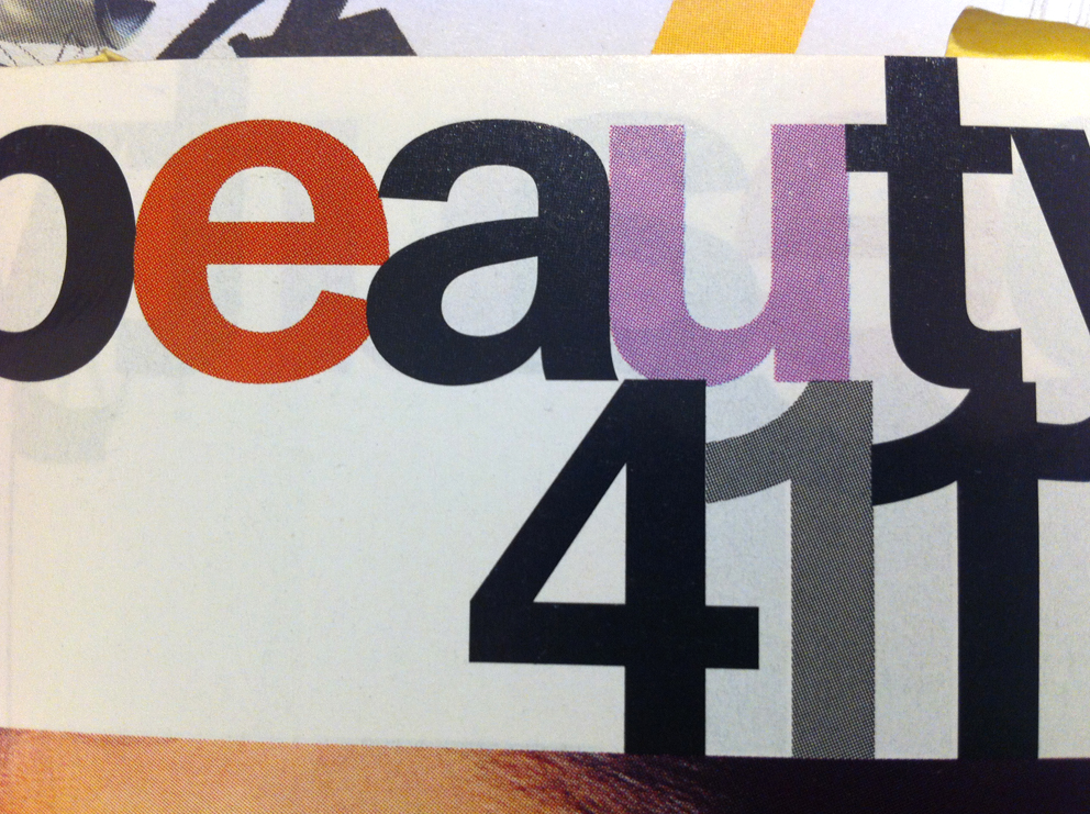

Haas Unica?
http://www.mengelt-blauen.ch/Typefaces/program.html?
Haas Unica is also close (/R still off) but Akzidenz grotesk remains closer to me.
To me PabloImpallari's find (scan detail) looks much like it.
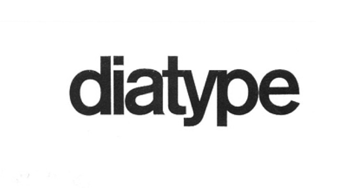
Yes, saw that too! But unfortunately, it doesn't solve the problem ;)

Maybe in this case the solution is not having the font? Although I personally don't at all appreciate people squatting on a gem like Unica.
hhp
Captured from commoncrawl.org on 30 Mar 2015. original URL

