
Hi, everyone !
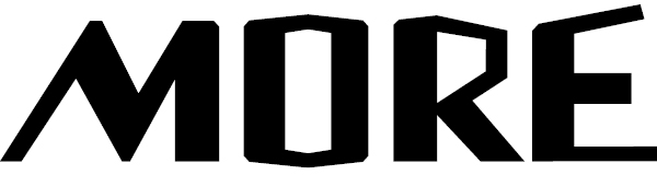
I would highly appreciate any critique for this logo. It's custom lettering. What would be the possible ways to improve it?
Hi, everyone !
I would highly appreciate any critique for this logo. It's custom lettering. What would be the possible ways to improve it?

To me it looks like MORÉ instead of MORE.

I would say the logo needs a lot of improvement. Stroke widths are inconsistent, diagonals are inconsistent as well. Take a look at the way letters are constructed and then rework your lettering. Logo, Font & Lettering Bible by Leslie Cabarga is a good source of information if you need some reading about font designing.
Regards
Thank you both for your replies! I tried to be more consistent. I checked all the measures using a sphere as a measure tool. It would be very interesting to read the book Graphirus mentioned, but I haven't got it at the moment and the logo is a rather urgent task to do.
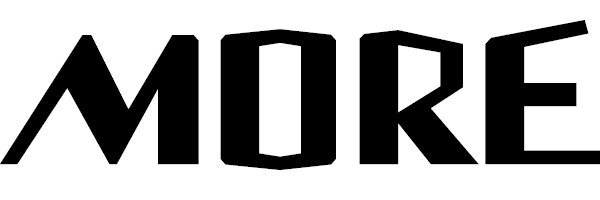

Is it for a demolition derby? :-/
Seriously: It might very well be perfect, but that depends on what it's for.
hhp
Well, not quite :) It's for an art and music festival in Venice.
I prepared some sketches for the client and he pick up this one.
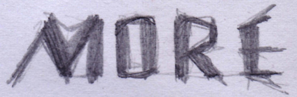
It's not an easy task for me so I would very appreciate any tips on it.
I guess it's hard to know what "level" of that sketch the client actually liked: the overall with the random wispy bits, or the "core structures" that can be guessed... If it's the former (which I personally would hope) then I might suggest constructing this with hundreds of fine lines that criss-cross and jump around.
hhp
Just a random thought — the O seems to be the focal point and I wonder if it could be made larger and become kind of a picture frame for various festival-related images (paint brushes, musical instruments etc), either contained within or projecting out. Could be the same each time or could vary.

@JamesM: you are joking, aren't you? ;) This is already in a bad shape without any additional stuff.
@Vykintas: what's the story behind this signage? Is it just something "they liked" or is there more to it? Does it have any meaning as it is at the moment? Because first and foremost I couldn't even by being totally whacked relate this to a music festival... And especially not Venice. :) But hey that's just me. And no offence I'm just asking directly without wrapping it in nice paper. It's supposed to get you through quicker and to better result.

Ya I agree with hrant in keeping it raw to the sketch as possible. It reminds of my first graphic that went international ...very gestural letter shapes.
I quickly ran your sketch through Ps to punch up that line work and keep as much shading as time would allow (GO BRUINS GO) and then in Illy did a trace...

...I might of tweaked the /E/ n'stuff just a touch.
n.
> you are joking, aren't you? ;) This is already in
> a bad shape without any additional stuff.
I had an ulterior motive. To be honest, your logo looked to me more like a logo for a machine shop than an arts festival. Sorry, but that was my reaction. So I was trying to think of ways to keep the same general treatment but add some elements to give it a look which I associate more with festivals (fun, energetic, colorful, artistic, exciting, etc.)
But I find 5stars' sketch (suggested by hrant) an interesting direction to explore. It's softer and more artistic looking. Maybe try some different media (charcoal, watercolor, etc.) Or maybe juxtapose rigid, carefully-drawn elements with hand drawn ones.
Wow ! I didn't expect so many comments. Thanks to all of you !
@hrant : It's the « core structures » that we are interested in. But the « hundreds of fine lines » – it's really an idea ! Is it technically possible (not too complicated at least) to accomplish that in TypeTool3 ? I mean I guess technically you cannot have a line in TypeTool ?
@litera : It's something they liked :) I should have added that electronic music is going to play an important role in this festival.
@5star : Thanks for the sketch ! The core forms are really more obvious now.
And there's a technical question. Is it possible to automatically round corners in TypeTool ? Of course I would adjust and polish them after it. But automatic corner rounding would be a very good tool to get the initial impression.
Well, the lines would have to have thickness. The T3 format is long dead... Which means you end up with a lot of points. But since it's a logo and not a font there are no technical limits to worry about there.
hhp
Well, actually there are some thoughts to develop the logo into a typeface.. So perhaps it would be technically too complicated to have such a lot of points.
It's doable.
www.typophile.com/node/19828
Follow the links in that thread too.
BTW, what about making it look like an explosion? Like an explosion of sound.
hhp
Hrant, it's interesting and very relavant threat you mentioned ! Explosion is also an idea. Thanks !
Captured from commoncrawl.org on 26 Apr 2015. original URL