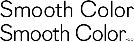
Each pair can only be defined once for an assumed average context, which really only does the basic minimum for you, and is fine for body text. But now let's say you're designing a logotype or book cover. The overall context of any specific setting can change how letters ought to be kerned so that the whole word looks consistently spaced. If your design calls for really tight letterspacing, every letter may best be kerned from scratch.
Imagine you've done a bold logotype for a company called INNERHIM. Nice straight sides you can shove together like books on a shelf, and the extra space made by the R's tail is acceptable because it falls at a semantic division (You would probably go for an overlap if the same RH were in, say, MINIRHINO). Now the company says it wants the same look but its name has been changed to OVERLACKY. Can you at least leave ER the way it was? No, because there is so much necessary space between all the other letters, ER will look too cramped if it is not loosened to match. This is an extreme example for the sake of explanation, but smaller decisions of a similar kind have to be made all the time.