

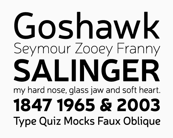
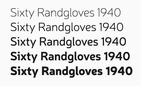
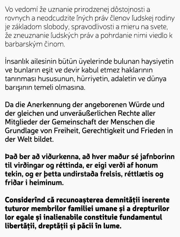
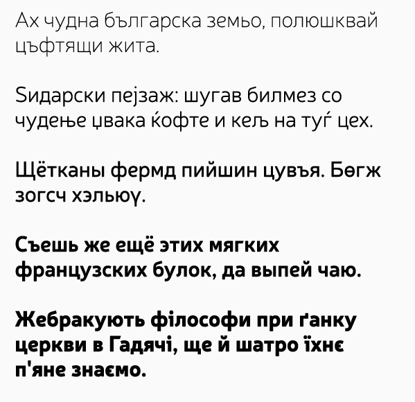
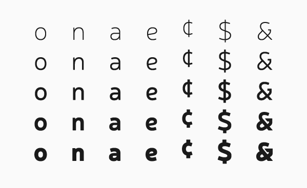
Not so long ago I made a thread asking to identify something like this. But it was just me looking for analogues early in the work progress. Although recently I've found very similar one, but it was already too late to quit.
I intended this for a paragraph-length copy. Quotes, openings etc. Originally it was an upright italic, but everything changed except /e slanted crossbar. 2 Masters, (prob.) 5 weights, Multilatin, Expanded Cyrillic. My first font being made with Glyphs. It's awesome. Won't be going back to FontLab.
Neris is a name of a river that goes through my city.
| Attachment | Size |
|---|---|
| Neris.pdf | 123.35 KB |
