
Just did this ambigram for a friend & want to check its legibility & see if anyone has any suggestions.
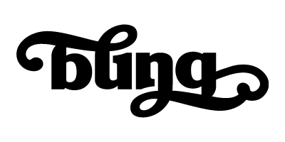
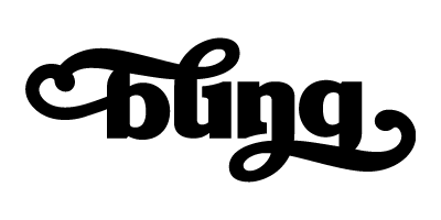
Just did this ambigram for a friend & want to check its legibility & see if anyone has any suggestions.

I'm reading "bung".
hhp

I'm afraid that's what I saw at first too...
I think you could add a dot to the /i/ without compromising the /n/.
Hiding the tail of the /g/ that way is probably not necessary, either...
Then maybe downplay the connection between the /l/ and /i/, or add connections between other pairs to make that look less like a /u/ and more like a linking stroke.

yup. Bung.

Could the tail of the /g/ end in a ball terminal that also doubles as the tittle? Then let the /l/ ascender flow from top left to bottom right.
Captured from web.archive.org on 15 Apr 2015. view this capture