
Ligatures: Is This Trip Really Necessary?
Very nice perspective.
This is a topic I wrestle with a lot; sometimes it seems I spend more time working on a font’s ligatures than drawing the rest of the alphabet!
Ligatures: Is This Trip Really Necessary?
Very nice perspective.
This is a topic I wrestle with a lot; sometimes it seems I spend more time working on a font’s ligatures than drawing the rest of the alphabet!

I think I often put the obligatory fi fl ligs in because they are expected by many purchasers, even though I usually use contextual alternates to solve ligature problems.
I must admit that I also often include whimsical ligatures for the fun of it--usually discretionary.

Aren't ff, ffi and ffl also generally considered obligatory?
EDIT: Ah. According to the article, apparently not, at least, not any longer, unlike the case with metal type.

Nick,
If you really spend more time on the ligatures than on the rest of the alphabet, I think you need to have a discussion with your Mum about the severity of your toilet training…

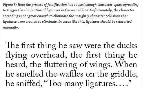
In cases like this, ligatures should be reinserted manually.
No — in cases like this, the H&J setting for letterspacing should be adjusted so that this doesn’t happen.
Most graphic designers would agree with Fred Goudy that letterspacing is wack.
But turn a blind eye to its use in justification.
Tolbert Lanston initially invented a method of justification by letterspacing, for the Monotype, but the look of it was rejected by typographers.
However, when Quark and InDesign introduced justification with letterspacing in the default, there was no such outcry, so we’re stuck with it as a norm.
It’s especially inappropriate for oldstyle revivals, which are the ones that have the fancy ligatures (see sample above).

Caught myself looking for the "like" button on Kent's post.
Captured from commoncrawl.org on 31 Mar 2015. original URL