
I'm seeking type recommendations for a "high fashion" brand that appeals to 25+ year old females. Yet at the same time, it shouldn't be overtly feminine, as it has to still appeal to males on some level. Any assistance would be much appreciated.
I'm seeking type recommendations for a "high fashion" brand that appeals to 25+ year old females. Yet at the same time, it shouldn't be overtly feminine, as it has to still appeal to males on some level. Any assistance would be much appreciated.

Perhaps you'll find The Regal Series by Parachute fonts suitable for your project. For better recommendations tell us more about the brand and it's activities. How will you use the fonts?

A few dozen year-old girls is not much of a market.
But seriously, how about a light italic slab serif?
These are more classic than industrial:
Bodoni Egyptian Pro Light Italic
Karloff Neutral Italic
Archer Light Italic
(Disclaimer: the Bodoni is one of mine.)
Thanks for your recommendations!
Yeah, the brand is for a prominent shopping mall. The use of the type would be in everything you can imagine: large and small signage: wayfinding, print, embroidery, digital formats: web and mobile... everything.

I'd take a close look at these:
https://monokrom.no/catalogue
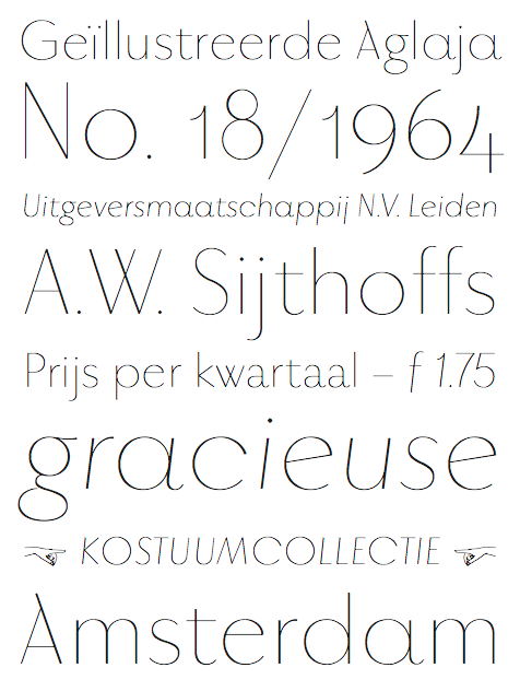
Vitner is high fashion, yet I don't find it totally feminine.
Of course, you'd have to pair it with something heavier to meet all your needs.

Disclaimer: this is one of mine, and it was aimed at your target audience about eighty years ago…which only goes to prove that everything old is new again…

Perhaps Escrow and/or Benton Modern Display?

I've always thought Minah is very stylish. It is unusually well crafted and strong for such a feminine look.

You might like Vulpa
Oh yeah, disclaimer: it's mine
Advert: it's currently on offer.
@daverowland
Those italics are gorgeous

Dave, I can't help saying that such a nice font deserves better spacing.
hhp
Vulpa looks nice; might try it on a job I'm working on.

Tiffany.
Paris.
n.
Dave, I can't help saying that such a nice font deserves better spacing.
It's spaced by iKern. Can't say I wasn't happy with it though. What do you think's wrong with it? If you can undercut Igino's prices you're welcome to my next font ;)
@chrisburton @JamesM Thank you!
This might not be the place, but since you asked - real quick: the right side of the "r" is too loose, the right side of the "k" is too tight, the "Y" is overkerned versus the lc... BUT: It's still a nice font - any good effort based on Plantin is highly welcome!
Now, BMW doesn't try to undercut Vespa's prices :-) but maybe we can talk before your next release - you might be pleasantly surprised (although the larger your character set the more price difference there will be).
hhp

Thanks for mentioning my work, Todd! Many of these suggestions evoke nostalgia. I tried to pull Vinter in a slightly different direction.
Captured from commoncrawl.org on 26 Apr 2015. original URL