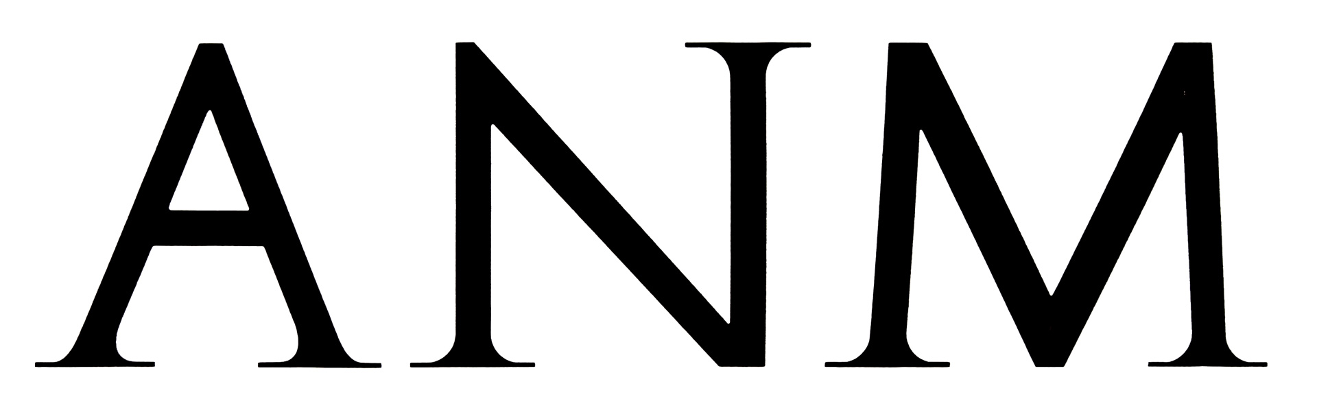
Can be wrong but as pointed out, this looks too much symmetric to be a font to me, more a hand-lettering. The apparent effort to make strokes equally thickened is weird too. They may even have started with strokes, creating the sans backbone then adding serifs. You could also try to rework Trajan, cutting and mirroring some strokes.
Some alternatives: Penumbra (Half) Serif, Monkton, Weiss, Jupiter, Giovanni
Hello,
I'm looking for this particular font for the sign company i work for.
Notice the symmetrical weight of the letters and the absence of serifs on top. That should narrow down the search a bit.. I have already tried Whatthefont, but no luck. I only have a few letters. Any clue anybody? Any help greatly appreciated!